


 Here’s an inspiring story from readers – Samantha and Dave – who told beige to bite the dust and instead painted their Colorado bungalow / ranch a fabulous shade of Burma Jade — jadeite green — from the Sherwin-Williams Suburban Modern palette. A note on the brick detailing on this house. By the early 50s architects and builders were looking to create a “long and low” ranch house feel on designs of every ilk. Adding a half-wall trim like the brick that runs along the front of this house — and in some cases beyond, as in this house — accentuates the horizontal, even though this house appears to be pretty much a square box. A classic classic mid-century house design trick. Click thru for Samantha’s explanation of their journey.
 She writes:
Hi, Pam,
Love, love, love your web site! I am writing to tell you our experience with using the Sherwin Williams Suburban Modern palette for our home’s exterior. Our house is a 1300 square foot ranch built in 1959 There are many classic midcentury modern houses in our neighborhood–some “cooler” than others; that is, some have bolder color choices and seem to stand out.Our house before painting was yellow with maroon trim. It has a brick facade that was originally pinkish-beige. We chose Burma Jade for the body of the house, and white for the trim. This was a classic combination according to the Sherwin Williams Suburban Modern palette. We also painted the brick facade white. When we finished, we received nice compliments from the neighbors. One woman who raised here family in the neighborhood said that it reminded her of when the neighborhood was first built. That was a big compliment, in our opinion! Some didn’t “get it.” One friend said it was an “old” color. Most people said that it went with the style of the neighborhood, so we chalked that one disparaging comment up to a matter of taste. The house looks amazing. We love the color and the fact that we don’t fit in with most of the brown and beige houses on our street.As for taking a courageous step…..it really was. We went through many color combinations before deciding to “go bold.” Initially, we wanted to use the beige color on the Suburban Modern palette, but when we tested it on the house, it looked pinkish. Not good. So after much discussion about colors, our “final” decision was white with the trim in Burma Jade. But then….we noticed that the house kitty corner from us was white with teal trim….a little too close to what we had in mind. So, at the last minute, we switched, deciding to go bold with Burma Jade as the body color and white as the trim. We love the way it turned out, even if some don’t get it.Thanks again for your wonderful website. I am addicted!Samantha and Dave


Thank you, Samantha and Dave, for sharing your story. It will give courage to all of us who struggle with taking a bold step when it comes to color.


Samantha says
Thanks to all for the positive comments! It is nice to know that there are so many people out there who love the midcentury modern style. I wanted to address the painting of the brick, since I know conventional wisdom says to never paint brick. I had to convince my husband Dave that painting the brick was a good idea for one reason and one reason only: the brick was UGLY. It wasn’t even real brick, but instead was that formed concrete “brick.” It doesn’t look bad in the “before” pic, but if you were standing on the sidewalk looking at the house, the brick looked terrible. There are houses in our neighborhood that have nice brick, and if our house had had a nicer style of real brick, I wouldn’t have even considered painting it. However, because it was so bad, I had no qualms. Also, our friends a couple of houses down have a white brick ranch with red trim, so I decided that the white brick would fit in with the neighborhood. I know that painting brick is some sort of sin in the world of home improvement, but the brick was so ugly that leaving it as is would have been worse. Again, thanks for all the wonderful comments. And Pam, thanks for the interesting details on 50’s brick facades. I always wondered why they did that!
pam kueber says
All – I don’t have anything “against” cabinets that go all the way to the ceiling. I am more in a “reporting” mode of saying that I don’t see them much in postwar homes. I can only speculate why. Thoughts: (1) cabinets were being mass produced, and manufacturers wanted to design a size that would fit well with all ceiling heights; (2) postwar kitchens were already much larger than previous kitchens so they provided ‘more’ space without having to take the cabinets to the ceiling; (3) the look is long and low – modern. And I will add (4): I had a kitchen once, in my 1912 house in Michigan, that had cabinets to the ceiling on one wall. Those shelves all the way at the top were not very useful, we’d stash stuff there and not touch it for years…Perhaps there are other places where kitchen extras can be stored, like a dining room buffet or china cabinet? In any case, all said and done: No single way needs to be prescribed – a room should be functional and make you happy, so apprise yourself of all the possibilities then choose what’s right for you.
Mary-Frances Main says
What a fantastic color and a great combo with the white!
loumeigs says
That is fantastic! I love seeing people embracing color again! Kevin just agreed to repainting our house the other day, to a pale turquoise! Of course, it was between that and a salmony pink color, (a neighbors house has that color and I LOVE it!) so he decided that pink didn’t belong on that large a space and folded! Hooray!
Jane (aka Elvis) says
Love, love, love the color!
You’ve inspired me: I was thinking of a lighter turquoise or aqua for the body of our 1956 ranch, but that jadeite green is spectacularly successful. Great job!
Debi says
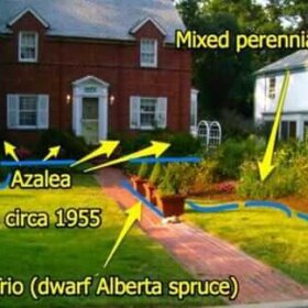
I love the jade color, especially against the white trim, but I also wanted to comment on the rest of the changes to the exterior of your house. The landscaping is very nice, and the font of the house number really fits in with the style. Fantastic job!
Trase says
Love the Burma Jade, to the point where I am thinking I want to see about getting it mixed up as an interior color. It’s one thing seeing it on a sample chip, and QUITE another seeing it in use – your house looks DARLING – kudos to you, Samantha!
pam kueber says
I just want to agree again – this is a terrific color. I really want to find someplace in my house, although it might be too close to my aquamarine to add more blue/green.
I also want to add: This is the 2nd time I’ve heard folks report disappointment with the beige in SW’s Suburban Modern exterior palette being too “pink” — like, “nude” pantyhose. I do recommend this color, though, for: Interior ceilings. I have it in my basement in all three finished rooms. My office has avocado walls/beige ceiling/narrow white trim. The rumpus room has original cherry paneling/beige ceiling. The guest room has Caribbean Coral walls/beige ceiling/white trim. All three look terrific. The beige ceiling keep the rooms feeling “warm”. In the rumpus room with the cherry paneling – the ceiling actually reads “white” without the harsh glare that actual white can sometime cause.
Final note, I think the Pinky Beige in the interior palette would be good for kitchen cabinets. But I have not seen it used there, yet.
Debi says
I love the jade color, especially against the white trim, but I wanted to comment about the rest of the exterior. The landscaping looks very nice, and the font of the house numbers really fits in with the style. Fantastic job!
Mindy Harris says
I love this house and am jealous! Our house was built in 1950 and we adore it (it’s all blonde brick)…however our next home will probably have more of the “atomic” shape to it–can you tell I’m still learning the terminology? When we first moved in I wasn’t as obsessed with mid-century decor as I am now, so we removed some wallpaper drapes, and green carpet–looking back I wish we would’ve kept it, but, I try not to kick myself for those mistakes.
Alice says
What a charming make-over! Love it!
MrsErinD says
Oh I just LOVE the burma jade and white on that house! You guys did great! It’s such a cool looking house to begin with and the colors just bring it right back to the 50’s. Yes it’s an “old” color, but that’s why we like it right?! I think it’s the perfect color combo for sure, and that’s my fave shade of green too. It looks like it was transported back in time, and yes that IS a compliment! :O)