

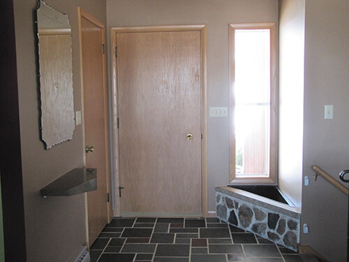
 Reader Kate — who has a 1961 ranch and a darn nice name, te-he — also has a Retro Design Dilemma. Her entry way has a beautiful random multi-color slate floor, a tall window that lets in loads of light, and an original built-in corner planter. Her problem — how to put the planter area to good use in an area that’s kind of a tight squeeze. So, she is asking for our ideas to decorate this this space — which is small, but still so important, because it’s where “welcome” happens.
How to decorate a foyer with a built-in planter?
Here’s the full backstory. Kate writes:
Hello Pam and Kate!
I am looking for ideas on how to decorate my entry way planter. We recently purchased our 1961 ranch and have been working very hard on getting it cleaned up and fresh. We bought it for the amazing woodwork, built-in china cabinet, shadow box, and original kitchen and bathrooms.
It has a great retro feel that we searched hard and long for. It has been a lot of fun to start collecting mid century furniture and décor. However, we have not been able to find the right thing to fill the space of the entryway planter.
We are open to taking the planter back to its somewhat original state, but we were not fans of the fake, dirty palm-like tree that was in there when we moved in. We are also open to covering it with a nice piece of wood to be able to set whatever we fill the space with on. Another thing we were thinking of was covering it with the wood and then just showcasing art on the wall above it. There is nice natural light that comes in the window and a recessed light in the ceiling above.
The entryway opens to the basement stairs, main level hallway and living room. We would love to have the area make a statement when people walk in the door but we need your help!
Thanks,
Kate
Thanks, Kate, for sending in your question. This is a good one — we haven’t talked about foyers much. Fun!
Kate’s idea to decorate this entry way with built in planter:
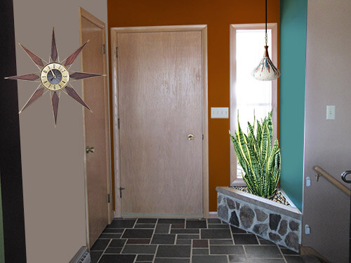
In order to make Kate’s entryway more inviting, add mid century style and make it feel more put together — I made a few key changes that focus on highlighting the planter — helping make it feel more unified in the space:
- Remove the shelf on the wall opposite the stairway — the shape was chunky and it sticks out into the space, obstructing the clear path and view to the front door.
- To break up the beige and add more interest, I’d paint the wall with the entry door one color (I chose a burnt orange) and the planter wall another (like the deep teal I chose). When selecting colors for the entryway, it is important to make sure they complement the colorful slate flooring.
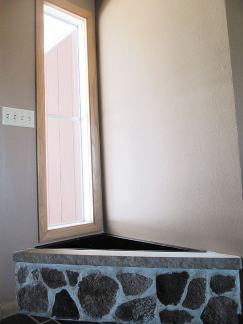
- As an improvement on the dirty, plastic palm tree that was in the planter when Kate moved in, an easy to care for snake plant is a period appropriate plant choice that is slow growing and compact to fit the space well. Covering the remaining exposed soil in the planter with river rocks makes for a finished look.
- Kate has a recessed light fixture above the planter — so it would be relatively easy to swap out the recessed light for a pendant light fixture like this great mid century pottery pendant lamp from Etsy seller lovintagefinds — which coordinates nicely with the chosen accent wall colors.
- To finish off the space — a mid century starburst clock like this model from Ebay seller katsajie (link now gone) would be the perfect finishing touch.
Pam’s idea to decorate this entry way:
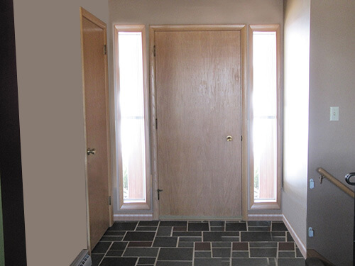
Well, you didn’t quite ask for this, Kate, but after staring at your entry way a long time, over several days, I thought that this situation might be one where, if it were my house, I might decided to rework the architecture.
So why?
- I think that Retro Renovation Kate’s solution is quite nice, if you want to keep the planter as is. Of course, you could choose different pendant lights, different plants, different wall art.
- Moreover, after staring and thinking… I came to the conclusion that the entire entry way looks kind of… scrunched. Like, too much jam-packed by that front door: a front door, the sidelight (name for tall skinny windows next to doors), the planter, the closet, and then Boom the staircase to the lower level. Interestingly, before RRKate and I posted our ideas (a few hours after we posted the question) — numerous readers commented that they thought the planter did not look original. I tend to agree – it may have been added later.
- In addition, that planter… it’s not big enough to hold much. In fact — I think RR Kate’s plants look… scrunched.
- And NOTE: I don’t really like what appears to be a sharp edge on the planter. In particular, if you have a weebit (a child) in the house, you need to consult with a properly licensed professional to look at that edge to decide whether/how to protect someone from accidentally falling on that edge and hurting themselves. Story: When I was in junior high, we lived in a house with a fireplace hearth made of sharp-edged Bedford stone. Sure enough, one day my toddler sister tripped and teetered and fell face-first onto that edge. She came within a mere inch of slicing her right eye open. I still remember holding her in my lap — I could see bone through the gash! — while my mother rushed us all to the hospital. My sister still has the scar.
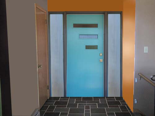
- So back to the design dilemma… I thought: What would it look like to remove the planter… to restore that portion of the floor with slate to match (okay, this will be tricky to tray and match, but random multi color slate is still available, and a skilled craftsman could match the grout, I bet… Then, center the front door… and add sidelights to both sides. I think that the Photoshop mockup that RR Kate made looks quite nice.
- Also note, I believe there are door installations with sidelights that are more integrated. For this mock up, we just replicated the sidelight you already had.
And reader Charles makes this entry way design:
 There have been tons of great reader comments on this story — including one from reader Charles — who even took the time to create a mock up for his solution (above). Charles writes:
Kind of a Kate/Pam combo here, but I would lose the shelf and mirror, remove the planter, and make both the entry-wall and (ex)planter-wall the same color. Toss in a Crestview entry door and sidelights, and you’re good!
Homeowner also contacted us after all these comments started coming in, and says that in response, her husband peeked under the planter and found that there is slate flooring underneath. Now it is up to them to decide the degree of time, money and change they’d like to use in their retro entry way.


Sarah says
I don’t have enough time to read all of the wonderful suggestions people have made, so please forgive me if I restate something someone else has already said.
First I like Kate’s idea a lot. Although I might go with different wall colors because the way the orange looks with the blond wood just doesn’t appeal to me (maybe a red instead?).
Second, in the comments that I did have time to read, the idea of covering it and making it essentially an end table is an idea that I also like, but instead of wood (if you can afford it) maybe you could get a piece of solid slate to tie the floor into the area.
Thirdly, if you don’t want to worry about tending to plants, have you considered an alternative like a zen or rock garden? Or maybe even a small water feature (depending on how near and easily accessed plumbing is to that area)?
Allen says
NOOOO!! Dont take the asymmetry away. Its beautiful. The trim on your recessed light looks to be vintage. So if you were to put a pendant there I would save the trim just in case because you wont be able to get that back if you toss it. The only real change I would add is to put some kind of windows (in an asymmetrical fashion) on the hinge side of the door. It looks like you have a 5 inch backset doorknob which implies that you have some sort of (probably fantastic) escutcheon on the outside of the door. The door windows could go along with that and further the asymmetry of the space. LOVE the asymmetry!!
Ranell Morris says
I think it would be nice to put a piece of wood on top you can make a curved edge. It would be a nice place to sit and take shoes on and off or to put coats and hats on. we added a little bench for our grandkids and it is so much easier!!!
Diane in CO says
(Posting after doctored photos added)
Pam, that is soooo much what that hall needs – so much better! I kept thinking the door should be replaced because it needs a window or something – but adding the second sidelight is brilliant and solves that for me (who always wants to look out before answering a door….)
The symmetry is much more pleasing. If the tile replacement doesn’t quite match up – they could place a narrow umbrella stand (cylindrical – something very retro or mid-century) for a few interesting walking sticks/umbrellas with bakelite handles to distract from the floor in that corner.
Robin, NV says
After looking at Pam’s architectural ideas, I’m wondering if there wasn’t already some architectural reworking of the front door. I wouldn’t be surprised to learn that the wall on the left is not original. It’s odd that the front door is scrunched (to use Pam’s word) over to one side and that it’s so close to the wall and the other door. Maybe it’s just me but it’s weird to have the doors hinged so that when you open one, it blocks the other. Reminds me of the opening credits of Laverne and Shirley where they open the front door and the closet door simultaneously and bump into each other.
Chutti says
I’m of the camp that suspects this is not original, but I still sorta like it.
I’ve had homes with both original and added planter boxes and made good use of both. If you don’t like it and want the space, that’s another thing.
As for mid century plants, I think a rubber plant is iconic and would not creep into the space too much. Those mother in law tongues grow too fast for that space. While I love, love my Monsteras, they explode into your space, and I am always having to cut it/prune it and reshape the moss log.
It was very much period to have gravel or other substance in the box and add the pots. I have an awesome Better Homes and Gardens indoor plant box with dozens of examples.
Don’t assume you have to put plants in there, either.
I had a totally wacky built in kitchen planter (like a screen between the back door and counters) that I couldn’t change in a rental (it was the owner’s self-prescribed therapy after returning from the Vietnam war).
It was a wood box painted orange, and full of large sparkly white rocks-cemented in!
I made a collection of decorative clear liquor bottles filled with colored water (yes there were a few to start from his collection) and lined ’em up in there. The light coming through was so neat I wound up doing this in the crazy window shelf inside the front door too.
Now if I had only figured out why he added a fan BENEATH the built in kitchen nook! We always called it the “bean-o-lator”.
He was a great example of MCM DIY run amok.
Steve H says
It’s kind of a tough call. I agree with others that the planter makes the entry look a bit cramped and the stone is a little too rustic for my taste. I think unless you have similar stone in the house like a fireplace, etc it must look a little out of place, although it does look like it was well made. I would do a little exploration to try to determine if it is original or not. If you find that the flooring runs under it then I would definitely consider removing it. I wouldn’t change the door and sidelight though. First, I would require relocating your light switches which are very conveniently placed now. Second, a think the asymmetry gives the entry a more modern look then two sidelights. What I would do is construct a built in bench that is the same height as the bottom of the side light and projects out even with the side light’s casing on the left side. It would make everything look more integrated. You could take your inspiration from a George Nelson bench and perhaps even find or have an iron leg made for the open corner that would echo the design of your iron staircase railing.
Jay says
I like Kate’s ideas for working with the existing planter. Then again if money is no object, Pam’s idea gives the entryway a semi-formal / MCM clean uncluttered look. What is the exterior like – this formality might not look right if the exterior consists of asymetrical placement of windows.
oh Holland says
I’m with Pam on removing the planter. Besides cramping the small entry, its angle points guests right to the stairs, like an invitation to tumble down.
For some MCM greenery, try a bullet planter inside or outside the tall window on the door opening side.
And how about a door-lite kit from Crestview to punch up the front door? That and some wall color like Kate suggests would really open up and transform the foyer.
Kelly M says
Lose it. Takes up too much precious real estate.