

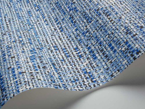
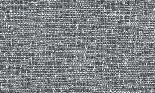
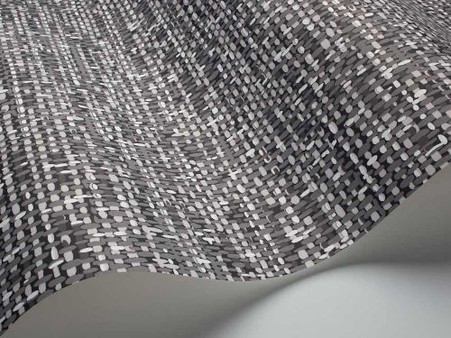
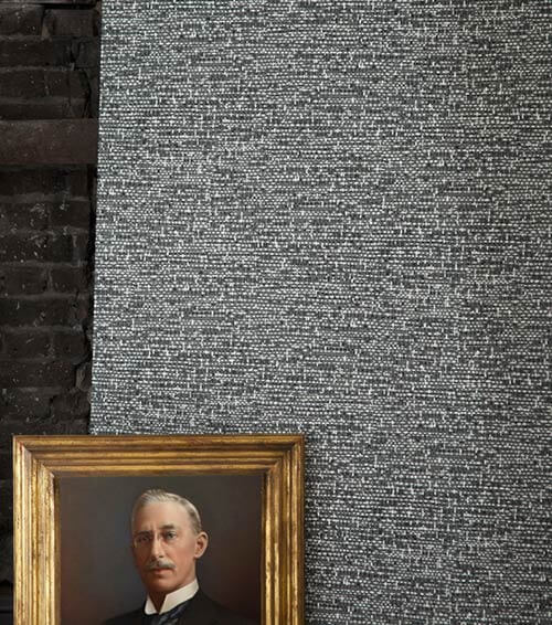
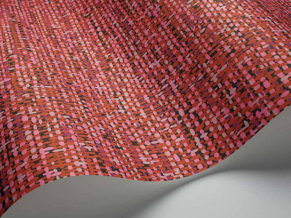
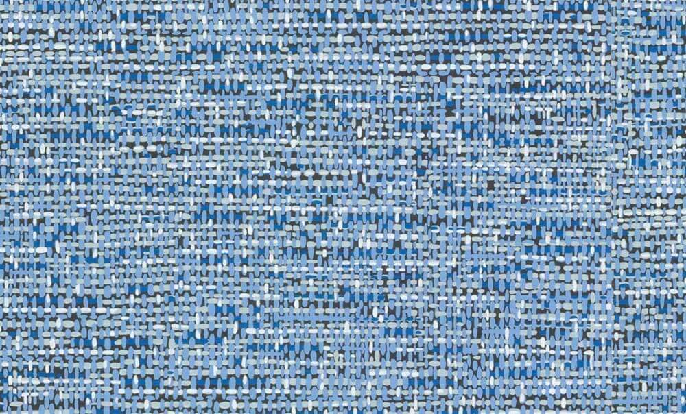
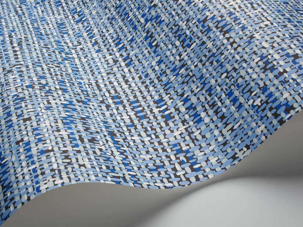
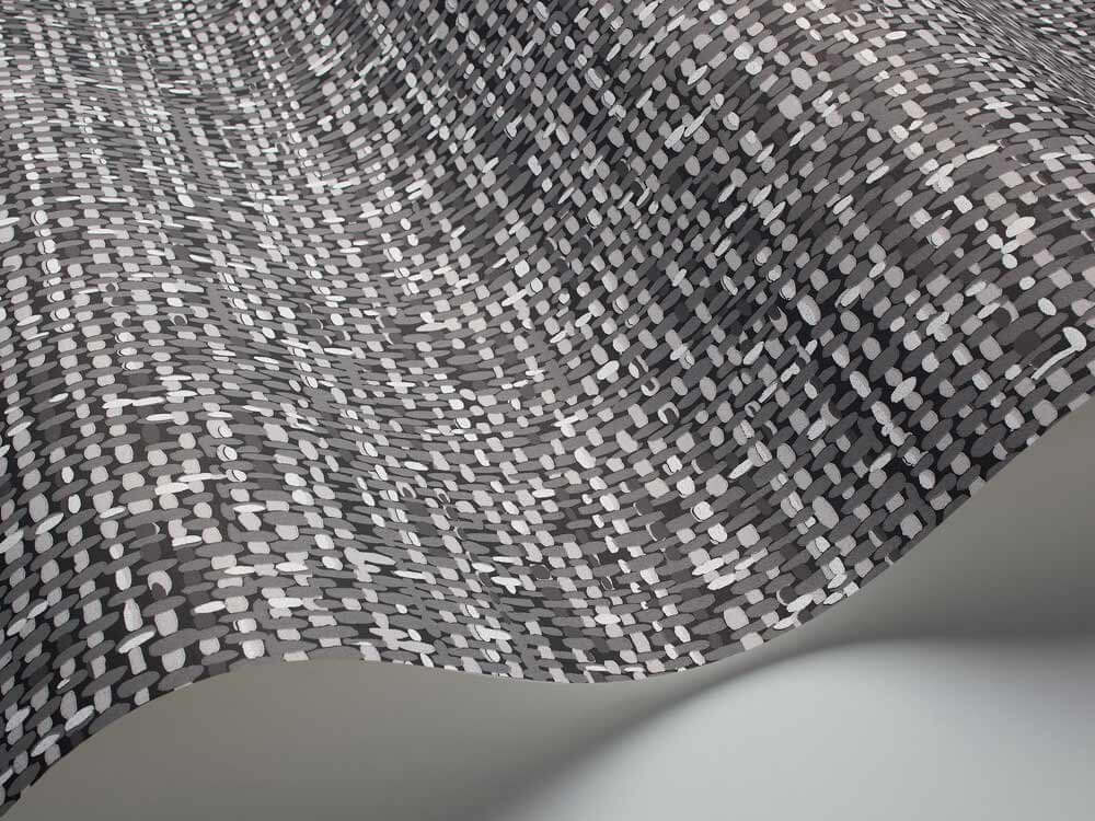
 Cole & Son’s line of tweed wallpaper comes from a 1950s document print — it’s an authentic vintage design — and we love it. It seems to read like a cartoonish grasscloth or linen — not a bad thing in our book, at all — because it makes for a delightful mix of sophisticated + whimsical all at the same time. There are 6 color ways ranging from soothing neutral to bold red, gold and blue.
Update: Since this story was originally published in 2014, this product appears to be discontinued. I will leave the story up, though, for history.
From the description on the Cole & Son website:
Foundation Tweed
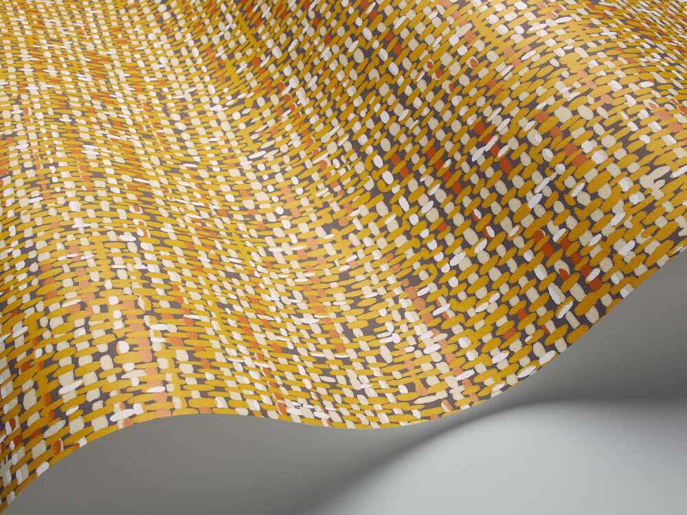
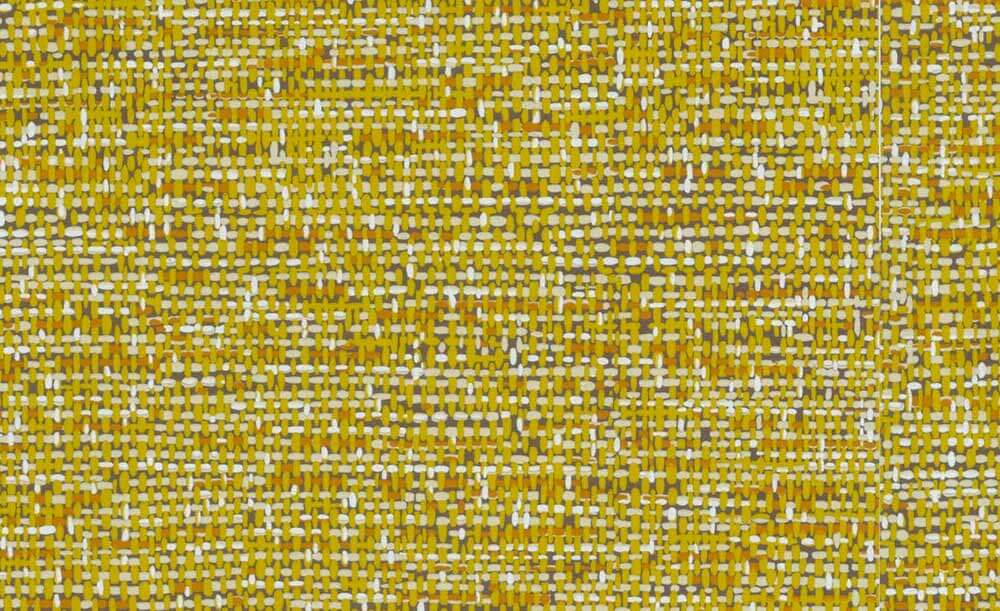
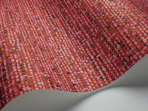
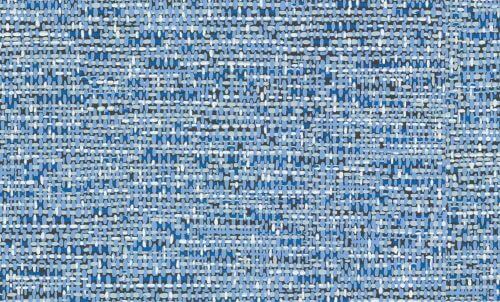
A stylish, vintage wallpaper design from the 1950’s. A colourful pattern that incorporates a tweed texture on a solid background, this design would suit a feature wall for maximum impact. Colour-ways include White, Brown, Black & White, Yellow & Orange, Blue and Red. Colours shown on-screen may vary from the original wallpaper, we therefore recommend ordering a sample to view the true colours. We recommend that you use Cole & Son Tub Paste.
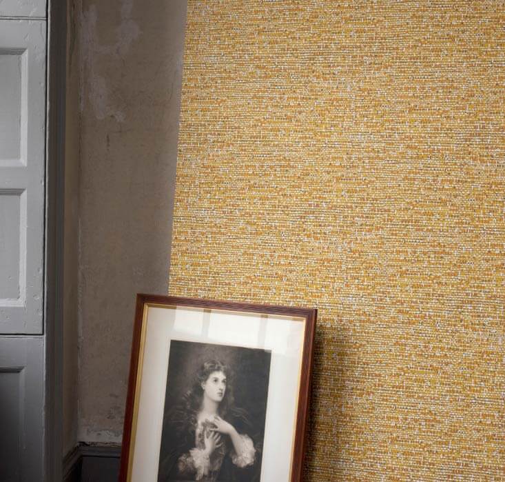 This wallpaper pattern would be a great ‘starter wallpaper’ for those timid about putting too much pattern on their walls. From a distance, the tweed reads more like a texture — like grasscloth or matting — than a print. The fact that it’s not to literal a representation — it’s an illustration — a sort of chubby representation — makes it all the better. Wallpaper is its own medium — we like it best when it is not photographic. At the same time, this design is not so scream-y that you can’t layer it. Au contraire – what a fabulous backdrop for art and tchotchkes of all sorts. Pam says she LOVES this wallpaper!

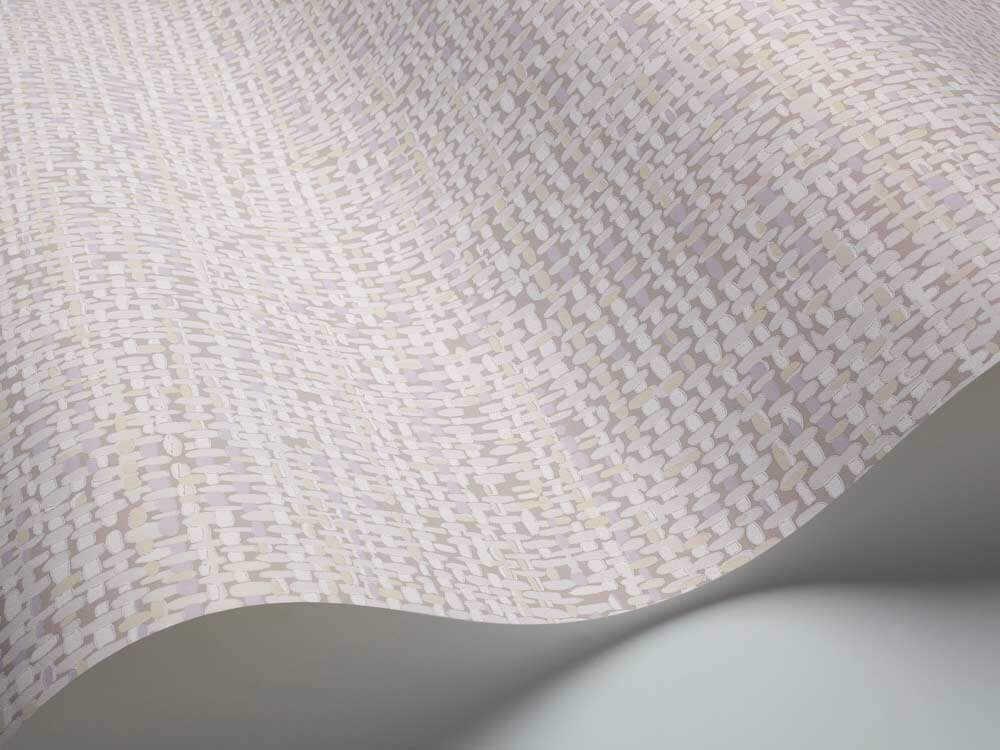

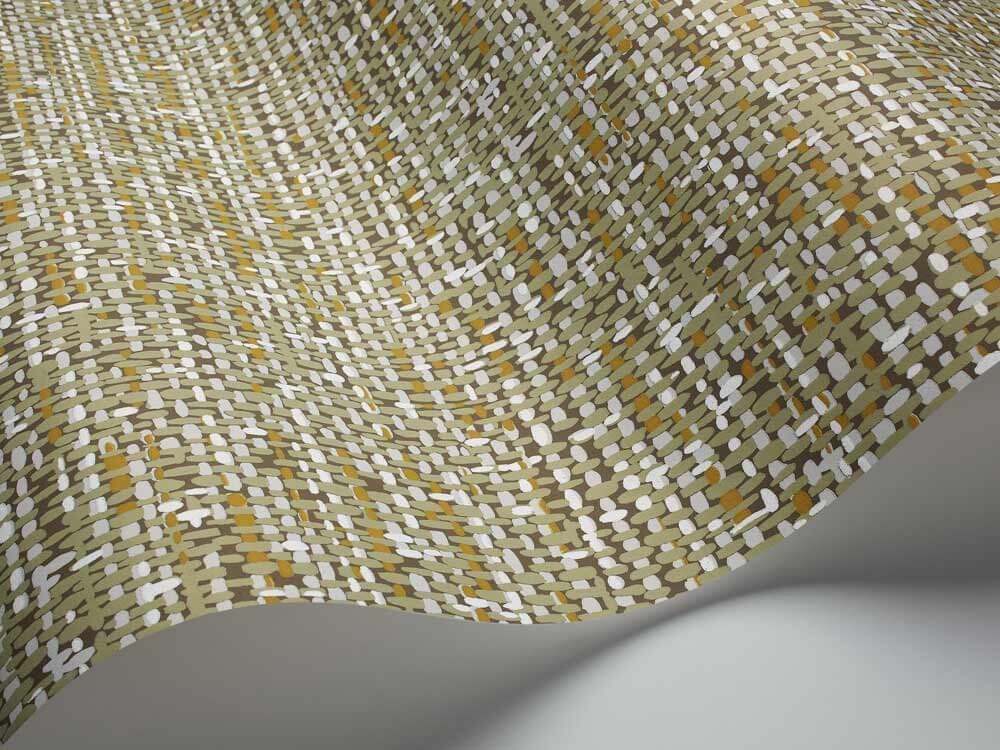
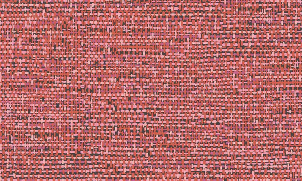 The color ways offered would work well in a retro home. I’m especially fond of the yellow/orange and the vibrant red/pink combo, but the white is a calming neutral if your are searching for a more understated look.
 What do you think readers? Would you use tweed on your walls?


Mary Elizabeth says
Love the idea of using this in an entry or as an accent wall. I have just the space for the green or beige.
SebastianFTL says
I think the only reason I am looking forward to buying our next home as opposed to renting is WALLPAPER! I really want a blue room in our next home…that wallpaper would work well in an office. Oooh, with a navy blue velvet hump back sofa & mix of retro, modern & antique pieces.
Sandra says
The reason there is more wallpaper on TV shows than in real life is because the camera loves it (and so do the set designers and directors of photography). Wallpaper gives both visual depth and personality.
Love it.
Kay says
We had paper very much like this in our ’78 “wet bar” area. When we sold, the realtor staged it as a coffee bar. I am thinking a bit of this paper behind a console set up with your coffee station would really “ground” the space and add drama:)
Robin, NV says
I love this wallpaper! I would look great in my guest room as an accent wall. I love the gold/orange and the sagey green ones.
Scott says
The yellow is killer and the C&S website is a treasure trove of cool stuff covering a wide range of different tastes/looks. Some of those geometrics are amazing.
cellen says
I want the green in my foyer. BTW, this has been a great week on Retro Renovation. Every post seems to be addressing something that I need or have been curious about or gives me a good idea. Thanks Pam and Kate!
Kate says
Glad you are enjoying it Cellen!
Sylvia O'Stayformore says
OMG! I love the Mirrored tiled wall paper also! I wonder how much it translates to in American $.
Cynthia says
Love it. Love love love it.
Lindel says
Oh Yes! I could find several places in my home to use several of these color ways…the grey in the already grey hallway, the gold/orange in the orange bedrooms (just one wall though…as an accent) and the red/pink as an alternate design scheme in the pink bathroom or perhaps in the red living room…..do you think it would go with 30’s streamlined chrome furniture?