

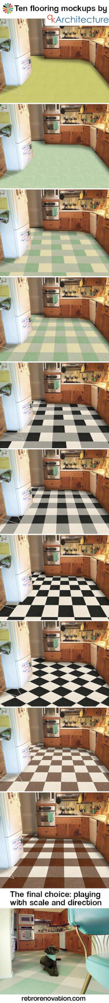
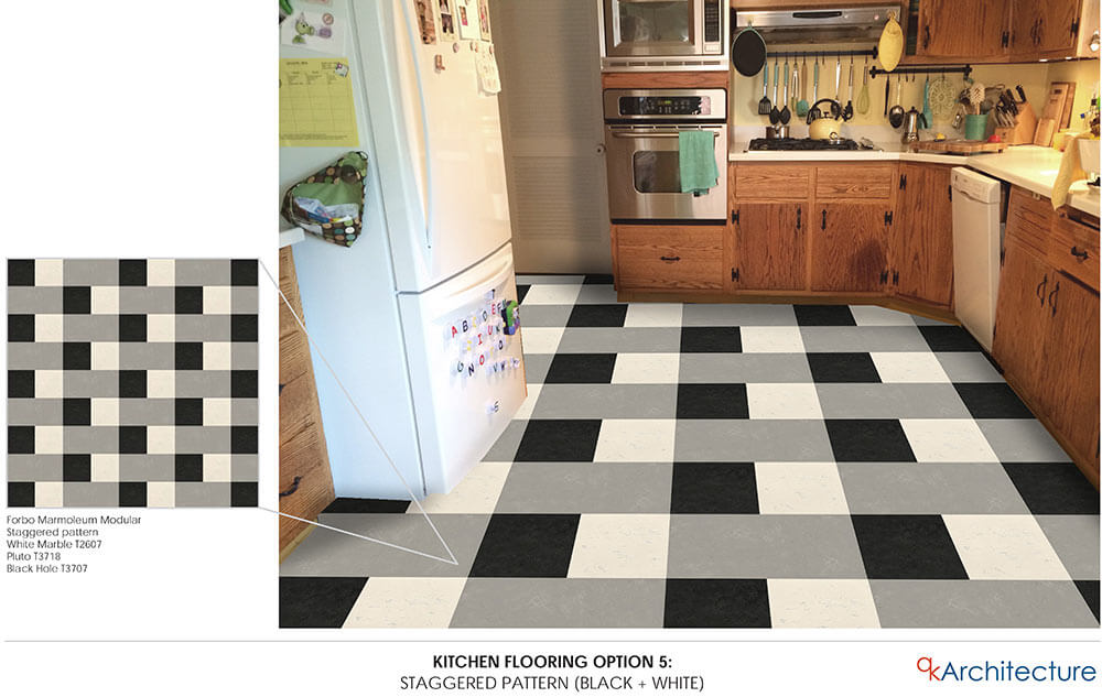
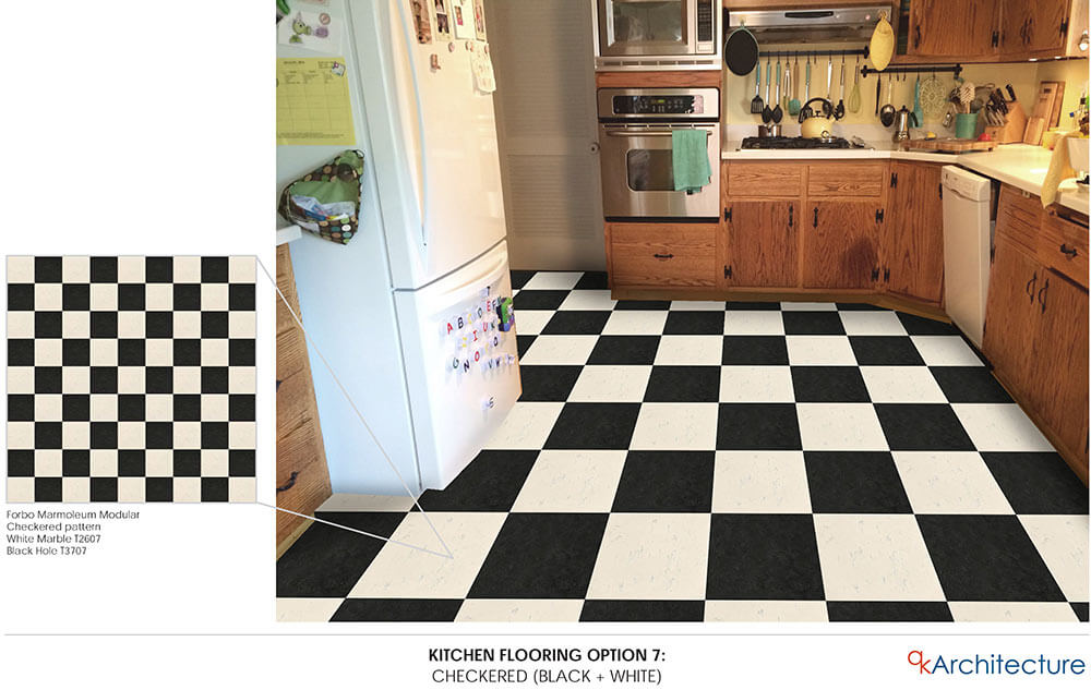
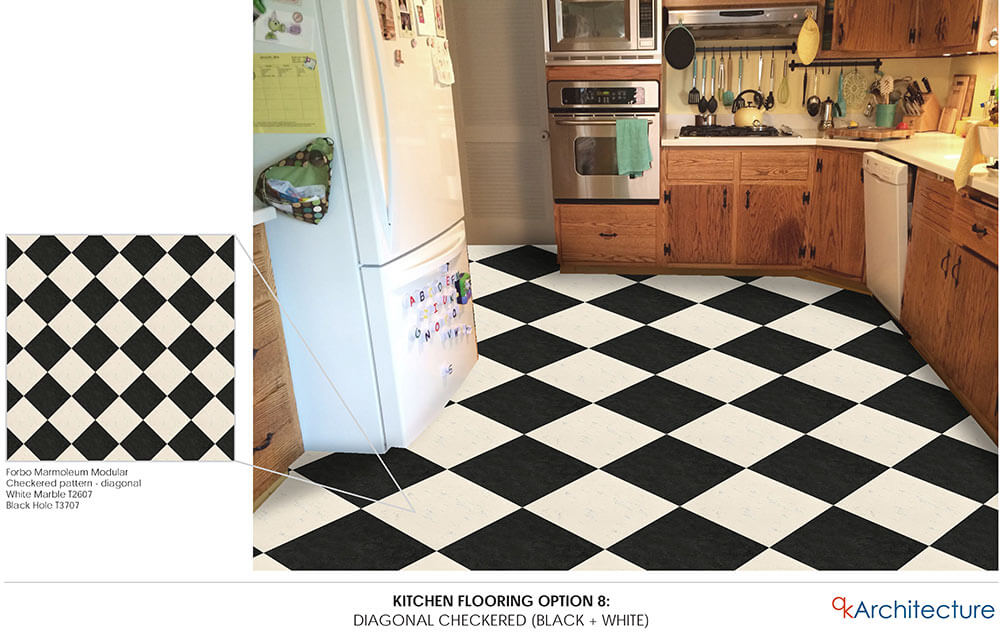
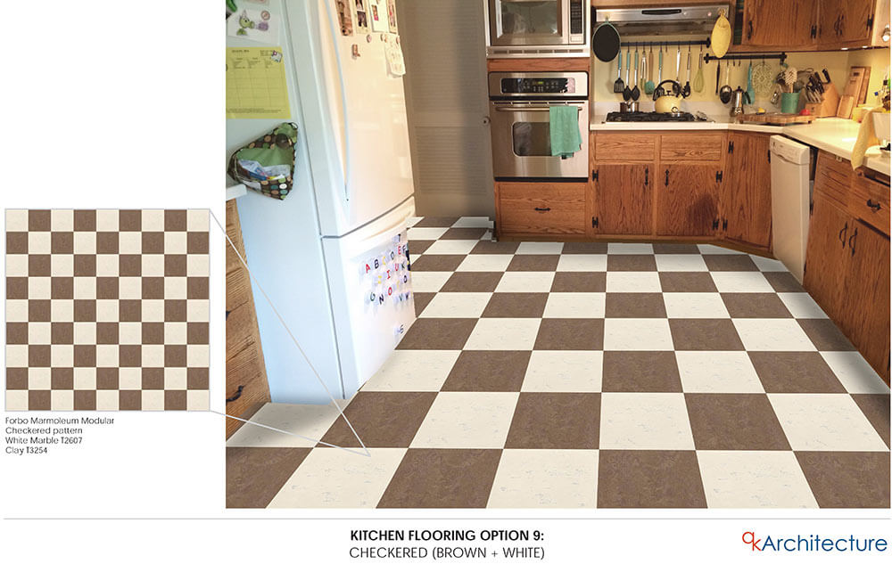
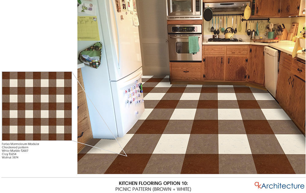
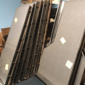
 Well, here’s a lead photo that breaks all the rules. But we made it to illustrate the benefits of working with an architect when you are planning a big renovation or key changes to your home. We recently looked at the final results of Diana’s kitchen project. Today, a spotlight on just the floor tile pattern options that her architect qkArchitecture put together for her. With these 10 linoleum floor tile designs in hand, Diana then worked with her contractor Pittsburgh Remodeling Company to tweak the original concepts and make the final selection. We love it!
 Hi Pam:
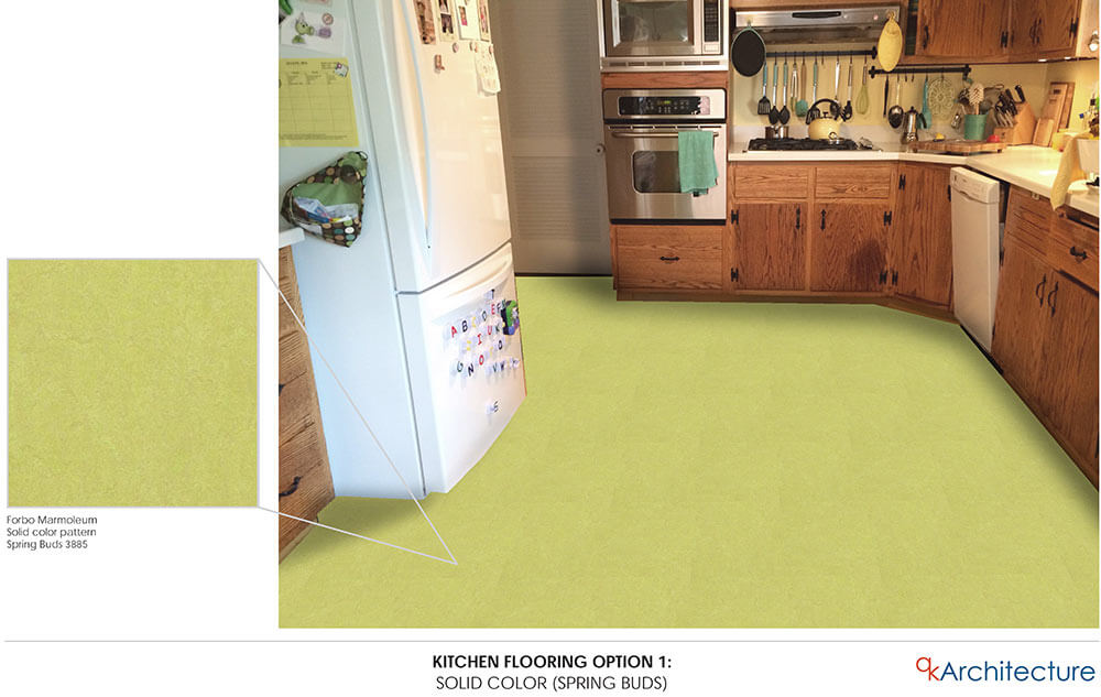
Yes, I really grappled with the color and pattern of the kitchen floor! I had help from Quintin, the architect, preparing those electronic mockups. I think I settled on the colors first. And, it wasn’t easy to pick the colors; I also had a respectable interior designer recommend the black/white/gray color scheme and that was very tempting to me too. The interior designer felt that the black/white/gray floor would have provided a very neutral palette yet also have a retro feel. Ultimately, I felt the black/white/gray was a bit too 1940s for the overall style of the house (which was 1960s).
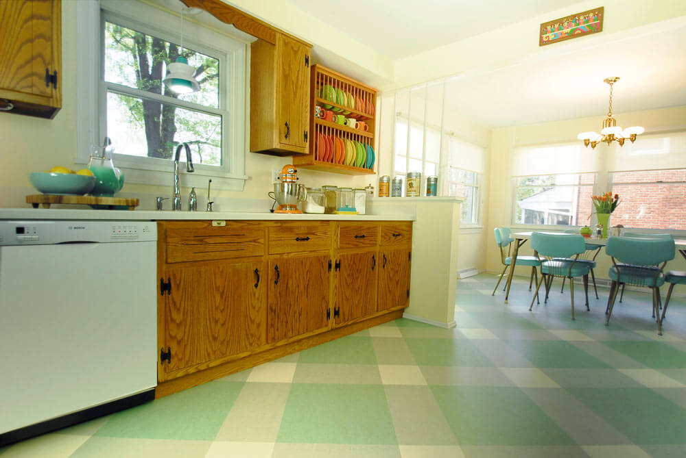
After I picked the colors, I still wasn’t keen on the mockups with respect to the pattern (those are the ones you see in your graphic). So, I asked the contractor (Pittsburgh Remodeling Company) to help me come up with a pattern and one of their internal designers came out to our kitchen, and made a hand drawn/colored mockup with three different patterns. Both my husband and I liked the plaid pattern. I think it was the combination of the large and small tiles on the diagonal that appealed to us most and it evoked something from the 1960s (but was also going to be unique).
We knew that whatever we went with; it had to mesh well with the hall and family room because after the walls were opened up those rooms would open up into each other (as opposed to before, when the kitchen was very well cut off from the adjacent space).
Stout Flooring installed the Marmoleum. As an aside, it isn’t easy finding a Marmoleum installer. There aren’t many of them around. The other big flooring company near us did not install Marmoleum.
Warm regards,
Diana
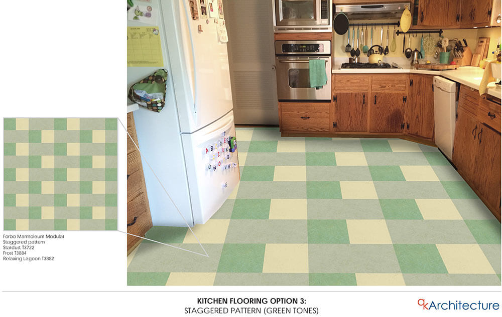
Individual designs of possible floor tile patterns from qkArchitecture, along with the Marmoleum colors:
Viewing tip: Click any image and it should double in size on your screen. Click anywhere outside the photo or hit Escape to return to the story.


Again: The benefits of working with an architect — especially if you are highly visual, are intent on having everything come out just so, and spending a lot of dough re mi.
Thanks again, Diana, qkArchitecture, Pittsburgh Remodeling Company and Stout Flooring for the great work — and to Diana and qkArchitecture for sharing this project with us!


Robert says
Yes, the best, but some other good ones, too. The chartreuse (#1) was comical, and ditto to Kathy and Neil’s thoughtful and dead-on comments. Streaks and splotches are mandatory in the world of retro-vinyl, but they can be quite sophisticated. This is proven by the need to have your tiles from the same run, as they are like a baked cake, each unique. And all the (extra) work Diana did resulted in a floor that greets, caresses, and enjoys the living done on it. Beautiful comments, and educational. My Aunt Katie had a man put a geometric medallion cut into a bathroom floor of her 50’s cottage. His old wooden box of well kept scribes, compasses and curves fascinated me even then. The final thing looked like a sort of geometric planet-of-Saturn, in 3 or 4 colors of blue, green, burgundy, black, on a field of goldish, with a black border.and after waxing, it looked as tight as an embossed floor, but with a warmth that made you feel special to be in there…I remarked to her it was a lot of trouble for a bathroom that wasn’t even her own bathroom. She said this was her guest bathroom, and that’s the sort of thing one did for their friends, and people they care about. But she didn’t design or even offer input as to the colors, and he used scraps he had with him. She just told him to give her a little something in the middle. And he did.
Diana of Mt. Lebanon says
Thanks for the great feedback. It does feel good to know we made the right decision!
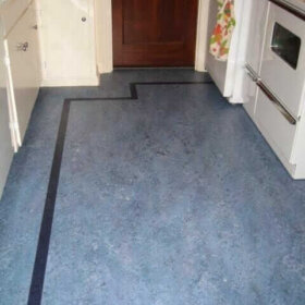
We discovered during the construction that the original floor was a sheet vinyl in a very muted beige. The original floor was destroyed by being covered with a second vinyl floor and another floor that was nailed onto that (what a shame). But the original vinyl had a pattern in it sort of like a terrazzo pattern. It was interesting to see it after we started the renovation.
Karen says
Diana, I agree with an earlier comment that your floor is one of the seven wonders of the world. I love love love the one you picked.
I want to do a vintage pattern and hubby wants to do a linoleum type floor vs ceramic tile or hardwood. This floor pattern fits the bill for us both. Brava for all of your hard work and research. And thanks to Pam & Kate for sharing it here. So many patterns and tile combos remind me of an old high school gym locker room floor. This is perfection.
Neil says
Diana,
Bravo! The pattern and colors you chose are superior to all the runners-up; you have a good eye. The soft gray seems to extend and blend and increase the visual effect of the friendly green, without adding even more green and so making it overpowering. Using a large-scale plaid makes the room seem larger, and doesn’t create tight busy-ness to compete with the other elements in the space.
And installing that pattern of crossing straight lines on the diagonal causes the cabinets and other perimeter elements to seem to float above it, and so increases the visual volume of your kitchen by implying that the plaid goes all the way to the walls; and it allows the eye, instead of stuttering against all those varying lines and corners around the edges, to tend to even out the shapes and see a continuous field of harmonious floor.
Great job.
Neil
normadesmond says
must be comforting to know you made the correct decision.
Kathy says
I agree with Christine. I love the final choice and putting the floor on a diagonal, but #3 was a great runner-up and is probably a bit easier to install.
And I agree that the black and white and grey variations just don’t work as well with this kitchen. I rather liked the last two brown variations as well.
Honestly, I think the stark black and white checkerboard and variations is more ’80s-style Retro than it ever was a style for home kitchens, and possibly even not as common as we might think in diners. A solid color shows every speck of dirt and who wants that? I think even solid colors were almost always with some sort of subtle or not so subtle pattern-a swirl, a streak or a splatter of some sort.
Maybe my memory is faulty, but I think just about every authentic unrefurbished diner I’ve been too had mostly grey streaky vinyl. Early diners and ice cream parlors might have gone for black and white tile, or white with a strong color, but then the floor expanse would have been broken up with grey gout lines, and the tile would have been in smaller squares.
I think vintage vinyl and linoleum checkerboard type flooring patterns could be bold, as shown on some of Pam’s vintage advertising, but were typically more variegated and less contrasty in the home.
Some nice vintage style examples I’ve seen featured streaky or splattered grey and black, or green grey and black, or beige to medium brown and black, and the “black” could be near black– dark brown, charcoal grey, dark green or burgundy.
Designers are not necessarily experts when it comes to “Vintage” style and tend to go for stereotypes if they haven’t studied it. Thanks Pam for pointing out the wide variety of mid-century design through this blog!
Christin says
Perfect choice!
Christine says
3 was my next favorite!
Marya says
It’s lovely! Retro while still being new and different. And it highlights the charm of your cabinets, instead of fighting with them, like some of the other choices. I’m so glad you didn’t choose the black and white – what was that interior designer thinking?! Yes, they are Classic retro, but not for that kitchen. Good job!
Elijah Grajkowski says
I can attest to the difficulty of finding a qualified Marmoleum/linoleum installer, at least here in my area. Not sure what it’s like in other localities however. The gentleman who ultimately did install mine in the kitchen (the Marmoleum pattern called “Pool Party”) told me that very few people do it anymore. He mentioned that he was specially trained by Forbo/Marmoleum on how to do it properly. He told me that he had to fly to California or somewhere for the training.
Your design is wonderful! Great job!
Laurie Louise says
Diana, your floor is surely one of the Seven Wonders of the retro reno world. The one you chose truly looks like it belongs in your kitchen. It’s fresh, subtle, sophisticated. Reminds me of the kinds of floors Pam shows from back in the day that took a lot of creativity and commitment–and that take your breath away. Well done!