


 Once upon a time not so very long ago, there was a cheery kingdom where royalty and serfs alike brought endless bouquets of colorful flowers into their homes and cast them in every direction — all over the walls, the upholstery, the fabrics — even the ceilings! These brave design folk were not put off by minimalists’ opprobrium. And in fact, it was these pattern-mongers — not the less-is-morers — who were lauded far and wide for decking their halls in the latest fashion. “Don’t forget the sixth wall,” the decorating wizards and sages declared. And so it was. Wallpaper everywhere! Thanks to reader Bob, who was the first with this time capsule tip.
UPDATE SEPT 21: Trixi tipped us to the estate sale coming up this weekend, more photos o’ the stuff inside here >> Estate sale.
 Whilst today this 1960s/70s (?) wallpaper explosion may not be everyone’s cuppa tea — although you know we LUV it — you gotta give the designers credit for their derring do!
And there are a number of things to learn from this beautifully-maintained 1960, single-owner time capsule house –>> for sale in Golden Valley, Minnesota, listed by Josh Sprague of Lakes Sotheby’s International Realty.
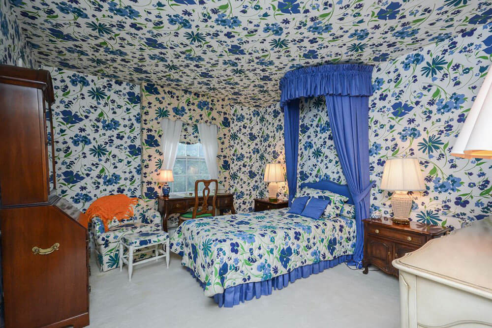
Lessons such as: using color harmony when you’re going bold… the lift of lacquer… and heck to the yeah: Why not wallpaper the ceiling or — better yet — canopy it in chintz ala the sunroom in the first photo above!
I do not know my interior design history enough to know who to credit for this layered look. I am reminded of these very famous rooms, which were done in 1957 by Billy Baldwin. Sister Parrish loved her chintz pinch pleats with matchy matchy upholstery nearby, too, as I recall. This whole idea goes way back.
From the property listing:
- Price: $674,900
- Square footage: 3,827
- Bedrooms: 4
- Bathrooms: 4
- Year built: 1960
400 Westwood Dr S in Golden Valley, MN 55416 is a sprawling mid-century split level home with an open floor plan and original elements of this home that make it stand apart from the crowd! The home sits perched atop a dramatic half-acre lot, within walking distance to North Tyrol Park, and the spectacular woods and trails of Wirth Park. Lovely three-season porch and entertainment area open up to the private backyard with small water feature/babbling pond. Huge kitchen, informal dining room, formal dining room, and two family rooms with fireplaces deliver wonderful main floor spaces. Private Master Suite with bath, and two additional bedrooms and baths above grade. Lower level features an additional family room with fireplace, bedroom, bath, and laundry room, plus additional lower level den and office.
- Read more about this house’s history in this story in the Minneapolis Star-Tribune published today (alas, link now gone). Thanks to reader Erik for pointing this story out! Glad to see the home is getting good exposure — we hope it helps connect with an appreciative buyer!
 When going bold: Narrow your use of colors:
Kate counted at least 11 rooms in this home that have unapologetically bold wallpaper that sets scene for each room’s design.
But go through these photos carefully and you will see that the wallpapers (and room colors in general) were chosen to be within a narrow range. The colors used in this house are mostly similar shades of blues, greens and yellows, all settled with bright white. This creates a harmony throughout the house that is much less jarring than if many colors had been used.
- In choosing the 18 vintage wallpaper patterns for my office walls patchwork, I also worked to keep the colors within a controlled range.
Above: The fun starts in the entryway with a crisp green wallpaper pattern and matching curtain on the door…
 Above: The kitchen and dining room use the same wallpaper pattern for continuity in the space. We love the pops of bright green on the dining chairs and rug, too.
 Above: The key to making this room feel less overpowering despite its dark wallpaper ceiling: lots of light and lots of white.
 Cheery yellow wallpaper with coordinating upholstery and accessories look fantastic with the warm wood wall paneling in the den…
 The living room has a lighter yellow wallpaper and bright green furniture. Check out the fabulous roman brick fireplace in the corner!
 Even the laundry room gets the royal wallpaper treatment.
 Only one of the bedrooms opted for a plain white ceiling, but there’s still plenty of matching fabric to be found on the chair and ottoman, bedspread and dressing table apron.
 Above: A midcentury blue and white bathroom with Impressionistic wallpaper, shower curtains and ginormous mirror reflecting it all.
 This jungle green leafy wallpaper pattern is one of our favorites. It’s balanced with lots of white on the wainscoting, carpet and bedspread.
 Again, while this wallpaper pattern is dark, the room has plenty of white to balance it out, and the two windows and pair of table lamps help make the space feel bright and inviting. Lacquering antique furniture was a “thing” during this period, as well.
If not for the dark periwinkle blue canopy, we’re not sure you’d be able to find the bed in this bedroom. Fantastic!
 Above: Another favorite. We love the combination of the all-over-fresh feeling floral wallpaper and the bright yellow vanity and other yellow decor. It just feels so clean — perfect for a bathroom. Again — doesn’t this house seem amazingly well maintained?! What a happy house!
Link love:
- Mega thanks / credit to Josh Sprague.
- See all listing information for this delicious home here.


Erik in Minneapolis says
Here is more detailed article on the house and its interior designer/owner Shirley Keller, published on July 22 in the Minneapolis StarTribune. Note that it includes photos of Mrs. Keller.
http://www.startribune.com/homegazing-the-woman-behind-the-wallpaper-house-in-golden-valley/387935542/#1
Over the years, the house had been redecorated three or four times. My and some other posters’ original hunches were correct; the current interior decor was done in the 1980s.
Judith Sachs says
This was a beautiful home – I was a friend of the family and loved to visit – it was magical. The people that lived there were kind and gracious – the look of the home was a reflection of their creativity and artistic taste.
Marilyn says
It is beautiful in its own special way…
Karen in Phily says
The colors used; greens, blues and yellows all paired with white make each room a little piece of art. Kinda reminds me of the book, “The Secret Garden”. All of the rooms are individual treats. My 90 year old father remembers wallpapering the ceilings in his parents’ home the same as the walls for several reasons: paint (which contained lead) was scarce due to the war effort (WWII), and the room was not considered “finished” if the plaster ceiling was just bare or painted. Historically, this home is a 1970’s version of many early Grand American homes which are now museums. I LOVE these florals with all of the white as these colors are my personal faves. Thanks for sharing this story, Pam!
Joe Felice says
Interesting, but I’m afraid it’s too much for me. I think my “style” is a cross between excess and minimalist. What would that be called? I have been decluttering and getting rid of stuff over the past-few years.
pam kueber says
I think a fancy way to describe it would be: Curated. As is, as high on the “excess” scale as you want to go, as long as it’s organized and clean.
Anne Træner says
It almost look like an art installation and it looks great.
Thanks for sharing!
Eliza says
I love every room in this house. I would move in there and not change a thing. Especially for cold Minnesota winters, every room in this house feels so finished and cozy.
Amy in Sacramento says
Wow! I never liked wallpapered ceilings — until this story! Great pics — thanks, Pam! 🙂
Rose says
I agree that this was more of a style in the 80’s. I visited a friend’s house in college in the 80’s and her parents were wealthy and her mother loved to decorate. The guest bedroom looked like these rooms – she used a Laura Ashley print that was dark blue with blueberries – and it was everywhere. The same print was used on the wallpaper, curtains, bedspread, pillows, and chairs. It didn’t really bother me at the time.
Joe Felice says
The excess, to me, is more reminiscent of the ’70s.
Marya says
I love it. It’s almost like an art installation rather than a house. You are so right about the restrained use of color. Even though it is over the top, there is nothing tacky or jarring about this house. I respect and appreciate design done right, even if it’s not a design I would choose. (Although I would choose that laundry room, or even the dining room, as is, in a heartbeat.)