

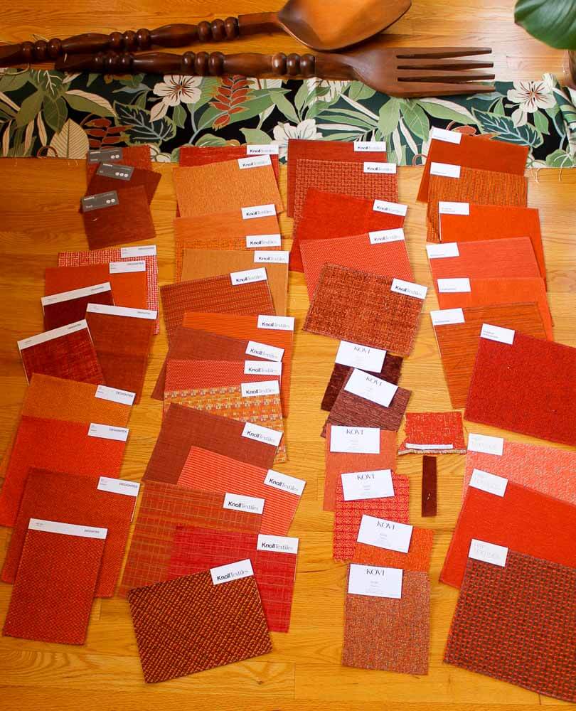
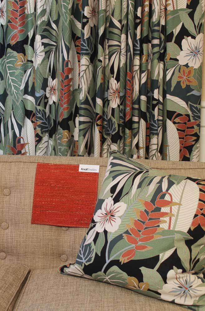
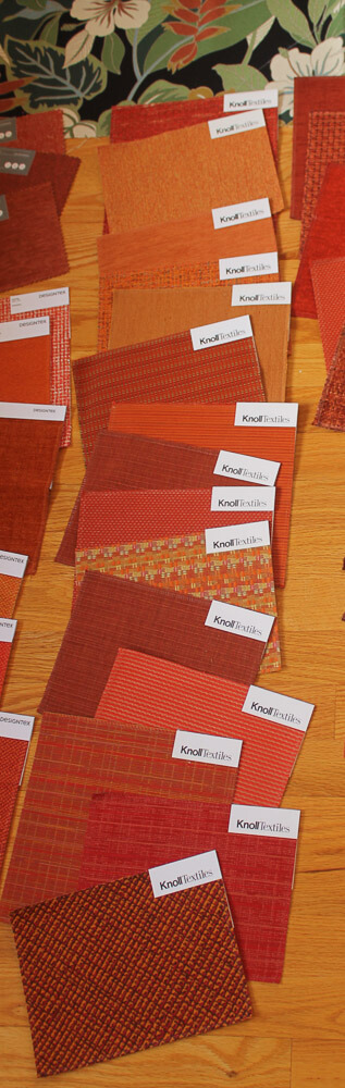
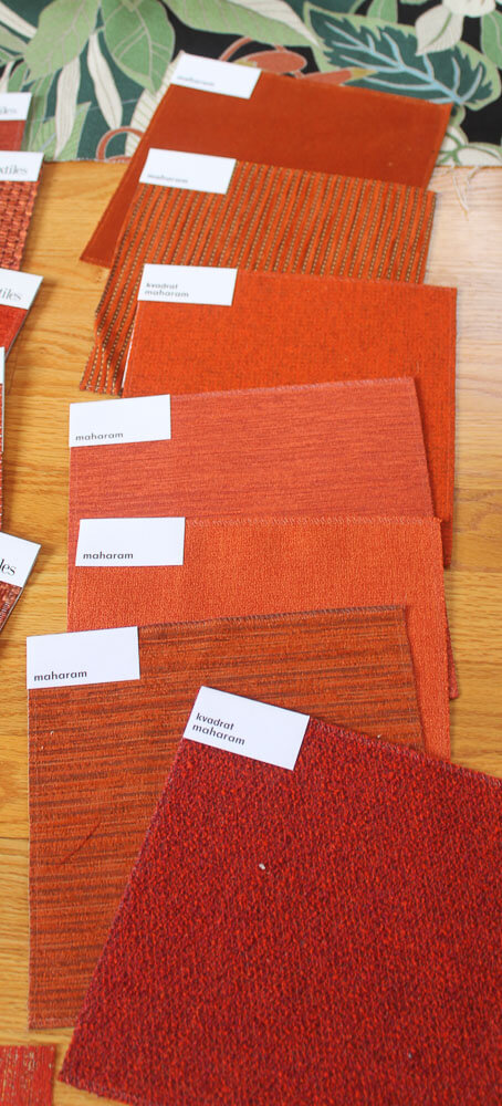
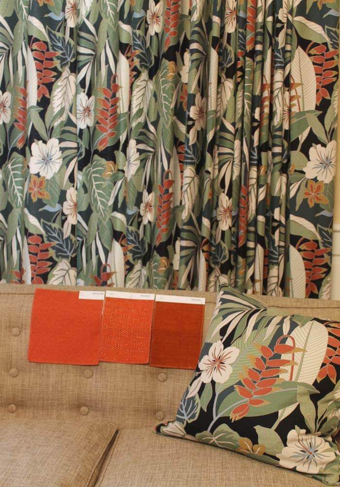
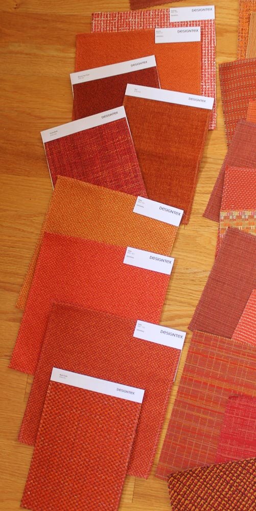
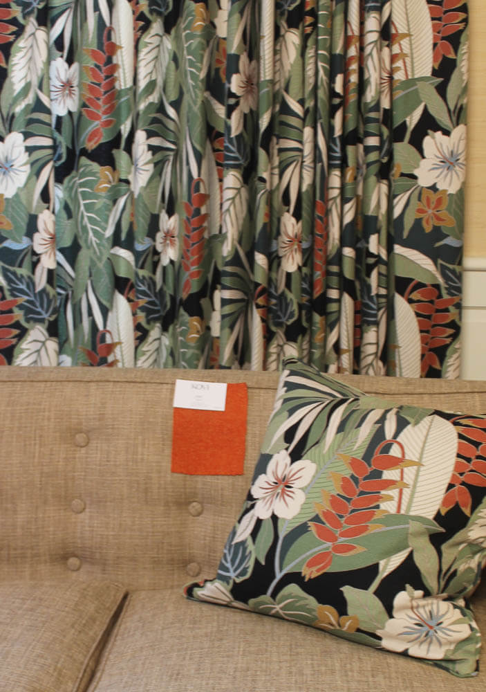
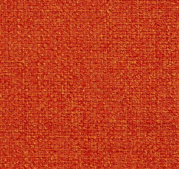
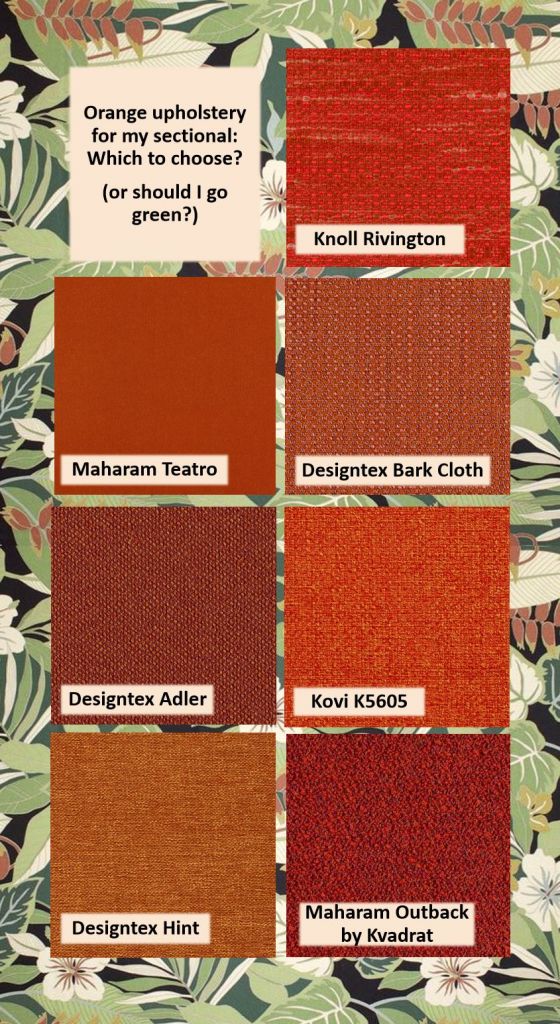
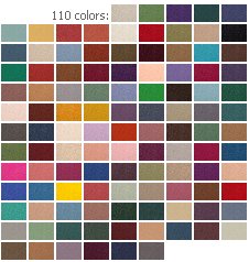
![]() I’m having a new wedge-shaped sectional built for my Mahalo Lounge. I need to choose the upholstery fabric. It needs to play nice with my 60 yards of barkcloth pinch pleats — and I’m planning a leopard print rug underneath. What color to choose? I started my hunt by looking for a burnt orange — or coral orange — or a red orange — or even a rust — that would pick up on the blossoms in the drapery pattern. I online-shopped and ordered ’til my eyes about bugged out. Above: All 49 oranges, laid out by manufacturer. Let’s take a look at the seven finalists >>
I’m having a new wedge-shaped sectional built for my Mahalo Lounge. I need to choose the upholstery fabric. It needs to play nice with my 60 yards of barkcloth pinch pleats — and I’m planning a leopard print rug underneath. What color to choose? I started my hunt by looking for a burnt orange — or coral orange — or a red orange — or even a rust — that would pick up on the blossoms in the drapery pattern. I online-shopped and ordered ’til my eyes about bugged out. Above: All 49 oranges, laid out by manufacturer. Let’s take a look at the seven finalists >>
Photo viewing tip: On a desktop computer, click on any photo and it should double in size on screen so you can see the detail better. Click ESC or outside the photo to return to the story.
Midcentury modern upholstery fabrics in orange from Knoll:
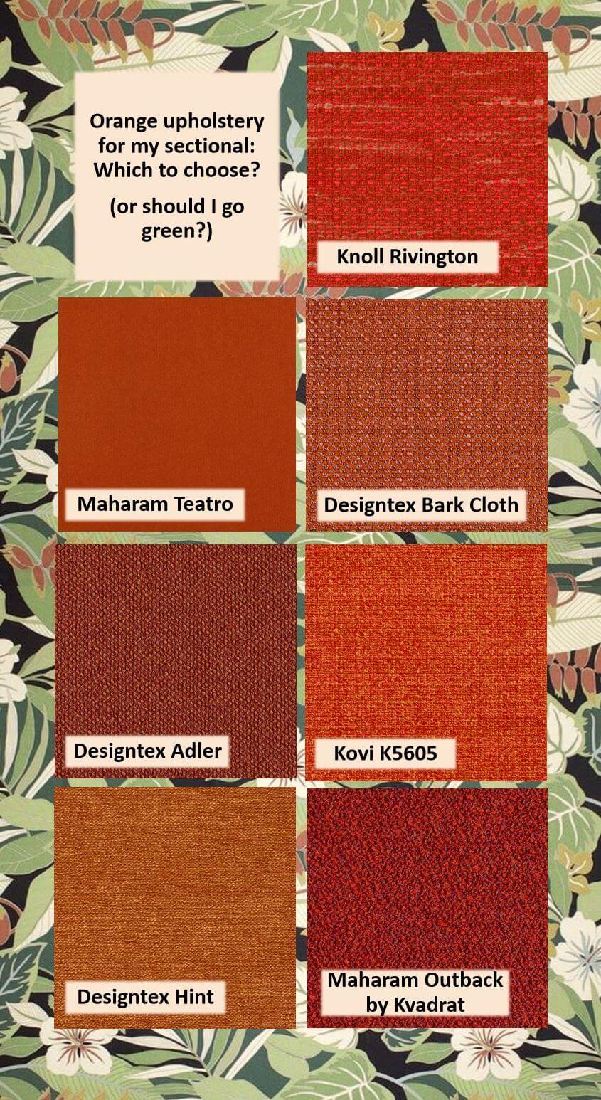
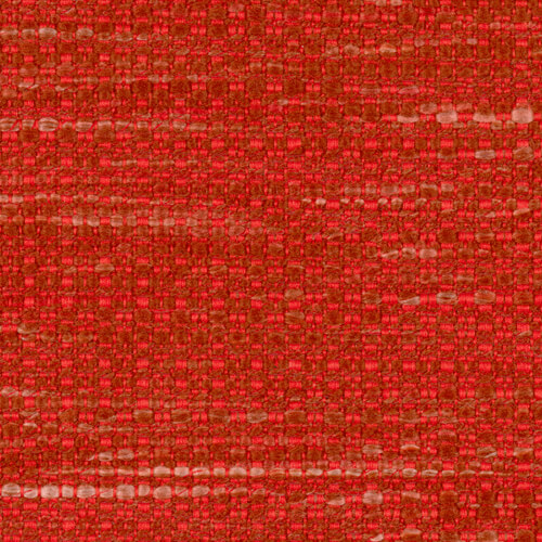
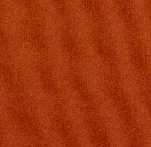
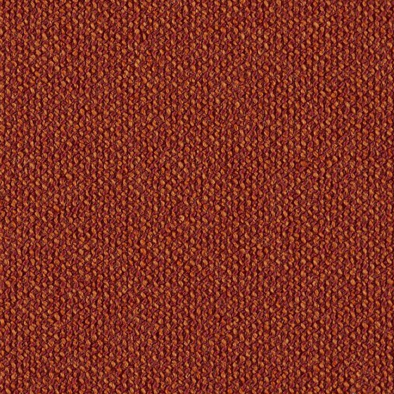
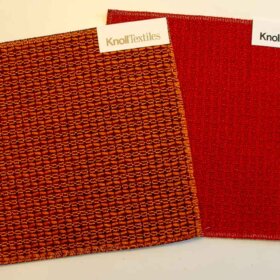
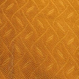
 Above: Knoll Rivington designd by Dorothy Cosonas in Paprika.
Before I started my upholstery hunt, I had no idea it was so easy to order upholstery samples from major manufacturers. Knoll is a big name — they have gorgeous fabrics — at a surprising number of price points, both high and low — and they make it super easy to order samples.
The Knoll Rivington in Paprika is a strong contender. The color really seems to change in the light.
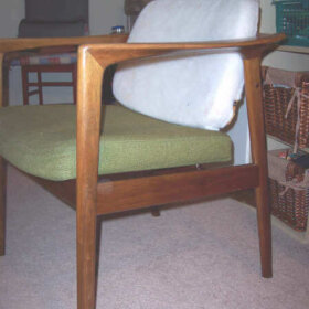
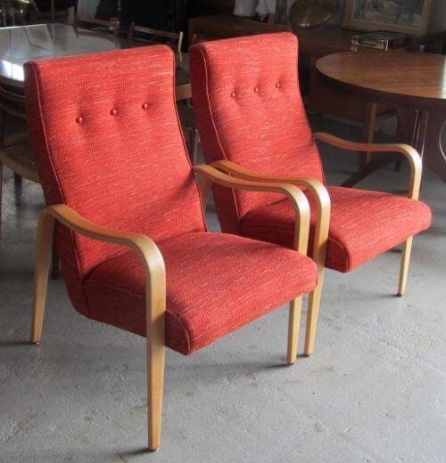 Above: See how the fabric looks on these vintage Thonet chairs reupholstered by Modern Chair Restoration— oh my! Thanks for the permission to show your photo, MCR!
 The weave is really nice — and bespeaks tropical.
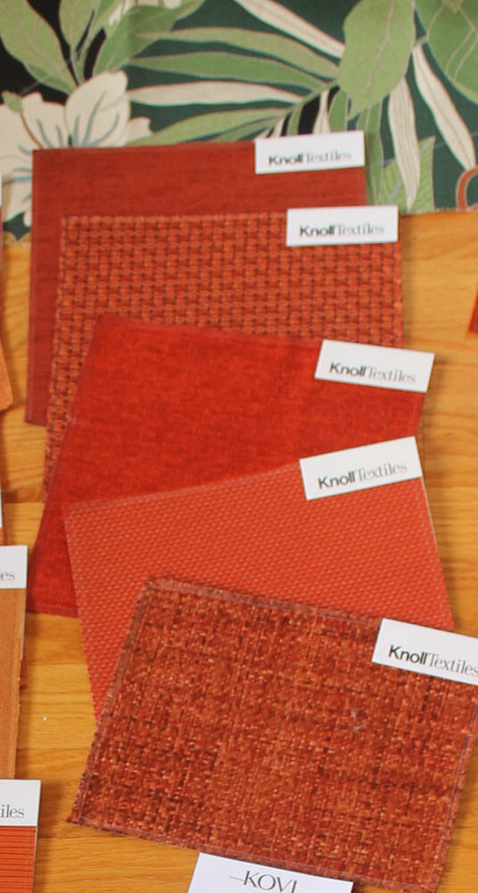
As I said, Knoll was fantastic about sending samples — nice big pieces, and they came within a day or two. Following are photo of all the orange(ish) Knoll fabrics I ordered to give a try. I was super impressed:
Midcentury modern upholstery fabrics from Maharam:
 Above: I was also super impressed with the easy access to upholstery samples from Maharam — and the fabrics were gorgous, too! Contenders:
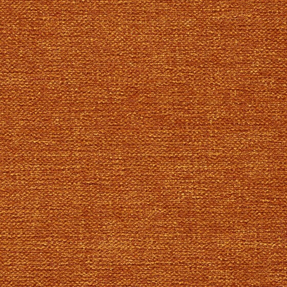
 Above: Maharam Teatro in Heat — it’s a yummy velvet..,
 And above: Maharam’s Outback by Kvadrat 466061 in Color 641. But: It’s not really a contender, because it’s way too lipstick red in real life. But oh my goodness, I adore this fabric, so I had to show it! It’s sort of more loosely woven than a boucle, with a wee bit of gray threads in it that give it just that little extra something in dimension. Comes in a bunch of rich colors. I so wish I had a place to put this — hmmm, maybe I need to make a coat out of it!
 Above: All my Maraharm orange upholstery samples.
Midcentury modern upholstery fabrics from Designtex:
 Above: Designtex is a company that I learned about from ModernFabrics.com, which often has remnants, including in substantial yardage. For this project, I found three samples on the Designtex website that are finalists. Designtex was also very easy to order from.
 Above: Designtex Adler — my sample is Tomato – a great looking- and feeling fabric — a wonderful boucle-type weave and lots of great mid mod color colors.
 Above: Designtex Hint in Carrot — a soft chenille with 100,000 Wyzenbeeks, so seems like it would last forever. Lots more color-colors in this line, too.
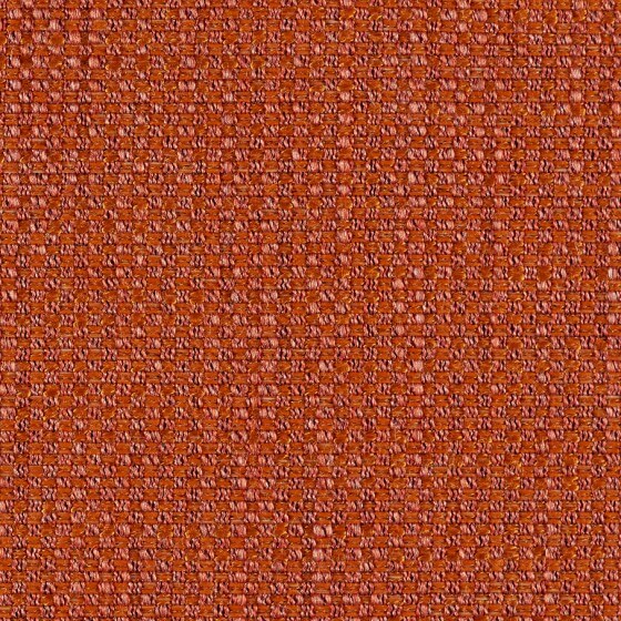 Above: Designtex Bark Cloth — in Red Orange — designed by West Elm. 100,000 Wyzenbeeks, some more great colors.
 Above: All the orange upholstery fabrics that I ordered from Designtex.
Midcentury modern upholstery fabrics from Kovi:
 I also learned about Kovi from ModernFabrics.com, which carries remnants.
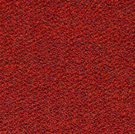
 Above: Kovi K5605, a nice woven with coral, orange and persimmon-colored threads made my list of finalists.
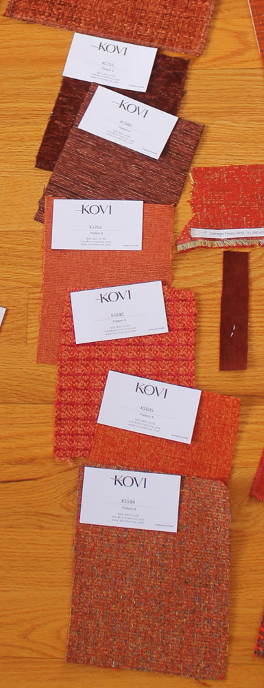
Above: Other Kovi orange upholstery samples that I ordered.
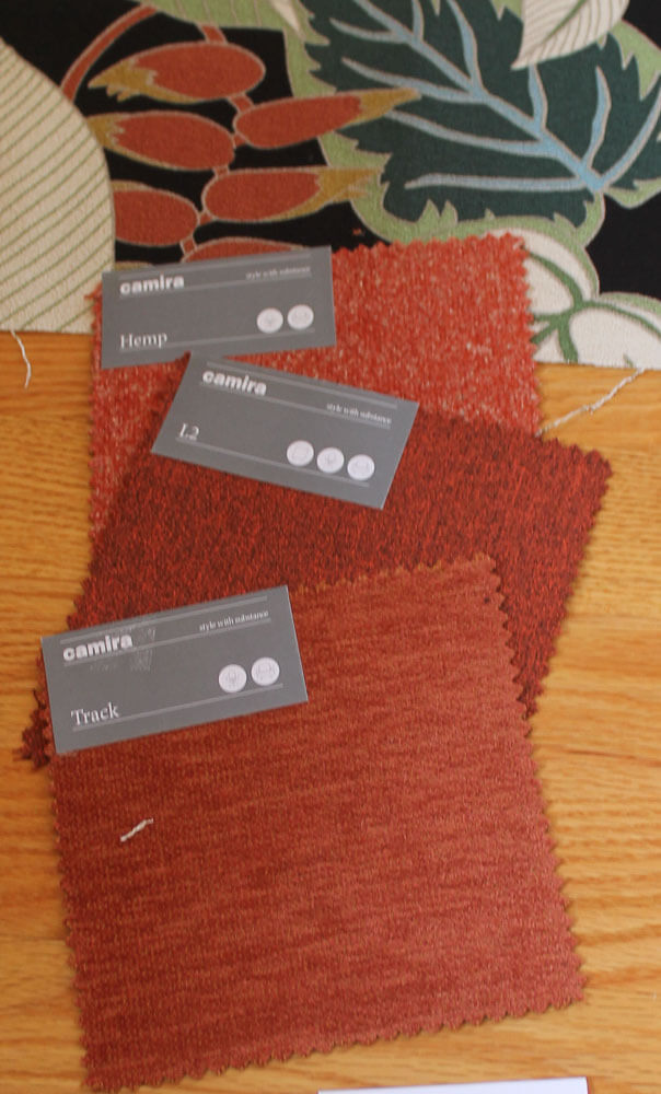
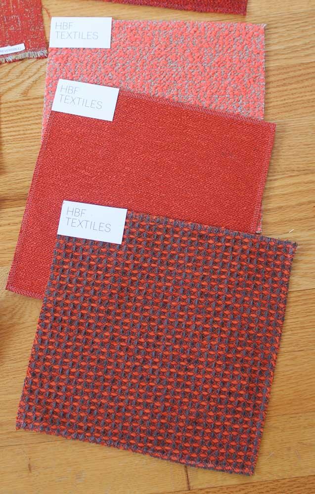
 Thanks also to Modern Fabrics, Camira, and HBF Textiles — I also ordered orange upholstery samples from them, and many were super nice, but they did not make my finals.
But: Maybe I should go green?!
Ack. After thinking I MUST go orange… and ordering all these samples, I then got the idea that a large orange sectional might present too much of a contrast — rather than act as a secondary complement — to the many many linear feet of green-dominant pinch pleats in the two rooms. So then, I began ordering greens. Story to come.
Meanwhile:
What do you think of these oranges, for a 101″ x 101″ sectional?
If I choose orange upholstery — which one?
Initial thoughts on orange v. green?
- Follow all my stories on the design of my Mahalo Lounge here.


RickG says
AND ……….. now I’m on the edge of my seat – waiting to see what your choice is Pam …….. c’mon the suspense is killing me !!! ( only kidding, take your time & make the choice that makes sense to you – it is a big decision after all.
stacia says
I’ve been out of town and am just catching up here… I haven’t read all the comments but enough to see people are concerned about the leopard rug with the orange. You will have SO many layers in that room the rug will recede. Plus you haven’t selected a final rug yet (I think) so you can make sure it goes with the orange. I don’t see that could possibly be a problem. IMO, you HAVE to go with the orange! The Kovi or the Knoll, because of the texture in the fabrics.
Lesley B says
Team Orange all the way! I think the warmer color is much more flattering to those sitting on the sofa. I like the texture and depth of the Designtex Adler.
Phyllis says
Designtex Adler in Tomato – I love it. Fabrics aways look lighter installed than on a swatch. Your sectional is big, like ours, and can take a darker color.
Keypal says
Adler is my favorite as well – love the color and texture.
Nikki says
I’m staying out of the rug discussion and adding my vote for the fabric. While I love the Knoll Rivington and the Kovi K5605 fabrics to my eye (and my monitor) they don’t seem to pick up any colors from the curtain. When I look at the flower in the curtain fabric I see pink undertones so to me, the Desigtex Barkcloth would harmonize better. The other fabrics (which I love, love,love) provide more of a contrasting color. So I guess it depends on what you want.
Jil Sonia Interiors says
Hi, such a fun project. I’m an interior designer and would love to chime in here. Any ideas I provide would be backed up with my reasons 🙂
First I would find a rug, it’s much more difficult to find a rug than fabric. So many fabrics to choose from but not so many rugs.
Then after the rug. Take the samples – the rug, the existing gorgeous drapery fabric, bit of the couch and your green or orange samples, and lay them on a white sheet. The white sheet will show the undertones of the colours better.
I vote green as I think the orange and perhaps gold in the rug will fight together. Gold has green in it which is across the colour wheel from the red.
Hope this helps a little!
sheila says
I like the Designtex Bark Cloth best. I spent some time over at the Room and Board site looking at the Reese curved sectional in all the different colors. I have it in natural because I am too much of a wimp to buy a bright color sofa but I greatly admire your courage!
I agree with the concerns of orange sectional on orange-ish leopard rug on orange wood floors being a challenge but I think I’d like it with a blond-ish leopard!
Tracy says
Love the oranges with the oak floor. I like the samples with texture, works with the grass cloth walls and nice contract to smooth curtain fabric.
I agree that the sofa and curtains are the focus, so maybe a different rug than leopard? You could use leopard elsewhere in the room.
ineffablespace says
I don’t think either Orange or Green would be a wrong choice, but the right orange or right green will be hard to choose over the internet.
My monitors at home and at work make the options look different, and I have been very surprised by swatches I’ve ordered as to how different they look in real life.
On top of this, some things that look fine in person don’t photograph very well.
pam kueber says
yes, agreed…. reds especially, and in that I include oranges. But folks still seem to be having fun giving advice — and I’m reading every comment closely!
inefffablespace says
It goes back to metameric failure.
I think cameras contribute to illumination related metameric failure. and the fabrics themselves will display geometric metameric failture (Meaning they look different from one viewpoint to another–oriental rugs display this very obviously)
(Then there is observer metameric failure where different people have different perceptions of matches and non matches–related to gender and age and things like that)
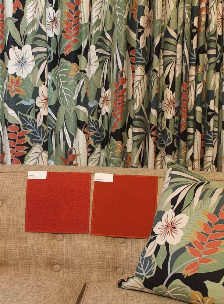
My Baughman cube chairs are upholstered in a tomato red Knoll fabric that is definitely warm on the roll, and they tend to photograph cherry red and brighter than I see them in real life.
If you are going to change over to LED bulbs at any point, I would do it now. I have been in rooms where the recessed lighting and the lamps cause the wall color to look different and spotted, depending upon what light source is hitting the wall in that area
Marie Gamalski says
Oh YES on the lightbulb comment!!!! I redid my bath, later changed from incandescent to LED and had to re-paint!!! I never made THAT mistake again!! It’s really amazing what a difference that one change made….
Khadija says
I really love the Kovi. It’s bright, modern and retro all at the same. I think an orange couch will make you happy every time you see it. What a fun choice!