

 The open-weave jute stinks. Literally. Thanks to the readers who alerted me to the concern, because of my many varied and obscure talents, sniffing ain’t one. I painted the ceiling of my Mahalo Lounge a beige, just to be able to see the room. But I can’t have just paint up there. Epic is a requirement. So following are my four wallpaper finalists. Which one would you choose? Which one should I choose?
#1: Vintage “Moby Dick” from Hannah’s Treasures:
 Above: A vintage rope-trellis wallpaper from Hannah’s Treasures — a pattern named “Moby Dick” from “The Twigs” collection, it says along the edge. The field is a bit darker than I would like, which will darken the room, but I think I could address the issue with lighting design. Heck, tiki bars are supposed to be dark and mysterious. On the plus side: I really do like those ropes — they are whimsical, and the ‘trellis’ effect mimics the trellis in the dining room ceiling wallpaper.
I love the name, too, since Herman Melville wrote Moby Dick in a cottage just 4.9 miles from my house. This paper is not shown on Hannah’s Treasure’s website — owner Marilyn stumbled on it looking for more of the same pattern with the coral field, which I initially inquired about.
#2 — Bradbury & Bradbury Art Wallpapers’ Seashell Cream:
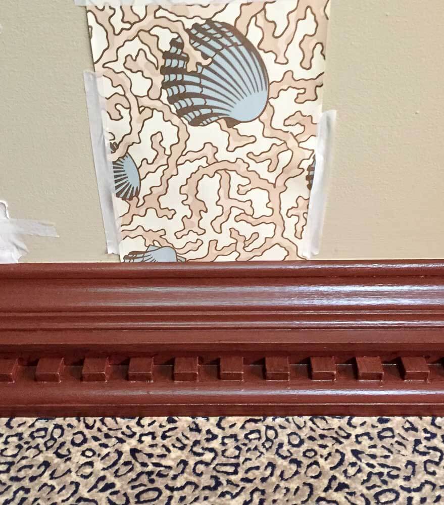 Above: Also going under the headline, “Ask Anyway”: I spotted the Bradbury & Bradbury Seashell Cream wallpaper in google images while searching for wallpaper designs using various terms. Wallpaper shells… wallpaper coral… wallpaper nautical… wallpaper tropical… wallpaper lattice… wallpaper trellis… wallpaper maps… wallpaper pirate… wallpaper bamboo… I searched so many word combinations and looked at so much wallpaper, my eyes hurt, I am not exaggerating. This wallpaper design popped up, probably under ‘wallpaper shells’, but the photo sent me to a ‘discontinued’ link. But, I emailed anyway, just to see if perchance they had any left — and they did! Just enough! I like this one because the colors are right … It’s also whimsical… and I really like the pop of blue in the seashells continued on to the ceiling. While the photo doesn’t show it, there’s also a glint of metallic gold. Question, though: Is lots of high-contrast, relatively small pattern on the walls and the ceiling too much of a good thing, especially in a space likely to get soaked with rum?
#3 Palms Springs by Kenneth James by Brewster:
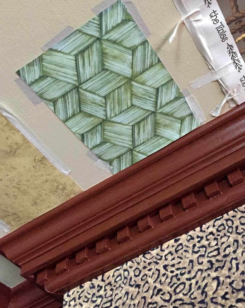
Above: I liked the idea of bringing color up to the ceiling, if possible. This Intertwined Green Geometric design repeats the color planned for the sectional but in a different textural way. It also has a lovely glint of gold ink. But, it may be too finely wrought — too sophisticated — for my room.
#4 Old World Map Collage by Brewster:
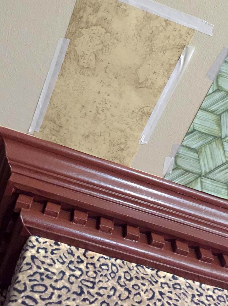
Above: Brewster had lots of old world antique map designs, in a variety of colors to choose from. This one — Brown Old World Collage Map from Brewster’s Field Guide Collection — had a beige-gold faded parchment feel that would look good with everything else, I think. This one is more subtle than the rest, less “risky”.
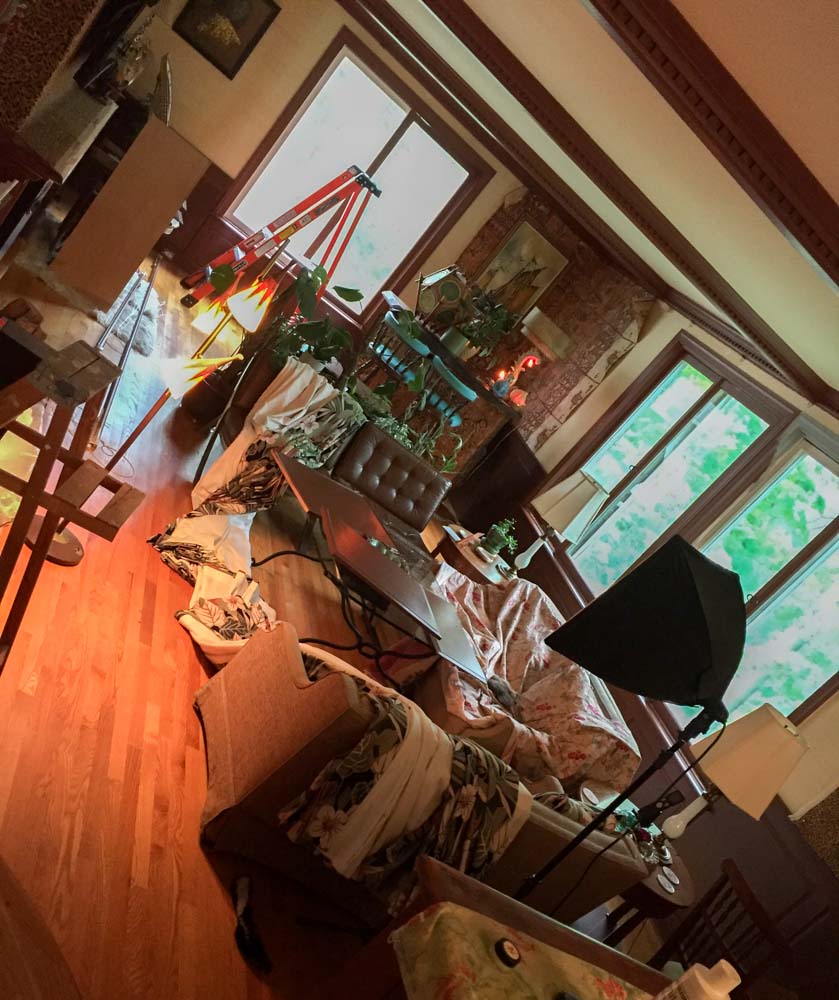
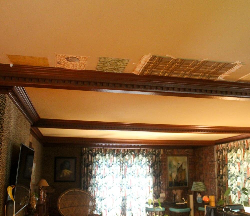
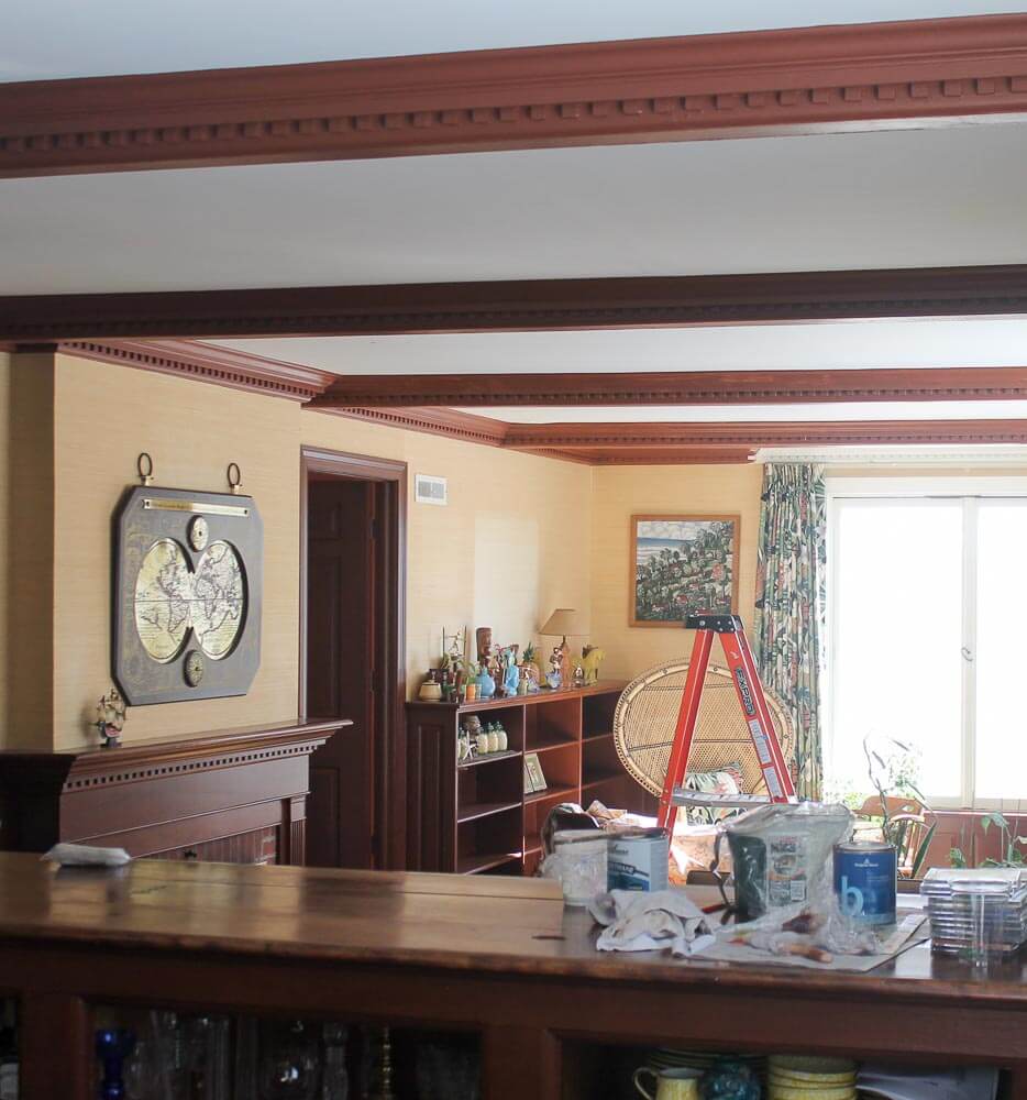 Above: Two more shots of the room in various stages of progress, so’s you can consider what I’m working with.
Q: Why don’t I just do grasscloth?
A: It’s too expected. I’m a rebel.
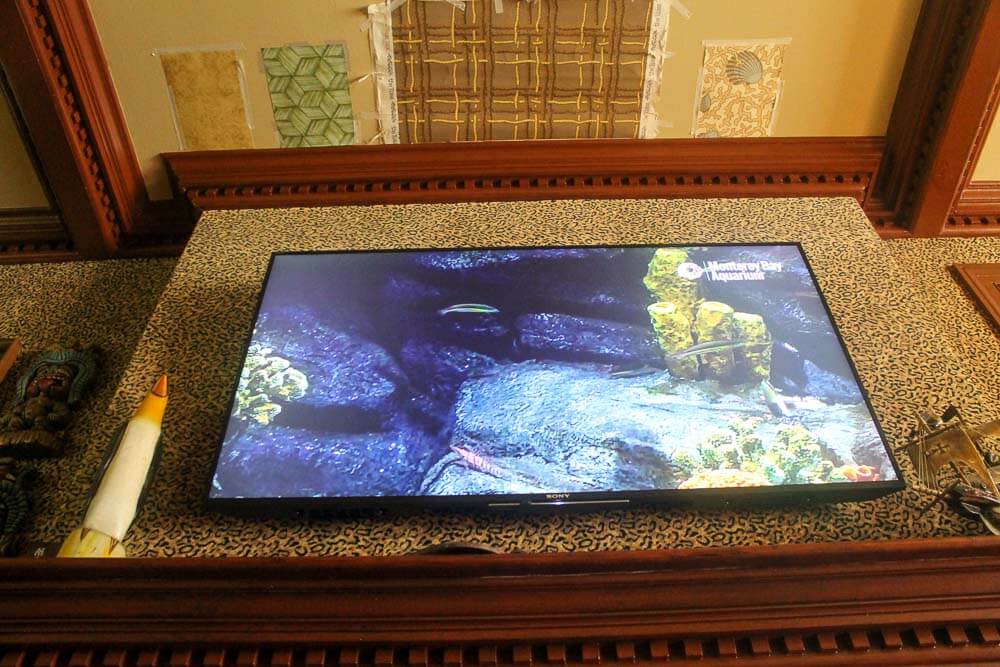
Q: You put a TV in your tiki bar!
A. I know. I know. I’m not “supposed to”, but I did. I don’t feel the need to explain, but I will take the opportunity. Tiki lounges are supposed to be a total escape from the real world. Fact is, though, that we watch TV most every night — while, on the other hand, we only drink cocktails on weekends and as party-throwers we are, so far, very lame. Bringing the TV into the Lounge gives us a reason to spend even more time in it.
Q: You put a TV above a fireplace!
A. I know. I know. I always said I’d never do that. ‘Never say never’ is what I say now. The only logical place for the TV in this room was above the fireplace.
See all my stories about my Mahalo Lounge, in progress, here.


Diana says
Palm Springs. It will give a thatched roof feel to the room, and the green fronds are restful. (I like the shells, but not on the ceiling.)
cathyd says
Moby Dick, Moby Dick, Moby Dick.
Since Herman Melville wrote his classic so close to your home, it must be a sign!
Think about lying on an old whaling ship from that era. If you lay on the deck of an old masted whaling ship and looked up, what would you see? Rigging made of rope. Lots and lots of rope.
Cheers!
Laura Ainsworth says
Part 2 — after looking at “Seashells” again, I must add that it runs a close second. If the picture represents the color accurately, there’s a coral cast to this one that would complement the rusty orange in the drapes. Might be very interesting, if not stunning.
Lisanne Freese says
Why not just stencil the ceiling to get exactly what you want (which can be easily painted over)? You’ve already put many hours into painting the woodwork, why stop now?! 😉
I’m just thinking how much of a chore removing wallpaper is … just from a wall. From a ceiling will be 10x worse! Not a fan of the leopard print, it limits what can go with it (sorry).
Moby Dick, then Sea Shell are my choices.
Sharon says
Palm Springs Green
Lauri says
Palm Springs is my definite first choice. Definitely.
SUSAN says
Well, while they are all quite nice, I like Rope Trellis or Antique Map. Hmmmm…such a nice dilemma….ok, ok, Antique Map….less competition should the room become too busy upon completion, the eye won’t have anywhere to rest. We must have restless eyes….
Laurie says
I guess I should just say “Ditto!” because I agree with most everyone else— the Palm Springs both said “tiki” to me and clashed less with the leopard print walls. So looking forward to the unveiling of the finished product!
Laura Ainsworth says
I’m thinking of what would best complement your drapes, because I’m looking at that very barkcloth print right now, in my own living room. Very hard to go by these pictures, but…impressions: NOT the ropes. Not the seashells (though I have seen that B&B wallpaper and it is beautiful). Maybe the maps, but would the look be tropical enough? For a lush, island look, I see some green up there!
John H. says
Either 1 or 3…I’d keep it simple. You don’t want to over shadow the rest of your room. But that’s me.