

 Julie wants our help: Which blue … or aqua … bathroom tile should she choose to go with the vintage Formica Nassau countertop laminate she’s salvaged? She’s building the bathroom from scratch, in the basement, so the sky’s — and sky blues’ — the limit.
 She writes:
Hi Pam,
I’m about to start the biggest retro renovation of my life–finishing nearly 1000 square feet of basement entertainment space in a style appropriate to my 1959 house. After months of searching, I found a mostly intact 1960 custom kitchen for sale on Craigslist two hours away, so I pounced. The handy husband on the sellers’ end somehow got them out in good shape despite the unitized construction, and they are now safely in my basement waiting for construction to begin. The plan is to use one 3ft section for a bathroom vanity and fashion a kitchenette from the rest. The counter top pattern appears to be Formica Nassau, which I believe you thought was the pattern inspiration for Wilsonart’s Betty & Endora. (Off topic: I recently put Endora in my pink bath and had actually purchased a sheet of Betty for use in the basement before it was discontinued [as stock laminate, note, you can still get it VDL-Pam] I scrapped that plan once I got the real deal vintage version, but there’s definitely a resemblance.)
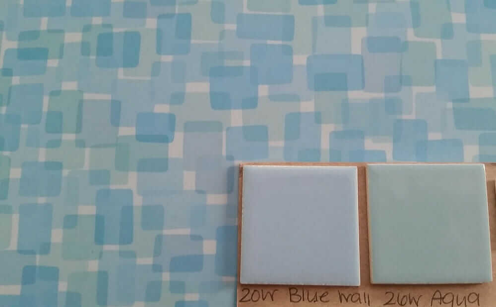
My dilemma concerns the tile for the bathroom. I want to do 4×4 ceramic tile in the shower and about half way up the walls elsewhere in the room. B&W has two colors (blue and aqua) matching the two different tones in the Formica pattern. This seemed perfect at first, but now I’m not sure how it will all look together since from a distance the counters will appear to be something between the two colors.
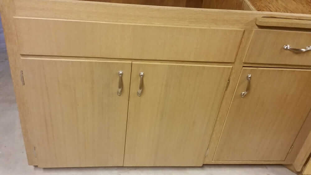
I’m including shots both close up and from a bit further away of the tile samples on the counter. Can I do either/or? Is one better than the other? Would I be better off doing a white or salt & pepper tile with a few colored ones placed randomly instead? The cabinets are blonde and the bathroom will be on the small side (6×10 including the shower) if that makes a difference.
Any advice would be much appreciated.
Best,
Julie.
So I wrote back:
- So, are you saying you want to use TWO colors of B&W tile and mix them up? Or are you asking, which of the two to choose?
- Also, what are you planning for the floors?
- Finally, photo of the cabinetry possible?
Thank you! AND: If you want to send me a photo of yourself, too, that would be great! Best, Pam
Hi Pam,
Awesome; thanks, Pam! I was wondering which of the two colors to choose (or, as a third option, whether I should do a neutral tile and just randomly place a few blue or aqua ones).
As for floors, virtually anything is on the table at this point. For the other areas, I am considering stained concrete or epoxy, both because these seem like highly durable options for a basement and because they wouldn’t eat into precious headroom. Looking at photos of epoxy floors online, it seems like I might be able to mimic terrazzo or the glitter flooring in my pink bath, so perhaps that could be carried into the bathroom too. But I also haven’t ruled out tiling the bathroom floor. (I considered VCT too, but (a) I don’t want the maintenance hassle of stripping and polishing this much furnished square footage and (b) I have seen them ripped out after water damage. My basement is dry, but we’re all just a freak storm / failed sump pump away, right?) I’d love to know what others are doing for basement flooring; I’m out of my element having never done a basement before.

I am attaching a totally embarrassing photo of the current mess in my basement. Maybe it will serve as a warning to those considering buying and storing an entire kitchen. It’s . . . a lot. The photo doesn’t show it all. I have drawers and doors on the other side of the room, and one enormous L-shaped counter and cabinet are still in the garage waiting to be cut so they’ll fit down the stairs to join the rest of this mess. I included a close up of one section, but it was tough to get a good shot–as you can see from the first photo, there’s very little room to get in between, and these things are *heavy* and tough to move. As you can see, the original cabinet pulls are gone. I’m hunting for vintage chrome replacements, but the distance between the screws is 3.5″ rather than 3″, so it may take time. Back when I had given up hope of finding vintage cabinets, along with that sheet of Wilsonart Betty, I bought some beautiful 1950s dish knobs and back plates, thinking I’d have cabinets built. Unless I find some giant round back plates to hide the two holes, it looks like I can’t use the dish knobs here, but I kind of feel like I deserve that for giving up too soon.
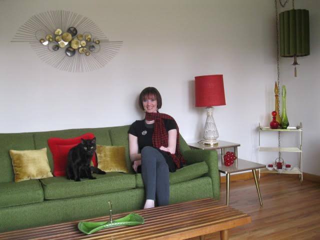
Also attaching the same photo of me you ran a couple years back with my pink bathroom story. If the finished project turns out, I’ll have to get a better one taken in the basement. 🙂
Thanks again!
Julie
Pam responds: Which tile to use?
Like I said, fun question. My first reaction: I would want to also check for a wall tile that is the same value — intensity of color — as the strongest of the colors in your countertop. That would be: the Blue.
A worry bead with the B&Ws is that they are lighter than the strongest value on the countertop. I usually don’t want any single element in a room to “shout” — that is, be louder than its surrounding elements — unless that’s carefully planned.
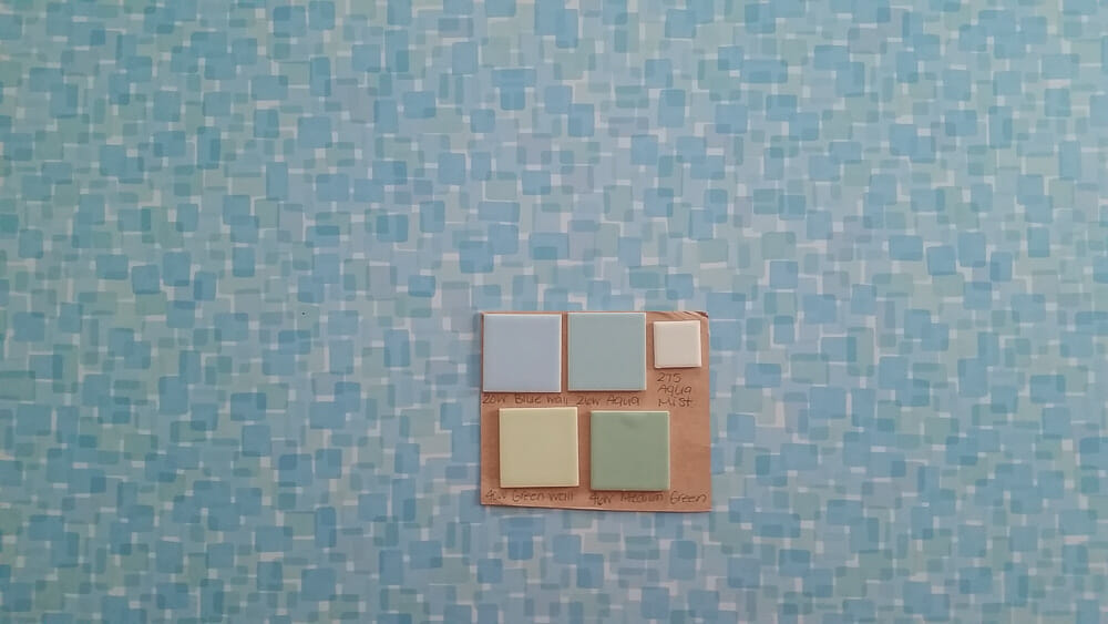
I found this at Classic Tiles — it’s the Interceramic Blue:
 Of course, you’d have to get some samples to see for sure. But here’s what it looks like cropped into your mood board and indeed, it seems to be about the same as your strongest blue:
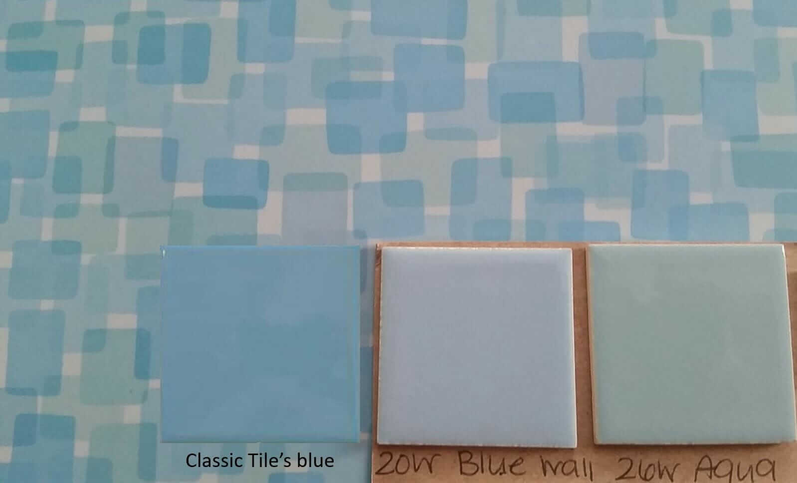
If you don’t gravitate toward the strong-powder-wedgewood blue tile look, I’d then say, without hesitation: Go with the B&W 26W aqua. I prefer it over the 20W blue (1) because I think it will give the bathroom a more definitive two-tone look, that is: blue + aqua = two distinct colors playing together; for some reason I’m not feeling the same playfulness or overall harmony if you were to use the 20W light blue with the Nassau. Again, this is likely due to 20W’s value: It’s too in the middle of the three colors within the Nassau pattern. Again, ff you want blue tile to coordinate with the Nassau, go with a blue that’s close to the strongest blue in Nassau.
I am not keen on the idea of salt-n-pepper tiles interspersed with the occasional blue or aqua solid tile. First and foremost, I don’t think that the salt n peps would do anything for your countertop — I’d go so far as to say they will ‘hurt’ the look, the patterns will not complement. MUCH better to go with solid tile.
I will also add: I’d likely torture the bullnose color too. White: I think that would be cheery, and it would pick up the white in your Formica Nassau. Solid: A more authentic 1960s choice.
Thanks, Julie — SO FUN!


Robin Adams says
When you have aqua as an option why would any other color even be considered!????
Stephanie Wiecz says
Nice score on that countertop. My first vote goes with the blue that Pam suggested. My second choice is the aqua. On another note, could you come up with a pattern that would use all three? Although that might be too much pattern competing with the counter. So back to the first two choices. The new blue would give the brightest room. The two could be used together if need be for trim reasons. Or the new blue that Pam showed, would not be so hard to match if you had to have trim pieces glazed to match.
Are there any samples of this epoxy flooring you are considering? Just wondering what that would look like. Bizazza makes (or used to) a cool glass terrazzo tile that I used in one of my bathrooms. I cannot recall what colors it came in though.
Barbara says
Oh my dear, is this dead drop gorgeous laminate going to be your center point?
Oh my, say, YES!
If so, then Pamela’s choices are perfect.
There are so…many choices. Take your time and you will find exactly what you want.
Good luck!
p.s. you go girl!!
Julie says
YES! Thanks, Barbara. 🙂
Robin, WA says
If I had to pick between the two choices, I would go with the aqua. However, I would be leery of trying to match the colors in the countertop. It is very nearly a fool’s errand to try to match vintage colors to modern materials. The colors might get close but not quite match and, personally, that would drive me nuts. My suggestion would be to go with a completely different color than what is on the countertop. A nice light yellow, perhaps. But if you want to go blue, definitely go darker than what is on the counter. It will mask the fact that the colors don’t match perfectly.
Brooke says
I think it depends what kind of bathroom you’d like to have – something more monochromatic (go with the light blue) or a bit of a contrast between the walls and the countertop (go with aqua).
I initially was drawn to the blue so that the tile doesn’t compete too much with that awesome laminate but I can see how the contrasting tile could also make the laminate pop. It depends what kind of decorating style you like to go whit or that matches the rest of the house.
Either way it’ll turn out beautiful!
Julie says
Thanks, Brooke!
Ann says
In the second picture, there is a green tile. On my computer screen, I like the green. It pulls green out of the forminca.
KStacey says
Aqua. The classic blue looks periwinkle. Could be my monitor, and the fact that I personally don’t like periwinkle really shouldn’t matter, but still, my vote is for the aqua, LOL! I can’t wait to see the “after” pictures!!
Natasha Loop says
I actually like the classic blue, it seems the most authentic somehow.
Jeff H says
Wow, that is one spectacular laminate.
Another vote for the B&W 26W. I really enjoyed working with the helpful and knowledgeable folks at B&W, and it’s great that they are still rolling after all of these years.
Regarding the wet basement, you might consider digging French drains along the roof driplines, although I don’t know your situation, and lots of folks will know more about this than me. But you might investigate French drains and see what you think. Simple swales might help too.
Julie says
Thanks! Glad to know B&W is good to work with. Fortunately, the basement is dry. The house came with an exterior drain and sump pump, and I wouldn’t even consider finishing the basement if there were water issues. Still, without knowing what kind of weather we’ll have in 10, 20, 30 years–I’d rather be prepared.
MARTHA says
Until Pam brought in the perfectly matching Blue tile, I was Aqua all the way! I think the light blue just fades in to the scheme too much and doesnt get to be a costar. That being said, it would be your personal preference between the Classic Blue and the Aqua, but, I’m thinking the reason you were unsure is because you may have really wanted a blue, but the one you found just didnt feel right so you were falling back on the Aqua, which is lovely, but just wasnt quite what you wanted.
Julie says
I’m actually a bit more drawn to aqua in general. If anything I worried that preference would steer me away from what was really right for the Formica. 🙂