

 I spent much of August helping weebit gather stuff for her law school apartment. Her style is not all-vintage, hunt-forever-til-it’s-perfect like mine. There’s a mix of old and new: contemporary-traditional, industrial, vintage finds, and stuff from Mom and Dad’s house. Because weebit wanted to be done by the time school started, once our “hunting for bargains” time ran out we finished with cheery filler-inner pieces that were easy to acquire and didn’t break the bank from the likes of Ikea, Home Goods, Pier One and Target. Indeed: The apartment is done, save for a few walls that need art, which she will pick up in her travels. She is now ensconced, very happy with the outcome, (and as you read this, wrestling Contracts, Civil Procedures and Torts).
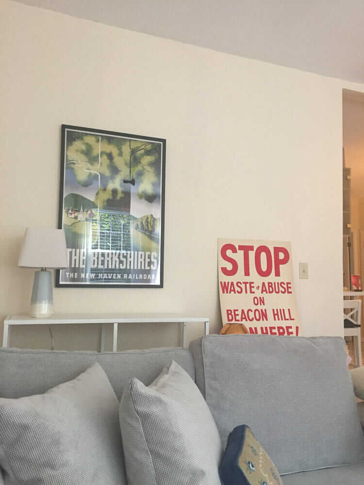
Since I spent mega-hours working on this project, I want to share out various “winner” ideas that surfaced. First up is one thing that we didn’t even have to think about: The paint color on the walls. We really liked it. It’s a vanilla creamy off-white custom color, from Behr. And I have the formula:

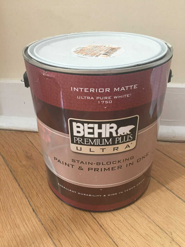 Here you go, although I don’t think the paint on the walls was flat matte, I think they pulled this gallon for some touch ups and specified the wrong finish. Get yee a nice eggshell finish.
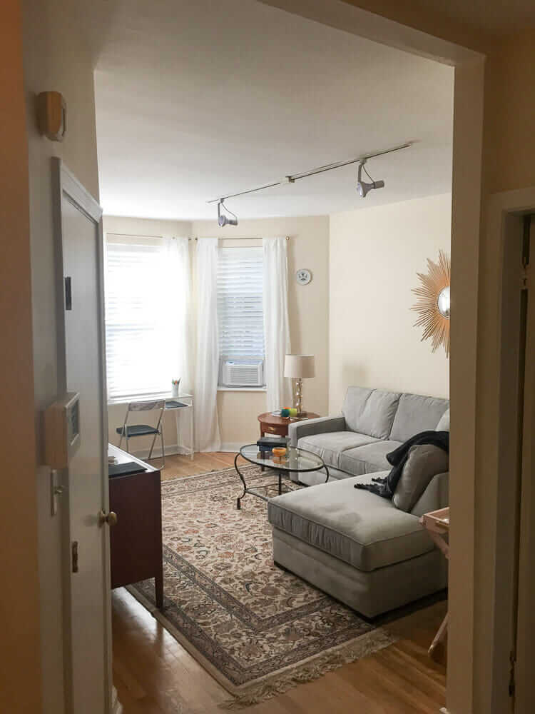
It’s very difficult to photograph paint colors, because they shift with light, and well, I was using my iphone. But trust me: This is a good color. It has just enough yellow in it to make it a bit sunny, yet not so much yellow that the walls start bouncing off each other intensifying. I am not trained to read paint labels to deconstruct their formulas, nor can I dissect, on sight, what colors are in a paint. But I’d guess there’s also a little red (pink) in this color too… a bit of peachiness. Yes: Off-white peachy yellow, does that make sense? I need to give it a name. I pecked around a bit. It may be like BM Vanilla Ice Cream — the egg into the cream would add the orange, the vanilla would add a bit of brown/bronze/gold. Behr also has a vanilla ice cream, and while it’s a quite pleasing color, especially on that small bungalow, I think it’s even yellower than what weebit has on her walls.
This is a “glowy” color. It seems to have good light reflectivity, so on a sunny day, you don’t really need the overhead lights. At night, turn on a few 40-watt lamps and you are happy. Glowy.
Weebit is a millenial who has been acculturated to prefer gray walls. But she now has personal experience, with me standing over her to remind her: Off-whites are fabulous. She likes her walls a lot.


Chrissy says
This is the color of my basement that I’ve been trying to find for months but nothing matched correctly! When we moved in last year, I knew it would be a tough match because it’s got a hint of yellow but not overwhelmingly so (99% of people look at me like I’m crazy and say, that’s white and it is SO not).
Thank you. I am absolutely going to try “your” mix.
That said, I have totally taken samples up to the counter and asked for components to be tweaked up or down a few drops to get a color I want. They always think I’m crazy and always remind me that I have to pay for it however it comes out. And then they always have the same dumb look on their face when I get the color I want by adjusting the number of droplets (it’s all about percentages and understanding how colors interact). If you’re curious, try this. Open Microsoft Word, insert a symbol (rectangle or something large) then tweak the colors to see how it looks. It’s impressive how taking out a little yellow or adding a little blue completely throws the visible colors. Of course, that can get expensive if you’re playing with actual paint. 🙂
Sean says
My go-to white for years has been Swiss Coffee- we have used it in our craftsman with all the dark woodwork, our 40’s modern home and now our mid century.. Works every time and has a nice warm creamy color..
Pam Kueber says
I looked as BM Swiss Coffee images online and indeed, it looks like a great color. Interestingly: With this off white and others, I’m sure, it can look like it has “more” color if you set it against a brighter right, compared to when you use it on all walls, trim and ceiling. That is: I think I see Swiss Coffee used on all walls, ceiling, and trim in some photos — and it looks ‘white.’ But when it’s just on the walls, you can definitely see the differentiation into off-white.
Tarquin says
This is beautiful. I love how the walls compliment the gray couch and wood floors. I once had bisque appliances and I wanted the walls to match exactly. I tried 50 shades of white, almond, and beige and couldn’t get right so I went with gray. The white you have selected is perfect. I now have a 70’s theme in my house and would like white here and there, but I’m scared of it. I remember when I was a kid in the 70″s, if someone had all white walls you would often hear “You have to paint the walls a color or wallpaper it looks like you just moved in.”
Pam Kueber says
Interestingly, the sofa is what I’d describe as a soft-spa-blue color and had a color-name to that effect, but yes, it tends to read light gray in some lights!
Andrea says
Pam:
Your Behr color reminds me quite a bit of my very favorite “go to” color for all public rooms in my house: Benjamin Moore “Navajo White.” It’s a neutral, yet warm color that blends with most colors. My home is a central hall Colonial with a lot door molding, baseboard molding and crown molding and the Navajo White makes the molding stand out and look crisp. I recommend it for a warm yet white look.
Pam Kueber says
In my very first house circa 1987, I painted the walls Navajo White. I wanna say it was Glidden Paint. Loved that color too!!!!!
Ranger Smith says
I grew up with Navajo White in some rooms and Swiss Coffee in others.
Amelia says
Navajo was my first thought when I saw it, my grandmother’s house was painted completely with it. It was a Benjamin Moore color.
Mary Elizabeth says
My home’s addition is all Benjamin Moore Navaho white, except the chair rail and lower wall in the dining room. The rest of the house is a much more vanilla cake batter color (freshly done by the people who sold it to us), which I liked so well I left it as is. An off white with a little yellow in it does pick up the sun in the windows, and when we first saw the house one winter morning, the whole place glowed with warmth. I’ll have to ask the seller how long she agonized over the color.
Jay says
Nice peachy glow! When I bought my house I had the painter match the existing off-white but I am not crazy about it, seems too dull. Thanks for sharing the photo of your hard work decorating the place. I think I see some items from Mom and Dad.
Karin says
This colour is great for your daughter’s apartment. The search for the elusive perfect vanilla hue is an arduous one. I compared swatches for months in search of an appropriate creamy white for our northeast facing condo because stark white would have looked too “cold” in daylight. I loved the wall colour in one of your stories a while back, but it didn’t read the same way in real life. I finally settled on BM Ivory Tusk. It’s still reading a tad yellow, but I can live with it I will definitely keep your colour finds on my radar for when we repaint. Great post, thank you.
Pam Kueber says
Yes: Off whites are so hard! I have struggled with many, loving how they look in some light, then not loving at all how they look in other light. Also, they can look different in the same room depending on the wall. When they go noxious yellowy I run screaming. But when they are just right — ahhhhhhhh.
Robin, WA says
When I was trying to select an off white to repaint my interior walls, two different paint stores told me that “it doesn’t matter which one you pick, they all look basically the same.” I was appalled by that. The DO NOT all look the same. We went with Almond Breeze by Behr (I think) and it is considerably brighter and cheerier than the gloomy pinkish stuff we painted over.
Barbara says
It’s wonderful having lots of family support for our children when needed.
Nice story, Pamela!
Since your talking about paint and walls, I’m going to wallpaper my entrance foyer.
I don’t have a clue on what to buy, where to buy/brushes for that matter.
HELP…!
Any suggestions??
THANKS SO MUCH!
Pam Kueber says
Hi Barbara, what fun! I am not an expert, so my first bit of advice will be: Talk to the folks who sold you the wallpaper / follow the manufacturer’s instructions if the paper is new / talk to the vintage wallpaper company if it’s old. And be sure to renovate safe! https://retrorenovation.com/renovate-safe/
Nancy says
An apartment in Boston..how exciting! Great color, not unlike Sherwin Williams Oyster Bar from your pics and description. Good luck to your young one. You must be very proud!
Dan Hoyer says
You piqued my interest in the color code. I don’t know if you allow cross-linking to another site, but here’s a discussion on the color codes. I personally like the comment that says, “Referencing a paint color formula to determine how a color will look is like trying to smell the color 9.” LOL!
https://www.houzz.com/discussions/5094217/behr-color-codes
Dan
Pam Kueber says
Thanks. I only was curious if the codes could tell us what the underlying hues are.
Pam Kueber says
Oh, I clicked and see they have the codes! Looks like we have, mixed into this particular white base:
CL=Yellow Oxide @180
IL=Brown Iron Oxide @20
LL=Raw Umber @168
Is the “384” the base?
Dan Hoyer says
Base is 1750
CLRNT is unit of measure one 384th of one gallon. Or in other words 1/3 of one ounce of colorant per gallon.
Pam Kueber says
So… the numbers add up to 368. How does that dovetail with the #384?
Catalina says
Here’s some extra information, hope it helps!
The numbers on the label correspond to the volume of tint that is added to the paint. The 384 represents 384th of an ounce — essentially a drop. The first row is the amount of full ounces (for this formula, you see all zeros) and the second row is the 384ths of an ounce. So this formula has 180/384ths (180 drops) CL, 20/384th (20 drops) IL, and 168/384ths (168 drops) LL. You don’t need to add up all three numbers—that would just tell you the volume of all tint added to the can.
The paint base is essentially the equivalent of a model number— it just identifies the raw paint for the manufacturer. Depending on the color desired, a different base may be used, as paint bases have different solid to liquid ratios, and “deeper” bases have more room for colorant to be added without overflowing.
On these tints: CL is a mustard/golden rod color, IL is brown, LL is darker brown. So, there’s not really red in this color, but it certainly is a warm color. Also, tints used to be identified with only one letter—the second letter, L, means the tint is a Low VOC colorant. You may see the single letters in older paint, and be careful when recreating the color with current tints, as the Low VOC tints don’t cover in the same way as the older ones, so formulas have been adjusted.
The walls were likely originally painted a standard color, but there’s no telling which manufacturer it came from. This can of paint was a color match, meaning someone probably brought a chip off the wall to make touch up paint. Not sure what’s popular in that area, but I’ve found lots of apartment complexes like Sherwin Williams colors, and that actually reminds me of Kilim Beige, which is very popular in rentals.
This Behr paint is their middle of the line: better than Premium Plus (which just has a basic drywall primer), but not as many solids as Marquee (advertised as one coat coverage). It’s considered a latex enamel—water based, but with a wipe-able finish. Because of that, the sheen reads a little shinier than a true dead flat. Rentals tend to go with flat, since it’s marginally cheaper, but you’re correct, an eggshell finish is more common for living and bedroom walls. She shouldn’t have any problems with this paint though, I think.
Pam Kueber says
Thanks, Catalina — fascinating!
Dan Hoyer says
my bad.. 1/384th of an oz not of a gallon.
So its a total of 368/384ths of an oz. So almost 1 oz total of colorants.