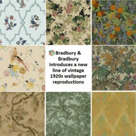
If you want to embrace a 1950s look in your mid century home, adding a splash (or more) of 1950s wallpaper is an important tool in your tool box. I’m always entranced with historic designs, so it’s exciting indeed to see Bradbury & Bradbury come out with this new collection of 1950s wallpapers. These are reproductions of original designs from the 1950s — the collection just went live last night!
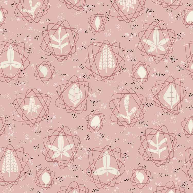
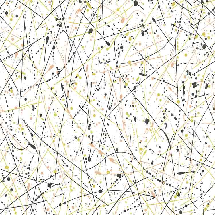
What a spectacular wallpaper design! Atomic — with all those googie and nuclear shapes. But kind of homespun-whimsical, too — with the leaf designs. And of course: It comes in Mamie Pink. Two other colorways, too.
52 new wallpaper designs
I count 52 new (old) designs in the collection, made possible by today’s digital printers. This is Bradbury’s fourth such collection of reproduction vintage wallpapers. Within the past few years, they’ve also introduced collections of digitally printed 1920s wallpaper … 1930s wallpaper … and 1940s wallpaper. These, in addition to their established screen print designs.
Using 1950s wallpaper to create the color palette for a room
Back in the day, marketers were working overtime to help homemakers understand how to coordinate colors in their kitchens, bathrooms, bedrooms, dining rooms — every room, and ceilings too!
Patterned wallpaper
A useful rule: Where’s your pattern? That is, look for one, key decorative item with a pattern in colors that please you — and build your room’s color palette from there. Usually, the wallpaper designers were astute in how they combined colors — take the lead from their selections.
The usual contenders for finding your pattern: Rugs, draperies, shower curtains — and wallpaper.
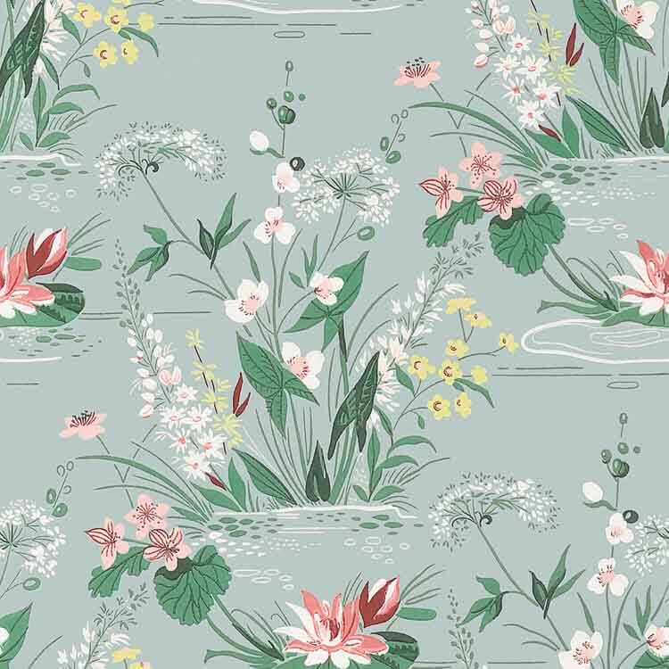
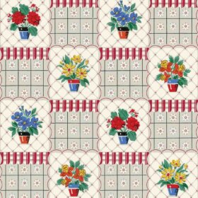
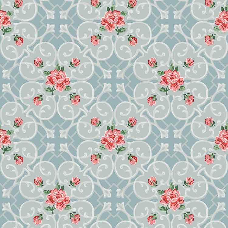
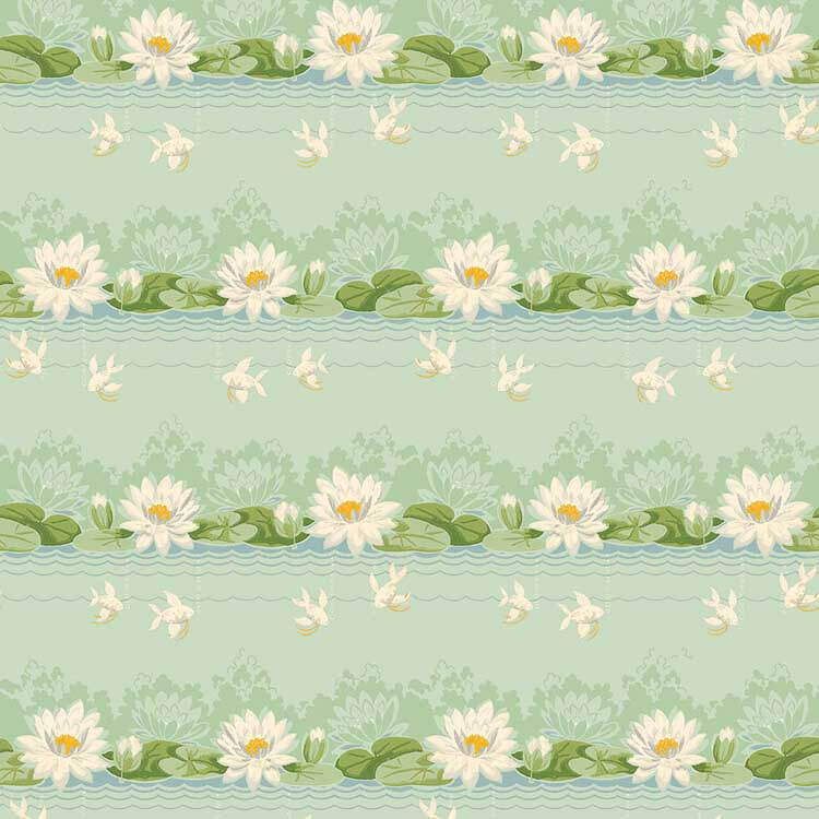
This lily pad design — with its variety of coordinated colors — is a good example of using wallpaper to “find your pattern” to establish the color palette for a room. In a bathroom, for example, match it to aquamarine or pink tile, then use one or two of the other colors in the paper for accents.
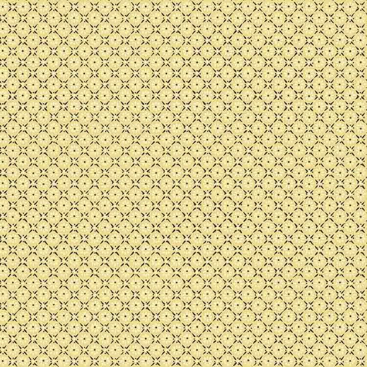
Tone-on-Tone wallpaper
Of course, sometimes wallpapers have only one, or few colors. These tone-on-tone — or simpler-palette — wallpapers can help anchor a monochromatic decorating scheme… or in kitchens or bathrooms with white cabinets and fixtures.
My foyer has white wainscoting a little less than half-way up the wall. Because of its touch of white, this vintage reproduction wallpaper would be quite welcoming… quite charming… there. This paper probably would not be considered ‘tone-on-tone’ because of the white and black, but it’s along that continuum.
More of my favorite 1950s wallpaper from the new collection:
And here are some more in my new Gallery feature:

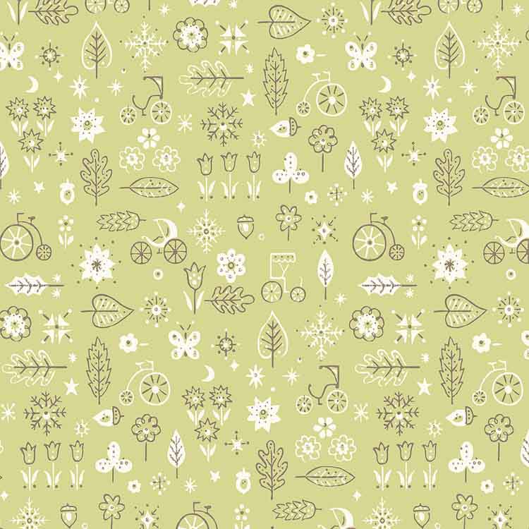
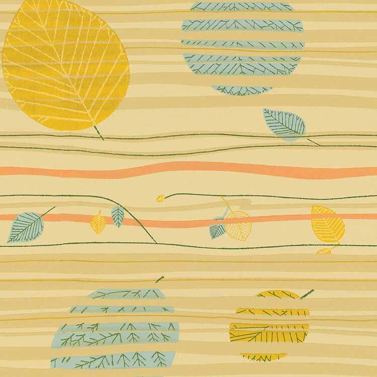
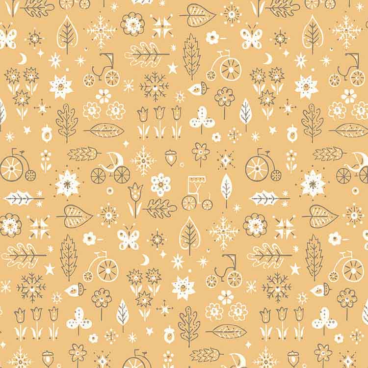
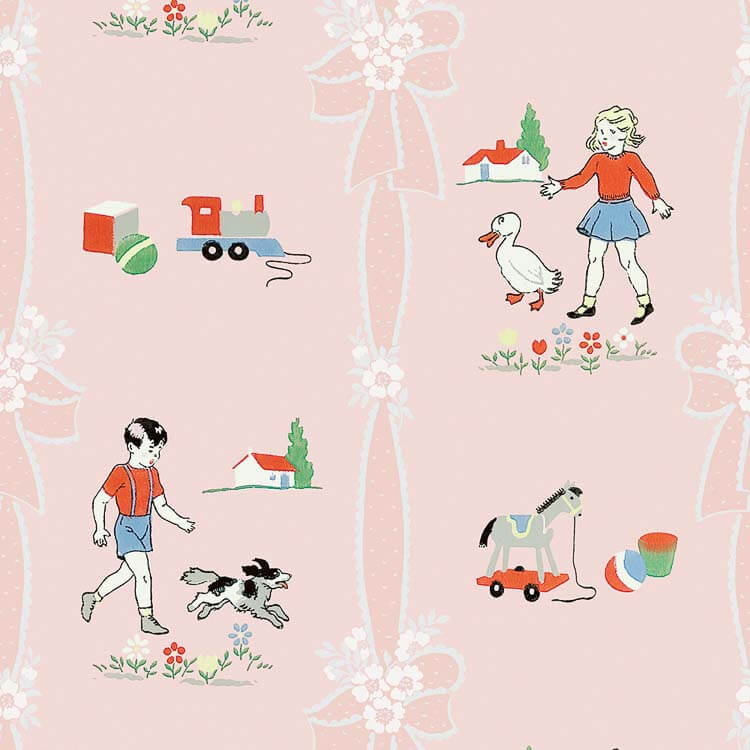
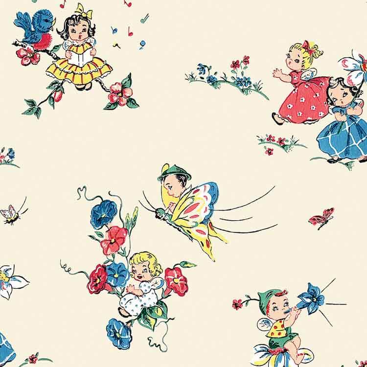
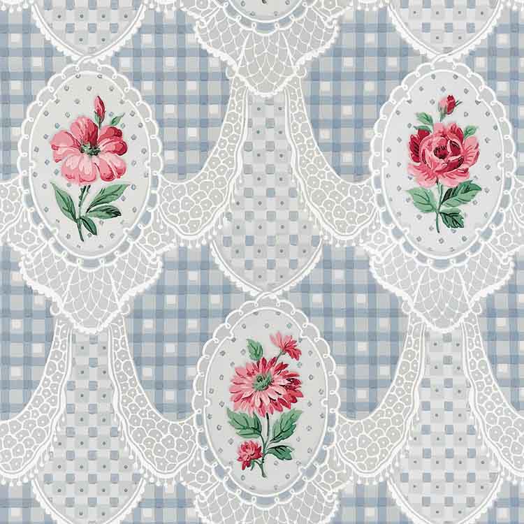
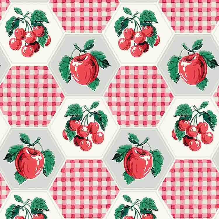
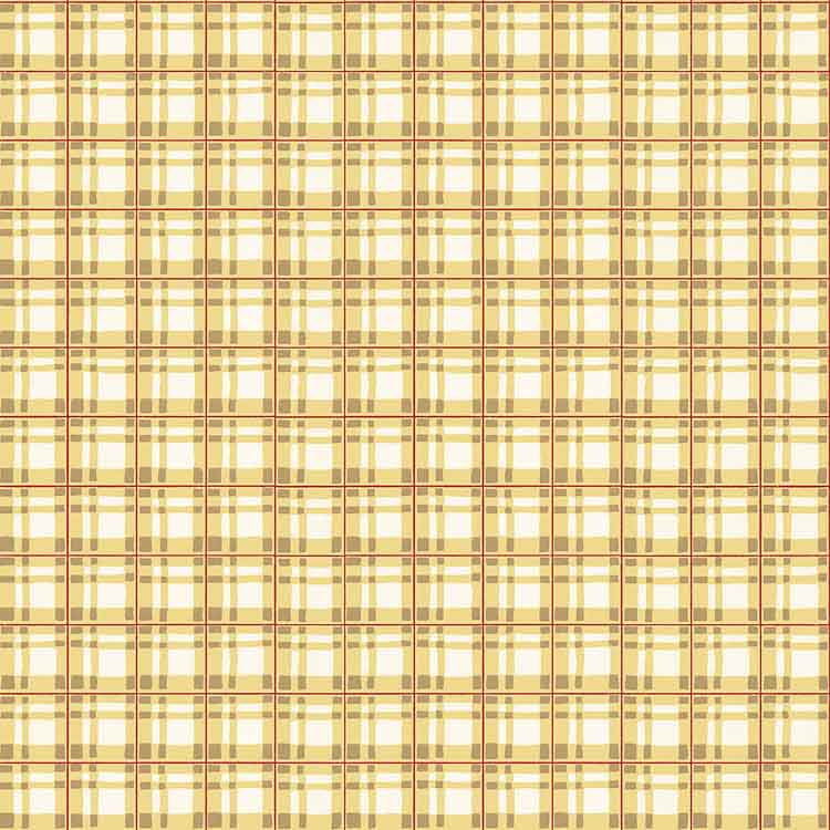
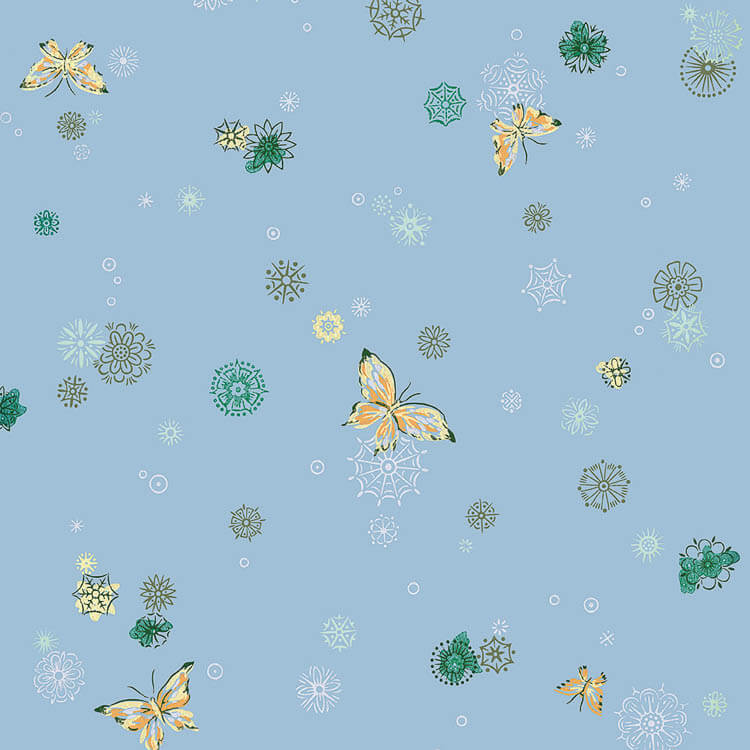
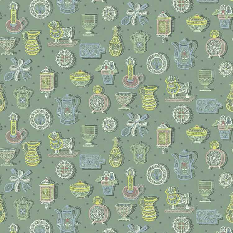
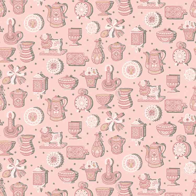
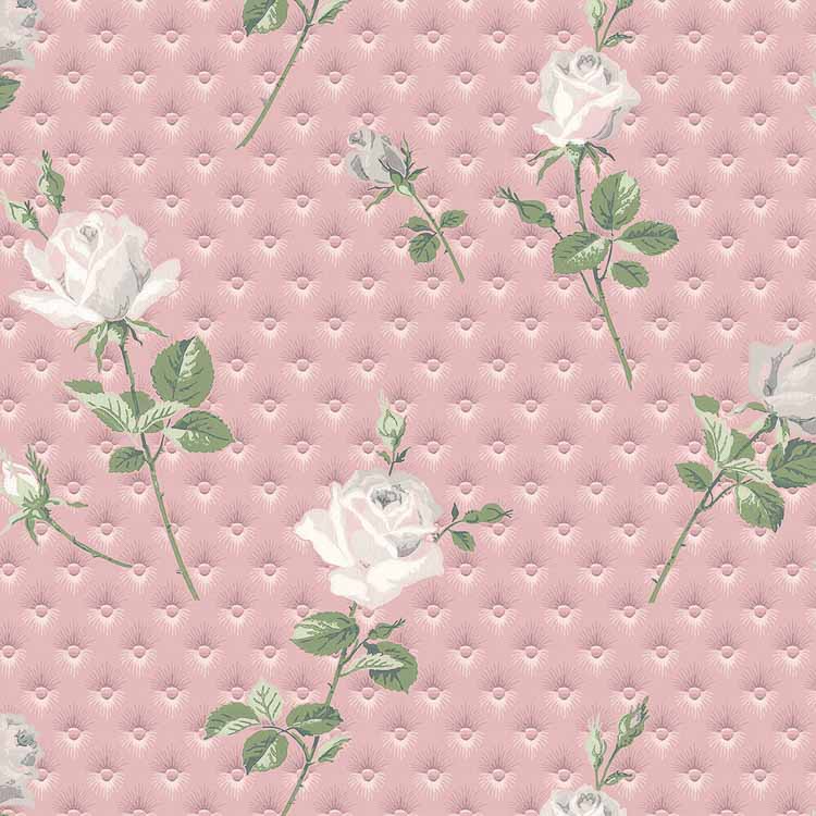
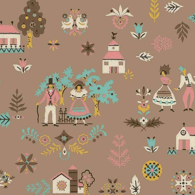
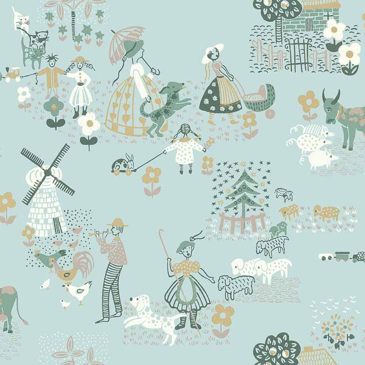
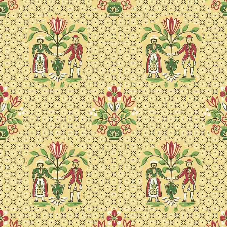
Another adorable retro wallpaper for a child’s bedroom. This 1950s wallpaper for children’s bedrooms or nurseries is whimsical and fun. Lace and posies on blue gingham checks — a great wallpaper for a soothing bedroom. The graphical combination of round apples and cherries… red gingham checks… all combined in hexagons… makes this a cheerful 1950s wallpaper for a kitchen. I like checkerboard wallpaper like this for ceilings. I think I may have used This Exact Design as one of the squares in my office remodel! Another lacy design. Very pretty for a bedroom or foyer or even a ceiling, I think. Atomic motifs combine with a fluttering butterflies — mid mod AND cheery — a two for one design! I adore smaller scale patterns that are almost tone on tone. This would look great in a kitchen. Another gorgeous tone-on-tone, this time in pink. A terrific design — well chosen, Bradbury & Bradbury! Wallpaper that looks quilted — lovely for a bedroom. I’m seeing this elegant wallpaper in a bathroom. This abstract reproduction wallpaper from the collection will appeal to mid century modern enthusiasts. This folksy novelty design would look good in a kitchen, I think. Yes, it’s dark — but dark rooms can be so very cozy! Again, almost tone-on-tone, this wallpaper features charming folks characters and scenes, on a classic aqua field. Get ready for a matchy matchy set. This one goes on the wall… >>> >>… and this one goes on the ceiling! Someone needs to do it! I would except that all my walls are already wallpapered!
So many wallpapers — not enough rooms to decorate!
Oh, and Bradbury & Bradbury reminds me: They offer most all these wallpapers (along with other of their designs) available as fabrics on spoonflower. All hail, the matchy matchy! And thank you, Bradbury & Bradbury, for the images and info!
Where to find the collections:
- See the entire collection here.
- Bradbury & Bradbury on spoonflower.