Skip to primary navigation
Skip to main content
Skip to footer
Search
Home
Kitchens
Bathrooms
Blog
Exterior
Other Rooms
Decorate
The “Museum”
Be Safe/Renovate Safe
Search
Search
Retro Renovation
Remodel & decorate in Mid Century Style
Home
Kitchens
Bathrooms
Blog
Exterior
Other Rooms
Decorate
The “Museum”
Be Safe/Renovate Safe
Home
/
Archives for December 2007
Archives for December 2007
Retro renovating Judi’s 1959 bathroom — which includes original pink tile
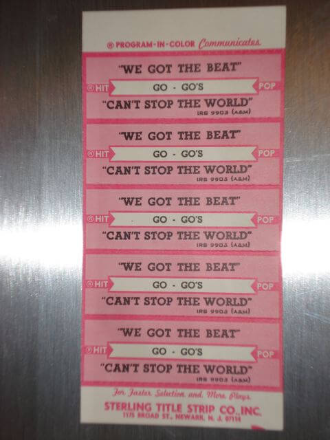
Sarah’s got the beat – with another Useless But Wonderful contest entry
Useless But Wonderful – dress labels from Miss Agnes Fashions, Pittsfield, Mass.
Happy holidays – no matter what your weather
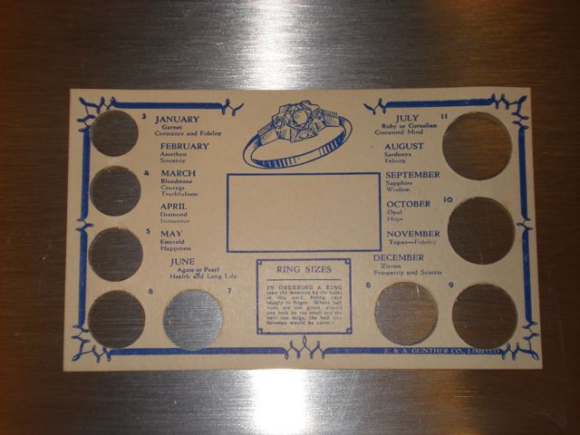
“With this ring (chart) I thee….” enter the first annual Useless but Wonderful contest
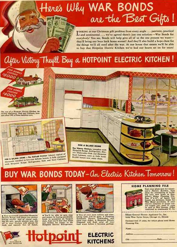
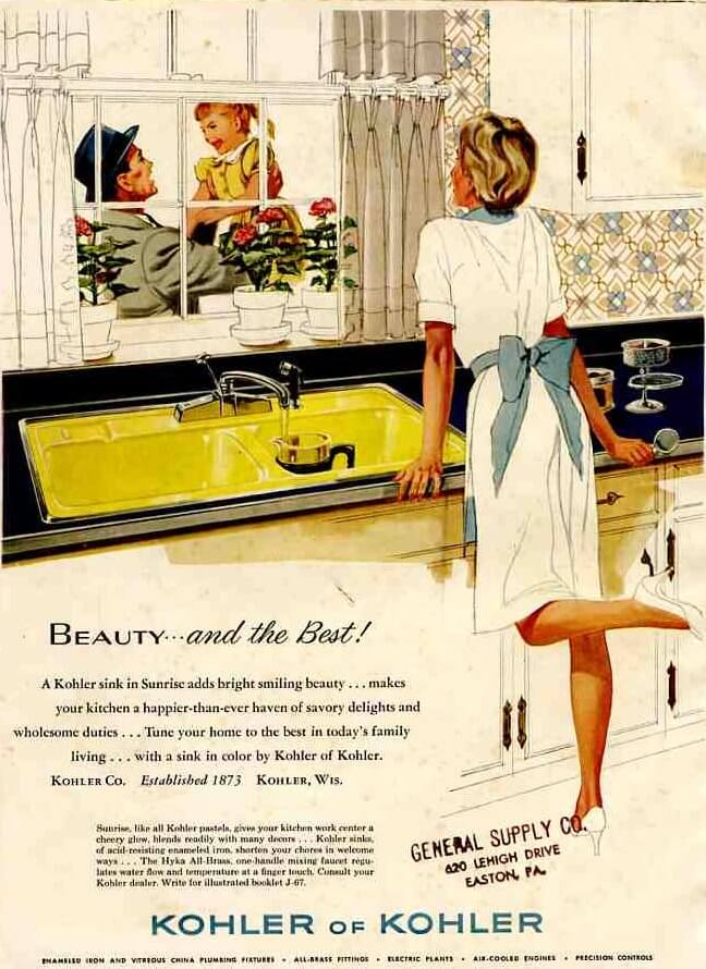
Will Santa bring you a new, retro kitchen this year?
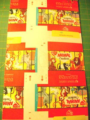
Animal crackers – useless but wonderful – from Mary-Frances
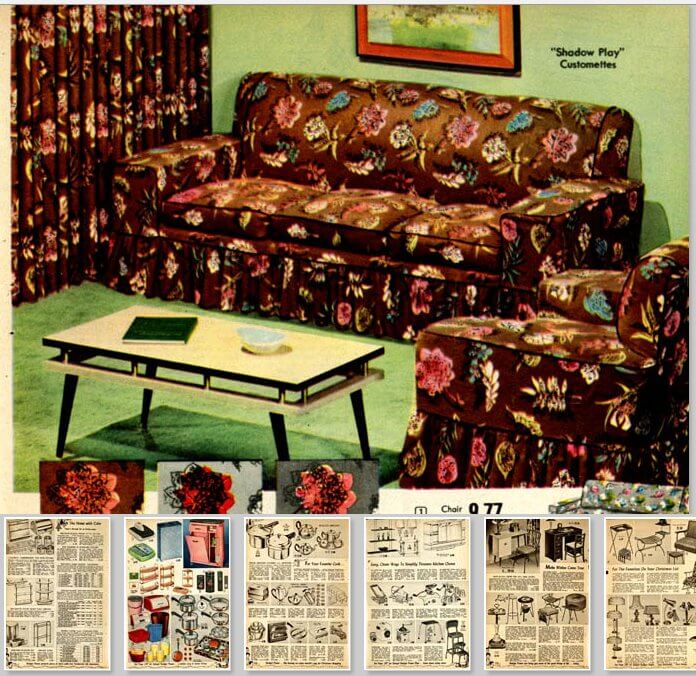
Wishbook memories circa 1955
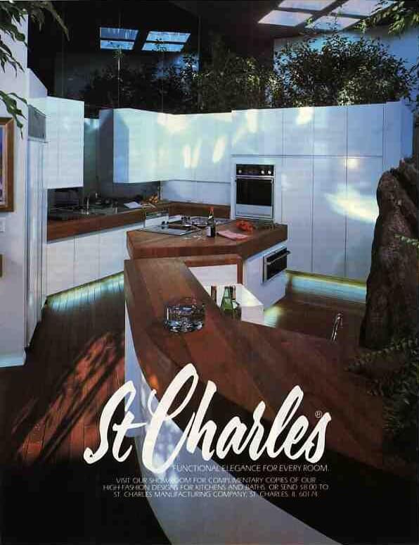
Big news — St. Charles cabinets are being resurrected — with big bucks marketing, too
One of the last St. Charles steel kitchens?
A Useless but Wonderful contest entry – from Ursula
A Colonial-meets-Modern 1960s kitchen to make you very, very happy
Page
1
Page
2
Go to
Next Page »