


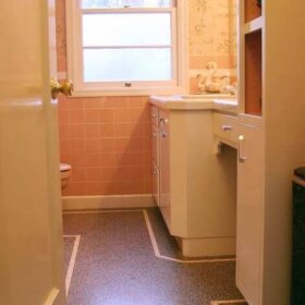
Sumac Sue, aka Judi, has a 1959 bathroom that features classic retro pink tile (see thumbnail to the left) – and has asked for some decorating suggestions. First of all – great tile, I am totally jealous. Notice also the recessed white soap dishes, and the classic medicine cabinet with sidelights. In response to the question, I found the inspiration photo featured at the top. The colors chosen to go with the pink fixtures — turquoise, charcoal, black, white — are great.
- I’d definitely recommend wallpaper, vintage if you can find it. I found mine in an arts supply store. There were a number of single rolls in a bin marked “for crafts projects.” I asked if there were more and voila – immediately became the owner of 40+ rolls of vintage wallpaper each at $3/roll. If you can’t find vintage, I’d definitely recommend taking a look at Bradbury & Bradbury’s new atomic line. My personal favorite to go with Judi’s tile: Googieland in Gray or Ivory – both of which contain some pink detailing. Ivory for a less in your face look. But I actually think the Gray is even better – it has a substantiality to it that is a good complement to the strong pink tile. Anything too light will get overpowered — you’ve got to find the right balance for the look to come out just right.
- To accent the wallpaper, choose towels, rugs and a cloth shower curtain in a strong contrast color. For the Googieland Gray…I might try a smokey gray one or two shades darker…or, go the opposite direction with an ivory with a trim band of gray in it. These classic neutrals would help keep the bathroom from looking too kitschy. There are lots of good choices for complete sets of towels and rugs at Land’s End, Kmart, and Target. As a window treatment – I’d probably used a pleated shade, same background shade as the wallpaper, interior mount if possible. These are low-profile (not bulky), inexpensive and very functional.
- Other updates: Hmmm. Vintage trash can found locally at an estate sale or in a shop. And maybe, new lavatory faucet, depending on state of the existing one.


50sPam says
Way to go, Sumac Sue. I’ve found that there are many people who do not get the ‘retro renovation’ thing at all — yet. But as with Victorian homes…then Arts & Crafts and bungalows….all these things come back with elements that are greatly appreciated. And then, everyone who tore the stuff out has regrets.
Sumac Sue says
Over the weekend, a relative asked what I planned to do about the “weird” pink tiles in my bathroom. I told her I planned to keep them. I have always loved the pink tiles, and this website has given me even more reason to treasure them.
It’s so much fun hearing about other people who have similar touches to their houses, such as Sarakay. Her 64 ranch definitely sounds like other houses in my neighborhood, where houses were built from the late 50s through early 60s.
By the way, we are hanging cabinets this weekend that we got at a Habitat for Humanity ReStore. It’s a great store and the workers there are really helpful.
50sPam says
Thanks, Sara. Others have mentioned the Habitat for Humanity stores – I think they are also called Re-Stores in some places. We all agree that they are awesome resources, no question!
Regarding adding a third color – whatever makes your “heart sing,” as another reader put it. If you’re going to need to add a contrast color in the shower – how about trying to save some of the old pink tiles and incorporate them somehow – like, turn them on the diagonal (like diamonds) and use them across the top running horizontally all the way around the shower – to tie into the pink in the rest of the bathroom?
And personally — I am now on a quest to help all readers overcome their fear of wallpaper. This makes a HUGE DIFFERENCE!
Finally – 1964 counts as part of the 50s – they were the tail end of the “Populuxe” years – and raised ranches were definitely a part of the era.
sarakay says
Love this thread! I also have a “little pink bathroom” and am getting inspired. Mine has a tub/shower combination and has some problems in the shower surround. At some point the tiles there will have to come out. I know I’ll never be able to match the pink, so I was very interested to see that the “inspiration room” has *contrasting* tiles in the tub area.
Right now my bathroom just has pink and white in it. It’s only 5×8; would it be overpowering to add a third color?
BTW I live in an 1964 bilevel (a.k.a. raised ranch) … not quite fifties but pretty close. I’m glad to see that houses of this vintage are finding admirers. They’re cozy and homelike, and probably better built than the ones being put up today.
Ooh, one more thing … if you have a Habitat for Humanity thrift shop in the area, check it out for furniture, accessories etc. You never know what you’ll find.
50sPam says
Femme1: Also, regarding the double drop in sinks in the illustration – these can still be had, in more limited colorways, from Kohler. It’s the Tahoe model – with the metal rim even, if you want it!
50sPam says
Thanks to both of you for your comments. Femme1: Send photos of your mom’s ranch if you can! And get the friends with the high-end ranch to send some photos too!
Judi – I’ll do some noodling re the floor. There is nothing wrong with a vinyl floor – especially since you don’t have a bathtub in the bathroom (as indicated by additional photos), so water will not be a big issue. I’m thinking something grey and marbleized looking. Also re rugs: Get one of those cute little ones that goes right around the toilet – a contour rug; and and another one for in front of the sink. Make sure the door will clear it.
Femme1 says
Judi, that medicine cabinet is exactly the one I just bought at the H for H ReStore to replace our broken cabinet. And your pink tiles are to die for. (covet covet covet) I have seen a lot of the pink/gray/black combo for bathrooms and think it’s very striking.
My mom’s ranch (in Pennsylvania) has a salmony pink and blue tile combination with a beautiful carved tile thin border. It’s wonderful. Her floor is done with small pink mosaic tiles in different sizes. (I can’t remember what that tile pattern is called right now.)
And those double sinks in the illustration! (more coveting) Just the other day, I got to tour a friend’s high-end late 50’s ranch; she and her husband haven’t done much work on it yet. When I saw her double sinks in the SS-edged formica countertop, I got a little enthusiastic. Maybe now they’ll think twice before they rip them out! (The formica is the same pattern as in my kitchen and in perfect condition.)
Sumac Sue says
Hi. Thanks for the great advice, and time spent, on answering my question about what to go with the pink tile.
I have never wallpapered before, but maybe I will get up the courage to try it. These two samples are really interesting. I love pink and gray together, and definitely want to work the gray in somehow.
Another question — how about the floor? It currently has a tired-looking white and taupe vinyl, probably from the 90s. No great ceramic tile lurking beneath, unfortunately.
And I can see from the illustration that I’ve got to work in some aqua somewhere!
Thanks again, Judi