Help Christa choose an exterior paint color for her 1961 house
pam kueber - April 1, 2011, Updated: April 1, 2011
Retro Renovation stopped publishing in 2021; these stories remain for historical information, as potential continued resources, and for archival purposes.
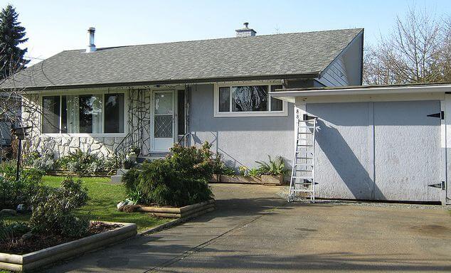
Since moving into her midcentury modest house a year ago, Christa has been having a ball updating the inside to reflect its 1961 architectural roots. Now, she’s ready to paint the outside — and has asked for ideas. Note in particular the rock wall — how to work it in? Read on for more background… then share your ideas about what paint colors she should use to freshen up the exterior of this adorable 1961 home.
Christa writes:
Hello Pam,
I’m a long time reader and admirer of Retro Renovation. When we moved in to our 1961 Vancouver Island house last April, your site provided oodles of inspiration for me!
Christa says: My husband Garrett and 5-year-old son, Emmit. Here's one from an evening last Summer, when Emmit set up his toys so that he could put on a show for them 🙂
Since moving in, I have painted almost all of the interior, save for the staircase, and completed many small projects to rejuvenate our home with a bit of colourful 1960s flair.
It’s been a ton of fun, and now that we’re cruising toward Summer, I’m anticipating painting the house’s exterior so that the outside will match the inside in pizazz. I have been browsing your paint inspiration collections, Flickr, and my own collections of vintage house magazines, and I’ve got nothing- I need your help!
I’m inclined to incorporate some aqua or seafoam, and/or mustard, burnt orange, pink, even black — really I’m all over the map and coming to a place of confusion in regards to what will actually suit the house. What will help it ‘pop’?
And what do I do with the rock wall? Does one paint any part of it, or just leave it? I feel lost. Any guidance you, or your readers could provide would be SO appreciated.
Yours in thrifty mid century modest-ness,
Christa
Christa, you have a lovely house, it just seems so idyllic. And, Vancouver Island: One of my favorite places in the world!
Readers, what do you think? What paint color(s) should Christa use to add curb appeal to her 1961 house? And, how should she deal with the rock wall facade?
What an absolutely adorable house! Love the rock. The very cool thing about that rock that I can see from the photos is that it’s actually got a lot of different colors in it. I can see a seafoam sort of color working really well on this house.
dalesays
There’s nothing original about that rock – or the stucco. Or the windows either, but that’s beside the point. Is the budget unbreakable? I’d lose the rock and stucco and put on some nice w i d e clapboards, maybe a 9 or 10 inch exposure like on a period ranch. Those sidings were usually some kind of masonite or asbestos. Then I like the mustardy yellow color. Oh, and update the garage doors, please. Beautiful backyard. I can see the tomatoes and peppers already.
Just another Pamsays
It’s original to my house, I met the people who built it last summer. I also learned it originally had a pink and black bathroom that the next owner replaced in the 80’s….way to break my heart.
dalesays
It looks just wrong. Having it take up the left half of the house detracts from the long low look of a ranch – it essentially cuts it in half. And having spent twenty years a s a painter starting in the mid 70’s I have almost never seen a stuccoed ranch, so I think all the veneer work was done later. Especially since the stone perfectly abuts the what looks like replacement windows. That’s my educated guess. But the question is, what does the homeowner want to do – go for a classic early 60’s ranch at all costs or a retro-inspired paint color and save money for other more meaningful upgrades?
Sarah W. in Oregonsays
I’m no expert, but there’s a lot of original rock like that in my 60s neighborhood.
Just another Pamsays
I’ve got the rock front on a mid-century house as well and restained all the cedar black, it was a nasty institutional dark brown, last year. This year the doors will become lime green for the ever popular ‘pop’ and, blush, it’s a good feng shui choice as well as looking yummy with the black and gray.
Just before we bought the house the former owner had it repointed to a tune of just over two thousand dollars. If the pointing is good I’d suggest working with it.
Maybe your favorite colour would be a good jump off point….your house, your rules!
Gavin Hastingssays
If i could hire painters…and do the whole house at once, I too would opt for black. Here in new England, I think it would be stunning in the snow!
Just another Pamsays
I originated down east too, Gavin, and love me a black house. Where I was born the men who worked on the ships ‘borrowed’ a lot of black paint but they also used, brace yourself, used motor oil to the same effect. Can’t think why the big ol’ balloon built cedar shingled houses went up like tinder.
My last house was log and I stained it black, white trim and red doors. And before anyone says it, it was naturally turning black on the south side, wood does that when left outside. Trust me ;o)
Jkayesays
Is the rock original to the house? Or is it something more modern and some sort of composite stick-on stuff? Since you ask what to do with the rock, do you like it the way it is? Or do you dislike it? Do you want it to be a prominent feature, or do you want it to fade into the background? Answers to those questions could help you — and everyone else! — with your paint decisions.
All I know is, I love the storm doors with the hearts and curlicues. I would like to see a color on your doors that makes those curlicues stand out more.
pam kuebersays
I love the rock.
Just another Pamsays
I love the rock too! It’s a quintessentially Canadian thing and very much present in mid-century developments across the country not just in dream locations by the sea with the Rockies in the distance. It’s real chunks of granite that are true blue representatives of their time and place.
LMsays
Leave the rocks alone. A red door is a must. It’s traditionally welcoming… For the rest… Turquoise or slate.
Sarah W. in Oregonsays
We re-sided and therefore repainted our 1968 tri-level in Portland, Oregon last summer – I spent two months torturing myself over paint color. My aim was for a dark greenish gray with an orange door. I researched eichler colors, so that was the design style that inspired my search.
After painting about 6 different sample colors on each side of the house (and driving my husband and neighbors bats) I arrived at Sherwin Williams Thunderous as the body color, Brandywine as the door color and Downing Sand for the trim and the eaves. We absolutely love it! Several people have asked for the color info and someone from city planning actually came out and took a picture – such a compliment after all the torture.
The Sherwin Williams Color Visualizer was a big help in pairing the body color we wanted with coordinating door and trim colors. (However, the color on my monitor was an awful representation of the actual color as I put up samples.) It’s hard to tell, but I think the dark green of the Thunderous would relate well to the grout on the rock facade (please don’t paint that rock!) Brandywine is a nice orange that adds a pop and draws attention to our front door, which is often in the shade. In the pic of your family it looks like there might be some warmth of color to those rocks and the Brandywine and Downing Sand would bring that out. Again, my monitor could be showing color all wrong too 🙂
I love the above suggestion of a flower box under the window to the right of your front door – a great way to balance your picture window.
I would paint the garage, doors and trim all the same color, whatever body color you choose with the eaves and roof trim the same as the house. Anything other than monochromatic will distract from the architecture of the house.
Sorry for such a long post. bottom line is I feel your pain… and it’s going to look great whatever you choose!
The Atomic Momsays
I’d leave the rocks alone, they’re a neutral color, so whatever you choose should be ok.
I vote seafoam or turquoise with a red door.
Carolsays
How about a very pale aquamarine for everything but the rock wall and trim, and freshen up the white paint on the trim? That would look nice, I think. 🙂
Quick question… is there a way that I could do this too at some point? I have been racking my brain trying to figure out what I’m going to do with the outside of my house as well. I’m usually really good at picking paint colors, I am NOT afraid of color! However, due to the funky brick that we are dealing with has made it all but easy or fun to choose a color. Soooo, I would love some input, but I’m sure you wouldn’t want everyone sending in their “help me” pictures:)
Pleeese let me know.


 Since moving into her midcentury modest house a year ago, Christa has been having a ball updating the inside to reflect its 1961 architectural roots. Now, she’s ready to paint the outside — and has asked for ideas. Note in particular the rock wall — how to work it in? Read on for more background… then share your ideas about what paint colors she should use to freshen up the exterior of this adorable 1961 home.


Melanie says
What an absolutely adorable house! Love the rock. The very cool thing about that rock that I can see from the photos is that it’s actually got a lot of different colors in it. I can see a seafoam sort of color working really well on this house.
dale says
There’s nothing original about that rock – or the stucco. Or the windows either, but that’s beside the point. Is the budget unbreakable? I’d lose the rock and stucco and put on some nice w i d e clapboards, maybe a 9 or 10 inch exposure like on a period ranch. Those sidings were usually some kind of masonite or asbestos. Then I like the mustardy yellow color. Oh, and update the garage doors, please. Beautiful backyard. I can see the tomatoes and peppers already.
Just another Pam says
It’s original to my house, I met the people who built it last summer. I also learned it originally had a pink and black bathroom that the next owner replaced in the 80’s….way to break my heart.
dale says
It looks just wrong. Having it take up the left half of the house detracts from the long low look of a ranch – it essentially cuts it in half. And having spent twenty years a s a painter starting in the mid 70’s I have almost never seen a stuccoed ranch, so I think all the veneer work was done later. Especially since the stone perfectly abuts the what looks like replacement windows. That’s my educated guess. But the question is, what does the homeowner want to do – go for a classic early 60’s ranch at all costs or a retro-inspired paint color and save money for other more meaningful upgrades?
Sarah W. in Oregon says
I’m no expert, but there’s a lot of original rock like that in my 60s neighborhood.
Just another Pam says
I’ve got the rock front on a mid-century house as well and restained all the cedar black, it was a nasty institutional dark brown, last year. This year the doors will become lime green for the ever popular ‘pop’ and, blush, it’s a good feng shui choice as well as looking yummy with the black and gray.
Just before we bought the house the former owner had it repointed to a tune of just over two thousand dollars. If the pointing is good I’d suggest working with it.
Maybe your favorite colour would be a good jump off point….your house, your rules!
Gavin Hastings says
If i could hire painters…and do the whole house at once, I too would opt for black. Here in new England, I think it would be stunning in the snow!
Just another Pam says
I originated down east too, Gavin, and love me a black house. Where I was born the men who worked on the ships ‘borrowed’ a lot of black paint but they also used, brace yourself, used motor oil to the same effect. Can’t think why the big ol’ balloon built cedar shingled houses went up like tinder.
My last house was log and I stained it black, white trim and red doors. And before anyone says it, it was naturally turning black on the south side, wood does that when left outside. Trust me ;o)
Jkaye says
Is the rock original to the house? Or is it something more modern and some sort of composite stick-on stuff? Since you ask what to do with the rock, do you like it the way it is? Or do you dislike it? Do you want it to be a prominent feature, or do you want it to fade into the background? Answers to those questions could help you — and everyone else! — with your paint decisions.
All I know is, I love the storm doors with the hearts and curlicues. I would like to see a color on your doors that makes those curlicues stand out more.
pam kueber says
I love the rock.
Just another Pam says
I love the rock too! It’s a quintessentially Canadian thing and very much present in mid-century developments across the country not just in dream locations by the sea with the Rockies in the distance. It’s real chunks of granite that are true blue representatives of their time and place.
LM says
Leave the rocks alone. A red door is a must. It’s traditionally welcoming… For the rest… Turquoise or slate.
Sarah W. in Oregon says
We re-sided and therefore repainted our 1968 tri-level in Portland, Oregon last summer – I spent two months torturing myself over paint color. My aim was for a dark greenish gray with an orange door. I researched eichler colors, so that was the design style that inspired my search.
After painting about 6 different sample colors on each side of the house (and driving my husband and neighbors bats) I arrived at Sherwin Williams Thunderous as the body color, Brandywine as the door color and Downing Sand for the trim and the eaves. We absolutely love it! Several people have asked for the color info and someone from city planning actually came out and took a picture – such a compliment after all the torture.
The Sherwin Williams Color Visualizer was a big help in pairing the body color we wanted with coordinating door and trim colors. (However, the color on my monitor was an awful representation of the actual color as I put up samples.) It’s hard to tell, but I think the dark green of the Thunderous would relate well to the grout on the rock facade (please don’t paint that rock!) Brandywine is a nice orange that adds a pop and draws attention to our front door, which is often in the shade. In the pic of your family it looks like there might be some warmth of color to those rocks and the Brandywine and Downing Sand would bring that out. Again, my monitor could be showing color all wrong too 🙂
I love the above suggestion of a flower box under the window to the right of your front door – a great way to balance your picture window.
I would paint the garage, doors and trim all the same color, whatever body color you choose with the eaves and roof trim the same as the house. Anything other than monochromatic will distract from the architecture of the house.
Sorry for such a long post. bottom line is I feel your pain… and it’s going to look great whatever you choose!
The Atomic Mom says
I’d leave the rocks alone, they’re a neutral color, so whatever you choose should be ok.
I vote seafoam or turquoise with a red door.
Carol says
How about a very pale aquamarine for everything but the rock wall and trim, and freshen up the white paint on the trim? That would look nice, I think. 🙂
JamieAbe says
Quick question… is there a way that I could do this too at some point? I have been racking my brain trying to figure out what I’m going to do with the outside of my house as well. I’m usually really good at picking paint colors, I am NOT afraid of color! However, due to the funky brick that we are dealing with has made it all but easy or fun to choose a color. Soooo, I would love some input, but I’m sure you wouldn’t want everyone sending in their “help me” pictures:)
Pleeese let me know.
Jane / MulchMaid / Elvis says
How about posting pics on your blog, then commenting here with a link to your blog so we can give you feedback?