Help Christa choose an exterior paint color for her 1961 house
pam kueber - Updated: April 1, 2011
Retro Renovation stopped publishing in 2021; these stories remain for historical information, as potential continued resources, and for archival purposes.
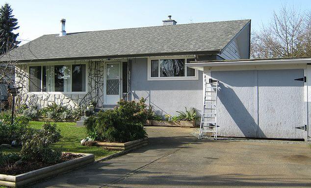
Since moving into her midcentury modest house a year ago, Christa has been having a ball updating the inside to reflect its 1961 architectural roots. Now, she’s ready to paint the outside — and has asked for ideas. Note in particular the rock wall — how to work it in? Read on for more background… then share your ideas about what paint colors she should use to freshen up the exterior of this adorable 1961 home.
Christa writes:
Hello Pam,
I’m a long time reader and admirer of Retro Renovation. When we moved in to our 1961 Vancouver Island house last April, your site provided oodles of inspiration for me!
Christa says: My husband Garrett and 5-year-old son, Emmit. Here's one from an evening last Summer, when Emmit set up his toys so that he could put on a show for them 🙂
Since moving in, I have painted almost all of the interior, save for the staircase, and completed many small projects to rejuvenate our home with a bit of colourful 1960s flair.
It’s been a ton of fun, and now that we’re cruising toward Summer, I’m anticipating painting the house’s exterior so that the outside will match the inside in pizazz. I have been browsing your paint inspiration collections, Flickr, and my own collections of vintage house magazines, and I’ve got nothing- I need your help!
I’m inclined to incorporate some aqua or seafoam, and/or mustard, burnt orange, pink, even black — really I’m all over the map and coming to a place of confusion in regards to what will actually suit the house. What will help it ‘pop’?
And what do I do with the rock wall? Does one paint any part of it, or just leave it? I feel lost. Any guidance you, or your readers could provide would be SO appreciated.
Yours in thrifty mid century modest-ness,
Christa
Christa, you have a lovely house, it just seems so idyllic. And, Vancouver Island: One of my favorite places in the world!
Readers, what do you think? What paint color(s) should Christa use to add curb appeal to her 1961 house? And, how should she deal with the rock wall facade?
Am I the only one that remembers 50’s-60’s houses painted an almost black with white trim and a yellow or pink door? There were millions of them and I loved them all…..
Yes, Gavin, it’s all coming back to me in a rush. I’d forgotten completely until you mentioned it! I’m remembering a sixties ranch with slightly turned-up eave and fascia boards (so it looked a tiny touch Asian, or Polynesian, maybe) and a small amount of vertical trim dividing the walls, painted deep charcoal with a pink door…wonder where that was?
Troublesays
Yeah there’s a house around the corner from me, with its original cedar siding. It’s painted black w/white trim and a blue ? door. I’v enever seen a black house, but it totally works!
Gavin Hastingssays
I suggested a deep long window box, because I want to balance the right side of your house with the left. I would like to see the bottom of that box begin somewhhere around the shadow line of the eave in the pictures…and ending with enough room to keep those windows operational. One box-the entire lenght of window, plus about 6″ to each side
I’ve used a virtual paint tester with a photo of the house, and though it’s still quite hard to tell how the colour will actually read in real life, I can say that the charcoal grey looked amazing, and that when I’ve tried shades of aqua, they were not so hot, unless it was a very deep, dark aqua, as dark as a forest green (what’s that shade called?). I do love Gavin’s idea of charcoal, with a butter yellow door, or maybe even a red door (and you know I have my eye on a Crestview door!). But I kind of want something that feels a little more exciting and playful, which is where it seems to be a little hard to coordinate with the rock wall, much as I love the rock wall.
The idea of a big planter under the right (kitchen) window is intriguing, too- in my head, I was planting tall grasses or shrubs under it to even it out with the massive living room window on the left, but a deep planter sounds genius!
There are many mini paint cans in my near future- I’ve definitely learned my lesson via interior painting- it’s worth buying 10 sample cans if it saves you from having to repaint, as I did with the living room of our old house. This most definitely applies to house exteriors!!
Thank you so much for all of your input, and thank you to Pam for putting my questions out there to the RR community! You guys are a fantastic help! I’ll report back once we get to painting (hopefully with a nice “after” photo, and not a tortured shot of 8 sample patches on the front of our house!)
christa hi! i say a rich buttery yellow or a rich turquoise with dark charcoal trim.
Shmershmiasays
Since we have so many grey days in BC, I would go with a cheery colour like seafoam, aqua, etc, as you mentioned. Or grey (not quite charcoal) with a turquoise front door. Keep the rock white. A bright yellow front door would be awesome! The big pop of colour will make you happy when you pull up on the 84 millionth dreary January day.
I totally agree with the grey – choose a dark slate grey and apply new grout in the same colour to the rock wall. Then paint your front door red to contrast with all the grey (or black if you want to be more conservative).
Pretty house!
Kerstensays
Oooohhh- big question! You don’t want an answer from me since I’m convinced I’m terrible with color. Any hints remaining regarding what color it was originally? That’s where my curiosity always leads.
Nancy ECsays
I’m with Gavin. And again, don’t paint the rock!
juliesays
You could find someone (or yourself, maybe?) who knows a bit of photoshop in order to try out some of these great suggestions to see what you like. It will help decide between drastically different colors such as charcoal vs. yellow.
Nancy Burtonsays
Have you looked at the Mid Century Modern selection of colors in the California Paint line? They are great & really give you the feel. I love their colors & info on the colors! You should check it out!


 Since moving into her midcentury modest house a year ago, Christa has been having a ball updating the inside to reflect its 1961 architectural roots. Now, she’s ready to paint the outside — and has asked for ideas. Note in particular the rock wall — how to work it in? Read on for more background… then share your ideas about what paint colors she should use to freshen up the exterior of this adorable 1961 home.


Gavin Hastings says
Am I the only one that remembers 50’s-60’s houses painted an almost black with white trim and a yellow or pink door? There were millions of them and I loved them all…..
Tut says
You sure you aren’t thinking of tar paper shacks? Bahaha! Sorry. 🙂
Jane / MulchMaid / Elvis says
Yes, Gavin, it’s all coming back to me in a rush. I’d forgotten completely until you mentioned it! I’m remembering a sixties ranch with slightly turned-up eave and fascia boards (so it looked a tiny touch Asian, or Polynesian, maybe) and a small amount of vertical trim dividing the walls, painted deep charcoal with a pink door…wonder where that was?
Trouble says
Yeah there’s a house around the corner from me, with its original cedar siding. It’s painted black w/white trim and a blue ? door. I’v enever seen a black house, but it totally works!
Gavin Hastings says
I suggested a deep long window box, because I want to balance the right side of your house with the left. I would like to see the bottom of that box begin somewhhere around the shadow line of the eave in the pictures…and ending with enough room to keep those windows operational. One box-the entire lenght of window, plus about 6″ to each side
Christa says
Ooh, you guys are good!
I’ve used a virtual paint tester with a photo of the house, and though it’s still quite hard to tell how the colour will actually read in real life, I can say that the charcoal grey looked amazing, and that when I’ve tried shades of aqua, they were not so hot, unless it was a very deep, dark aqua, as dark as a forest green (what’s that shade called?). I do love Gavin’s idea of charcoal, with a butter yellow door, or maybe even a red door (and you know I have my eye on a Crestview door!). But I kind of want something that feels a little more exciting and playful, which is where it seems to be a little hard to coordinate with the rock wall, much as I love the rock wall.
The idea of a big planter under the right (kitchen) window is intriguing, too- in my head, I was planting tall grasses or shrubs under it to even it out with the massive living room window on the left, but a deep planter sounds genius!
There are many mini paint cans in my near future- I’ve definitely learned my lesson via interior painting- it’s worth buying 10 sample cans if it saves you from having to repaint, as I did with the living room of our old house. This most definitely applies to house exteriors!!
Thank you so much for all of your input, and thank you to Pam for putting my questions out there to the RR community! You guys are a fantastic help! I’ll report back once we get to painting (hopefully with a nice “after” photo, and not a tortured shot of 8 sample patches on the front of our house!)
kim says
christa hi! i say a rich buttery yellow or a rich turquoise with dark charcoal trim.
Shmershmia says
Since we have so many grey days in BC, I would go with a cheery colour like seafoam, aqua, etc, as you mentioned. Or grey (not quite charcoal) with a turquoise front door. Keep the rock white. A bright yellow front door would be awesome! The big pop of colour will make you happy when you pull up on the 84 millionth dreary January day.
Anne says
I totally agree with the grey – choose a dark slate grey and apply new grout in the same colour to the rock wall. Then paint your front door red to contrast with all the grey (or black if you want to be more conservative).
Pretty house!
Kersten says
Oooohhh- big question! You don’t want an answer from me since I’m convinced I’m terrible with color. Any hints remaining regarding what color it was originally? That’s where my curiosity always leads.
Nancy EC says
I’m with Gavin. And again, don’t paint the rock!
julie says
You could find someone (or yourself, maybe?) who knows a bit of photoshop in order to try out some of these great suggestions to see what you like. It will help decide between drastically different colors such as charcoal vs. yellow.
Nancy Burton says
Have you looked at the Mid Century Modern selection of colors in the California Paint line? They are great & really give you the feel. I love their colors & info on the colors! You should check it out!