Help Christa choose an exterior paint color for her 1961 house
pam kueber - Updated: April 1, 2011
Retro Renovation stopped publishing in 2021; these stories remain for historical information, as potential continued resources, and for archival purposes.
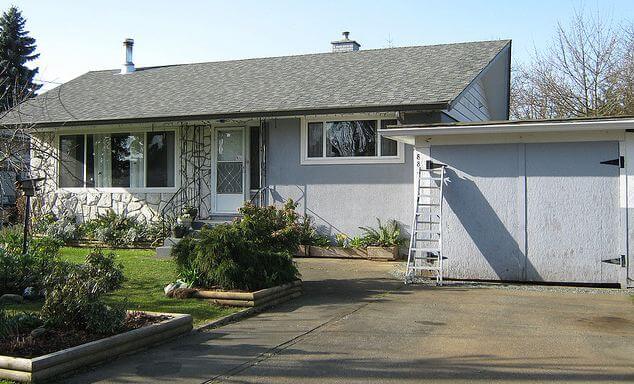
Since moving into her midcentury modest house a year ago, Christa has been having a ball updating the inside to reflect its 1961 architectural roots. Now, she’s ready to paint the outside — and has asked for ideas. Note in particular the rock wall — how to work it in? Read on for more background… then share your ideas about what paint colors she should use to freshen up the exterior of this adorable 1961 home.
Christa writes:
Hello Pam,
I’m a long time reader and admirer of Retro Renovation. When we moved in to our 1961 Vancouver Island house last April, your site provided oodles of inspiration for me!
Christa says: My husband Garrett and 5-year-old son, Emmit. Here's one from an evening last Summer, when Emmit set up his toys so that he could put on a show for them 🙂
Since moving in, I have painted almost all of the interior, save for the staircase, and completed many small projects to rejuvenate our home with a bit of colourful 1960s flair.
It’s been a ton of fun, and now that we’re cruising toward Summer, I’m anticipating painting the house’s exterior so that the outside will match the inside in pizazz. I have been browsing your paint inspiration collections, Flickr, and my own collections of vintage house magazines, and I’ve got nothing- I need your help!
I’m inclined to incorporate some aqua or seafoam, and/or mustard, burnt orange, pink, even black — really I’m all over the map and coming to a place of confusion in regards to what will actually suit the house. What will help it ‘pop’?
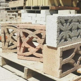
And what do I do with the rock wall? Does one paint any part of it, or just leave it? I feel lost. Any guidance you, or your readers could provide would be SO appreciated.
Yours in thrifty mid century modest-ness,
Christa
Christa, you have a lovely house, it just seems so idyllic. And, Vancouver Island: One of my favorite places in the world!
Readers, what do you think? What paint color(s) should Christa use to add curb appeal to her 1961 house? And, how should she deal with the rock wall facade?
We are (going on two years now) still debating that exact question at our house. I wish I could help you, but I want a bright mid-century color like Coral or Burma Jade, and hubs wants a medium beige to make our landscaping look great.
One other thing to consider is that it looks like you have white vinyl windows like we do: if so, and if you paint the wood trim a different color, you may find the narrow window and trim pieces beside each other are not strong enough to look as good as if you kept all the trim white.
Oh, and definitely keep the rock unpainted. It’s one of the best things about your very sweet house!
Oh, and check out this series of photos of vintage paint charts and ideas (there are twelve or thirteen) from Pam’s Flickr stream. There are some glorious color combinations here!
Hi Christa – I played around in Photoshop with a photo of your house and overlaid some of the colors mentioned. It’s something I have done with our newer ranch style (with stone facade) house. I don’t think I can post a photo here, so if you want to see what three combos I’ve come up with, email me jennifer [at] omysoap.com. You may not find the perfect color, but it helps to visualize what it may look like on your house. Good luck! And have fun. Color is a good thing.
pam kuebersays
Jennifer, I will send you my email address and see if I can post the photos. Many thanks!
The house I grew up in of 1960s vintage was painted a soft mint green with saturated accent colors – I’m think teal would look good on your house and accent the stone wall.. Do not paint the stone. Whatever you choose I’m sure you will enjoy a fresh new look.
I’m at a loss for the house color since I usually gravitate towards saturated colors like aqua and sea foam and can’t tell if that’s what would work here or not. I’m leaning towards a cheerful color and not grey though. I say to leave the stone like it is. It’s really pretty. And paint the door a nice pop of color. You could always get a big piece of plywood or similar board, prime it and then buy some quart paint samples and paint that baby up and lean it up against the house near the stone to see if the color works and how you like it from the street. Good luck and please report back with what you do. Can’t wait to see!
Marthasays
Hi Christa,
I saw the color the minute I looked at your pics and saw the brown adirondack chairs. I think that tone or a couple of shades lighter if you think it’s too dark would look fantastic with the stone (please don’t paint the stone). That color would also go very nice with the white and black accents you have going on in the doors, windows and railings.
Elizabeth Marysays
Love the stone and agree with all who say to leave it alone. I really don’t like painted stone at all as it looses its true identity. Embrace it don’t hide it.
And, since the stone is so prominent and such a great feature, the house color should compliment it — I even like the current light grey, but think a darker grey, as suggested by Gavin, would be even better. Then, brighten it up with color accents such as the door color and maybe some trim. And, color can be added with landscaping as well.
Oh, yes, a darker grey will also pick up and highlight the great color on the roof.
And, I also like the earlier suggestions to put trim on the garage doors.
One more suggestion if budget allows: Get a new screen door that is wood, not aluminum as this appears to be, with less going on so the new door color will show through.
Good luck! It is a wonderful house and to me, the stone makes it!!
Marksays
I also feel your pain, I painted my house last year and it took weeks to pick out the colors! For some reason our weather up here in the Pacific Northwest makes colors hard to choose, surrounded by green year round and gray skies 9 months a year makes you want to go with bright colors but, then you look at the house down the street……… I made myself crazy!
I would go for a darker color, like the charcoal gray suggested,
The garage door is where you can make a real statement, some inexpensive trim to dress them up would go a long way!
Don’t paint that rock!
BlueJaysays
My vote would be for a sea foam (such as Sherwin Williams’ Burma Jade). It’s a great color, adds interest and pop, but is not overwhelming. I would paint the door in a complimentary pale pink/beige. I would definitely add some trim to the garage door as well, perhaps recreating a mid century garage (there are posts on this site to get inspiration). I wouldn’t paint the stone.
My wife and I love Sherwin Williams. Their paint is really good quality and the Burma Jade is a wonderful color. We’ve used it in our house and on the exterior as a trim color. It’s bright and cheery without being jarring. 🙂


 Since moving into her midcentury modest house a year ago, Christa has been having a ball updating the inside to reflect its 1961 architectural roots. Now, she’s ready to paint the outside — and has asked for ideas. Note in particular the rock wall — how to work it in? Read on for more background… then share your ideas about what paint colors she should use to freshen up the exterior of this adorable 1961 home.


Jane / MulchMaid / Elvis says
We are (going on two years now) still debating that exact question at our house. I wish I could help you, but I want a bright mid-century color like Coral or Burma Jade, and hubs wants a medium beige to make our landscaping look great.
Do try the Sherwin Williams Visualizer (link on my blog post about this very subject last year: http://mulchmaid.blogspot.com/2010/03/which-house-color-looks-best-with.html) It’s a fun online program and would definitely help you make some initial decisions.
One other thing to consider is that it looks like you have white vinyl windows like we do: if so, and if you paint the wood trim a different color, you may find the narrow window and trim pieces beside each other are not strong enough to look as good as if you kept all the trim white.
Oh, and definitely keep the rock unpainted. It’s one of the best things about your very sweet house!
Tut says
A light creamy yellow sort of thing would go nicely with the stone, and it would go nicely with the house’s roots and history.
Eartha Kitsch says
Oh, and check out this series of photos of vintage paint charts and ideas (there are twelve or thirteen) from Pam’s Flickr stream. There are some glorious color combinations here!
http://www.flickr.com/photos/retrorenovation/4508921565/in/photostream/
Jennifer says
Hi Christa – I played around in Photoshop with a photo of your house and overlaid some of the colors mentioned. It’s something I have done with our newer ranch style (with stone facade) house. I don’t think I can post a photo here, so if you want to see what three combos I’ve come up with, email me jennifer [at] omysoap.com. You may not find the perfect color, but it helps to visualize what it may look like on your house. Good luck! And have fun. Color is a good thing.
pam kueber says
Jennifer, I will send you my email address and see if I can post the photos. Many thanks!
Cheryl Warren says
The house I grew up in of 1960s vintage was painted a soft mint green with saturated accent colors – I’m think teal would look good on your house and accent the stone wall.. Do not paint the stone. Whatever you choose I’m sure you will enjoy a fresh new look.
Eartha Kitsch says
I’m at a loss for the house color since I usually gravitate towards saturated colors like aqua and sea foam and can’t tell if that’s what would work here or not. I’m leaning towards a cheerful color and not grey though. I say to leave the stone like it is. It’s really pretty. And paint the door a nice pop of color. You could always get a big piece of plywood or similar board, prime it and then buy some quart paint samples and paint that baby up and lean it up against the house near the stone to see if the color works and how you like it from the street. Good luck and please report back with what you do. Can’t wait to see!
Martha says
Hi Christa,
I saw the color the minute I looked at your pics and saw the brown adirondack chairs. I think that tone or a couple of shades lighter if you think it’s too dark would look fantastic with the stone (please don’t paint the stone). That color would also go very nice with the white and black accents you have going on in the doors, windows and railings.
Elizabeth Mary says
Love the stone and agree with all who say to leave it alone. I really don’t like painted stone at all as it looses its true identity. Embrace it don’t hide it.
And, since the stone is so prominent and such a great feature, the house color should compliment it — I even like the current light grey, but think a darker grey, as suggested by Gavin, would be even better. Then, brighten it up with color accents such as the door color and maybe some trim. And, color can be added with landscaping as well.
Oh, yes, a darker grey will also pick up and highlight the great color on the roof.
And, I also like the earlier suggestions to put trim on the garage doors.
One more suggestion if budget allows: Get a new screen door that is wood, not aluminum as this appears to be, with less going on so the new door color will show through.
Good luck! It is a wonderful house and to me, the stone makes it!!
Mark says
I also feel your pain, I painted my house last year and it took weeks to pick out the colors! For some reason our weather up here in the Pacific Northwest makes colors hard to choose, surrounded by green year round and gray skies 9 months a year makes you want to go with bright colors but, then you look at the house down the street……… I made myself crazy!
I would go for a darker color, like the charcoal gray suggested,
The garage door is where you can make a real statement, some inexpensive trim to dress them up would go a long way!
Don’t paint that rock!
BlueJay says
My vote would be for a sea foam (such as Sherwin Williams’ Burma Jade). It’s a great color, adds interest and pop, but is not overwhelming. I would paint the door in a complimentary pale pink/beige. I would definitely add some trim to the garage door as well, perhaps recreating a mid century garage (there are posts on this site to get inspiration). I wouldn’t paint the stone.
Elizabeth says
I had to google Sherwin Williams Burma Jade and found this great site!
http://www.sherwin-williams.com/pdf/color_themes/ext_suburban.pdf
BlueJay says
My wife and I love Sherwin Williams. Their paint is really good quality and the Burma Jade is a wonderful color. We’ve used it in our house and on the exterior as a trim color. It’s bright and cheery without being jarring. 🙂