

Photos hot off the presses!
Need new countertops for your midcentury kitchen or bathroom? If so, you might want to hang on until summer, when Wilsonart will introduce two new abstract designs — “Betty” and “Endora” — for sale. Hmmm. With their colorways, scale, and well-designed retro pattern, Wilsonart Betty and Wilsonart Endora skyrocket to the top of my list of laminates to consider for countertops in a midcentury modern or vintage-style home. Also good news: These will be standard residential laminates — so the price should be very affordable.
- Update midyear: Readers tipped us that you can now buy these direct from Home Depot including ordering online, just $60 a sheet!
Tip to view photos: Click on any photo, and it should double in size on your screen, so you can see more detail. Keep clicking anywhere on the enlarged photo, and all the photos in the story should run as a slide show. Hit anywhere off the photo or hit Escape, and you return to the story. This feature should work in all stories here on Retro Renovation.
Wilsonart says these will be available nationwide “this summer.”
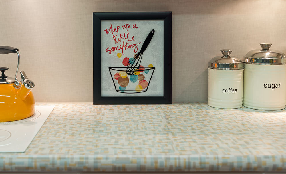
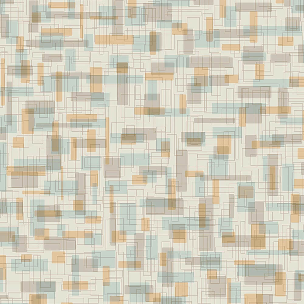
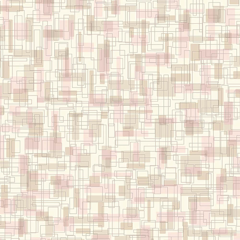
Wilsonart’s 4972-38 Betty laminate:
Wilsonart says:
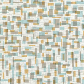
Betty is a small to medium scaled abstract pattern overlapping box and square in retro color blend of teal and orange. The name is indicative of the mid-century names to connect to a moment in time when women named Betty and Endora would work in their very modern kitchens. This pattern reflects the quirky optimistic quality that reflects that period in time.
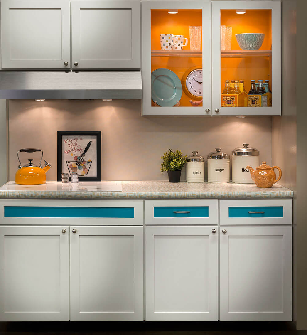
 From their vignette shown at the recent KBIS show, it looks like the so-called “teal” in this pattern will harmonize quite nicely with aqua cabinetry or accessories. The field looks to be grey (golly, I’d prefer an off white) — but I certainly understand the choice considering the continuing popularity of gray in the contemporary mass market today.
We’ve asked to see samples as soon as we can and will report back as soon as we have them in hand.
Wilsonart’s 4973-38 Endora retro design laminate
So… will the pinks in “Endora” go with all the Mamie Pink tile in millions or American bathrooms?We can’t wait to get a look-see and let you know.
Endora is a small to medium scaled abstract pattern overlapping box and square in retro color of pink and gold. The name is indicative of the mid-century names to connect to a moment in time when women named Betty and Endora would work in their very modern kitchens. This pattern reflects the quirky optimistic quality that reflects that period in time.
Formica’s Nassau pattern from the 1960s:
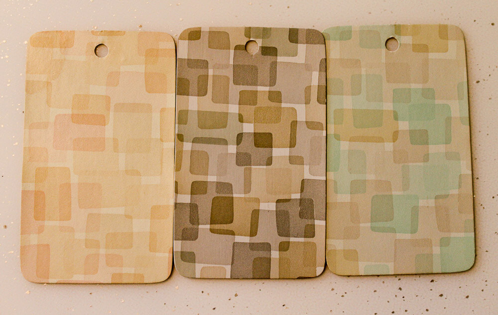 The new Wilsonart designs remind me of Formica’s Nassau design, shown above. According to materials expert and historian Grace Jeffers, this pattern introduced in 1955, then removed from the market in 1957, because it did not sell well.
Again, my view on the best laminate designs for a retro kitchen: Tone-on-tone, multidirectional, small-to-medium abstract patterns in colorways that will harmonize with our “real color” interiors. The new Wilsonart Endora and Betty designs look to be a great step in that direction.
Super mega thanks to Robert of ElectraChime for sending me the box of Formica paper samples that the three samples of Formica Nassau shown above came from. What a generous contribution to my archives! xoxo
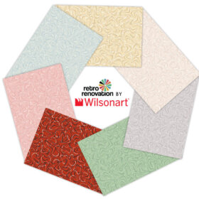
The complete new “Stylistic History” collection coming from Wilsonart
There are additional patterns in the Stylistic History collection that includes Endora and Betty. The other designs in the collection are moving to the Residential line from the Contract (Commercial) line or another country in the Wilsonart family:
Stylistic History
“Be yourself; everyone else is already taken.” – Oscar Wilde
Personal styles evolve and change. These 8 fresh new patterns are an exciting nod to our collective stylistic history. Baby boomers are searching for those things that feel like simpler, more innocent days, while the millennials incorporate optimism and originality. Fun patterns, unusual textures and bold colors represent this direction, without being bogged down in the past. Think individuality, difference and distinction.
These easygoing, aspirational lifestyles are centered on both the meandering road and the techno highway. Plastic laminate was originally used for its low cost versatility and has grown up to be the perfect material for these unique forms of self-expression.
These bold and whimsical new colors and patterns offer an updated nod to historic and vintage patterns while being firmly rooted in the present. There would be no denying that these new patterns are anything but.
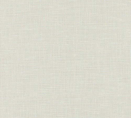
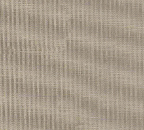
4942-38 Crisp Linen (Standard)
A neutral background with crisp white warp and weft “threads”. Reminiscent of a woven fabric, it has evolved into a compact small pattern that provides texture and highlights. Crisp Linen is a crossover from the contract line.
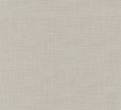
4943-38 Classic Linen (Standard)
4944-38 Casual Linen (Standard)
4962-38 Gesso Tracery (Standard)
The quatrefoil is a conventionalized representation of a flower with four petals or of a leaf with four leaflets. The small scale quatrefoil motif is repeated and fades in and out and is rendered in a warm white with hints of grey. Gesso Tracery is a crossover from the contract line.
4973-38 Endora (Standard)
Endora is a small to medium scaled abstract pattern overlapping box and square in retro color of pink and gold. The name is indicative of the mid-century names to connect to a moment in time when women named Betty and Endora would work in their very modern kitchens. This pattern reflects the quirky optimistic quality that reflects that period in time.
D502-60 Ocean Matte Finish (Standard)
This color comes from one of our international sister companies. Ocean can be found in Polyrey’s collection as E026 Emeraude, as well as in Shanghai’s and Thailand’s collections as 0028 Emerald Sea.
D501-60 Orange Grove Matte Finish (Standard)
This color comes from one of our international sister companies. Orange Grove can be found in both Thailand’s and Shanghai’s collections as 0387 Orange.
4972-38 Betty (Standard)


David in Marietta says
I think it may depend on which big box store and possibly which H D you go to. We were able to get one of the Formica sheets without minimum, no problem. Also I surprised my contractor when I did some shopping around. I was able to get the Formica from Home Depot cheaper in price as a walk in than he would have gotten from some of his suppliers with his contractor discount.
Marcia says
It sounds a little like Formica Cracked Ice.
Sharon Letchford says
I’m in Australia and have been looking for those pearlescent weave patterned laminates that were popular in the 60’s. It’s next to impossible to find reproductions here and all the old stuff is pretty much wrecked – the market is just so small. Do you know what I’m talking about, and if so, what those patterns are called??
Joe Felice says
Endora and Betty look better up close than on the entire counter top. They look a little too muted for MCM, IMO, but I will reserve final judgement till I see them. Also, colors change when viewed online. I love the Ocean, and wouldn’t it go great with Orange Grove? Those types of colors are the ones I remember from the ’50s and ’60s. How about Ocean with Daisy Yellow?
pam kueber says
Joe, I disagree. I think that Betty looks great on the countertop!
I received 18″ x 24″ samples from Wilsonart today (don’t try this yourself, official samples not til summer). I am on the run today but will photograph and opine as soon as I am able. Quikly: Betty definitely on the gray side, but very soft gray. The colors are quite nice and definitely retro.
I like the Endora even better given its off white field (me no fan of grays, in case ya haven’t heard). The pink is a bit on the lilac side. However, it still might work with Mamie pink tiles — I will send my samples to Kate as soon as I get done and let’s see what she says.
Fundamentally, I think these are aimed at the mass market and current color trends — in my mind’s eye, I am already designing some fabulous retro-modern kitchens (no gray cabinets ugh) using them… that said, they are potentially workable for a less modern, more retro remodel, I think.
There just aren’t many choices today that hit all my marks — which include good-scale, multidirectional, abstract, pattern… the “right” colors… at stock prices. At this point, I am grateful for whatever we can get…
Lissie says
I actually like the gray! I know it is a “trendy” color – but I find it is a great neutral – we have our bedrooms painted in a soft gray. I will definitely consider this for our kitchen counters. I’m not a huge fan of the rounded edges, though. My original Formica counters are squared off and trimmed on the backsplash with chrome. Sadly – they are in bad shape… I suppose we will keep our sink and hudee ring, if we can.
Mary Elizabeth says
I don’t think all shades of gray are trendy, and some are appropriate for mid-century decoration. My pink bathroom has dove gray tiles, and it looks great with the pink. Ditto with that gray laminate with turquoise and orange.
What’s been happening for 20 years or so, however, is the designers’ and/or real estate agents’ insistence on filling a whole house–tile, countertops, floors–with blah neutrals, the so-called “griege.” That’s what I personally don’t like.
Carrie says
Perfect timing! Endora is going in my pink kitchen this summer. I have vintage 60’s rocket and astronaut wallpaper as my kitchen back-splashes. I think they, and the pink hues in the laminate can work out their differences.
Mary Elizabeth says
We want to see the project when it is done!
Jackie says
OH, happiness!! These are great! One step closer to getting rid of greige (put those patterns on a white background!).
I know I’m being greedy–but Linen in bright colors please! Jadeite green, bright red, primary blue.
pam kueber says
See my story about new Jonathan Adler Formica collection (use Search box or Kitchen Help/Countertops category) — linen in a green and orange, at least…
Dorothy says
Absolutely beautiful! Reminds me so much of my childhood times.
Sara says
LOVE!!! I was planning to re-do my bathroom vanity with laminate, but the big box store has a $200 minimum on laminate orders (unless you buy the few big pieces they have in the store), and that’s way too much for a 30″ vanity. Now that these patterns are available, I’m definitely going to pursue this further and see if there are other suppliers that don’t have a minimum charge. Or…maybe I need to re-do the kitchen too! Then that pesky minimum charge wouldn’t matter. 🙂
Mary Elizabeth says
DH and I just installed a new vanity top with Formica, which we ordered through one of the “big box” stores in Connecticut. (Hint, the chain’s primary deco color in the store and outside is orange, and it’s initials are the reverse of DH.) In the past, we have bought both Wilsonart and Formica from them. The design we chose came in a variety of sizes, and we got the small piece we needed for $37 plus tax. We did have to wait about a month for it to come into the store, but we picked it up ourselves. So if you are dealing with a different chain, try these folks. And if the folks at HD are the ones saying you need a minimum order, ask to speak to the manager and tell him or her that other stores in the chain don’t require a $200 minimum. That is totally ridiculous, because they get regular shipments from the two primary laminate factories.
pam kueber says
A few years ago, we purchased laminate sheets directly from Home Depot at a very reasonable cost. I also think you can order sheets on their website, pick them up in the store.
Marcia says
It looks like you can also order a sheet of laminate from HD’s website and have it delivered free to your home with $45 minimum.
Melanie says
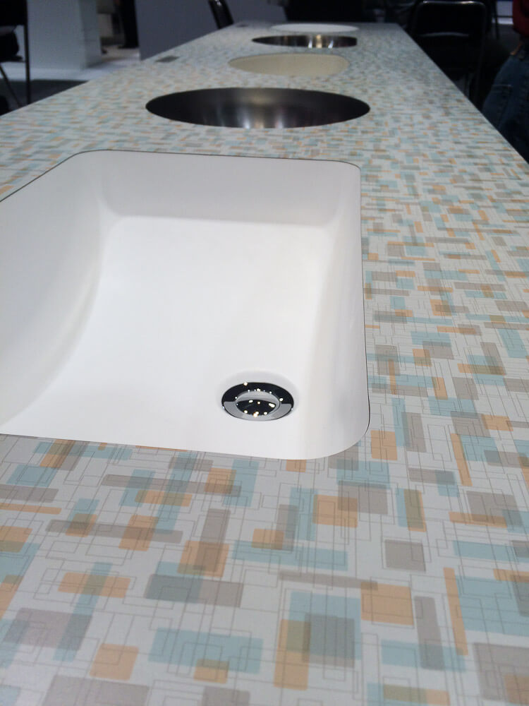
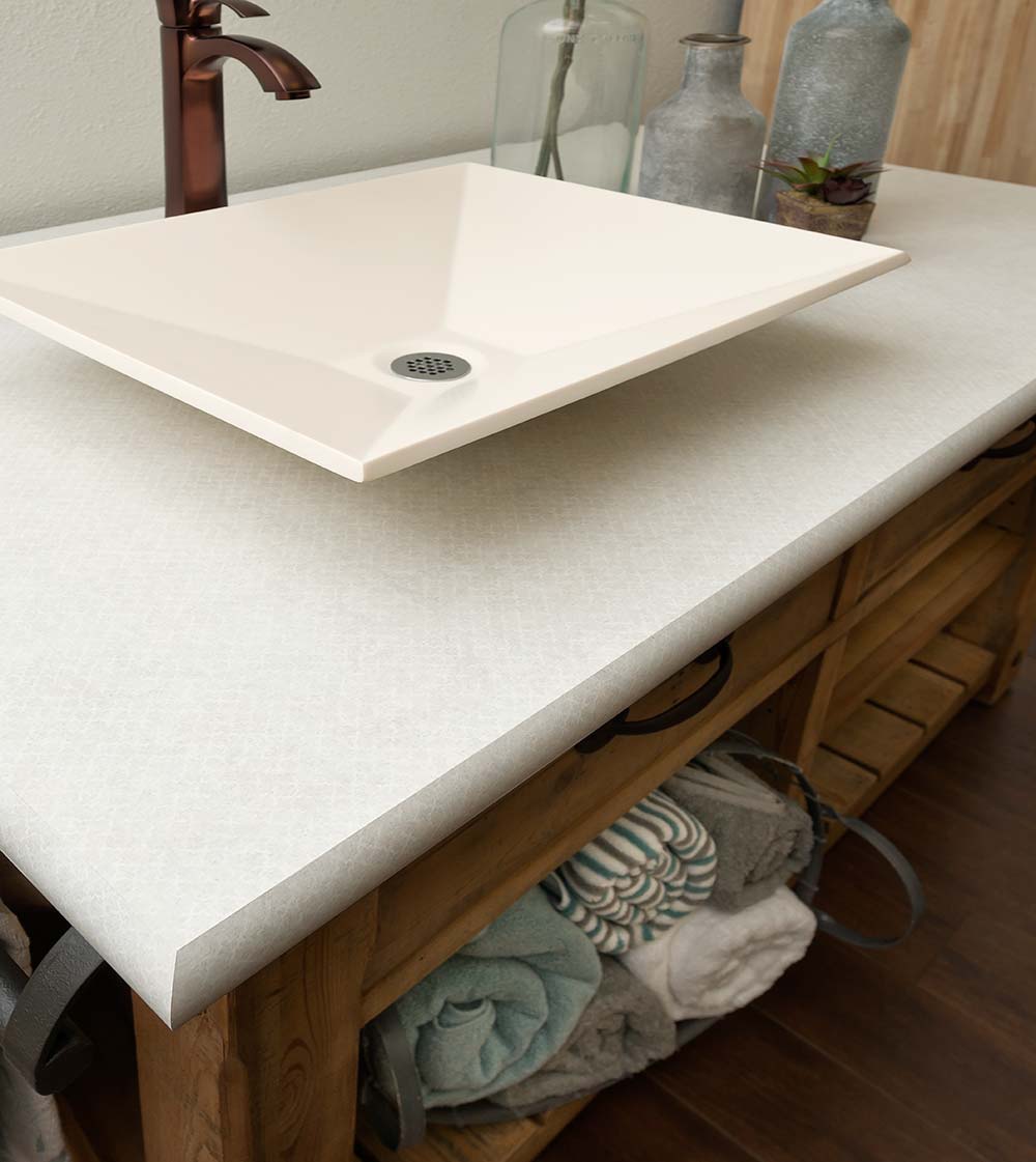
Saw the Betty up close and personal at the Karran Exhibit at the International Builders Show in Las Vegas last week. Karran produces seamless undermount sinks for use with laminate. They had multiple undermount sink examples displayed on one long tall piece of Betty. While I recognize that undermount and laminate don’t ring true of the mid-century design aesthetic – it sure does make for a nice clean look with Betty as the shining starlet – as she should be. I’d attach the photo I took with my phone if I could figure out how to do so.
Susan D says
Melanie – I was going to make the same comment about the undermount sinks. Maybe not historically accurate, but it sure is a nice clean look.
Deborah says
I have been wanting solid cast countertops for some time but these cool laminates are beginning to make me think again.
My Modest still has its original yellow laminate countertop but it’s in very poor shape and really needs to be replaced.
I would love to see something with glittery flakes in it!
toni says
Deborah, are your counters this yellow? I was hoping for something a little less gold.
http://www.heffrons.com/retro/swatches/laminates.html
Maybe it’s my monitor. The red is really dark, too, and that would be my second choice. Actually either one but at nearly $400 a sheet…… not any time soon. I’ll live with my white.
pam kueber says
The price is because these custom laminates are special-order, one-off digital printing required. It’s exponentially more expensive…
That’s why I keep repeating: We need more “stock” options. That is, rotogravure-printed deco paper… printed and distributed in bulk. But herein lies the problem for manufacturers: Is the market really big enough? Hence… we may continue to be faced with digi-prints and digiprint prices. Again, for this reason, I am grateful for any “stock” laminates with mid mod style — like Endora and Betty — that I can get….
See our Kitchen Help / Countertops category for all our research on possible options. There are, like, eight laminate companies to check for all their current options.
Judy says
As increasing numbers of people become environmentally conscious, I am amazed at the popularity of stone counters. Have you ever seen a strip mine? Where do these people think stone comes from? I keep trying to get more people to consider laminates by pushing the image of opening mines. I know, I’m not very nice sometimes. I actually think that fits in with some of the messages here at RR because you do push people to reuse and repurpose their cabinets for similar reasons and avoiding filling landfills. Off my soapbox!
Love these new choices. Hope more keep coming. Unfortunately, those won’t work in my colors. Darn it anyway.
pam kueber says
Yup. You can find my rants on the blog about money = carbon, too.