

Photos hot off the presses!
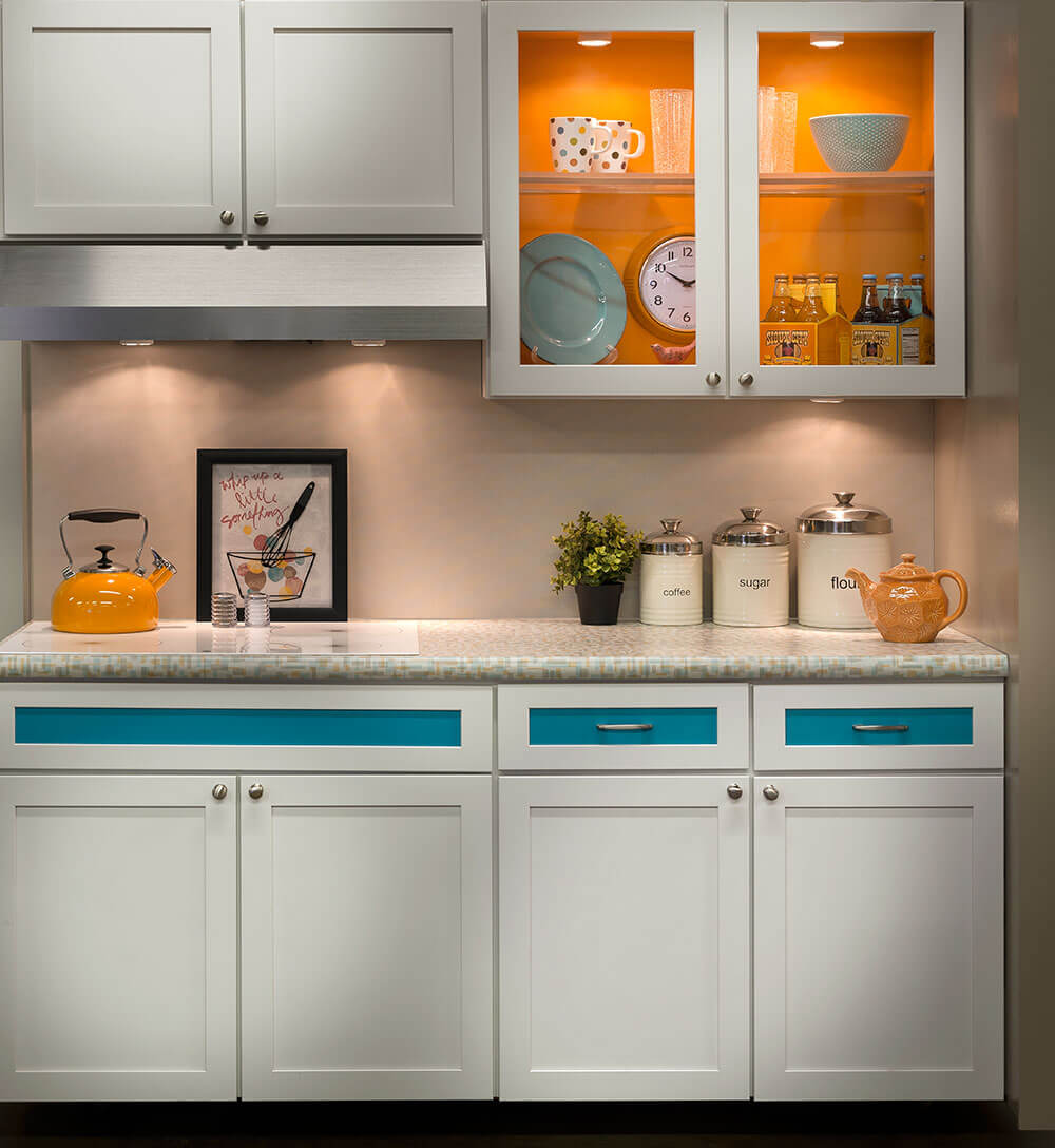
Need new countertops for your midcentury kitchen or bathroom? If so, you might want to hang on until summer, when Wilsonart will introduce two new abstract designs — “Betty” and “Endora” — for sale. Hmmm. With their colorways, scale, and well-designed retro pattern, Wilsonart Betty and Wilsonart Endora skyrocket to the top of my list of laminates to consider for countertops in a midcentury modern or vintage-style home. Also good news: These will be standard residential laminates — so the price should be very affordable.
- Update midyear: Readers tipped us that you can now buy these direct from Home Depot including ordering online, just $60 a sheet!
Tip to view photos: Click on any photo, and it should double in size on your screen, so you can see more detail. Keep clicking anywhere on the enlarged photo, and all the photos in the story should run as a slide show. Hit anywhere off the photo or hit Escape, and you return to the story. This feature should work in all stories here on Retro Renovation.
Wilsonart says these will be available nationwide “this summer.”
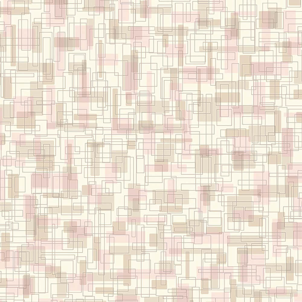
Wilsonart’s 4972-38 Betty laminate:
Wilsonart says:
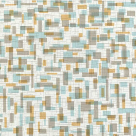
Betty is a small to medium scaled abstract pattern overlapping box and square in retro color blend of teal and orange. The name is indicative of the mid-century names to connect to a moment in time when women named Betty and Endora would work in their very modern kitchens. This pattern reflects the quirky optimistic quality that reflects that period in time.
 From their vignette shown at the recent KBIS show, it looks like the so-called “teal” in this pattern will harmonize quite nicely with aqua cabinetry or accessories. The field looks to be grey (golly, I’d prefer an off white) — but I certainly understand the choice considering the continuing popularity of gray in the contemporary mass market today.
We’ve asked to see samples as soon as we can and will report back as soon as we have them in hand.
Wilsonart’s 4973-38 Endora retro design laminate
So… will the pinks in “Endora” go with all the Mamie Pink tile in millions or American bathrooms?We can’t wait to get a look-see and let you know.
Endora is a small to medium scaled abstract pattern overlapping box and square in retro color of pink and gold. The name is indicative of the mid-century names to connect to a moment in time when women named Betty and Endora would work in their very modern kitchens. This pattern reflects the quirky optimistic quality that reflects that period in time.
Formica’s Nassau pattern from the 1960s:
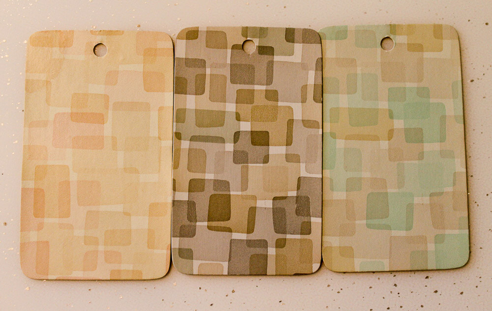 The new Wilsonart designs remind me of Formica’s Nassau design, shown above. According to materials expert and historian Grace Jeffers, this pattern introduced in 1955, then removed from the market in 1957, because it did not sell well.
Again, my view on the best laminate designs for a retro kitchen: Tone-on-tone, multidirectional, small-to-medium abstract patterns in colorways that will harmonize with our “real color” interiors. The new Wilsonart Endora and Betty designs look to be a great step in that direction.
Super mega thanks to Robert of ElectraChime for sending me the box of Formica paper samples that the three samples of Formica Nassau shown above came from. What a generous contribution to my archives! xoxo
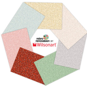
The complete new “Stylistic History” collection coming from Wilsonart
There are additional patterns in the Stylistic History collection that includes Endora and Betty. The other designs in the collection are moving to the Residential line from the Contract (Commercial) line or another country in the Wilsonart family:
Stylistic History
“Be yourself; everyone else is already taken.” – Oscar Wilde
Personal styles evolve and change. These 8 fresh new patterns are an exciting nod to our collective stylistic history. Baby boomers are searching for those things that feel like simpler, more innocent days, while the millennials incorporate optimism and originality. Fun patterns, unusual textures and bold colors represent this direction, without being bogged down in the past. Think individuality, difference and distinction.
These easygoing, aspirational lifestyles are centered on both the meandering road and the techno highway. Plastic laminate was originally used for its low cost versatility and has grown up to be the perfect material for these unique forms of self-expression.
These bold and whimsical new colors and patterns offer an updated nod to historic and vintage patterns while being firmly rooted in the present. There would be no denying that these new patterns are anything but.
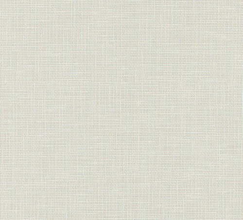
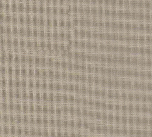
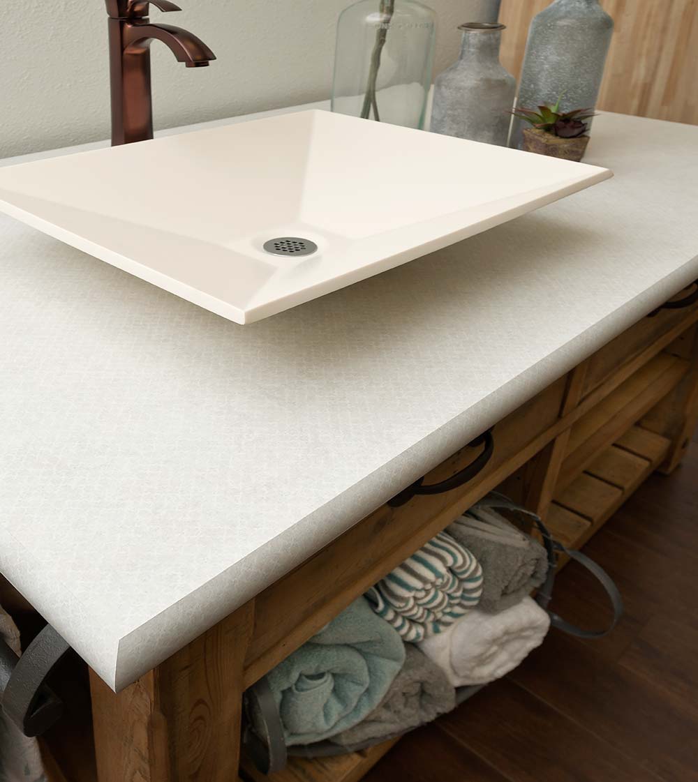
4942-38 Crisp Linen (Standard)
A neutral background with crisp white warp and weft “threads”. Reminiscent of a woven fabric, it has evolved into a compact small pattern that provides texture and highlights. Crisp Linen is a crossover from the contract line.
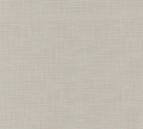
4943-38 Classic Linen (Standard)
A taupe background with lighter taupe warp and weft “threads”. Reminiscent of a woven fabric, it has evolved into a compact small pattern that provides texture and highlights. Classic Linen is a crossover from the contract line.
4944-38 Casual Linen (Standard)
A brown background with lighter brown warp and weft “threads”. Reminiscent of a woven fabric, it has evolved into a compact small pattern that provides texture and highlights. Casual Linen is a crossover from the contract line.
4962-38 Gesso Tracery (Standard)
The quatrefoil is a conventionalized representation of a flower with four petals or of a leaf with four leaflets. The small scale quatrefoil motif is repeated and fades in and out and is rendered in a warm white with hints of grey. Gesso Tracery is a crossover from the contract line.
4973-38 Endora (Standard)
Endora is a small to medium scaled abstract pattern overlapping box and square in retro color of pink and gold. The name is indicative of the mid-century names to connect to a moment in time when women named Betty and Endora would work in their very modern kitchens. This pattern reflects the quirky optimistic quality that reflects that period in time.
D502-60 Ocean Matte Finish (Standard)
The colors in the mid-century were a reaction that went against what was there before which was very somber, subtler, quieter colors. Colors in the ’50s and ’60s became brighter and stronger — anti-establishment, but optimistic. Colors were mixed in ways they hadn’t been put together before, such as black, turquoise, and red, a clear example of all the rules being thrown out the window.
This color comes from one of our international sister companies. Ocean can be found in Polyrey’s collection as E026 Emeraude, as well as in Shanghai’s and Thailand’s collections as 0028 Emerald Sea.
D501-60 Orange Grove Matte Finish (Standard)
The colors in the mid-century were a reaction that went against what was there before which was very somber, subtler, quieter colors. Colors in the ’50s and ’60s became brighter and stronger — anti-establishment, but optimistic. This dynamic orange perfectly reflects that sentiment.
This color comes from one of our international sister companies. Orange Grove can be found in both Thailand’s and Shanghai’s collections as 0387 Orange.
4972-38 Betty (Standard)
Betty is a small to medium scaled abstract pattern overlapping box and square in retro color blend of teal and orange. The name is indicative of the mid-century names to connect to a moment in time when women named Betty and Endora would work in their very modern kitchens. This pattern reflects the quirky optimistic quality that reflects that period in time.


sherree says
So happy to see these! We are planning a big remodel of our 1952 kitchen and are having a hard time finding a laminate that we like that hasn’t already been discontinued. I love the colors in Betty 🙂
midmichigan says
They’re all real good. The solid aqua was popular in the 60’s for sure. Maybe Wilsonart is slowly moving toward producing some long sought after, gold flecked white laminate. It would satisfy the retro crowd and the newer generation would love the bling factor. Kind of a twofer. Do it, Wilsonarters!
kathy Merchant says
Even if it is some “photo” of gold flecks on the countertops, a lot of us would line up for that.
Rebecca says
Oh my gosh! Love!
Sydney says
I am unspeakable thrilled about these! I can see both colors working with knotty pine cabinets that may be in my future 🙂
kathy Merchant says
I agree. Those of us with wood cabinets could use a little color…
Marcia says
Ooooh ooooh, I may have found my counter top. Can hardly wait for the samples to come out. I was getting a bit frustrated at the selection available.
On a side note, I’m taking a bit of umbrage at the ad hype (I know I shouldn’t). I found 477 women named Eudora in the 1940 census. 200 of them were born before 1900, which seems like the least likely group to be working in a quirky modern kitchen. Still, including them averages out to only about 10 Eudoras per state, hardly creating a “moment in time”. I’m pretty sure these names were lifted from “Bewitched” and “The Flintstones”, or maybe “Mad Men”, which I do find appealing. Don’t treat us like dummies, ad writers!
pam kueber says
Marcia, the name is “Endora”. That was the name of Samantha’s mother on Bewitched, played by the awesome Agnes Moorehead! http://www.imdb.com/name/nm0001547/
Marcia says
Yes, sorry, my fingers can’t type. Endora was the name I looked up, not Eudora. Endora was such a great character, and she does deserve a quirky optimistic laminate! She’s just not a mid century “everywoman” as the hype implies.
Mary Elizabeth says
Great research, Marcia! And I myself did confuse Endora (which none of my friends are named) and Eudora (of which I know exactly one).
But don’t minimize the “quirky modern” tastes of women born at the turn of the last century. My grandma was born around 1900, and in the 1950s and 1960s she had the grooviest kitchen with pink cabinets and boomerang laminate.
Neil says
Marcia, I’m with you on that one. When I read that I couldn’t imagine Endora was a common name in the mid-century kitchen, except in the wonderful Samantha Stevens’ kitchen, poor dear.
And by the way, Endora was one of the absolutely least “kitchen-y” women on TV at that time; she had way too much attitude and independence to lift a finger to cook anything (or look through laminate swatches) except to waive all ten bejeweled fingers, in a fabulous gesture of dismissal and disdain, and make it all materialize without a whiff of domestic fuss. And, by the way again, the colors of the laminate Endora don’t hold a pitiful candle to The Endora’s taste in colors and pizzazz!
And while I’m on the subject, I happened to have Thanksgiving dinner, at some friends’ house here in San Francisco about 15 years ago, with Alice Ghostley, who played the dour Esmeralda on Bewitched, and Alice told me that while Agnes was nothing like the flamboyant Endora, she was no homey domestic either. So for all those reasons, if I may rant a little about so small a matter, the naming of the new laminate seems like a madcap stretch.
Marcia says
Good story, Neil. Thanks for sharing. I just read somewhere that Moorhead was nicknamed “The Lavender Lady” because purple was her favorite color so I bet she was the one who came up with that outfit she wore.
linda h says
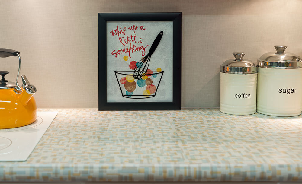
Also thinking about copying the “whip up a little something” art.
pam kueber says
Let me ask Wilsonart where to acquired the piece….
linda h says
Thanks! That would be easier than making my own and maybe infringing upon copywright laws.
Tammy/Wilsonart says
Thanks for asking about the framed art Linda. Our design team snagged it from HomeGoods.
Sally says
That cute sign may have come from Hobby Lobby, not Home Goods. Sorry for the confusion! Happy Hunting!
linda h says
I usually think my house has enough artwork so don’t often look for it at either of those places so hadn’t seen it before. I am fortunate to have both a Hobby Lobby and Homegoods within a half mile of my home. On another note, I am always on the look at estate sales for vintage crewel embroidery pictures although I do already have plenty of artwork. And thanks again to Wilsonart for a quick reply.
Sandra Knight says
I am redoing a 1977 vintage Camper and the Betty would look great where can you buy this at
pam kueber says
Hi Sandra, as the story says, these are not on the market yet… please read it for details….
Wendy M. says
I love the “Betty” pattern! I immediately thought of the counters in my daughter’s elementary school office, which I’ve always admired. I then I scrolled down and saw the “Nassau” pattern…I’m pretty sure that’s what they have at her school!
It’s so nice to see color and pattern that would work in homes without overwhelming the space.
kathy Merchant says
That was my first reaction too! I work in a 1959 elementary school bldg. The classrooms still had the little sinks and these countertops until a year and half ago when they pulled them all out and remodeled. We have something kinda brown-marble like now. Wonder what they did with all that counter-top? There was a different color in different classrooms……. I’ll be looking for something retro and yellow for my vintage kitchen counters. 🙂
linda h says
Love the pattern of the Betty and Endora, but wish they came in the same colorways as the Apricot Glow Daisy and Envy Daisy. My husband is calling the Daisy pattern too whimsical. I think he would like the pattern of Betty if it came in the right colors for our bathrooms. Anyway, Wilsonart was very quick about sending large samples of the Daisy pattern.
Robin, NV says
Oh gosh how I wish these had been available when I redid my countertops. LOVE them. My aunt had something very similar to the Nassau patterns only in a sunny yellow. She had yellow appliances to match too!
Jan says
Oh my gosh! I love these! Outside of linen patterns, these may be my favorites of the new ones yet!