Wow, Alice. You have a beautiful kitchen, bathrooms – and house to wrap all around them. What a classic! Readers, note that Alice is in Richmond, VA. Alice, you asked about suggestions for your kitchen, so here are a few thoughts:
- How about putting a picture window with two sidelight windows (double hung) in your kitchen – above the sink. It seems to me that your kitchen is big enough to handle this addition. Putting in a big window would really open it up and make it truly spectacular. I did this in my kitchen, and it made a huge difference. Of course this has to make sense given the façade of the house, and I don’t know the exact orientation. If you do put in a window(s), you can take out some of the cabinetry to the right and left, and add corner cubbies. Also, bring the base of the window down to about 4 inches above the sink. That, too, would open up the space to the maximum possible.
- I know that, right now, the wallpaper seems much. But, I would recommend living it for a while before you rip it out. In reality, it is really great and certainly speaks to a time and place – very classic 60s. Also, I wonder if you got more light in the kitchen with the window set, would the wallpaper seem lighter, too? Less “in your face.” Bottom line: GO SLOW, once it’s gone, it’s gone.
- Ditto – the countertops. Be absolutely sure of your path before you gut. To me, the countertops themselves look nice. I don’t care for the laminate all the way up the backsplash, though. Too homogenous. Maybe….just take the backsplash out, salvage that laminate (hopefully) and use it to make and install a 4” backsplash instead. Then paint the drywall. Also, if you install stainless steel edging on, I think that would perk up the countertops, too. Define them. You have one mighty STRONG kitchen. Any elements that are too subdued look…measly. Stainless steel edging would empower those countertops.
- I very much agree that the floor (from what we can see of it) looks like it can go. How about, the ‘brick’ vinyl from Armstrong – a nice, modern look. Or, a new favorite of mine, the Armstrong royal sheet; it is available in widths of 6’ so there would likely be a seam somewhere (can be filled with a weld rod). The seams, I don’t like – but boy, how I like the look of this stuff overall! Finally – how about VCT tiles. Personally, I like all of these in the white versions for your yellow kitchen. Sunny and bright!
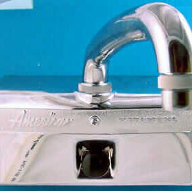
- Okay…one more thought: That sink isn’t impressing me. Looks dinky. How about putting in an Elkay stainless steel with drainboards (the drop-in style, not the countertop style) to give the space more anchoring, heft?


So….there you go, Alice. Thank you so much for sharing all these photos with us. Hey, where’s the aqua bathroom? The living room, the dining room…and do you have a knotty pine or wood-paneled rumpus room hiding in that gem? We want more. We can never get enough of fabulous time capsules like yours!
Readers – as usual, all of your comments and ideas are welcome as well! Keep the wallpaper, or not?