

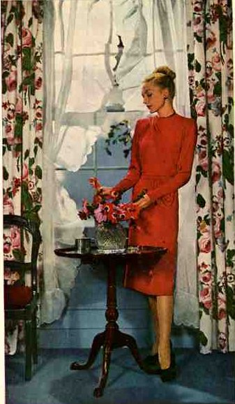
Quickly after World War II ended, Americans plowed right into making a wonderful new life for themselves – starting with building their dream kitchens, dream bathrooms – dream houses. Looking at periodicals from 1946, I can see a few distinct trends – this was a transitional period…you still see many Deco influences…you see a lot of primary colors…and definitely, interiors were “sweet”, although in ’46 homeowners certainly would have declared them “modern.” Read on for ideas from each of six great interiors, including a bathroom, two living rooms and a bedroom. 1946 was a very good year!
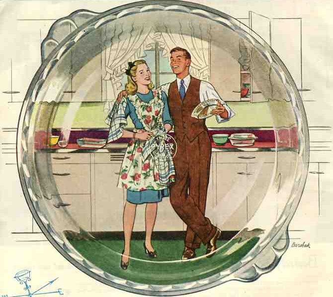
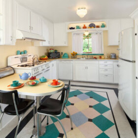
Tips from the first kitchen image — isn’t the “life through a Pyrex pie plate” awesome?:
- This color combination: Dark cherry red linoleum countertops, primary green linoleum floor, white metal (or wood cabinets) with deco pulls seems to have been very, very common.
- In this image, you also see a light chartreuse green on the wall – this, or yellow, also seem to have been popular secondary colors.
- And flowered fabrics… These kitchens are pure prettiness. Image: Pyrex, of course.
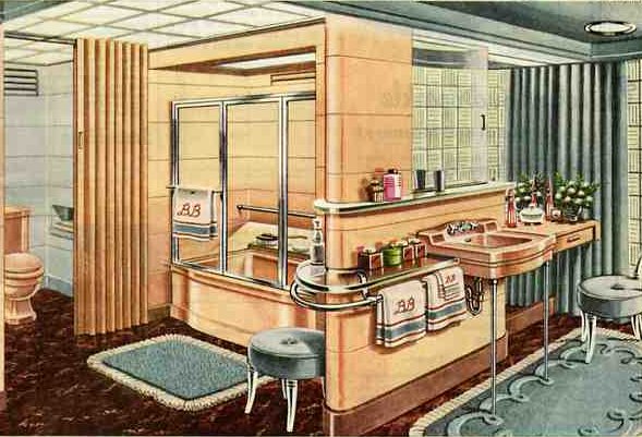
Isn’t this Briggs Beautyware bathroom just gorgeous. To be sure, there is a lot going on. Observations:
- Great color combination: beige – almost salmon tile, light baby blue (ala today’s “spa blue”), brown linoleum floor. The darker floor in both this image and the kitchen above “anchor” the rooms.
- Very ’40s: the fringy rug in front of the tub, striped and monogrammed towels, chenille-scalloped rug in front of the sink, tufted dressing chairs, and all the Carrera glass (used instead of tile on the walls).
- Last time I checked, today’s linoleum is not recommended for bathrooms – but if you are dedicated to keeping standing water off the floor – or want to use it in a 1/2 bath, go for it.
- Notice the full length mirror behind the dressing table at the far right.
- That full length drape – and of course, the glass block – both add to the luxe feel. Image: Briggs Plumbing.
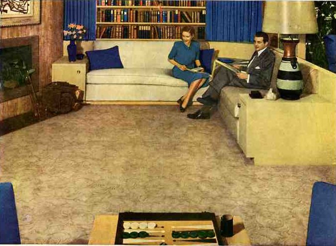
- Blonde wood – similar to Heywood-Wakefield’s classic champagne (I believe) finish. This room definitely has a primary color feel.
- The lampshade: I’d call that “40s”…”waxed foil”?
- The patterned rug – definitely promoted heavily in the 40s.(You can see it in my header!)
- The built-in couch … a continuation straight of of 20s and 30s moderne designs
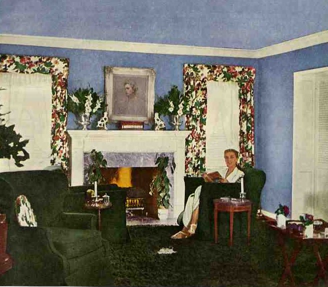
- Oh my gosh, oh so ’40s: lavendar walls, emerald green floors. Combining these “secondary” colors of the color wheel is always on the “recommended” lists that were so common during this period.
- Chintz draperies – scalloped valance
- Notice the Staffordshire dogs on the mantel – very classic.
- Not a ton of furniture in 40s interiors. (Today, our interiors are way jammed compared with the immediate postwar period.)
- Note the style of the deco club chairs. And, there’s a colonial wing chair in the foreground. Image: American Home.
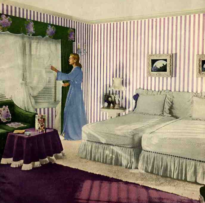
- Here’s the purple/green color combo again.
- I’m calling the bedding: dove gray, although it’s hard to tell from this image.
- The wallpaper – very sweet, simple…and combined with the chintz curtains and scalloped valance (again…) even more so. Note: I’ve found some not-too-expensive wallpaper in this vein and will feature it soon. Image: American Home.
- Cabbage rose chintz pinch pleats with frilly undercurtains. American Home.
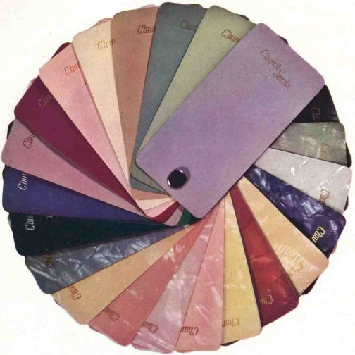
Remember this palette? It’s from the Church toilet seat company – and it captures the 40 palette very will indeed. Happy decorating all you owners of 40s homes… Jason K…Carleton Heights Girl… Neil.. and more! Ad: Church Plumbing.


Retrocat says
I love the images! I was born in 1955 and I remember the first 3 houses we lived in had predominately pink walls. That seemed to be the color scheme for the majority of the houses in one particular neighborhood we lived in. If rooms weren’t painted pink, they were mauve, or pale institutional green. Painting the house interior an off-white color didn’t come into vogue until the mid 1960s. Blinds were wider and were called ‘venetian blinds’. Draperies were in, especially the pinch-pleated kind. Shutters were in vogue during this era, also. They were a little different than today’s plantation shutters. Pink, mauve, and beige carpets were very much a part of this period. The sculpted carpets didn’t come into vogue until the mid 1960s.
That’s how I remember it.
retropink57 says
Jeanne
Thanks for your fab suggestions! I seriously need all the help I can get! My countertop now is original to the kitchen and it’s solid black. The backsplash is solid black, too, and it goes all the way up to the bottom of the upper cabinets. I was going to keep the backsplash the same as the new countertop but maybe I’ll leave the backsplash off and just paint!
Retropink57
Mid Mod Pam says
Tammy, I am looking at the photos you sent me. I will queue them up for a post this week. Question, though: Why do you want to get rid of the countertops? Are they in bad shape? If not, I’d recommend to keep them…?
retropink57 says
Rikki
Thanks for your great suggestions! I love the idea of linoleum instead of the VCT squares but I have a question: Do I have to piece the linoleum together with a border and liner or is the linoleum manufactured in one big piece like that?
I also love the idea of pink/burgundy/grey…maybe I can add the dark green in the form of leaves in a 40s print floral in my curtains and wallpaper. I don’t have those patterns picked out yet, but I have an idea in my head. I’m waiting for something to ‘jump out’ at me…you know how that goes. I might find something tomorrow or it might be next year!
Retropink57
Jeanne says
The first house I bought (ahem, 1981) was built in the late 40s and had that exact dark red countertop with metal edging and white cabinets!
I love all the images you’ve posted. Fantastic ideas for the 40s look. I think Tammy/retropink57 should go with the maroon and grey, with the chartreuse green as an accent color.
I love the blonde furniture. I bought a blonde dresser at a local antique/used furniture warehouse. FYI Russel Wright is the one who coined the phrase “blonde” to describe the light furniture (or so I’ve read). He was the Martha Stewart of the 30s-50s.
Also, I’ve noticed that monogrammed items are back in style. It would be fabulous to own some monogrammed towels as shown in the one picture.
Anita says
I particularly like the first two pictures, the kitchen and the bathroom. The kitchen cabinets, countertop, counter edging and handles look almost exact to the house I grew up in (built in 1950). Love the 40s! (but then, I love the 30s, 50s, 60s….., tiki, diner, oriental….. too many good things to just stick with one!)
Rikki says
You can see a distinct demarcation in the advertising … before and after Hiroshima. The word I would use to describe it is sheer exuberance! I swear there are people kissing on every other page alternating with babies!
The stylish traditional look was a continuation of the 1930s, but modern styles for young modern adults could be seen more, especially in the pre-fab housing of the period. The constraints of the Depression and lack of new housing during the War had built up a tremendous demand. During the War, everyone had been investing in War bonds. They were ready to cash in!
retropink57: You could easily use grays, burgundy, pink, and a dark green. Give it a little life with a rich gold highlight. You could skip the tile and use linoleum with a border and liner instead. Very retro 40s and consistent with the Cape Cod/Minimal Traditional style, but itS modern enough now to be pleasing to live with (and easy to maintain).
As for linoleum on the bathroom floors, Pam. It works fine for small bathrooms as long as it’s sheet and has been sealed and caulked. Armstrong and Forbo both waffle about its installation and both show pics of bathroom installations. I wouldn’t use the click product or tile, and patterned designs are out. I’ve used it in both my bathrooms and I love it.
And you’re right about standing water, but then that’s deadly with any flooring.
R.
Mid Mod Pam says
Rikki – thank you very much for these comments, they are very useful indeed!
Wendy says
Love the 1940’s images! Your description of “transitional” is exactly what I love about this era. My family was pretty frugal, so my grandparents’ house included a few turn-of-the-century antiques, danish-modern pieces, Hawaiian textiles, and some 50’s kitsch. The beauty of recreating this look for my home is that it’s cheap, and found items can originate from anywhere in a 50 year span.
Elizabeth Mary says
Sumacsue, Love the pyrex and it is the best for making sure the crust bottom is cooked. And, as you say, the handles make getting a bubbling pie out of the oven safer and easier than with pie plates with no such handles.
sumacsue says
I love that illustration with the pie plate. How clever of the illustrator. I have several of those pie plates, formerly owned by older relatives, and they are great because of those little tabs for grasping with potholders.
retropink57 says
Hi Pam
I live in a 1948 Cape Cod and I’m in the process of renovating my kitchen…as you know from my pictures and questions I bombarded you with! I had originally thought I wanted to go with pink and aqua but since my pink appliances are very early 50s (therefore soft and round), I’m learning toward more of a 1940s look for the kitchen. I started getting major cold feet with using aqua (even though it’s one of my favorites) so I’m going with my gut-feeling and scrapping that color altogether with my kitchen reno.
Instead of the aqua boomerang countertop with my white cabinets, I’m thinking about the Formica VirrVarr grey. I had picked out aqua and grey 12″ squares for the floor to be arranged not in a checkerboard but a slight variation to where I would end up with diagonal rows of aqua diamonds on a grey background (I sent you a picture a while back). Now, I’m thinking about replacing the aqua with a burgundy. Would that go with the pink? Or should I not use squares at all?
Or maybe I should pick a different countertop color? Any help is greatly appreciated! Thanks so much!!!!
Tammy – retropink57