

 The Mad Men ad men were very busy gearing up both the set design and … enthusiastic models … in my 12 Hotpoint kitchens from a 1961 hardware store calendar. At first glance these scenes all appear a bit silly. But thinking more about “why”, I remember that, through most of the 1950s, advertising images were mostly illustrations — not photographs. Toward the end of the 50s, magazines started switching to photography. When I went to that Al Parker exhibit at the Norman Rockwell Museum exhibit two years ago, I learned all about it. I recall that the change had a lot to do with printing technology (register? plates? I forget.). So, imagine: If these had been illustrations, they would have seemed idyllic, idealized. But as photos, the realism gets in the way, and the representations seem stagey, silly even, instead. I sense a definite shift under way, as art directors try to figure out how to move from the “old look” to the “new look.”

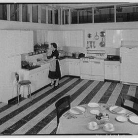
Staging aside, the kitchens are fabulous, don’t you agree? Looking at the first, blue kitchen, I have the opportunity to mention: I like louver doors. I also like how the brown of the ceiling beams is continued in the wall color… and look at the wood floor, nice. In our knotty pine example, above, the brick veneer walls are fabulous, and hey, turquoise appliances look good with knotty pine, don’t they? Boom. Pow.

What the heck are these two lovelies doing? Oh: Sewing. See the machine behind the woman in the little black dress. Rejuvenation: No need to replicate the clown-nose cabinet pulls, thank you very much. Oh my, the valances — imagine the dust and the grease, and the little bobber-doodles decorating the table — why? That said, the color composition here is lovely, the fridge is integrated nicely into the drywall, that oven and stovetop look pretty great, and look, those are windows flanking the sink, overlooking the city skyline where the redhead is planning her night on the town. Note: All of these images also have been loaded into the 1960s kitchens, bathrooms and more gallery, where you can see them 1200 pixels wide. Batch #2 of our 1961 Hotpoint calendar kitchens tomorrow.


Sara in WA says
I look forward to seeing what you find to go with knotty pine. I was in an upscale kitchen cabinet showroom today and they confirmed what I already knew: pine is very, very soft. He said the guys would nick them with their belt buckle carrying in the new cabinets and they would dent/scratch. Which is why they do the “distressed” look as an option. Here in the NW “knotty alder” is very popular. Alder takes stain beautifully so you can get the look you want whether light or dark. If you went a little yellow with the stain it would mimic the pine. Remember the “form follows function” thing.
Tikimama says
The red bobber-doodles remind me of the floats they had in the swimming pool where I learned to swim as a kid – told us where the shallow end ended and the deep end began. Those cabinet knobs are hilarious! I couldn’t stand to have them in my kitchen.
As for the laundry in the kitchen, my last house has this configuration. Handy in a way, yes, but when you have a full household and continuous laundry, it’s hard to keep the dirty clothes from spilling all over the floor. I longed to move my washer and dryer to a hall closet. It was better than my first house where I had to do the laundry in the garage with the dogs – hated that! My favorite is what I have now: a conveniently located laundry room!
Tamara Hoffbauer says
Have to second Carole’s opinion on dusting – we have several original louvered doors in our 50’s house and while they do look cool I honestly can’t stand trying to keep them clean…
Carole says
My inlaws had a Hotpoint stove for over 35 years, until it broke down and wasn’t possible to repair. It was a great stove. I loved the huge work surface that it has on it.
I like louvers, but I would not want to dust them. lol Been there, done that.
I was wondering what the heck those were hanging from that table. They look like giant red beads. lol
As for the kitchen laundry area, my laundry is in my garage, and unless I build onto my house it’s never going to be inside. I thought I would like having it out there, but I hate it. Let me tell you, it would be much handier to have it in the kitchen (or hallway), hidden behind some doors. More centrally located and easier to deal with. Though there again, the dust issue, because no matter how tight the connection, there is always dust associated with the dryer.
nina462 says
I love your descriptions. My kitchen cabinets mirror the 2nd photos…so when I replace my current black fridge & stove/microwave, I should go with turquoise and a copper range hood? I was going towards red appliances (as I have a cherry theme)…but hmm, turquoise?
Anyone notice the ashtray next to the phone in the laundry area of the turquoise kitchen?
pam kueber says
nina462, i think that knotty pine could go with a number of colors… i’ll keep this on my list and maybe try to make a photo gallery at some point of different color combos.
Mark says
The table is sitting on a giant bongo drum, or it’s supposed to look like it is anyway.
Eucritta says
I love the turquoise bottom-freezer fridge in the second photo. Not long ago I ran into photographs of the inside of a similar fridge – and I dearly wish I’d snagged captures of them, too – that had turquoise and foil accents on the drawer pulls, etc. Very pretty.
Those twisted-wire ice-cream parlor chairs were very uncomfortable!
Tamara Hoffbauer says
I must say I LOVE the super-mod yellow and orange kitchen. Yes, it is completely ridiculous, but I am a sucker for orange, what can I say? Not sure about those vintage ice cream chairs at the table though.
I must point out that many modern houses have moved away from laundry in the kitchen, and while I prefer keeping dirty underthings out of my food prep area, I wonder if the idea of the kitchen being the center of the (wifely) home hasn’t actually diminished somewhat these last couple of decades. (Now that we aren’t quite as chauvinistic.) We all still say it is the “heart of a home”, or our favorite room, or where everyone hangs out at a party – but why NOT have a laundry space and a sewing station in there? I have some lovely vintage kitchen layout pics with a big comfy couch in the kitchen. Nice!
One last point…I love how the interior design rules of the 50’s-70’s era always relied on the trick of multiplication. If one ship on the kitchen wall is good, five is better. (Note the one right at the ceiling?!) If one pan on the range splash is good, three is perfect. If one orange doo-dad accent is good, let’s plaster them all over the cabinets! I think something that makes for good design today is learning a wee bit of simplicity, even if you do it in shocking turquoise and chrome. Thanks for the pics, I recently discovered your blog and LOVE it!
~Tamara
Mel Kolstad says
Pam, your description of this kitchen is HILARIOUS!! “Clown-nosed pulls”? “Bobber doodles decorating the table”? Just fantastic. 😀 I also enjoy the early “photoshopping” of the big-city outside the window when clearly this is a suburban home (or more likely, a decorated set)! Oh, and one more thing – how uncomfortable do those cafe chairs look? 😀
Maryanna says
Ha! I actually rather like the clown-nose cabinet pulls! I suppose it comes from a deep rejection of wood-grain surfaces in a kitchen, but I absolutely love the bright color combo and the smooth geometry of the design. It looks so clean and bright. (I agree about the table though…what the heck are those things?)