


It’s time again to enter to win “Love the House You’re In” custom collage by Mel Kolstad. Her latest creation — for last month’s winner, Stacey — is above. Isn’t it amazing…? Imagine what she could do with your house — it’s easy peasy to enter….
To enter this month’s contest, leave a Comment answering the question:
What color paint (or wallpaper design) is on your kitchen walls right now? Optional: Are you happy with it? Please read all the rules here before entering, they all apply.
Just like last month — this contest rewards regular readers, because I’m only leaving it open for 48 hours. I’ll pick a winner on Tuesday morning.
Meanwhile, here is what Mel had to say about her latest creation:
Look at this little gem of a house! When Stacey sent me the photos, I knew instantly how I was going to create the collage. The house and the surroundings have a very “ecclesiastical” feel to them – that’s the only way I can describe it. There is just something so peaceful about this place, which is why I used the calming greens and browns to highlight the house, along with the “overcast” sky. The tiny stones were a wonderful challenge to recreate, too! So there you have it. I don’t want to play favorites but this house was REALLY REALLY fun to do! 😀
Thank you, Ms. Mel. You can experience more of Mel’s world at her blog: Ephemeraology


tulsatammy says
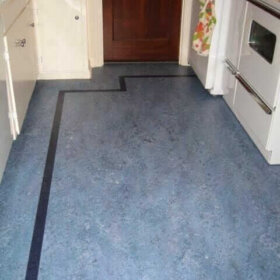
The color in my kitchen is Sherwin Williams’ Hubbard Squash. It is actually an Arts & Crafts color & my house is a 1957 L-shaped Ranch, but chose the color it four years ago when I moved in to cover the two-toned grey sponge painted walls. That’s because my cabinets are two-toned grey, my countertops are grey, and the floor is grey. It was a really depressing color scheme when I first saw it.
Nina462 says
I have white wainscotting up half the side of the walls and a creamy latte color above that (it’s not greige). The walls are decorated with cherry chalk ware pieces and a lovely 1940’s bird house clock. And today I just ordered a red kitchen hutch! I can tell it was originally wall papered but I don’t know for sure with what – I think it was a brick pattern ala the MadMen kitchen. I did contact the relatives of the lady who originally had the house built (she just passed away) – they stated they’d be glad to send any original pictures when/if they come across them. As you all know I have a cherry theme in the kitchen –
Jay says
Well, when I moved in the kitchen walls were white and the chair rail in the corner was screaming yellow to match the 57 yellow countertops. When I had the countertops replaced,(badly worn) and electric coil cooktop shot, it was a beigy color with specks and the new cook top was electric coils also. Even though it was updated, the overall 50’s feel is still there with the birch cabinets and through the wall exhaust fan. Oh yeah, the walls are a pale yellow with a hint of green. I like it, it’s all easy on the eyes. I just need to get the shelves up to display the old pyrex.
Suzi Hughes says
Pick me! We have a reptilian back splash. No kidding. It looks like a snake shed it’s skin right on my backsplash.. :O
We also have a mustard oven. Not the original to the house (1956). I think the previous owners updated the kitchen in the late 60’s 😉
pam kueber says
May you live an interesting life, like the Chinese saying….
Jennifer Loepker says
What color is my kitchen????? Funny you should ask. I’m in the process of re-doing my kitchen and we’re almost done. I knew I wanted to paint my cabinets a creamy white but there was no question as to the wall colors. I painted the whole house 5 years ago. I can’t go with just one color, so I picked 3 shades of the same color – Green! Technically it’s Lowe’s Eddie Bauer collection colors Curry Green, Patina and Pine Needle. But basically it’s comfy green, home green, calming green. With the re-do we’ve added the last shade – Gelato – to the wainscoting we put up. I loved it when I first painted 5 years ago, and I love it even more now. With new countertops and my island painted Sienna red, schoolhouse white globes with red stripes, it’s more fun to come home to than ever. It’s not my “vintage” project – that’s at our river cottage – but I’ve added lots of vintage touches. My kitchen is happy green!
Karen Day says
We don’t have much actual wall space in the kitchen (mostly cupboards) but what little we do have is painted in Dunn-Edwards “Opaline”, a beautiful aqua. I originally painted the walls pink to coordinate with the pink sink, but it turned out too Pepto-Bismo-ish, so I changed to the aqua. The cupboards are D-E “Cottage White”.
Betsy Ward says
I was so shocked to see the collage of Stacey’s house because the roofline is so similar to mine…but please don’t let that stop you from picking me this time! Shortly after moving into my 1957 house, I realized why the former owners had put textured wallpaper on many of the walls. The plaster underneath was pretty rough in spots. I’m sorry to say, I painted over the wallpaper (not ready to deal with replastering yet) with Behr’s California Dreamin (yellowy-green) and a nice aqua on the soffits. I still love it 4.5yrs later.
stacey says
***THIS IS NOT A SUBMISSION*** 🙂
That is my lovely home up there, as created with Mel’s amazing vision. I must say, she got the details spot-on, down to my bullet planters, the winter treeline, and yes… the rock garden of ‘landscaping’ that I have left. I was VERY self concious over sending her a photo of the house in the dead of winter, when you think that everything looks ugly but she created a collage that literally caused the house to pop out from under grey skies and sparse foliage. I literally see something new in it each time I take a look.
I highly advise everyone to take a minute or two to enter this lovely contest that Pam and Mel coordinate. To win would not only get a lovely original piece of art, but a family keepsake.
Thank you ladies !!
pam kueber says
Mel, I agree: This is an amazing collage!
Mel says
Pam, you are so sweet! Thank you so much for all you do for me, which is a LOT. Making these collages for this wonderful blog and meeting you and all of your fabulous readers is such an amazing experience!! 😀
Mel says
Stacey, it makes me jump for joy that you like your collage. I can’t tell you what it means to me to hear you say all those nice things about it. I LOVED the photos that you sent and I fell in love with your house instantly! You have a real gem and it’s obvious how much you love it! Thank you for allowing me the opportunity to make the collage for you! 😀
Caroline Ramsay says
The cheery and bright kitchen in my 1960’s North Vancouver B.C. Canada Post and Beam was not always thus. When we moved in, we replaced the dark green wall to wall carpet with cherry red Marmoleum and removed the rainforest scene wall paper (that took the idea of bringing the outdoors in to a whole new level!) painting the walls a pale sunny yellow with white trim.
Peter in Jax says
The wall color of our kitchen is a Tiffany box blue. Am I happy with it? I was, but am leaning more toward chartreuse so that it flows with the color story present in the rest of the public rooms.