
How classic is this color? When I was at the Ringling Museum in Sarasota this summer, I took this photograph of Carlo Dolci’s “Blue Madonna” — blue being the color typically associated with the Virgin Mary in Western art. Dolci was a Florentine painter patronized by the Medicis, and he painted this exquisite portrait sometime before he died in 1687. A classic “midcentury modern” color, indeed — in either the 17th century or 20th century.
Seven Reasons Why Rimini Blu is my Color of the Year:
- Since the moment I spotted my first piece of Bitossi Rimini Blu, in summer 2010, I was mesmerized — the color is so pretty to me.
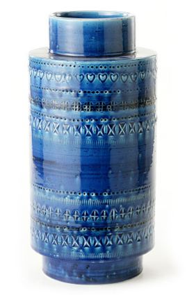
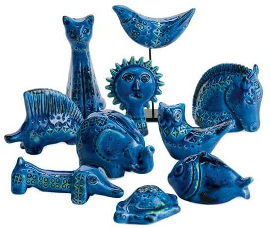
- The color has a wonderful midcentury pedigree. Londi was a fascinating person. He started doing ceramics when he was 11. According to the website ARS Longa he was held as a prisoner of war in South Africa from 1935-1943. After World War II, he began working with Bitossi and ultimately became famous as its art director. His first line for Bitossi — Rimini Blu, named after (1) the historic Italian coastal town and province of Rimini and (2) the proprietary glaze — seems to have been an enormous hit. In the U.S., the line was marketed by Raymor and sold in many department stores. Bitossi still exists and still manufactures pieces from the Rimini Blu line. So — you can find these ceramics both vintage and new.
Orange and Rimini Blu play quite nicely together on my pillows. - Rimini Blu plays very nicely with my 2011 Color of the Year, Orange. In fact — if you follow color theory — you know that these two colors are exact opposites on the color wheel. Pairing exact opposites is a classic way to create drama in a room.
- When you ask people, “What is your favorite color?”, blue is the most common answer — especially among men. Throw the guys a bone.
- Rich Rimini Royal Persian Lapis Lazuli Cobalt Blu, used an accent, gives your room punch (like black would)… Use it strategically throughout a room, it will help keep your eye moving playfully — dancing — around.
- It’s not “trendy”. In 2011, I’d say the mass market color story was: Greige and citrine. In 2012, I hear that we’ll be seeing purple and even teal — to layer on the neutral greige that’s been added everywhere. Rimini Blu, on the other hand, has a strong basis in history, so it’s less likely to be less closely aligned with any specific date — more “timeless.”
- I love to play the contrarian, and think that this color is kind of underappreciated in mainstream pop culture interior design today. This is a wonderful, storied color.
More information about Rimini Blu, from a press release for Bitossi Ceramiche, in English as translated by Google:
When and how: the birth of the Rimini Blu collection
Aldo Londi has been the creative soul of Bitossi Ceramiche for 40years: Thanks to him we have the Rimini Blu collection that is officially dated to 1959 when it was firstly cited on the notebooks of Raymor, the American importer and distributor who first introduced Italian home design to the US market. Traditionally this collection is dated back to 1955 when Londi created the big “Ball Vase” in the characteristic Persiano Blue, but only a few years later a group of objects all bearing this special effect and chromatic tone are gathered into a line of products that was called Rimini Blu. A collection with an extremely modern background for the playful and allusive sense of shapes and for this special decorative technique that was conceived purposedly in the post-war years when it had become necessary to find ways to employ in the growing ceramic industry a not trained labor from agriculture.That’s where this embossed pattern comes from and it combines a easy technique with the advantage of a pleasant and stunning effect, underlined, in the Rimini Blu, by the chromatic effect obtained by putting underneath yellow and black stripes in those points where the blue turns to green. (emphasis Pam’s)
Hey, if there are Italian speakers in this crowd who can provide a better translation, I would much appreciate it!
More to come on Rimini Blu throughout the year. Meanwhile, here are some more resources:
There is always a lot of Bitossi Rimini Blu promoted for sale on ebay:
It might be by Bitossi, an Italian manufacturer who produced the Rimini Blu line, but I don’t think this particular example is part of the line in question. The blue glaze is similar, but the impressed designs are not quite right. Rimini Blu was designed by Aldo Londi, the art director at Bitossi, and beside the tell-tale blue-green faience glaze was embossed with a series of shapes: circles with hatch marks through them, series of parallel lines, etc. I’ve never seen a marked piece of Rimini Blu without the circle with the # sign embossed in it.
Just to clarify the name of the line, it indeed is Rimini Blu … not Raymor Rimini. Raymor was a distributer of mid-20th century decorative arts, and had shops in Chicago and New York. They also distributed wares to higher end department stores around the country. Designers from all over the world sold their wares through Raymor, which began as a collaboration between the Richards-Morganthou (where the RAY-MOR name came from) company and famed American industrial designer Russel Wright as a means to distribute his first line of dinnerware: American Modern. That line was such a success Raymor went on to add other designers to their roster: Ben Seibel, Michael Lax, Arthur Umanoff, Richard Galef, Aldo Londi, Marcello Fantoni, and dozens (if not hundreds) of others.
The problem with designating a piece as “Raymor” comes with the many competitors bringing similar wares into the United States. One such company, Rosenthal-Netter, employed some of the same manufacturers as Raymor … including Bitossi. Many less-than-honest sellers on eBay and elsewhere are trying to capitalize on the cache held by the Raymor name, and thus are marking every unknown piece of MCM Italian art pottery as being “Raymor.” This is a completely false practice, and only serves to disinform the casual collector. The only way we can say if an object is truly “Raymor” these days is if the item is marked with the Raymor name in the embossed or printed mark, or if it still retains its original Raymor product sticker. If a sticker remains on the bottom of your jug, it should be stamped with a product code including the three letter indication “BIT” if it indeed originated from the Bitossi factory.
Your jug certainly looks like other pieces Bitossi produced under the art direction of Aldo Londi, and it may or may not from the Rimini Blu line. I’m by no means an expert, though, and this is simply my opinion.
Bitossi marks?
Where to buy reproductions?
- By my count, Bitossi Ceramiche continues to make 105 different pieces of Rimini Blu today. It is sold at a variety of retailers, including online, but they do not each carry all pieces. So, I recommend: First take a look at the complete Rimini Blu product line on Bitossi’s website. Once you identify the piece or pieces that you are interested in, enter them as search terms into google.
Wanna get all art-smart about Dolci’s Blue Madonna?
Watch this video:


Bepsf says
I’ve been collecting Bitossi for over 10 years – I guess it’s time for me to cash in and sell my collection to pay for the next trendy collectible!
One little known thing about Bitossi is that Rimini Blu is not their only color. I have a bit of orange & brown, an Avocado Green compote, a matte white vase – and even some bright Red pieces including a monumental lamp base (my favorite!)
It’s been funny sitting back and watching the retailers knock off Bitossi: First it was Jonathan Adler with his Sgraffito line a few years back – Now we see it in WestElm’s catalog this season with their Aquamarine collection…
One of these days I’d like to go to Montelupo, Italy to see where my collection came from.
Chutti says
MMmmm…. blue and chartreuse gets a thumbs up here.
I think I overdid the blue and yellow 15 years ago, but it was my tiny dark little kitchen in the woods.
I’m more than a little obsessed with a Mid Century children’s book I read a lot. Anyone else know “We Help Mommy”? I keep recreating rooms from this book -that’s where the classic blue and yellow came from.
Images are here: https://www.google.com/search?q=we+help+mommy&hl=en&client=firefox-a&hs=ejn&rls=org.mozilla:en-US:official&prmd=imvns&source=lnms&tbm=isch&ei=MgfgTsGEPIaQiALaqaT4Dg&sa=X&oi=mode_link&ct=mode&cd=2&ved=0CCIQ_AUoAQ&biw=1011&bih=584
I am finally getting my dream speckled VCT floor in this house, and I giggle every time I see the new old-style tiny shopping carts with two removable baskets and front loader washing machines. I remember longing for these in that book, and now they are everywhere.
Long way of saying this blue really, really is timeless and goes with everything. Complementary, for sure.
Jane / MulchMaid says
Who knew when we put counter tops in our ranch five years ago that we were using the 2012 color of the year? I love, Love, LOVE this blue; it’s classic, lively and works beautifully with so many other colors (my kitchen has warm yellow walls, cork brown floors and cream cabinets.) Long live Bitossi Rimini Blu!
Jordanna says
It’s this colour’s year, every year, for my sister! She likes blue in myriad shades but this shade especially. We call it just cobalt though, but this is what we mean by it.
But me, I can’t figure out how to decorate with it. What colours does it go with? I mean my sister loves blue so much she’s happy just keeping it to a palette of pale blue, dark blue, silver, white. Which can work, in the right ratios.
But me, I don’t love blue *that* much, and blue and just white seems to be suggesting I live in a Mediterranean beach house, which I don’t. I think it could work with a Suburban Modern-type chartreuse, or am I kidding myself?