

 Reader Kami loves the built in 1970’s hutch in her dining room because of its charming details and storage capacity — however, the hutch isn’t jiving with the rest of the room and is in need of refinishing. Kami likes the eclectic mix of 1930s -1970s furniture that came with their house, but isn’t sure how to make all of it work together in this room while also trying to achieve a “cottage feel.”

Kami writes:
Hello Pam!
I came across your site by randomly clicking through blogs that discuss renovating and styling post-WWII houses. When I arrived at your site, I found a wonderful source for information and inspiration!
Here is my story:
My husband and I are teachers and we just purchased our first home. It’s a post WWII cottage that was maintained by the original owners until they passed away. When we bought the house from the owner’s children, we were sure that we wanted to keep the integrity, charm and style of the house. As an added perk, the children threw in nearly all of the 1940s – 1970s furniture. That brings us to the design dilemma.
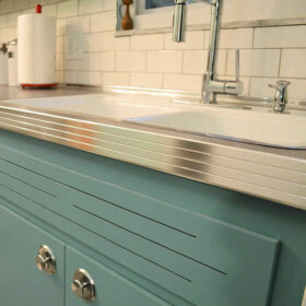
Included in these bonus pieces is a really cool built-in hutch/buffet. It’s at least nine feet long and has these really cool yellow/green plastic panels. I really like it’s functionality and form. The top of it is brown woodgrain laminate, which is super helpful when you are using the buffet to serve food because once the guests have left, it’s a simple spray and wipe cleanup with no lasting damage to the piece. The only problem is that it is painted with a faux wood grained pattern that is peeling, and has blotches of different paints all over it. The laminate is starting to peel off as well. I don’t mind that it’s brown but that particular shade looks kind of wacky with the super cool table that we received with the house. The table and chairs are in the Hepplewhite style and they are a rich mahogany brown. The walls in the room are a blue grey color, which accents the paintings and the peacock blue curtains.
I’m leaning on painting the hutch, but I have no idea what color I should choose. The panels are yellow green, the table is mahogany, the paintings are blue, the walls are grey and the wood floors are red oak. I really want to try to keep the room in the 1940s-1950s design aesthetic, but leaning towards a cottage style. If you all have any tips, I’d be really grateful.
Sincerely,
KamiP.S. We haven’t added the molding to the room yet, because it is being repaired. It will be painted white when it’s done, though.

Repeat the colors and shapes already in the room
Kami — that’s a tall order. Blending so many styles can be tricky. One trick to use when making an eclectic grouping of decor look less chaotic and more intentional is repetition of colors and shapes.

I know the obvious thought for the built-in might be to paint it white, but before you decide to pull the trigger on the white paint, consider trying to repeat the color of your wood dining table — the deep mahogany — on the built-in.
Rustoleum makes a product called cabinet transformations that Pam has mentioned several times here on the blog before. They have an extensive range of colors available — surely one would match your table — and the cabinet transformations system can be used over laminate. I think making the built-in cabinet match the dining set would help unify the room and balance the darkness of the wood around the room.
Adding a large rug under the table — like this one from Albert & Dash — would help make the space look more finished and add a medium color tone to the room — bridging the gap between light walls and dark wood. We chose this hooked rug style because you said you wanted to evoke a cottage design; you could also use a braided rug.If you are being very budget conscious — shop vintage and at estate sales… Pam says she sees rugs in both these styles — large vintage ones — very inexpensively priced where she lives at estate sales and thrift stores. In reality, the colors in your rug help set the colors for the entire room. Just make sure whatever colors you choose don’t clash with the mahogany — I would probably stick with blues, greens, yellows — which allow the reddish mahogany to stand out — instead of rugs that are predominately red or orange. The mahogany already has a warm red tone — adding too much more red to the room could make it feel too intense.
The pattern in the rug also evokes of the shapes in the yellow plastic panes of the hutch in addition to the decorative grooves on the lower doors and even the shapes of the chairs in the dining set. The cottage blue color we chose of the rug complements the artwork. Painting the small piece of wall between the upper and lower parts of the cabinet the same cottage blue color as the rug would help carry the color around the room as well as provide a high contrast backdrop for the lovely white dishes that Kami has displayed on the hutch — really allowing them to pop.
Instead of keeping the walls light grey, I suggest painting them a pale lemony yellow to echo the yellow plastic door inserts in the hutch and the gold accents around the room. The yellow also brightens up the room, helping to achieve a lighter and more airy cottage feel. Once the white moulding is installed, it will feel much more crisp. To finish off the room — especially if you want to reinforce the cottage feel — you could swap out the peacock blue curtains for fresh and airy looking white curtains. However, the peacock blue curtains would still work with this color scheme if you end up liking the more formal look.
It is possible to successfully blend varying styles and decades together in one room — through the repetition of color and shape — like I’ve done above. Repeating the same colors (mahogany wood tone, white, yellow and cottage blue) evenly throughout the room helps make the room feel cohesive, while the repetition of similar geometric shapes (rug pattern, chair back, hutch doors — even the mirror) adds interest and further unity to the room’s design.
What do you think readers?
What would you suggest to help Kami unify her dining room?


Annie B. says
As much as I hate to destroy the authenticity of that hutch, I believe I would remove the top down to the buffet bottom and hang a large mirror over it. Might make the room look larger and lighter. It seems long enough so that a lamp could be placed on it for some softer, indirect lighting. Also, maybe a mural over the buffet might give a cottage-y, 1940’s feeling to the room.
Wonder if the top of the hutch could be repurposed into something like a headboard?? Or use it as a wall cabinet in another part of the house? Just thinkin’…..
Kate H says
I like the buffet, and if it needs new laminate you could replace it with tile, as mentioned (maybe fun 70s tile), possibly something mirrored and plastic (so it wouldn’t chip — the disco buffet!) or if it wouldn’t be too depressing, granite or slate. I don’t like granite, but it is good for hot dishes. I don’t like slate as a countertop, because I’m used to walking on it and it makes me feel unhygenic to put a plate on it. But it might be good in this application.
Hey — what about surfacing the top in cork? Has anyone tried that?
Joni says
I think that surfacing the buffet in any of the click-n-lock flooring options (cork, wood, stone, etc.) would be an easy and inexpensive solution.
(and since Kami needs only a few square feet, check the local Habitat ReStore!)
With all of the matching trim options like transition strips and stair bullnose, it shouldn’t be too tough to finish the lip of the buffet top.
Lynne says
Hmmmm…A couple of ideas right off the bat.
First, if that table has leaves (or is it leafs?) in it, remove them and make the table smaller. It’s eating the entire room. Put the extra chairs in the corners or elsewhere in the house. Loose the drapes, find something you love and use that fabric for the windows and recover the chair seats. Personally, I would go with an avocado green or a gold to go with the hutch panels. If you can get enough of it, I would also put the same fabric in the “void” between the top of the hutch and counter. You can stick this up easily with liquid starch.
Rustoleum also has a furniture restore kit, to go along with their other transform kits. It has colors, and some fabulous wood tones, if feel you must paint the hutch. I would replace the counter top, yes, but maybe you should live with the wood tone of the hutch before you do something to it and regret it later.
I’m not an area rug fan, but even if I was, this room has lovely wood floors and is too small for one. Save some money and skip the rug.
Diane in CO says
p.s. I also wonder if there would be some way to “beef up” the door frame at the end of the room a bit to balance the large hutch? Yes, and paint the ceiling vent as lynda suggested.
Also, it would be simple to replace the yellow-green glass in the hutch doors with beveled or leaded glass.
Genevieve says
If it were mine, I would paint the hutch a medium green, a bit deeper than the panels, but light enough to use a dark over glaze to accent the neat detailing, which is kind of lost when there is all that wood tone. I would leave the countertop as it is, or replace it with walnut butcher block or walnut laminate. I might even only paint the doors, and leave it two toned, but I would definately do an over glaze treatment to bring out all the neat joinery and edging. If not medium green, then blue– “colonial”, of course. Either color would fit all decades of that era. You can find color swatches from those eras, and medium greens were popular, as were blues. Reds wouldn’t work with the mahagany. I would not paint it white or cream, it would make the plastic panels look odd. You would have to have other pieces that added up to the same mass also painted white for that to feel balanced. A two toned treatment is very keeping with the era, and would allow the hutch to compliment rather than compete with the table. If I had to replace the countertop, I might consider walnut butcherblock, or walnut laminate. I would go with an oriental carpet, it works with the formality of the room, they just tend to ground everything and pull everything together. That is my two cents. Neat cabinet and table, and congratulations!
lynda says
Green with a glaze would be very period correct and would go nicely with the plastic insets.
Diane in CO says
I love the re-done room pic – but lose the shiny brass swagged chandelier. Otherwise it feels very good with the dark wood and the blue, sophisticated while remaining cozy. Love the rug! Needs a rug – but no braided which would be too “country” IMHO.
Diane says
I would either buy laminate or solid surface material to use for the surface of the hutch. That would change the look of the hutch and the feel of the room. Whatever you decide take baby steps-its not fun painting a wood piece and then deciding you don’t like it .
Saundra A says
You could also consider a table runner or table scarf to break of the large expanse of dark wood and add a little more cottage look.
lynda says
This is a design dilemma! Do you think the top can be taken off? I think I would take it off and replace the top with some sort simple tile that might compliment the color of the plastic insets. (I bet the tile could go right over the existing top) I would tile the back splash area too. For a built-in look, I then think I would paint the cabinet a color or a white that matches the woodwork. Repeat the color of the tile or the plastic on the doors inside all of the cabinets and the open shelf. I would not keep books in the cabinet. I would use the entire space for dishes and glassware. Interesting serving pieces would look great along with dishes on stands for display. I would replace the hinges and handles with a brass if you decide to keep the light fixture. Although it might be a little crowded, you might try moving the table back more to the center of the room. It looks lopsided now. I would have the fixture moved so it does not need to be hooked to be in place. If the curtains are still in good shape, I think they look nice with the painting. Right now I can’t see the right color for the walls. I think it depends on the colors you use in adjacent rooms. The rug is pretty, but may be more upkeep than you want. An oval braided rug might fill the space better. Check out Capel rugs, they have some pretty braided rug colors. They have an outlet in Raleigh and maybe a few other places. I also have found fabulous deals on rugs at Overstock.com. I would make sure the rug would not show a lot of dirt or wear, since the area looks like it may be a passage way to the living room. Oak floors without a rug is a nice cottage look too.
And..you are very lucky–it is a beautiful space and the furniture is very niice. Also, I would paint the air conditioning vent to match the ceiling.
Holly says
We have a 1950s home and I’m totally going for the cottage style. If you don’t mind compromising the original integrity of the piece I would go for an either solid white on the built-in or a white-wash where you can still see the dark finish around the edges. I would leave the yellow/green glass and then use a yellow or green accent in the room, such as the rug. I would go with a light color for the walls and definitely white trim on the doorway. As for the table that would be a challenge to whitewash as well. Perhaps you are better off using some bright & cheery cushions on the seats and also find a table cloth or runner to place on the table that will help ease some of the darkness of the color in the room and blend the room better. Oh and I would definitely get a new ceiling light that matches your cottage feel. With cottage I always think whites, cool/bright colors and cheer. Good luck!