

 In this week’s Retro Design Dilemma, reader Jeanne is asking for ideas to decorate her beautiful vintage knotty pine bedroom. She wants tips on colors to paint the angled ceiling, along with ideas for window treatments and nightstands to match her beautiful Broyhill Brasilia bedroom set.
Jeanne’s full letter:
Hi Kate,
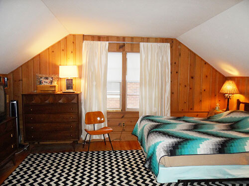
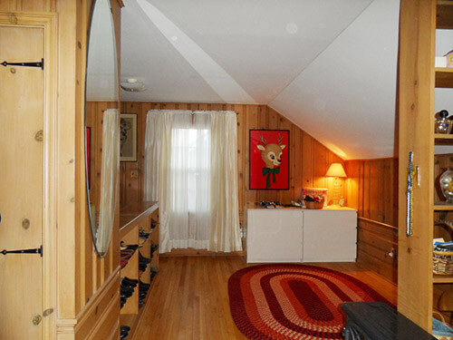
Here’s my knotty pine bedroom. I live in a story-and-a-half brick bungalow built in 1952. The upstairs is finished in knotty pine and is one large, open room. It has two sections, one which I use as my sleeping/bedroom area and the other is sort of a dressing, open area. The only thing I did before moving in, was have the hardwood floors refinished with three coats of polyurethane applied because I figured I’d never do it once I moved in.
I’m the second owner of the home. The widowed “woman of the house” passed away and her two sons (who grew up in the home) sold it to me (in 2008). I assume that the sons used the upstairs as their bedroom, because there are two sets of built-in drawers built into the kneewall/attic space – one on each side of the bedroom. The cool thing about the house is that the kitchen was custom remodeled around 1960 and the bathroom was remodeled in 1964. Everything is original to these remodel periods, except a year ago I stripped all the wallpaper in the bathroom (even on the ceiling) and repainted and wallpapered.
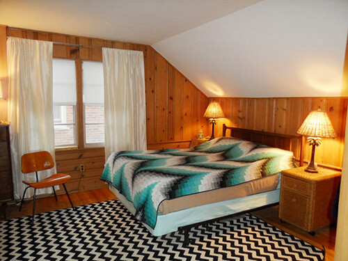
Two braided rugs were left in the bedroom when I moved in. I decided that I don’t really want to use them in the bedroom and have replaced the one on my bed side with the chevron rug (although I’m rethinking that decision but will use it for now). I plan on replacing the braided rug on the dressing area side eventually. I was thinking a solid color, depending on what color(s) I paint the room.
The ceiling and angled walls are white. A flat white. This is my dilemma. I really love aqua. I would love to paint the room light aqua. Do I just paint the angled walls and leave the ceiling white? Do I paint the angles AND ceiling aqua (the same color) or should I paint the ceiling one shade and the angles another for contrast? I’m open to a darker teal as well. I’m not sure if that would be too dark, or would make the room enveloping and cozy.
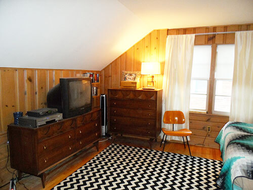
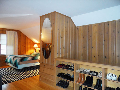
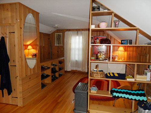
There are built-in book cases in the dressing area that I use for my shoes (I’m a woman, what can I say!).
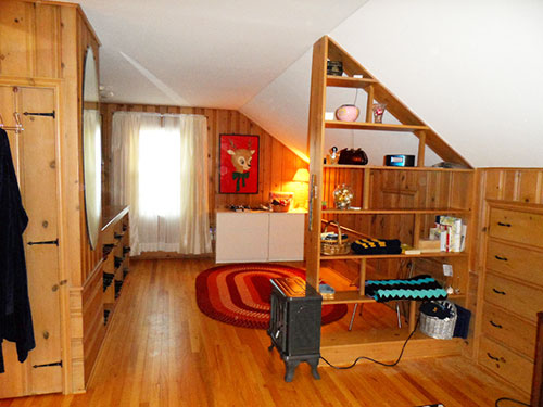
Also, there is a built-in open shelf unit that divides the two areas (I love it!). I was debating about painting the shelf unit (maybe a darker teal) and possibly painting the backs of the bookcases the same dark teal. Or should I leave the shelf and bookcases wood. There is a lot of wood in this room. Or maybe paint them white or black. Help!
Plus, my biggest challenge will be painting the ceiling area above the stairway (above the shoe shelves in the photo). I don’t think I can do a precision paint job using roller extensions and may have to hire someone for that area. A friend told me about using a “plank” but there is no way that I will be standing on something suspended above the stairs and I do not own one of those fancy ladders than transforms into scaffolding.
You’ll notice the closet and built-in drawers have the original black wrought iron hardware, hinges and pulls. I recently painted and re-did the inside of the closet (it was wood with one galvanized rod across). It has an angled ceiling – so I had to configure it to optimize the storage & hanging space with custom ClosetMaid parts I got at Home Depot. I’m really happy the way it turned out.
My goals for the room are:
• Paint the ceiling and walls (hope to do this between Christmas and New Year when I’m off work)
• Possibly paint the shoe shelves (backs only) and open shelf unit
• Find nightstands – either Brasilias to match my bedroom set* or possibly something modern from IKEA that I can mount on the wall. I don’t believe I have enough space for two full sized nightstands.
• New lighting – possibly something that mounts on the wall or turquoise ceramic vintage lamps.
• I’m not attached to the window treatments and will be re-thinking those as well. I saw some aqua velvet (not to be confused with “Aqua Velva”) curtains at IKEA (not sure if they still have them) or I also have some barkcloth drapes that I started cutting up to make valances. They are a cream background with turquoise and red tropical floral pattern.I went to school for and was a graphic designer/art director for about 20 years before switching to the account side of the advertising business. Yet, I have the hardest time trying to decide on something for myself. Just like the shoemaker’s children who have no shoes – either that or I have commitment issues. 🙂
* I found my Brasilia set on Craigslist and got it for $450 (Queen headboard, dresser with mirror and chest)! I’m still thrilled about it!

Thanks, Jeanne, for all this great information, and the photos. What a beautiful space — the knotty pine looks like it is terrific quality! We’ll be back at noon — with some ideas!
Readers, what do you think Jeanne should do?
Thanks to everyone who commented with suggestions or was able to tune in (or join in — that’s you Larry) live for our Google Hangout. Below are the three solutions that Pam and I came up with for Jeanne’s knotty pine bedroom.

Pam here: We know that Jeanne prefers aqua, but I wanted to show this first mood board — knotty pine and rust — to principally show how starting with your curtains — or, another complex colored textile — can be a great starting point to choosing colors for any room. In this case, I had these vintage rust and orange curtains on hand. I found them at the Goodwill and, well, have been hoarding them for some future project. I love how the rusty tones meld with the honey amber of the knotty pine walls and the oak floor. I found a braided rug in the same tones from Capel — I would make it big… I suggest a buttery yellow coverlet that picks up one of the colors in the curtains, on Wayfair.com…. and even would spray paint the traverse rod a hammered iron color to coordinate the rod with the knotty pine hardware used elsewhere in the room.
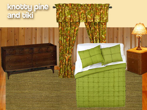 When I saw Jeanne’s knotty pine in combination with the Broyhill Brazillia and her tropical palm tree lamps, I immediately thought — tiki. I wanted to try to use what Jeanne already had in the room and make it work together. The Brazilia design reminds me of an up close view of a carved wood tiki figure and the knotty pine is reminiscent of a close up view of bamboo — perhaps like the bamboo that often lines the front of tiki bars. Even Jeanne’s existing natural wicker end table has a tiki feel to it because of its natural texture. I first found these Tommy Bahama Tropical Harvest window curtain panels (now gone from website) at Bed Bath & Beyond. They have a lot of the same warm brownish orange color that is already present in the wood floor and knotty pine walls. I picked out the acid green from the leaf design on the curtain and found this limey green bedspread (now gone from website) from CB2, which has a great modern texture instead of being just a solid block of color. For a rug, I chose this greenish hand woven Amesbury Jute Rug from Overstock.com, which also adds some earthy texture — that reminds me of a grass skirt — to the room without calling too much attention to itself. To finish off the room, painting the walls and ceiling a light, buttery cream — pulled from the curtains — will warm up the walls without competing with the knotty pine walls or any of the other elements in the room.
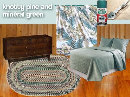 Pam back: Mood board #3 heads into the aqua-ish territory that Jeanne likes. However, as we discuss in more detail in our video, Kate and I are concerned that a strong aqua will be too clashy with the knotty pine… it may be too “competitive” with all the orange in the kp. But, we think that if you tone the aqua down somewhat — lighten it and grey it out, then the values of both colors will be harmonious. The color of this coverlet set from Garnet Hill is called “mineral green”, and I think that it would work. The blue/green in the vintage curtains (now sold) spotted for sale by ebay seller private screening are a darker version of the mineral green. I found another Capel braided rug that seems to have the right colors — all the colors from throughout the room. Pick up the stronger colors in the rug for your accents. For example, the Arcadia Green of the spray paint for the traverse rod.
So there you have it. Lots of ideas, Jeanne — we hope we helped, rather than just confuse you. For sure: Your room already is beautiful — that knotty pine is dreamy — and versatile. We’re… jealous… because we don’t have this room in our own house to decorate! Let us know what you decide — many thanks for sharing!


Sarah @ Crafty Waffles says
What a lovely room, I’m jealous of your master retreat space!
My suggestion from experience is: When you are picking out the paint, make sure you do test samples in situ – it is totally worth the extra cost because the orange colours in the wood really “throw” off your paint colour when the light is bouncing around the room.
I tried to get a soft grey/beige colour for our openplan livingroom, and the orange-y wood ceiling and floors made it look like cold concrete grey or lavender!
Oh, and I’m not a period purist, so I thought I’d mention that love your chevron rug, and thing it ads a nice modern feel to the retro space. If you wanted to stick with it, the black and white are a noce contract to the orange wood. Incorporating other more period fabrics like this (http://blog.vastudc.com/wp-content/dropbox/Maharam_Small_Dot_Pattern_by_Charles_and_Ray_Eames_1947_006_Document_Reverse.jpg) combined with your pale aqua and teal pops of colour (like your quilt – try turning it 90 degrees to better hide the sides of the bed, and layer it over a plain white/aqua duvet) could tie it all together if you limit the palette.
Too bad you’re not closer to Vancouver or I’d be happy to take it off your hands if you decided to go the ‘authentic’ route 😉
tammyCA says
I want that knotty pine bedroom! I’ve always wanted a cozy treehouse type “attic” bedroom. My 2 cents would be a green-blue muted shade of paint for the walls and ceiling…go to a used book store and look at the vintage books with that shade (or look on Etsy since people sell them in artistic batches)…even, decorating the room with a few of these books.
But, always get a bunch of paint small samples and test on different walls/ceiling because as I’ve learned the shade will change depending on the natural and lamp lighting (I have an aqua room that is both pleasing and jolting depending on the time of day…and, I wish I had thought it out before painting the entire small room in one afternoon!) (Also, since mine is a small boxy room the color is way too intense for such a small room).
Color shades is the most frustrating thing for me…after finally deciding on a pink shade for another bedroom I could “feel” the coolness of the pink instead of the “warmth” I was hoping for. It is subtle but for those of us sensitive to color it makes a big difference.
For the curtains…yes, go with the fabulous vintage that has so many wonderful colors and motif in them. You never see curtains with gazelle, pictorials, tropical plants, etc. At least, I don’t.
Also, agree with not painting the wood shelves and maybe, placing the wonderful vintage matte pottery in those solid colors of green-blue, pink, yellow…that would echo the colors in the drapery, and other textiles…and, yes, chenille bedspreads rule! I have several and of so soft & pretty. Good luck!
tammyCA says
Also, wanted to say if you wanted to dress up the shoe shelves then using foam board and fabric (possibly matching the drapery) is the way to go. That way you can change it out when you want and won’t have to deal with peeling off contact paper…sometimes, I wish that stuff was never invented for all the times I’ve had to peel off cruded up paper.
And, also I do think the chevron rug/bedspread and orange chair would need to find another room where they’d be more appropriate…they are too modern & stark for the knotty pine bedroom.
Marta says
I’m not a fan of pinch-pleat drapes in this situation for a couple of reasons. I think they’re too heavy for a knotty pine bedroom, and I think they echo the ‘striped’ effect of the paneling which could be too much for such a large paneled room.
About the nightstands, and not having enough room on either side of the bed, you might try putting a narrow sofa table or bookcase behind your headboard. It would give you a place for lamps, phone charges, alarm clocks, and such, and I don’t think you’d miss 10 inches or so of floor space at the foot of the bed. I’d go with something painted or covered with a cloth so you wouldn’t be introducing another wood.
I’m so jealous of all that room and storage you have, Jeanne! It’s a just a beautiful space.
Larry says
Hi Pam and Kate – thanks for letting me sit in, it was great fun! I have to admit that it was a bit of a surprise as I didn’t expect it to connect directly. I logged onto Google and clicked a few things and something loaded and there I was! But it was a blast all the same, next time I’ll just make sure to be more prepared on the subject at hand should I stumble in. At any rate, thanks again!
Kate says
We were just as surprised as you Larry!
It was really nice to “meet” you and get your direct input too! Thanks for being a part of our first live Google+ Hangout Retro Design Dilemma! 🙂
Katie says
I love the wood, and I agree that it should be left as is. For the colors…I like aqua, but I think that a warm color would look better with the wood. The black and white rug is beautiful, but not right for that room. I’d go with something more colorful-maybe the Kattrup rug from IKEA, although I think that what the room really needs is a couple of Navajo rugs, but they can get spendy for large pieces.
Robin, NV says
If I had to choose one of the designs by Pam and Kate came up with, I’d go with the Tiki style. The rust also looks good. I’m really not fond of the muted aqua look though. I find it to be too cold, formal, and a bit too modern looking for the room. If it were my room I’d definitely go for more of a granny ranch look – braided rugs, chenille bedspread, comfy upholstered armchairs(s), and a fun print for the curtains. Another post mentioned that the curtains should go to the ceiling and I totally agree. I’d go with the ceiling color from the rust room or a “warm aqua” as suggested by Kate.
Janet in CT says
Oh, and loved the video and what fun to watch! I forgot and got on too late but I need to sign into Google plus anyhow. This will be fun and can’t wait for the next one! I am home almost all the time so I hope to join you!
Janet in CT says
Just watched the video and I am in total agreement with you on the braided rug and the autumn colors and I love the drapes you offered, Pam. I had pinch pleated drapes in this house that came with it. I just took the traverse rods down and replaced it all because the pinch pleats were just too heavy a look for me and I went with lacey sheers. I am sorry to say that I also agree with Tracie that the Brasilia just doesn’t go with the knotty pine. I too like painted or pine furniture with knotty pine, and think the Brasilia just doesn’t cut it in the room. But that is really going the drastic route. If it is a drafty window, I would love the quilt over it, unless air circulation is a concern, and put the bed under it. There are so many things to address with this bedroom, I think it is almost too hard to make a decision without major changes! But first thing is decide which way to go, keep the bedroom set, or go to the colonial look which maybe is more in keeping with the knotty pine. I think I just made things far more confusing. My favorite bedroom in my last house was rust and blue print curtains and matching bedspread and a deep sapphire blue rug, with golden pine bedroom pieces and it was stunning. It was just so warm and inviting. So I would cover the window with a quilt, rearrange the furniture with bed under the window, put a print bedspread on the bed that compliments the quilt, and do a two color braided rug,not too busy. I think a head-on sight of the bed and quilt would be the eye catcher. But that’s me and I am not known to be a brilliant decorator, that’s for sure.
Mary says
This is such a lovely and cozy room. I think the turquoise would be beautiful on the ceiling and I second the votes against painting the wood on the shelves, they are just so beautiful as they are and would be hard to undo if you ever wanted to. I hope you have a blast redecorating this great space. Please post pictures after! Also, I noticed your heater and immediately thought of this modern little red heater that would be adorable in that room:
http://www.amazon.com/Dimplex-Mini-Freestanding-Electric-Stove/dp/B005T08LFW/ref=sr_1_12?s=home-garden&ie=UTF8&qid=1356029741&sr=1-12&keywords=dimplex
Mary says
Oh – and I don’t have this particular heater but I have another from this line and it’s a pretty realistic looking faux fireplace and heats well, too.
lisa says
I think you should get rid of the white chest of drawers and move the one the TV is on over there. Replace with a TV stand that has a footprint no bigger than the TV and can hold the DVD player and whatnot inside/underneath. I like the shoes in the dressing area and would not bother to cover them up, but adding color/pattern to the backs of the shelves via wallpaper (not pasted) or fabric is a great idea and totally reversible.
Looks like spending a little on an electrician to increase the number and improve the placement of the outlets would be a good idea.
As for color, check out the Martha Stewart line at Home Depot. There are some greyed-out aquas that might look good. Some aquas, especially the lighter ones, are too cool and icy. They will compete with the warm wood tone instead of complementing it. I would NOT choose yellow with that wood, although if you are drawn to that idea perhaps something in the mustard family might work.