Breaking News: Formica’s 100th Anniversary designs include retro style counter top patterns and colors — hurray for color and pattern!
pam kueber - Updated: August 18, 2021
Retro Renovation stopped publishing in 2021; these stories remain for historical information, as potential continued resources, and for archival purposes.
“The patterns and colors… acknowledge the brand’s past – especially with designers such as Brooks Stevens
and Raymond Loewy – but without delving into nostalgia…
— Designer Abbott Miller
Yup, the day is finally here — Formica is announcing its much anticipated 100th Anniversary Collection. One minute after launch, we have all the new patterns ready to show to you. And, yes: Hurray! for color and pattern! — We have some great new Formica patterns for your kitchen counter tops and bathroom counter tops to add to our archive of retro-worthy laminate options. What do I like about these new designs:
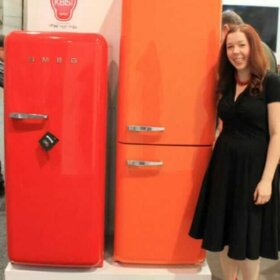
Homeowners wanting classic cherry red counter tops will most likely be happy to see Formica’s new Ellipse design in red. It’s nice to have a tone-on-tone red again that doesn’t cost a small fortune (our current “reds” of choice are Arborite Xania, which is not tone-on-tone… and crackle ice laminate, with is highly pixelated and expensive.)
The patterns on the Halftone and Dotscreen designs are downright fun — and that orange in the Halftone is downright Brady Bunch. However, these are more so 1970s colors, rather than immediate postwar colors. Not that I mind, of course, but folks wanting aqua and coral and baby blue didn’ get ’em’. Note — I’m declaring the orange is the same as my 2011 color of the year… the blue the same as my 2012 color of the year and the green, not too far off my 2013 color of the year. Let me say it again: Hurray for real color and pattern!
Yes, Formica gave us some real colors… not just gray. Of course, there still are lots of grays. Grays are “in” today, and to be sure, offer a neutral alternative. (If you want retro grays, there are numerous additional alternatives from Formica, and other manufacturers.) Even so, it seems like Formica is banking on the appeal of its retro heritage with all these designs — these new designs offer edgy, FUN, graphic patterns, not stone or granite, like the mass of new laminate patterns today. Hurray!
Nicely done, Formica. Not to appear immediately ungrateful but now, can you give us some more!? xoxo
Details on how much, where to get, and when:
Same pricing as standard laminate.
Not promoted in the big box stores initially but if a consumer asked for it they would be able to order it from them.
Available January 31st.
Read on for the complete news release from Formica, along with ALL THE PHOTOGRAPHY from the announcement AND a slide show with the images bigger, too:
Formica Group Celebrates 100 Years in 2013
with the Formica® Brand Laminate Anniversary Collection
Exclusively designed by world-renowned design firm Pentagram
Cincinnati (Jan. 22, 2013) — Formica Group, the original inventor of laminate, celebrates 100 years with a fresh take on its iconic Formica® brand laminate. The 2013 Anniversary Collection features 12 new patterns that reflect the Formica® brand and its history.
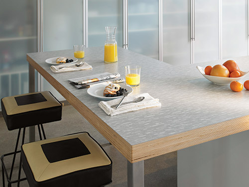
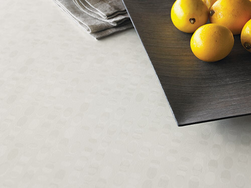
See the “natural” edge? I think this substrate is called “Appleply.” Or, that is one of the brands. Very cool – very “modern” in that it lets the “authenticity” of the material show. Must be very trendy now. I like.
“While Formica Group invented laminate, designers are credited with realizing its full potential as a stylish and desirable surfacing material,” said Renee Hytry Derrington, Group VP of Design for Fletcher Building’s Laminates & Panels Division, which includes Formica Group. “The Anniversary Collection is just one example of our commitment to continue the joint exploration with the design community to define the future of Formica Group in the next 100 years.”
Collaboration with World-Renowned Design Firm Pentagram
Pentagram, the world’s largest independent design consultancy, created the collection exclusively for Formica Group. Pentagram partner Abbott Miller designed the anniversary patterns, introducing characteristics and colors that are new to the range.
“Developing this iconic brand’s 100-year Anniversary Collection was inspiring,” Miller shared. “Formica laminate is extraordinary because of its Zelig-like nature, blurring the past, present and future while completely crossing all social and economic categories. It’s a material with distinctive tactility, a warmth and domesticity; it’s man-made, yet has attained a natural quality in our lives.”
Miller’s vision for the Formica® Laminate Anniversary Collection underscores the material’s limitless design potential. “The heart and soul of Formica laminate is a printed sheet. Pattern and color are intrinsic to the culture of the company, so exploring the translucency of ink and the interaction of pattern and color was a natural area for me.”
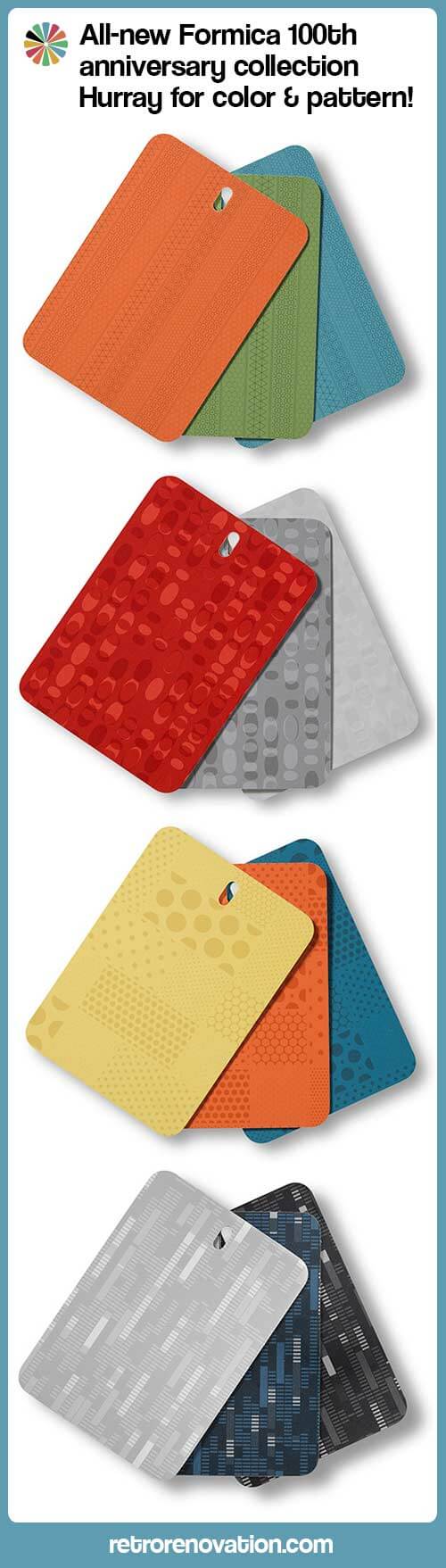
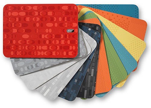
Twelve New Patterns in Four Collections: Ellipse™ Collection, Endless™ Collection, Dotscreen™ Collection and Halftone™ Collection.
Ellipse™ and Endless™ play off the anniversary theme “Formica Forever” by utilizing innovative printing techniques that allow independent layers of pattern to randomly interact during the course of printing. The method creates seemingly infinite patterns that appear consistent due to the fluidity of the overlapping elements. Unlike most patterns that repeat every 50 inches, the pattern repeat of Ellipse™ and Endless™ only occur every 500 to 700 sheets, the equivalent to more than a mile in length.
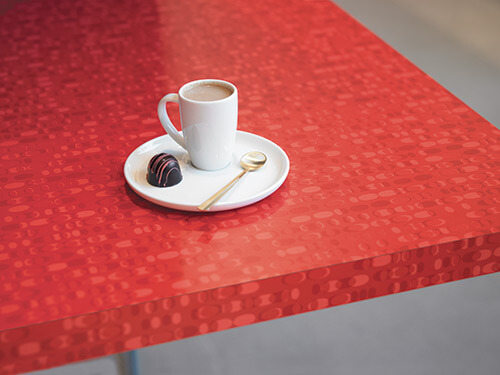
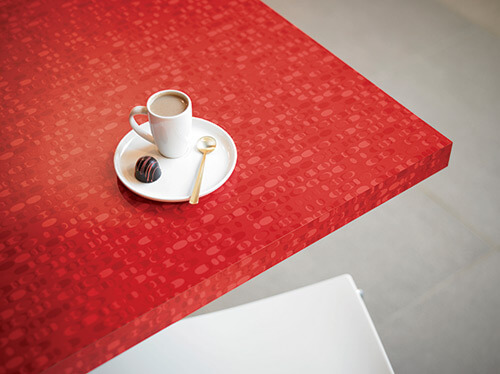
Ellipse design
Ellipse™ uses the “hidden oval” in the iconic Formica® brand logo to create a series of layered strands that ripple across the surface.
6613 White Ellipse – a tonal non-color
6614 Gray Ellipse – a classic gray
1913 Red Ellipse – a strong red (The signature color of Formica Group features 1913, the year the company was founded, as its product code.)
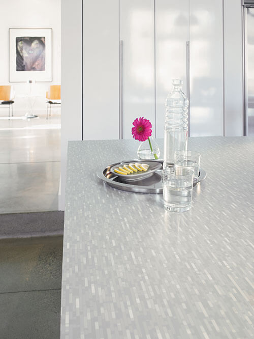
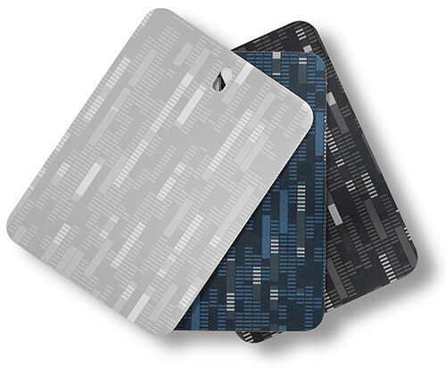
Endless design
Endless™ creates a digital grain from bars that alternately layer and punch through a colored base. The result is a continuous tone-on-tone, architectural pattern that provides visual interest at close range and, from a distance, provides a geometric texture.
6610 Endless Graytone – a versatile gray-on-gray
6611 Endless Smoke – an ebony that recalls carbon and mica
6612 Endless Indigo – a deep inky blue
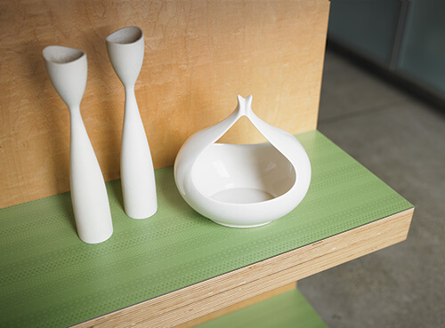
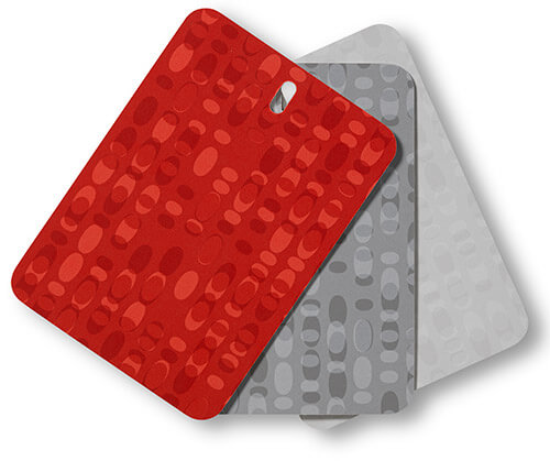
Dotscreen™and Halftone™celebrate Formica Group’s history of exuberant color and printing technology. Both Dotscreen™ and Halftone™ feature “solid patterns” of bright and saturated colors made more complex by undercurrents of detailed patterning. Fine dot motifs provide a second scale of interest within the optimistic hues.
Dotscreen
Dotscreen™ features luminous colors with extremely fine micro-dots in continuous ribbons.
6615 Aqua Dotscreen – a distinctive sky blue
6616 Mint Dotscreen – a vegetal green
6617 Tangelo Dotscreen – a soft orange
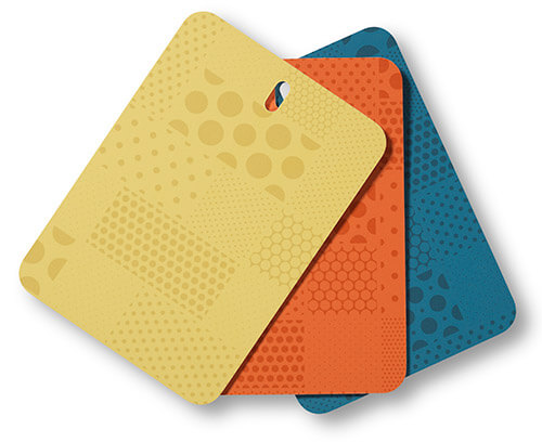
Halftone design
Halftone™ features “near-bright” colors patterned with various sizes of toned dots, reminiscent of halftone printing screens.
6618 Blueberry Halftone – a medium-toned blue
6619 Citrus Halftone – a bright lemon yellow
6620 Tangelo Halftone – a soft orange
Each Anniversary Collection pattern contains a subtle, tone-on-tone Formica® brand watermark embedded into the design on every sheet.
“The patterns and colors of the Anniversary Collection acknowledge the brand’s past – especially with designers such as Brooks Stevens and Raymond Loewy – but without delving into nostalgia,” Miller said. “While the collection aligns with the brand’s heritage, it offers surfacing design that is unique in the market. It also was satisfying to know that we were pushing the technical boundaries of print.”
In addition to the Anniversary Collection, Pentagram’s Miller and partners Michael Bierut and Daniel Weil collaborated on Formica Group’s anniversary brand elements, Formica Forever book and display concept.
About Pentagram & Abbott Miller
Pentagram is the world’s largest independent design consultancy with offices in London, New York City, San Francisco, Berlin and Austin. A partner in Pentagram’s New York City office since 1999, Abbott Miller has designed award-winning identities, exhibitions, environmental graphics and multi-media projects. He has received numerous design honors and his work is included in the collections of the Art Institute of Chicago, SFMoMA, and the Cooper-Hewitt Design Museum. He is the author of several books and numerous essays on design.
About Formica Group
Formica Group globally leads the industry in the design, manufacture and distribution of surfacing materials. Part of Fletcher Building’s Laminates & Panels Division, Formica Group is global group of companies consisting of Formica Canada, Inc., Formica Corporation, Formica de Mexico S.A. de C.V., Formica IKI Oy, Formica Limited, Formica S.A., Formica S.A.S., Formica Taiwan Corporation, Formica (Thailand) Co., Ltd., and Formica (Asia) Ltd., Homapal GmbH, among others.
Our renters just ruined our vintage formica counter with drip edge, in white with gold marbling. I can’t find a replacement in the formica. We are keeping the cast-iron sink with hundee ring. Have I missed anything available? Our replacement counter will not have the drip edge, and the closest I can come to the formica design is travertine.
pam kuebersays
see all our possible selections in Kitchens/Countertops section. How do you feel about White Onyx – that’s old skool
Joe Felicesays
Yea for Formica! It invented laminate, so it’s only natural that it should lead the way with its new line. This is victory for good ol’-fashioned Americana, and that’s why we love the new colors and patterns. These do tend to have a bent towards the ’70s, but hey–Americana was alive and well in that decade, let me tell you, even though I’m still stuck in the ’50s & ’60s. Besides, when I think of the ’70s, I am reminded of how we raged at the discos! Boogie down, Formica, and keep the progressive & flamboyant colors & patters coming. We love them!
Scottsays
Talk about timing.
I was almost to the point where I’d decided nothing was going to make me happy short of red cracked ice, but this new Red Ellipse Formica is really blowing my mind as a viable alternative.
I honestly can’t stop looking at those two countertop shots!
pam kuebersays
YAY!
amandasays
Yeah, I get that they are going for 70s colors, but for their 100th anniversary, I wish they would have brought in some 50s inspiration too. For me, there’s dated good and dated bad, but maybe I’m just not into 70s kitchens- those shades of blue remind me of the blue formica counters in my mom’s country cow kitchen which she redid in the 90s. I, too, would love to see pastels included here. Sadly, the only color I’d consider out of this collection is gray.
I think it was smart to do some modern model kitchens; many people just can’t visualize how something can look and would exclude formica if they only saw it in vintage models. I do really like the patterns, they look great close up and from afar and I like the edging on some of those too– please update us if you find out for sure what that is. I think it looks more modern having that separate edge instead of all formica.
pam kuebersays
I didn’t mean to say that Formica intended that these would be “70s colors” — that’s my take on several of the colors. I think they wanted to appeal to the MASS CONTEMPORARY MARKET today — and I guess that these colors are trendy today – which does not surprise me.
I really dig the orange and green dotscreen. If I were going to re-do my counters, I would give those some serious consideration. I really like the chunky natural edge, too. Very, very cool.
Jennysays
Samples ordered! Glad I waited for this to start my kitchen restoration. Thanks Pam for breaking the news!
and you will see swatches for all these new styles, just pop them in your cart and fill in your address info.
My Red Ellipse swatch is on the way! 🙂
MissAbbysays
Thanks!!! I ordered all the dotscreens and that red!
Dulciesays
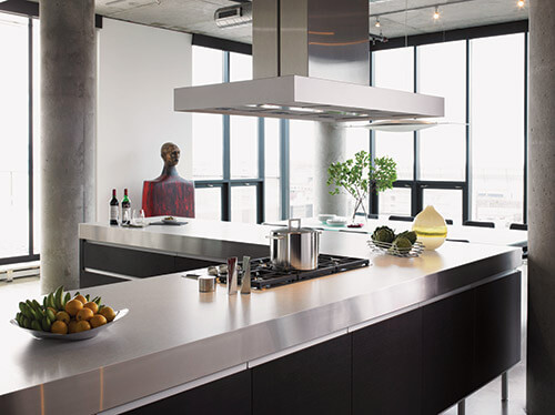
I love the colors, bright and popping are the way I like to do thing decorating-wise. I was a bit disappointed by the model kitchens they used in the promotional though. I was hoping to see some fun and exciting uses for the bright colors, but instead, they didn’t make full use of them, using them as accents to the mostly grey/beige rooms rather than giving us an exciting, colorful kitchen fully utilizing the beautiful colors they’re offering.
pam kuebersays
Yes. But I am sure they want and need to appeal to the mass market… so I think I understand. I DO love the chunky countertop with Appeply countertop edges — very cool!
Tomsays
Frankly, I’m rather nonplussed by the whole collection. As for that “but without delving into nostalgia” comment, I’d just point out to that there are quite a few of us out here that would be thrilled to see them re-release mother-of-pearl/”cracked ice” or authentic linen type patterns in original colors (and hopefully without the grainy digitized look). And we would be willing to pay a premium for it too. Oh well, at least Miller was honest about its lack of retro-authenticity. New designs are fine if that’s what you want, but for those of us who don’t want that – we’re still waiting!
pam kuebersays
Yes, I’m not sure why the designer had to diss “the nostalgic”.
jaysays
Seems like the post -war 40s, 50s and 60’s (Formica’s greatest era of popularity) were skipped over for inspiration – color wise and pattern wise. Why didn’t they just dive into the vaults?
pam kuebersays
I am presuming they discontinued the aqua/blue/coral boomerangs because they were not selling in enough volume to make their sale a continuing, going proposition…. I can understand, I think, why Formica has taken this approach. The mass market wants new interpretations.
Janicesays
On a similar topic, Pam do you have a favored bathroom sink that you would recommend for a retro re-do? Our current sink in the master bathroom is one of those all one piece, molded in with the hard surface countertop numbers so I need a new sink and was just curious if you had a favorite. I was going to go vintage but I think I better go with brand new, vintage looking.
pam kuebersays
Kohler Tahoe with the metal hudee ring! Or…. Men’s Lav, if it’s still in the lineup!


 Yup, the day is finally here — Formica is announcing its much anticipated 100th Anniversary Collection. One minute after launch, we have all the new patterns ready to show to you. And, yes: Hurray! for color and pattern! — We have some great new Formica patterns for your kitchen counter tops and bathroom counter tops to add to our archive of retro-worthy laminate options. What do I like about these new designs:
 Details on how much, where to get, and when:
Formica Group Celebrates 100 Years in 2013
Miller’s vision for the Formica® Laminate Anniversary Collection underscores the material’s limitless design potential. “The heart and soul of Formica laminate is a printed sheet. Pattern and color are intrinsic to the culture of the company, so exploring the translucency of ink and the interaction of pattern and color was a natural area for me.”
Twelve New Patterns in Four Collections: Ellipse™ Collection, Endless™ Collection, Dotscreen™ Collection and Halftone™ Collection.
In addition to the Anniversary Collection, Pentagram’s Miller and partners Michael Bierut and Daniel Weil collaborated on Formica Group’s anniversary brand elements, Formica Forever book and display concept.


pam kueber says
Yes, I have done several stories about the Wilson House: https://retrorenovation.com/2008/09/15/the-ralph-sr-and-sunny-wilson-house-in-temple-texas-the-wilsonart-house-that-truly-launched-laminates/ and this video: https://retrorenovation.com/2011/01/18/video-the-wilson-house-shrine-to-mid-century-laminate/
Judy says
Our renters just ruined our vintage formica counter with drip edge, in white with gold marbling. I can’t find a replacement in the formica. We are keeping the cast-iron sink with hundee ring. Have I missed anything available? Our replacement counter will not have the drip edge, and the closest I can come to the formica design is travertine.
pam kueber says
see all our possible selections in Kitchens/Countertops section. How do you feel about White Onyx – that’s old skool
Joe Felice says
Yea for Formica! It invented laminate, so it’s only natural that it should lead the way with its new line. This is victory for good ol’-fashioned Americana, and that’s why we love the new colors and patterns. These do tend to have a bent towards the ’70s, but hey–Americana was alive and well in that decade, let me tell you, even though I’m still stuck in the ’50s & ’60s. Besides, when I think of the ’70s, I am reminded of how we raged at the discos! Boogie down, Formica, and keep the progressive & flamboyant colors & patters coming. We love them!
Scott says
Talk about timing.
I was almost to the point where I’d decided nothing was going to make me happy short of red cracked ice, but this new Red Ellipse Formica is really blowing my mind as a viable alternative.
I honestly can’t stop looking at those two countertop shots!
pam kueber says
YAY!
amanda says
Yeah, I get that they are going for 70s colors, but for their 100th anniversary, I wish they would have brought in some 50s inspiration too. For me, there’s dated good and dated bad, but maybe I’m just not into 70s kitchens- those shades of blue remind me of the blue formica counters in my mom’s country cow kitchen which she redid in the 90s. I, too, would love to see pastels included here. Sadly, the only color I’d consider out of this collection is gray.
I think it was smart to do some modern model kitchens; many people just can’t visualize how something can look and would exclude formica if they only saw it in vintage models. I do really like the patterns, they look great close up and from afar and I like the edging on some of those too– please update us if you find out for sure what that is. I think it looks more modern having that separate edge instead of all formica.
pam kueber says
I didn’t mean to say that Formica intended that these would be “70s colors” — that’s my take on several of the colors. I think they wanted to appeal to the MASS CONTEMPORARY MARKET today — and I guess that these colors are trendy today – which does not surprise me.
Jenny A. says
I really dig the orange and green dotscreen. If I were going to re-do my counters, I would give those some serious consideration. I really like the chunky natural edge, too. Very, very cool.
Jenny says
Samples ordered! Glad I waited for this to start my kitchen restoration. Thanks Pam for breaking the news!
MissAbby says
How did you order samples?! I’d love to!! 🙂
Scott says
Miss Abby, just go to
http://www.formica.com/home/WhatsNew.aspx
and you will see swatches for all these new styles, just pop them in your cart and fill in your address info.
My Red Ellipse swatch is on the way! 🙂
MissAbby says
Thanks!!! I ordered all the dotscreens and that red!
Dulcie says
I love the colors, bright and popping are the way I like to do thing decorating-wise. I was a bit disappointed by the model kitchens they used in the promotional though. I was hoping to see some fun and exciting uses for the bright colors, but instead, they didn’t make full use of them, using them as accents to the mostly grey/beige rooms rather than giving us an exciting, colorful kitchen fully utilizing the beautiful colors they’re offering.
pam kueber says
Yes. But I am sure they want and need to appeal to the mass market… so I think I understand. I DO love the chunky countertop with Appeply countertop edges — very cool!
Tom says
Frankly, I’m rather nonplussed by the whole collection. As for that “but without delving into nostalgia” comment, I’d just point out to that there are quite a few of us out here that would be thrilled to see them re-release mother-of-pearl/”cracked ice” or authentic linen type patterns in original colors (and hopefully without the grainy digitized look). And we would be willing to pay a premium for it too. Oh well, at least Miller was honest about its lack of retro-authenticity. New designs are fine if that’s what you want, but for those of us who don’t want that – we’re still waiting!
pam kueber says
Yes, I’m not sure why the designer had to diss “the nostalgic”.
jay says
Seems like the post -war 40s, 50s and 60’s (Formica’s greatest era of popularity) were skipped over for inspiration – color wise and pattern wise. Why didn’t they just dive into the vaults?
pam kueber says
I am presuming they discontinued the aqua/blue/coral boomerangs because they were not selling in enough volume to make their sale a continuing, going proposition…. I can understand, I think, why Formica has taken this approach. The mass market wants new interpretations.
Janice says
On a similar topic, Pam do you have a favored bathroom sink that you would recommend for a retro re-do? Our current sink in the master bathroom is one of those all one piece, molded in with the hard surface countertop numbers so I need a new sink and was just curious if you had a favorite. I was going to go vintage but I think I better go with brand new, vintage looking.
pam kueber says
Kohler Tahoe with the metal hudee ring! Or…. Men’s Lav, if it’s still in the lineup!
Janice says
Thanks Pam. I’ll check them out.