

 Reader Ashley loves bright colors and retro style. Though her house was built in the 1930s and originally a country style, she wants her great room to have a more 50s/60s vibe — at least in her kitchen/dining/living room area. She’s painted the built-in shelves a burnt orange to match her vintage modern sectional couch and even put up — yes, I said put up — wood paneling along the front wall. With a new Big Chill fridge and some Youngstown vintage steel cabinets waiting to be painted, Ashley needs our help to pull it all together and create her retro modern dream room.
 Ashley writes:
Hey Pam,
First off I just want to say that your site is amazing and I cant even tell you how much this has helped me in the past few years. THANK YOU!(I apologize in advance because this will be long) I don’t know where to start so I will just tell you everything….
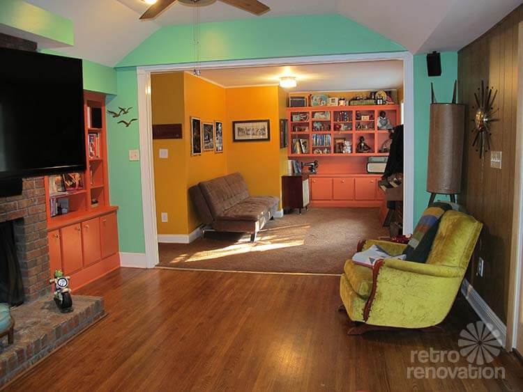
I live in Alabama and we bought our house a little over a year ago. We wanted a more midcentury modern style house but we needed acreage for my husband’s business and shop so unfortunately we were not able to get that. Our home was built in the early 30s and is more of a country style home (I am not complaining anything old is better than new in my book) and has been updated and added on to several times. It has a very open floor plan and the den, dinning room and kitchen are all connected and technically one room.
I bought my second set of Youngstown cabinets yesterday after almost a year of searching and need to decide how to do the kitchen to where it will still go with the rest of the connecting rooms and have the mcm look I am going for.
We painted the den and built ins, put up wood paneling, bought furniture all when we moved in and recently bought a BIG CHILL fridge in jadeite green. With all that being said…Now I am looking at these rooms as a whole and I am not sure what I have done. Are the colors all from the same decade, does my fridge go with my couch and have I wasted all his money and ended up with a disaster. EKKKKK!!!!
I am so overwhelmed! I hope that made sense.
I have attached photos of our den/dinning/kitchen area and photos of the couch, Big Chill Fridge and my drexel dining table. (Those three pieces have to stay) I also want to keep the same color palette pretty much, but I know something needs to be tweaked (just not sure what). I have no idea and I dont want to just start changing things and still not get it right especially since we are about to have our Youngstown cabinets repainted and installed along new laminate countertops.
I am struggling with:
What color to paint my youngstown cabinets and what style and color of laminate to choose that will go with my jadeite fridge and burnt orange/red couch. (The cabinets that are currently in are painted jocular green by sherwin williams and the match the fridge exactly, I had originally planned on doing that color on the youngstown cabinets, but unsure if that really goes with the rest of the space.)
I obviously need to repaint the mustard room past the den…so should I paint it the same color (vegan sherwin williams) as the den and kitchen or change the color all together.
Lastly, the built-in shelves that flank the fireplace and are in the mustard room (are actually the same color as the couch but the pictures make it look a little brighter than they truly are) not sure if those should be muted down?
Geeze Louise this is long and I hope it makes sense. Cant wait to hear back!
Thanks so much in advance.
Ashley
Ok readers — let’s give Ashley some ideas. How can she tweak her large space to all coordinate and look more cohesive?
Kate’s advice:
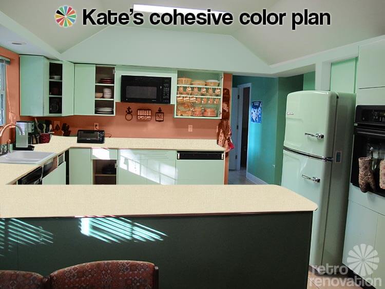
Ashley’s large great room area — including kitchen, dining room, living room and den — has a lot going on and is a big space to plan. I can see why Ashley is stuck — she has several angled walls where they meet the ceiling, long walls that connect rooms, pieces of wall that jut out and have cut outs and lots of corners. My advice for you Ashley — simplify.
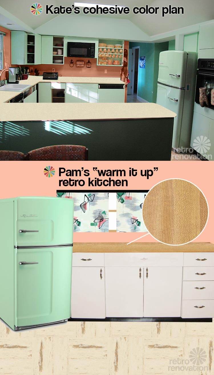
 Let’s start with the kitchen. I think having your Youngstown steel cabinets painted to match that stunner of a Big Chill refrigerator that you have is a great idea. In fact, the color you are thinking about painting your Youngstown cabinets is close to the Sherwin Williams “mint condition” color that I painted my kitchen cabinets. What I think needs to happen on the walls though, is to first — paint the angled bits of wall that meet the ceiling the same color white as the ceiling. Before, when they were bright green, it was drawing too much attention to this portion of the wall — taking away from your cool fridge and cabinets. By painting it white, it will blend in and allow the true focus to be where it should be — on your soon-to-be awesome kitchen.
Next, I would pick a color that relates to your dark orange couch and painted built-ins (hard for me to recommend one since the oranges look so different in every photo) but is several shades lighter. Maybe a coral or peach depending on the specific orange on your couch. Get a bunch of coral and peach swatches and hold them up next to your couch and built-ins to see which one looks best. Then, I would use that color to paint the wall between the bottom of the cabinets and counter top. This will bring some warmth into your kitchen to help it coordinate with the rest of the rooms. Before, with the green on green color scheme, it felt too monochromatic and too “cold” next to the warm burnt orange of your sofa and built-ins.
For counter tops, I would choose a warm neutral laminate with a linen look — like Arborite Weathered Hemp or Earthen Hemp. Get samples of both and see which one coordinates best with your neutral tile floor and wood floor. This will add further warmth to the space, as well as some subtle texture to add interest. Since you have some chrome on your refrigerator and possibly cabinet handles — you could use metal edging like Pam used in her kitchen to complete the look.
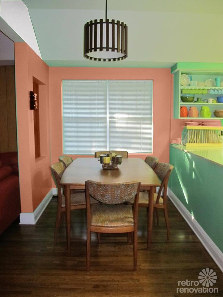 I would continue the peachy-coral paint into the dining room. The warm color will look great with your warm wood Drexel dining set and wood floors.
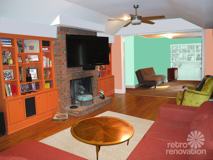 For the living room, continue the same peachy-coral color on the walls. The warm color will look great with the wood paneling, fireplace and other burnt orange pieces in the room. I’d add a neutral area rug — like this one from IKEA — in front of the sofa to visually anchor it and break up the large expanse of wood flooring. Then find a vintage coffee table, like this round Lane model, so you have somewhere to set your drinks. You could also add a few light neutral and light green throw pillows to your couch to bring the kitchen color out into your room. All of these touches will also make your room feel cozier.
Continuing through the room, I would paint all the bump outs near the ceiling the same white like in the kitchen, to draw attention away from them and towards the other elements in the room.
In your den room (previously yellow), you could paint The walls the Sherwin Williams Vegan green that you used before, then paint the built-in the same color as your kitchen cabinets. Put some orange pillows on your futon and a few orange/peachy things on your shelf and you’ll have a space that uses all of your favorite colors in a pleasing and cohesive arrangement.
Pam’s advice:
Ashley, your Design Dilemma inspires me to offer some theoritical design advice: There is, I believe, a “logical” order to making design decisions about a room. Fundamentally, the most expensive decisions are the most important ones. You nail these down before progressing to less expensive decisions. More expensive = hard to change, you want to be very careful, very thoughtful, because unless you are made of money, you want to be able to live with these decisions a long time. Less expensive = easy to change. Repita: The order in which you make design changes: Expensive first, Inexpensive after.
In regards to your design dilemma, I would advise: Do NOT get hung up on the color of your walls — until you have the more expensive designs made first. Wall color is relatively cheap and easy to change — while kitchen cabinets, countertops, refrigerators etc. ARE NOT.
Here is a stab at identifying which expenses fall into which bucket:
Expensive — focus on these first:
- Architectural changes to the house — moving walls, moving windows, moving doors, etc.
- Kitchen cabinets
- Kitchen countertops and tile backsplashes
- Kitchen floors
- Kitchen appliances
- Large pieces of new furniture
- Custom window treatments
Inexpensive — focus on these after:
- Paint color
- Used furniture
- Accessories
- Rugs
In the case of your specific questions and dilemmas, Ashley, here is what I think I might do:
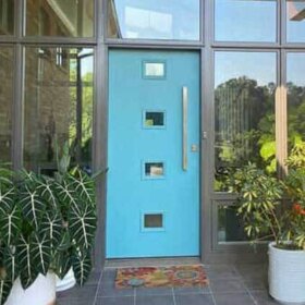
- You did not ask about this — so I realize this is unsolicited advice — my apologies! — but I question the fact that your front door seems to be opening into the smack dab middle of your living room. To me, this placement looks like it is disturbing furniture flow and use of the room. And, it means there is no real foyer area to welcome guests, to put down their bags, etc. You said that the house has been added on to over time, and I am guessing that the den is an add on. My suggestion, if it is possible, is to consider moving the front door either closer to the den, or closer to the kitchen; then add a half-wall to compartmentalize it, and then move forward with the design of the living room. Admittedly, though, I can’t really see the entire situation. This is just a thought. But I think you get my idea — this is an issue of “fixing the architecture” that I might deal with first, before moving forward on aesthetic issues.
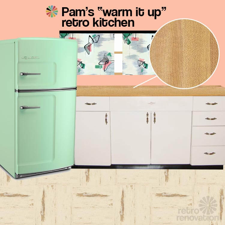
- For the kitchen, you have already locked into one expensive piece — the jadeite Big Chill refrigerator. So, this is now a starting point for the next steps in your kitchen. I do not think I would go with cabinets painted to match the fridge. I think it would be better to go with another color — one that would make the Big Chill fridge pop like the beautiful hunka hunka that it is.
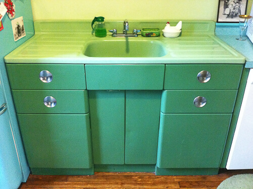
Erica’s jadeite kitchen cabinets — believed to be original finish I have seen ONE example of jadeite greenish steel cabinets here. I like how they appear darker than the jadeite of the sink — and presumably, darker than your fridge. You could also go with white cabinets. Maybe you don’t even need to repaint them if you stick with white? If you do repaint, be sure to test for lead paint first and if it’s there, take precautions accordingly; consult your own properly licensed professional.
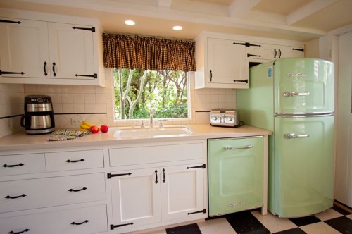
How the jadeite Big Chill looks with white cabinets — click the photo to see the story on this kitchen - For countertops, I would consider something wood-look to bring warmth to all the metal in your kitchen. Wood-look countertops also would relate to the wood tones through the rest of the open concept area adjacent. How about Formica’s Butcher Block laminate. I would not edge them in metal, I would choose a simple postformed edge. And here’s another idea I have been toying with lately — real maple was used on countertops in the 1940s. How about maple laminate? Or, if you want to keep the wood tones darker to coordinate with your Drexel and your wall paneling, how about a wood toned laminate in the Drexel shades? I also like the idea of a woodtone countertop because you are mid century in the country.
- For flooring, how about my kitchen floor, Azrock Cortina Autumn Haze. I think that would look quite nice. Alternatively, look at the sheet linoleum from Forbo and go with a light marbleized linoleum. I just read Jane Powell’s book on linoleum (affiliate link) this weekend. A must-have for any Retro Renovator’s collection! She makes a very compelling case for the environmental benefits of true linoleum vs. flooring that contains vinyl/PVC.
- For paint color for the wall, I went with Kate’s suggestion. And, I tied all the colors together with barkcloth from Melinamade (update: company now gone).
- In the living room, I would nix the burnt orange paint on the bookshelves. They are just too much. I love the Jerry Seinfeld gag where he says that when he has a killer headache, he wants to take just enough aspirin to kill him — then back it off. Same deal with the old saw: When you are getting all dolled up for a night on the town, the minute before you are walking out the door, check yourself in the mirror and take one piece of jewelry off. These cabinets are your aspirin, your one-bling-too-many. Either strip them and stain them to match your paneling or Drexel, or use a product like Rustoleum Cabinet Transformation to mimic that wood look. I would likely finish the bookshelf in the den the same way, for visual continuity since you have one large open space.
- I agree with Kate about repainting the mansard parts of the ceiling white rather than a color.
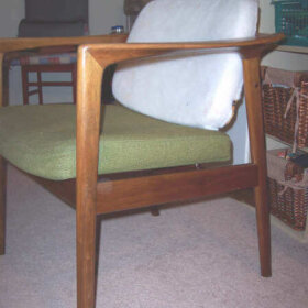
- You have a big investment in the sectional. So that stays.
- Paint color for the walls, room to room to room? Once you have all the expensive decisions outlined above completed, the paint colors should come relatively easy. I like Kate’s ideas a lot — as they keep the paint colors in the families of the larger decisions. One final note, the rug to go under the sectional could/should tie all the principal colors of the entire connected space together. It will need to contain shades of jadeite green, burnt orange, light and dark woodtones… I would not make it too light and bright. It should read dark to settle the space. Maybe a large oval chenille braided rug in a principally brown colorway, with these other colors speckled in. This would also be cozy to lay on, and it has a little bit of country in it, too.
Good luck, Ashley. We congratulate you for being bold with color — you are close! Let us know what you decide!


Melissa L. says
I love your space and like the green walls in the kitchen and dining room. I think that the space could be unified by just a couple of simple changes: 1. paint the yellow wall in the back room green like the rest of the rooms. A lighter shade of the same hue of green would also work (maybe the light green as in the kitchen cabinets?). 2. As suggested by Kelly, paint the orange cabinetry a lighter melon orange in the same hue as the sofa but just a lighter tint. This would work much better with the minty green of the walls. In general, my feeling is that the color scheme needs to be simplified, and I’d stick with the orange/green theme rather than introducing more neutrals or accent walls.
Shannon says
I haven’t read through all the previous comments, so my apologies if I’m repeating what has already been said. First of all, I LOVE your cute house and furnishings! I also love bold colors, and vibrant aqua is probably my very favorite color. That being said, I think that your bold aqua green color in the kitchen overpowers the whole space and I suggest toning it down a bit. This is particularly a problem in the kitchen, because it washes out your beautiful fridge and cabinet color and they look white with reflected color from the wall paint.
Your dining room color is great, your living room colors are great, your cabinet and fridge colors are great. I think you can really pull everything together by simply repainting the kitchen walls. A soft yellow-gold or buttercup color would pull the space together nicely. It would really make everything pop!
KLS says
I’m with Chris: the green wall paint in the kitchen is the major obstacle to my enjoying your wonderful spaces. I’d go neutral with that and let the cabinets provide the green. I like the mustard wall and rust cabinetry colors, but not the kitchen wall green.
Barry Stampler says
I try to use a rule of thumb given to me years ago…If you like it, and it makes you happy then do it! ( or leave it alone!) I find that when I stick to this rule, I’m always happy!!
connie says
I would treat each room separate, even though it is an open plan. When would we ever try to make our fridge and couch match? I LOVE the couch. To make the orange pop and make it a center piece of color, I would paint the bookshelves a different color, maybe a warm gray shade that would match the brick mortar, and complement the wood floor. Since they are built in, I might paint them the same color as the wall, neutral. First I would find neutral colors that would go with the paneling and floors for the living room and paint over the green in this room. Rearrange the furniture, it does not have to be against the wall. Could you move the couch down by the fireplace? Does the chaise come off the couch? Move it around and see what you like, don’t be afraid to pull them away from the wall. Our feet are made for walking…. around furniture.
The Kitchen. I would tone down the green walls. So the fridge color (again) will pop! Yellow was a popular color for kitchen, and you have some yellow in there. Go for a soft color….like your fridge color, so it doesn’t overwhelm. Yellow would also go with your dining set. Maybe a tad lighter than the mug on your table. 🙂 You have great color in accessories that are bright. Going with a softer color on the walls, would make them stand out even more.
If you want to pull all these color together….find a print with those colors, to pull them all together, in any room you do. Curtain, rugs, pillows, throws. Patterns of color can pull it together. If you want the orange couch to be the centerpiece b/c you love that color, I wouldn’t use that color in large areas of the same room. It will just be another large “orange” piece. But when it’s the only large orange piece….it will make a statement! It is GRAND retro! Y
ou could recover the foot stool in a neat retro pattern, with a little orange, or no orange at all. Aqua blue, complements orange. whatever you get, use the same material for some throw pillows on your couch. A retro area rug with accent colors?
Even though your plan is open, take each room separately, don’t get overwhelmed, but keep in mind the flow of the open floor plan. and patterns to pull it all together. Your furniture is groovy…good choices. 🙂
Michelle says
Personally, I would not make all the ceilings one height/profile. Because you essentially have one giant room that is defined by ceiling and color to create “living spaces” you need the color and ceilings to make the divides.
I think your colors are a little jarring together honestly, but I DO like the concept of bold colors. I have a very different style house than you do, but have large open rooms painted very bold colors. What I did to unify them was to use the same color trim in all of the rooms, except one, where the trim color (light cream) was used as the wall color and I used a very bold color for the trim instead.
You can keep a similar pallet, but if you’re looking for a more unified color scheme, I would suggest working with color samples until you find a set of bold colors that work together and can be unified with a trim or detail color to pull all of it together.
All that said, don’t freak. 🙂
Live with it for six months or so and see if you like it more over time. Sometimes it’s jarring at first because it’s so different than the houses you might be used to. Meaning, if all your friends live in 70’s/80’s/90’s houses with neutral interiors and white carpets then your house is going to feel different because it has character!!
Ethan says
When I look at your house I see a 70’s house. The colors on the walls are all wrong for me. I would use harvest gold, avocado, orange or even tan on the walls. The kitchen would look very good in a harvest gold type of color in my opinion. The living room would look good with tan walls and the den area would look good with 70’s orange or avocado walls. I would really like to see grasscloth wallpaper in the den or living room but with those cielings, forget it. Any kind of 70’s wallpaper in any of those areas would be great but the work to do it would not be fun. I dig everything else. Just keep experimenting with paint colors until you find what you like.
Laura says
I think your best bet would be to treat the areas as one large space, but with three distinct areas, with their own (coordinating) color schemes. Instead of trying to treat them all as the same room, treat the kitchen as the kitchen, the living room as the living room, and the study/nook area.
Kitchen: Let the fridge stand out as an accent piece all its own. Don’t try to match it, as it will ultimately be very difficult to match that with a wall color. The fridge is glossy with white undertones, and that’s just plain difficult to replicate with wall paint. You could try a cool color to let the color pops (the jugs and the fridge) come out, like a medium gray (perhaps with a green undertone). If you’re set on a bold color, I’d plan to go darker than the fridge – make it a distinctly different shade or even a different color. A pale carnation-y pink might work out well, like the color of the middle jug on your shelf.
Living Room: The cabinets look cool in that orange color, but I think all the variant shades are fighting with each other for attention. The couch disappears, and the shade of green on the wall doesn’t seem like it likes the orange on the built-ins much. A navy blue might go well in there. Or, if you’re not interested in such a dark shade, I would suggest a pale blue with a tinge of green in it (maybe a desaturated aqua). That would allow the oranges in the room to pop out and give the couch and the built-ins more wow factor.
Study/Nook: I like the yellow in there, but I think it is too close in saturation to the orange in there. The yellow could stand to go just slightly lighter to give more of a contrast and prevent the room from feeling as closed in.
Disclaimer: I’m more into retro-lite and retro-feel than retro recreation, so my color comments are based not in historical accuracy necessarily.
Jenna says
I love so many things about your house and I’m okay with the colors individually but I don’t like the cool green with the very warm yellow and orange. I think you need to stick with either warm OR cool tones throughout the entire space which will make it more unified.
I love your angular ceilings!!!
Sharon Haas says
I have similar colors too so I understand your problem. If you get too much color drama going on then everything fights for dominance.
The main thing I would do is remove some of the green that’s in the dining area. I would change the color in the dining area on the window wall and the wall wit the cut out to something softer like one of the coppery colors that are in your chairs or even a creamy pale yellow – yellow was also a great mid century color – as long as it is something that tones down that transition area.
As for your cabinetry – don’t be afraid to use more than one color – for the kitchen, it looks like you get a lot of light lower in the room so that part of the room should have cabinets that are a little lighter than the top ones – – going up or down in shades of the same color can make the important things pop better – make things around your fridge work to make the fridge be the focal and not just blend in.
I love what you;re doing but don’t be afraid to keep redoing till you feel the space is at your comfort level. you can’t forget that you are creating a living space and not a time capsule.
David says
I agree with the yellow for the wall color throughout the space. You have red-orange and green, and yellow bridges them on the color wheel. Right now, your bright green steals the show from the cabinets and fridge in the kitchen and, to my eye, clashes with the earthy tones you have in the living room. Keep the yellow more pure (not leaning either orange or green), but not bright–I would choose either a soft shade, as others have suggested, or a richer goldish tone.
I would agree that you have different decades going on, but that’s not necessarily a bad thing. You have a 1930s house, so let’s say that the kitchen was updated in the early 1950s–metal cabinets, Big Chill, etc. Now the living room was redone about 10 or 15 years later. The different eras can work together, but I think the key is getting a paint that ties the spaces together without competing with either, and I’ve seen yellows/golds used in both contexts, with both color schemes you have going on.
I would do the cabinets either white, matching the fridge, or a darker shade of the fridge’s color. Keep the countertops neutral, but if you go light with the other elements, consider a charcoal or black (but no boomerangs, which seem more mid-50s than the early-50s feel you have now).