

 Wow, Diane is a decorating dynamo! We featured her Retro Design Dilemma just last week and already, she has transformed her vintage pink tile bathroom with paint, towels and Lilly Pulitzer design draperies. It works!

 This was Diane and her bathroom a mere one week ago, can you believe it?
Diane writes:
Hey Pam, it’s Diane from last week’s design dilemma bathroom. Wanted to tell you that you were right! After my posting a message on that thread telling how I had put my turquoise accessories back into the bathroom, you responded by saying “ok but i still think you need to pull everything together in the window treatment”. That was the thing that was still nagging at me, also.
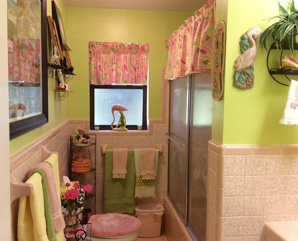
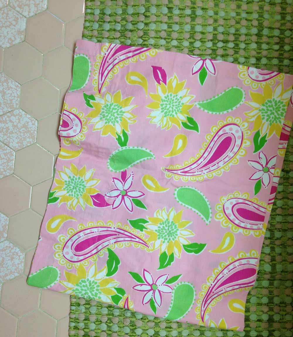
Well, as luck would have it, while at a consignment store, I stumbled across 2 Lilly Pulitzer curtain valances in pink with the same color green accent as in my bathroom wall – for $12 total! Although they didn’t have any of the turquoise in the print, I decided that I wouldn’t be out much if I tried them. Well…. Surprisingly, the pink ended up looking great against the backdrop of the green walls!

I decided to put the 2nd valance on a shower rod & hang it above the tub shower doors. Although not as full as the window valance – and a tad higher, I think the look of continuity really adds to the room. Of course, now my turquoise accessories no longer go with the room, so once again they have been removed – so it goes in the trial and error decorating world!
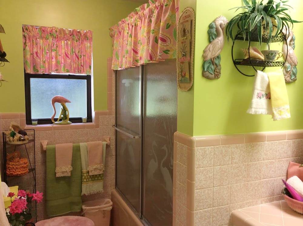
Found some towels in a kiwi green color which looked to be a good match, and they work nicely accented alongside the vintage yellow towel I already had. I still need to pick up a few more towels (green, yellow or pink?) I don’t really care for,the white hand towel here – I may bid for some on ebay with the same Lilly Pulitzer print trim, “pink sorbet”. Also possibly switch out the toilet seat cover to a similar shade of green.
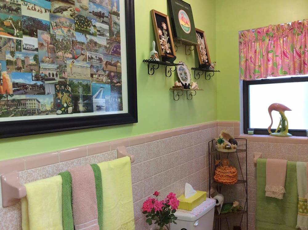
I am bidding on a flamingo paint by number picture with the same color green & pinks in it to put on wall to the right of the vanity – and am trying to figure out what to put above the vanity for lighting in place of the giant hideous fluorescent thing we currently have going on there. But other than that, things really do appear to be coming along! And yes you were right, the correct color curtain certainly makes all the difference in that bathroom! Yes, there still needs to be a bit more tweaking, and although the valance are not a tropical print per se, I am loving all the bright, happy colors and the vintage Florida Lilly Pulitzer sweet look of it! 🙂

Here are a few photos I took to give you an idea of what is going on in the bathroom now. I added one of me wearing a vintage Lilly Pulitzer dress that I happened to find at the same consignment store (only $35 – woo hoo!) Talk about some bright, vivid colors! This dress dates from the mid to late ’60s according to the tag — Lilly had such a crazy, fun, timeless look! A few days before I picked up the valances, I bought it with the original idea of possibly pulling a Scarlet O’Hara, deconstructing it and using the fabric as curtains, (which I really didn’t want, to do as the dress just so happened to fit me perfectly! 😉 ). Then I serendipitously stumbled across those other two other valances – and fate worked its magic. Love it when that happens!
Put up the Christopher Cross album to just to see how it would look – the colors are right, but I think I still prefer the kitschy-ness of the Anita Bryant one 😉 The roses are from my front flower bed..
Great job Diane — and holey heck you are fast — very impressive! Your bathroom is shaping up wonderfully — love the pink/green/yellow combination and how you repeated it around the room and in the curtains. Pam always says that the curtain pattern should contain every color used in the room, and I think you nailed it with your vintage curtain find. Mega thanks for sharing your update with all of us, and enjoy your bathroom.
 Color theory
 One of the reasons we think that Diane’s bathroom color scheme is working better now is that the pink and light green — essentially, light red and light green — are complementary (opposite to each other) colors on the color wheel. Complementary colors ‘play nice’ together — they balance each other well.
Adding the pale yellow — the color that is “analogous”, or next to green on the color wheel — also creates harmony in the room’s color scheme — and adds freshness.
Take a look at the Lily Pulitzer fabric — and at other Lilly Pulitzer designs — and you will see how she combines complementary and analogous colors to great effect. Diane: What do you think about hot pink flamingo color hand towels? See how you could layer strategic pops of that color, too — ala those flowers by the towel bar. Don’t overdo it — just pops.
While we don’t think it is impossible to use turquoise with pink (Diane’s original color combo), achieving color harmony buy using complementary and/or analogous colors is a tried and true method that may be easier to manage.
- See our story: Use the design color wheel


Jessica says
Wow, that looks great!! Isn’t it a wonderful surprise when things come together like this!? Your bathroom looks perfect!
Melissa L. says
I love seeing someone who is not afraid to try something a little different. I would have been afraid to try this color combination but it works so well in this space! I love the way the curtains tie everything together. Amazing transformation in such a short period of time.
Jan says
Diane – I love your color choices! That green is one of my top 4 favorite colors (along with yellow, orange, and turquoise). But now, I just love it with pink! Great job and what a lovely place to read your newspaper! Thanks for sharing!
Diane in CO says
I love it! Keep the pink lid cover, IMHO! Green will jump out and call attention to the loo. Pink blends in better with the surroundings at the lower level.
Becky F says
I totally agree about keeping the pink toilet seat cover!
Trixie says
Super cute transformation! The curtains were an amazing find! Vivid green is not always the best choice for a bathroom, because of the way it makes you look in the mirror, but playing with the lighting can help a ton. So happy to see the pink tile preserved so beautifully in the makeover.
Martha says
Love, love, love the color combination and the Florida look and feel it gives the bathroom. Beautiful!
Jay says
Very nice indeed! Lily P. and the pink and green color combo were longtime favorites on the Phila. Main Line. Thanks for sharing. It’s always nice to see the “after” room.
Janice says
What a successful transformation! Sometimes fate just falls in your lap and finding those curtains was the perfect start to a perfect ending! I love all the colors together and I like Kate’s suggestion of putting just a pop of hot pink in there. I noticed how nicely your roses looked in the room and they’re hot pink so when they’re gone, I, too, would add just a touch of that color somewhere. I always like to add a pop of an unexpected color in every room I do. Great job Diane – you are a very speedy and creative renovator!
Marcia says
What a transformation. The bathroom seems so much warmer and inviting now, and those pink flamingos are right at home in their tropical colors. Great job.
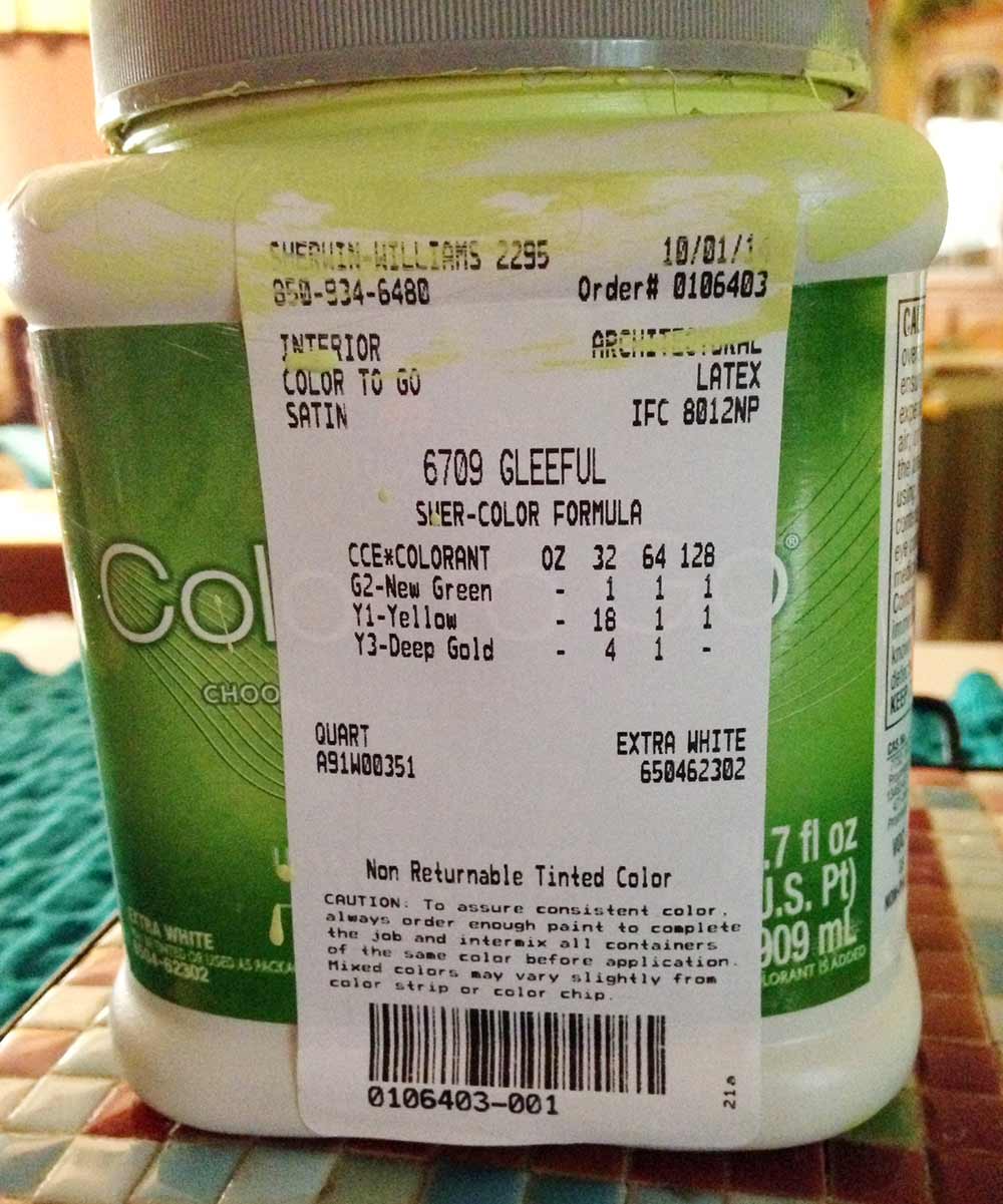
I love that the paint color is called “Gleeful.”
virginia says
Wowie zowie! This looks fantastic — love the LP fabric and that you went with the green, Diane. Love the introduction of the yellow towels also. Looks like you also brought the great vintage postcard piece closer into the bathroom itself.
I love it — Your collection really pops now. This Easter-egg combo of light pink, spring green, and soft yellow is one of my favorites. So cheerful and clean.
Congratulations. A happy, happy ending.