

 Color, color, color! Are we just imagining things, or are we seeing a return of pretty colors in home decor available from mainstream market manufacturers? Well — here’s hoping!
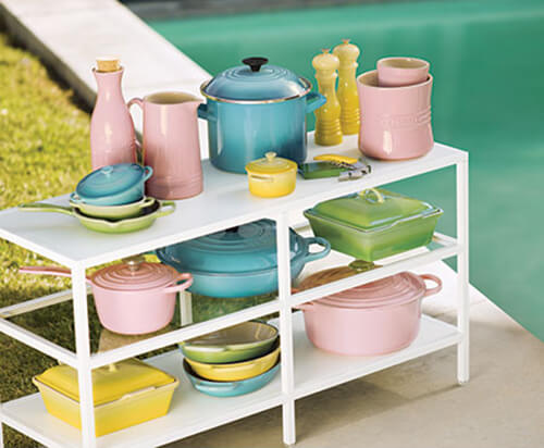
The latest evidence: Le Creuset’s new Oasis Collection.
I’ve always been a fan of Le Creuset, so when I received their latest email blast promoting their midcentury ‘Oasis’ collection, it piqued my interest. The collection combines three of their existing colors: Soleil, Palm and Caribbean with a new color — and it’s pink! ‘Hibiscus’ is a light midcentury pink that would look oh-so-cute in a vintage kitchen, maybe even one with our Retro Renovation® by Wilsonart® First Lady Pink boomerang countertops? Squee!
From the Le Creuset website:
A Bright New Paradise
In midcentury America, a new kind of optimism swept the nation. From Palm Beach to Palm Springs, people everywhere lit tiki torches, mixed cocktails and let the party spill out onto the patio. The backyard became the suburban paradise. On patios and by pools, open-air entertaining captivated the country as hosts embraced outdoor cooking and exotic island flavors in their own personal oases.

Tiki Torches Not Included
The crisp, refreshing shades of Oasis mingle effortlessly in any combination, just like guests at a great party. And what does a great party require? People to gather, food to share and a place to relax. Decades after midcentury’s heyday, the backyard still makes a perfect escape — and the timeless allure of outdoor entertaining still draws us all outside.
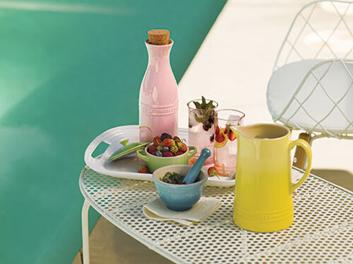
Cocktails by the Pool? Yes, Please.
As part of our celebration of all things midcentury, we redesigned our pitcher with a clean, modern sensibility. Grab a long bar spoon and channel your inner mixologist, or simply fill it with your favorite lemonade.


Diana says
I love these colors and I love le creuset. I have one dutch oven I bought on eBay for a very reasonable price. So reasonable I thought there must be something wrong with it! Ha! But it was perfect and I love it! You can still get good pieces for good prices on eBay.
pam kueber says
Sometimes I see Le Creuset at estate sales, and it is always in great shape (at very reasonable prices.) That said: I don’t see if at estate sales often — and I’m betting that’s because the kids grab it! Family heirlooms for sure!
Judy H. says
I love it! I think people are looking to lighter, fresher colors to wear, to decorate with and certainly to cook in! Pastels have been making a comeback for the past couple of years. How much cheerier to pull out a hibiscus casserole dish to make dinner and the old tired harvest orange!
Mary Elizabeth says
Fantastic development in kitchenware design! I am also in love with the green and blue/aqua colors. Yes, I think it’s a trend, like the renovation of mid-century houses, and that it’s being driven mostly by Millennials. The young 20 and 30-somethings are buying the houses from the estates of old folks and buying vintage dishes and such. It’s natural that they would want their new stuff to echo the old.
Retroski says
Speaking for the Millenials, yes, I think you’re right. We see this as old, cool, retro and Grandma’s kitchen. We value the quality, design and the lines.
As for me, I’ve always gravitated toward old things, especially old houses, like bungalows. But my appreciation for mid-century hasn’t come until recently . As a kid I snubbed ranches as “uncool” since they weren’t intricate or pretty like Victorians. But now (in part thanks to Retrorenovation) I appreciate the 50s-60s houses too!
pam kueber says
Yay, A Millenial Explains!
tammyCA says
I hope so..I love color & especially the “Jordan almonds” ’50s colors. I’ve been hoping to come across some le creuset pots at estate sales but naturally these go very fast. I finally just bought a less expensive new enamel cast iron Dutch oven (green) & it works great. I do remember seeing some Caribbean blue le creuset at home goods a few years ago.
Now what we need is affordable appliances… and sinks, tubs, toilets in colors!
pam kueber says
Well said: Jordan almonds colors!
Chris says
Did anyone else think that that the leading photo almost looked in miniature? Something about the perspective made me think, at first glance, that I was looking at dollhouse furniture. Big or little — love it!
Shelly says
Yes, I thought the same thing!
Allison says
Its the surprisingly coarse lighting they used for the photo- notice the harsh shadows? They were trying to mimic natural backyard daylight, and it just looked fake.
I’m glad some more vintage colors are emerging, but these are too pastel for me. A vivid aqua, chartreuse green and a salmon pink would be more in line with my 50s color palette (or palate!).
What am I saying? I’d love some la Creuset, but really, my inner cheapskate won’t let me buy any.
I did pick up a lovely 1950s butter yellow Dansk enamel-on-steel teak-handled saucepan at the thrift store yesterday- $5 well spent!
Donna says
LOVE the pink! It goes perfectly with my 50s kitchen and 80s “Forever Yours” Corelle
Retroski says
La Creuset has always had colors, but it’s nice to see the 50’s pastels! But I think La Crueset has always had pieces with that ombre look. How I love cooking with enameled cast iron…but it’s hard to love their prices! Even though they are made to last.
Kate says
Yes I agree — I have two Le Creuset pieces (a red dutch oven and an aqua cast iron skillet). I ADORE using them to cook and use them both often. Both of them were wedding gifts from when I was married about 6 years ago and they still look like brand new. With proper care, I expect they will last a very long time!
Retroski says
Righto! I have a little red Dutch oven by them (wedding gift) and it’s working great. I’m not lucky finding them resale but I’ll have to try EBay!
Rick S says
The colors are wonderful. They would add so much to a beige/gray neutral home but fit nicely with vintage interiors.
Even the shapes are vintage inspired. Maybe it is a trend 🙂
rick
Ethan says
I’ve noticed the “burst” colors in more and more things in the last year or two. By burst (I don’t know what else to call it) I mean when the color is darker on the bottom and gets lighter towards the top. This was popular in the 70’s as I’m sure we all remember avocado, harvest gold and Coppertone appliances being darker on the edges and lighter towards the middle. I like it and hope it sticks around for a while.
Jennifer says
The gradation you are describing is called “ombre.”
Andréa says
I certainly hope so!