

 Finding the just-right paint color can be such an arduous process. Margie struggled for a solid year to find the perfect pink paint (or would she go for wallpaper??) for her original Mamie pink bathroom. Would she ever find it? (Hint: In the end, she took matters into her own hands.)
 I’ve actually been in contact with Margie for the better part of a year, as she continued a tenacious quest to find just-the-right wall treatment for her vintage pink half bathroom.
After considering everything from vintage wallpaper to several different colors of paint, Margie found inspiration from Jane’s pink and green bathroom. Margie liked the idea of Jane’s ‘Apricot Fluff’ walls… but she had found another pink she also liked. So, she combined the two ideas….
Margie documented her saga for us — we suspect this is similar to what many of us do on the path to finding “perfect” wall treatments:
Hi Kate and Pam,
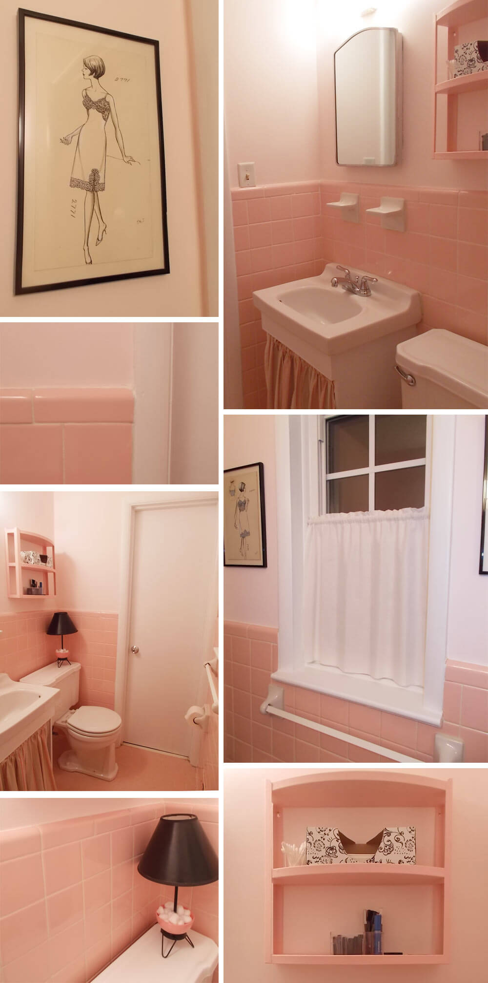
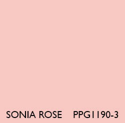
Just over a year ago, I told you about a paint color that almost exactly matches my 1957/58 pink half bath tile. It’s PPG Porter Paints’ “Sonia Rose.” I looked through a LOT of pinks to find it!
I used it to paint a metal shelf (above) in my bathroom but felt the paint color was too intense to use on the walls in such a small (4’3″ x 4’3″) room. I looked into wallpaper since I know the kitchen, full bath, and this half bath had been papered originally, and I’d even found a sliver of a tropical green and pink paper that I suspect might be original to the half bath. But I wasn’t happy with any paper I saw, either vintage or new.
Then I tried a grey paint for a while, and that wasn’t working, either. I removed the original interior window shutters to have them stripped and when I did that, the trim paint was ruined, so I needed to strip and repaint the trim. I tested for lead (none) and stripped the window frame and sill completely. When I started looking closer at all the trim and door paint, it was so lackluster and even seemed to be a sort of grey-white. I cleaned it and cleaned it and it never got whiter, so now I’ve repainted all the trim in the room and will (eventually) do a lot of trim repainting throughout the house. I had my original red oak floors refinished (Early American stain–it looks fabulous) in November, new shoe molding went down, and I have to touch up all the baseboards in the house, so this is a long-term job.
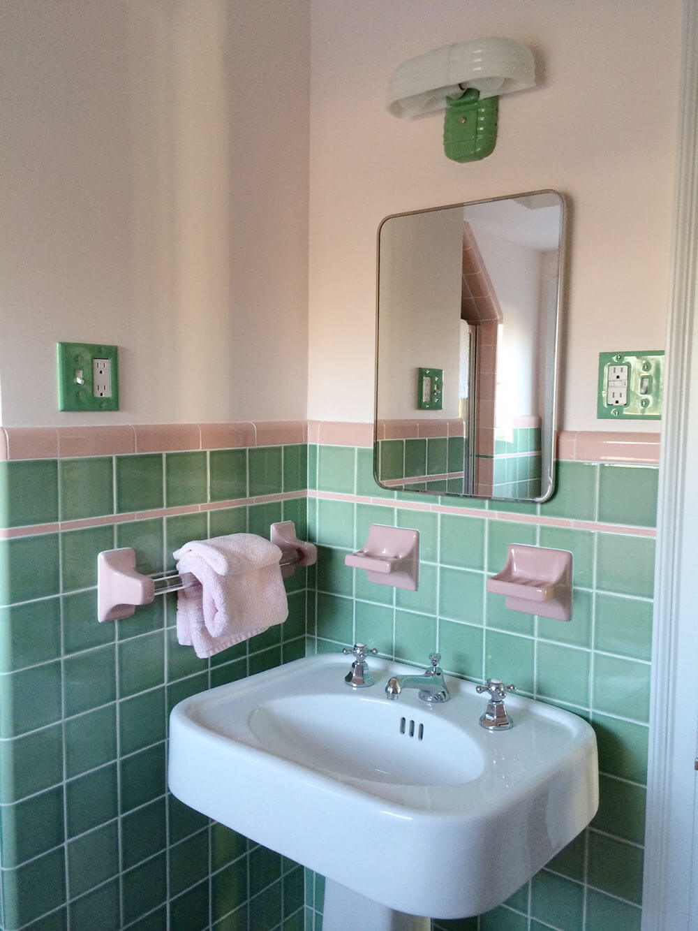
After seeing and loving Jane’s pink and green bathroom, I was inspired and thought maybe “Apricot Fluff” would work in my room, but it’s just a little too peachy for my pink tile.
So I decided to buckle down and mix up my own shade, which turned out to be about 25 parts white to 1 part Sonia Rose. I am so happy with it and wanted to show it off to you.
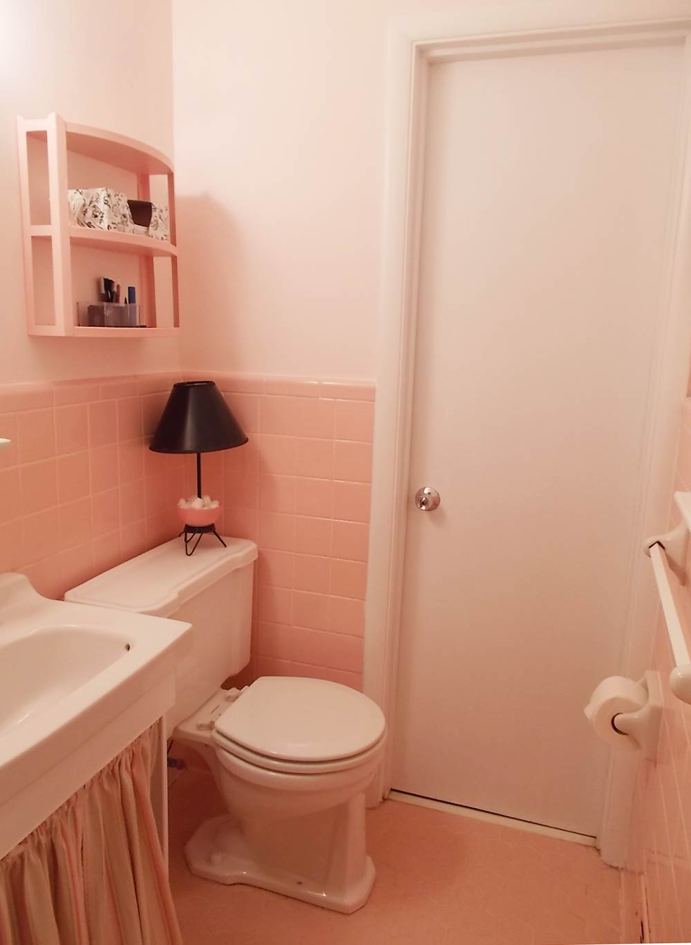
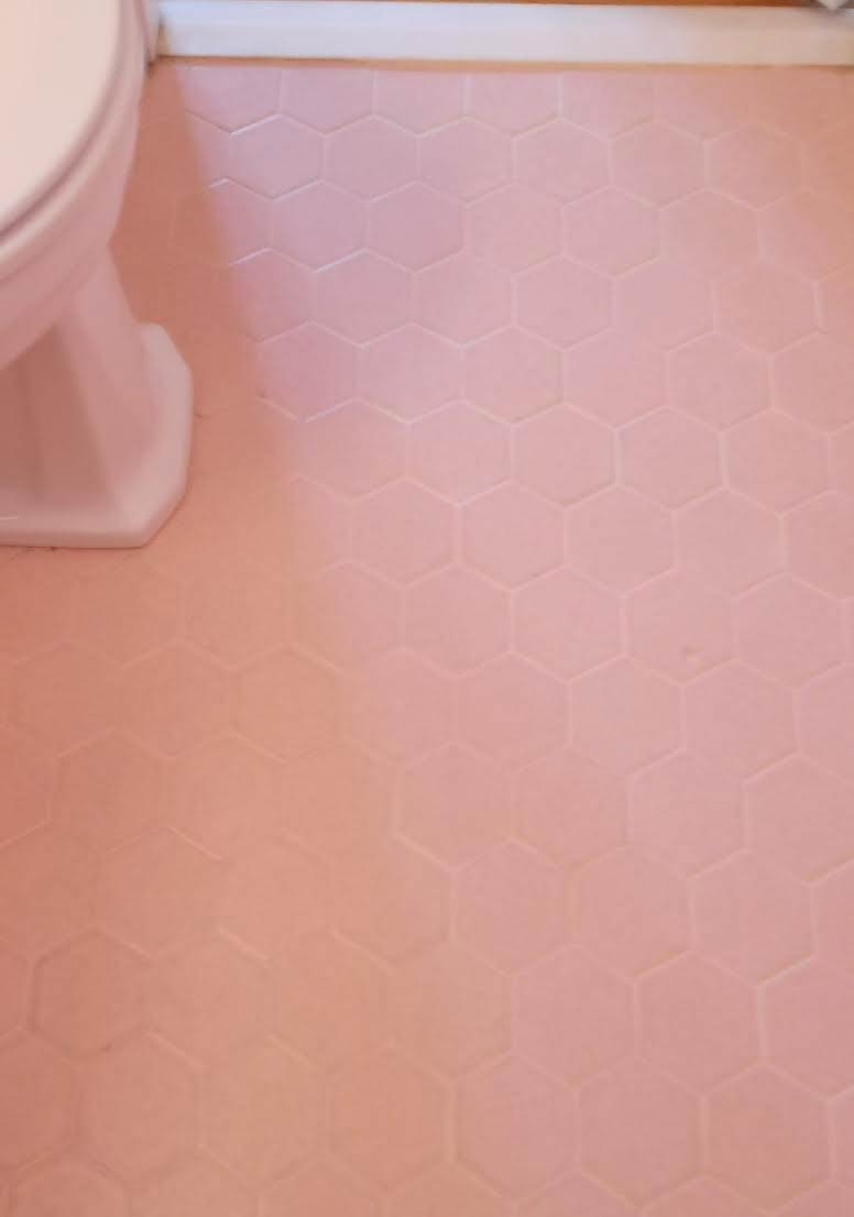
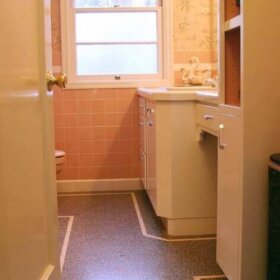
The bathroom still has its original floor tile, a dapple-finish hex tile.
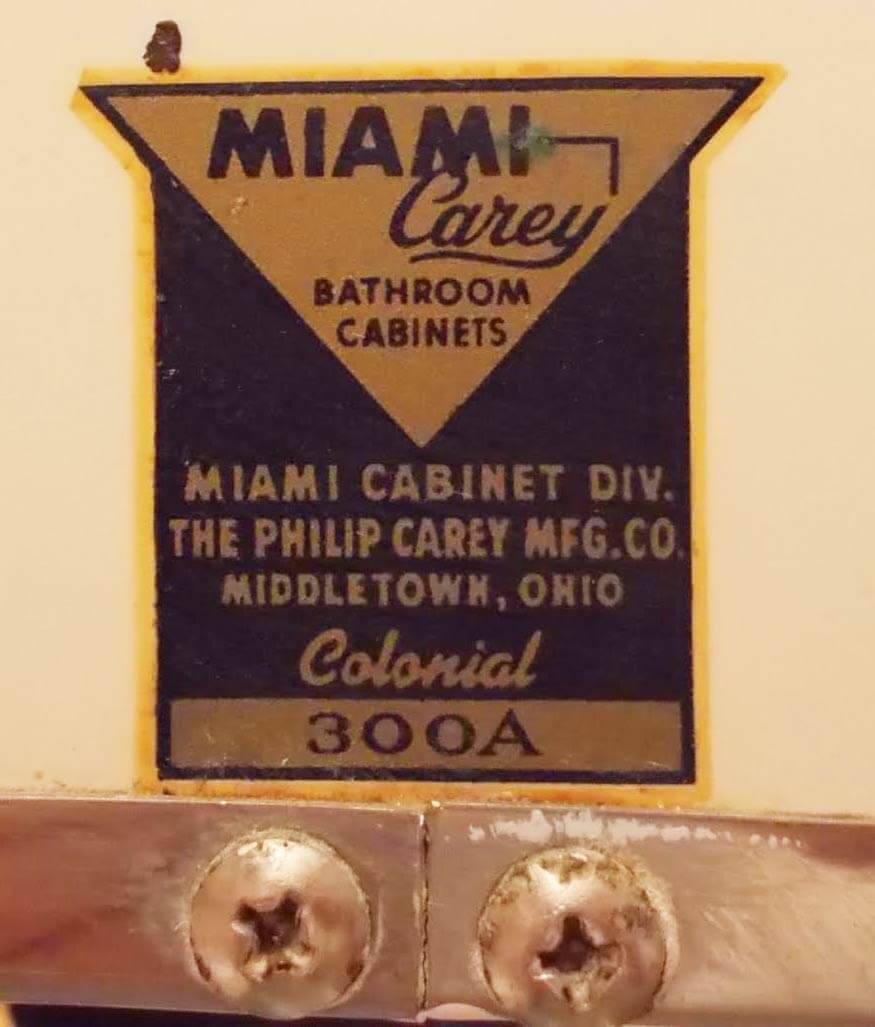
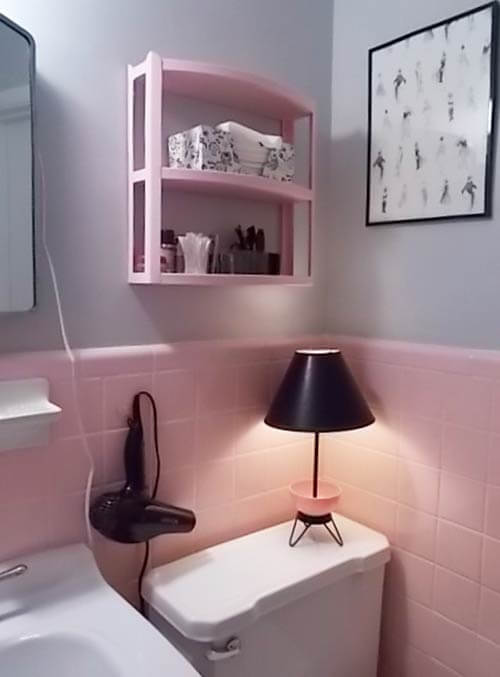
Thought you’d also like to know that the medicine cabinet is the original Miami-Carey, and the light switch glows when turned off. They installed the switch box too low, so I’ve had to cut the plate to make it fit above the tile. The only plug in the room is on the light fixture. If I did anything to remodel the room, it would be to move the switch box up and enlarge it to fit a switch+plug set.
The vintage lamp on the tank lid has a pink glass cup, perfect for storing cotton balls. I got the original lingerie sketches from a seller at Atlanta’s Scott Antique Market a couple of years ago. And I just installed a new, old-style light fixture to replace the single-bulb light that was in there. One day, I’ll find a more decorative shade for it on eBay.
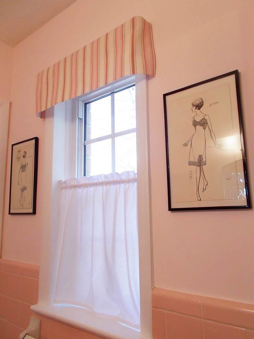
I made the valence to match the vanity curtain, but when I held up the fabric to look at making a matching window curtain, the room just looked like an old-tyme soda shoppe. So I got some whiter fabric that looks nicer with the whiter-white trim paint and made a new curtain. It’s clearly easy to overdo such a small space, which is why I was concerned about pink wall paint when this all started, and why I wasn’t happy with most wallpapers.
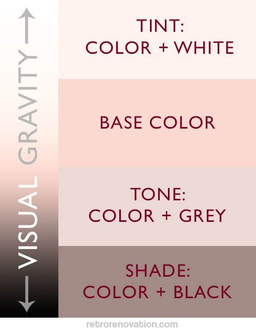
Margie, your pink bathroom looks fantastic — we love the pinks together, along with simple elegance of the pink paired with black and white decor — classique. In a small space like our bathrooms, sometimes the best bet is to use colors that have high Light Reflective Values (LRVs) to bounce light around the room and make it feel lighter, brighter and more spacious. Also, you know what Pam says about pink: It’s Retro Botox — it takes 10 years off, what with the rosy glow — great place to take portrait shots!
Thanks for sharing your fun paint-journey story!


Mary Elizabeth says
Congratulations, Margie, for finding your own solution. The pink you finally mixed came out looking like my childhood bedroom, which my dad and I painted together when I was about 12. When I was picking out the color, he told me, “Pick out the color you think you like, then pick a lighter shade of the same color. Then we’ll try it on a patch of one wall, and if it still is too dark, I’ll add white to it.” I’ve never gone wrong with his advice–on paint or any other topic, now that I think of it. 🙂
Margie says
That’s great. What a nice memory!
Pat says
Margie congrats on finishing this project! Gorgeous!!
maria says
We painted our *tiny* MCM master bath 7 times before we got the right, just a blush, shade of pink.
Kudos!!!!
Margie says
7 times!! You are braver than I am! The older I get, the less I like painting clean up!
Karin says
Stunning. The room glows. Persistence paid off. Thank you for the paint lesson. I will take it to heart.
Silver Screen Suppers says
Ha ha – Margie-Michelangelo indeed. It is GORGEOUS Margie. I am coming to stay! Jenny in London x
Margie says
PPG Porter Paints are perhaps a tiny bit more expensive than basic-level Lowe’s, but I like their tint variety and I’m pleased with the quality. Since the can sat so long, I had the shop shake it again before I started mixing. This room doesn’t have the same RH/water issues as a full bath, so I wasn’t worried too much about extremes of wear or cleaning where a really expensive paint might help. The qt. of Sonia Rose I got when I painted the shelf was an eggshell finish & I added flat white. I’d tried just eggshell with the grey for reflection but wasn’t happy with that look (plus the cool/warm issues) and really wanted the saturation of flat with this pink. And adding a two-bulb light fixture to replace the one-bulb fixture really helps in this north-facing room. I love RR’s color rules, and I worried that too much bright white would cool the pink, to much so I added a tiny bit of Sherwin-Williams “Cream” (what the main walls in the house are) to add back some warmth. In testing, too much Cream made the mix too peachy, so I had to be careful with it, but that little dab did do it!
pam kueber says
Margie-Michelangelo!
Trudi says
What a lovely room! We have a store nearby that carries them but I’ve never used PPG Porter paints. Can you compare them to another brand in ease of use, price?
Dana says
PPG paint is now the only paint I will use (interior – Silken Touch). It is more expensive, but the best quality – thick, superior coverage, incredibly durable, especially in bathrooms and kitchens and with kids! Well worth the price.
Carolyn says
Now watch, she’ll be toodling along in a store, looking for something else entirely, and her eye will catch on a bazillion (rough estimate) paint chips of “her” color. Or it’ll be featured in all the decorating/home magazines.
Margie says
Speaking of spotting pinks, I was at Lowe’s the other day and among their HGTV Home/Sherwin-Williams colors, I spotted SW0026 “Rachel Pink” and SW6323 “Romance” which are close contenders for Mamie Pink bathrooms. Rachel Pink has slightly more peachy tones in it than Sonia Rose, but it’s very similar. Romance has a beige tone to it but is very pretty.
Ruth Ann Kuntz says
A mono chromatic color scheme is probably the hardest to achieve. The color tints need to be consistent and not have extreme cool and warm tones mixed. They will feel off and you may not notice the temperature clash is the problem. Also light, bright and dark are needed. Rather it is a high, low or medium contrast. Your end result is beautiful and warm. Well worth the time.
pam kueber says
Agreed – your comments re temperature clash are spot-on. Much harder to pull off than one would think!
Beverly says
Paint selection is a brutal process–at least it is for me. I either have a precise idea of what I want, then can find nothing that is suitable, or I see so many things that could work then can’t make up my mind.
Congratulations to Margie.