

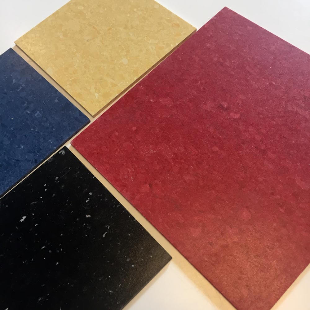
 Always on the search for retro flooring options, I ordered some samples from Mannington’s Progression line of 12″x12″ vinyl composition tile. There were several colors that looked like they could work for a vintage-era kitchen, basement, or even living room. Sure enough: I declare winners among:
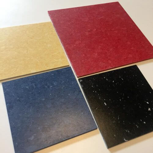 55228 New Geranium — a wonderful apple red…
- 55503 Banana Cream — a nice but not cloying yellow…
- 55170 Duchess Blue — a crisp classic blue…
- and 55101 Classic Black — although I’d compare that with the more streaky, super scrumptious Armstrong Standard Excelon Imperial in Classic Black, which has been around for decades, before making a final decision.

Note: I ordered these samples a while back. They’ve been sitting on my desk waiting their moment in the sun. Now that I go back to look at the site, I see there are some new colors. Check them out — my experience is that the image online and the tile in-hand look pretty different.
Link love:
- Mannington Progression VCT.
- All of our research on flooring options are filed in our Kitchen Help / Flooring subcategory here.


steven says
Sorry.
I forgot to mention that the florringinc.com stone peel and stick is only 40 cents a square foot. also the coppertone brown on the monitor looks red, but order a sample, its really a coppertone brown color.
steven says
If you are into the late 60s/70s then check out Flooringinc.com, click on “vinyl”, then click on “stone peel and stick tile”. they have a coppertone brown, harvest gold and blue in 70s styles. there is also one that has some green, called “decorative flower”. wish there was an avocado!!!!
pam kueber says
Thanks!! I will go take a look right away!
Marilyn Watson says
I lived in an old Victorian House for a few years which had the original kitchen floor of the 40’s and it was red and white…I loved it.
Karin says
These tiles are all great. I especially like the black. Do they need to be sealed with a high gloss finish?
pam kueber says
I do not know; manufacturer recommendations need to be checked…
Sam R says
Cut those into some different sized squares and rectangles, and it would be pretty easy to make a VCT version of the slate mosaic floors found in some MCM houses.
Debbie in Portland says
I’ve been agonizing over a kitchen floor decision for YEARS. I looked at these online last week and kinda waffled on ordering samples. But now that they have the Retro Renovation Stamp of Approval, samples of four different colors are on their way to my house. 🙂
Markie says
I like that the yellow is not a “sweet” yellow or “nursery” yellow- it is like a pencil yellow and more sophisticated. If that makes sense lol
Pookha says
My mother, always ahead of her time, put a red and black checkerboard pattern in her kitchen floor. These are a great throwback.
Jay says
Well I didn’t pick a retro color. I just had Progression installed four weeks ago but went with a neutral tone – the Almondine, which I guess many would say it was gray (horrors) but it had a green cast to it and it looks nice next to the dark green carpet in the hall. Although the streaks are subtle the installer asked about laying it and said the direction should alternate, but of course I said, is there any other way? He said people like it all in one direction and the tile does not look as nice. This tile is heavy, the color goes all the way through. It’s not going anywhere, it will last.
Paul in Omaha says
Those color options are delicious!