

 Ted and Marzie just closed on their “new” 1948 ranch house. But… do we really call it a ranch house, when the facade also has some delicious Streamline Moderne married to it? And… how should they decorate? Ted wants our ideas — and has sent photos to inspire our input. The invitation is out: time for all of us to put out thinking caps on and play decorator-designer!
Ted writes:
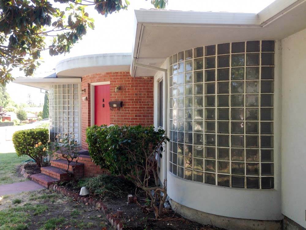
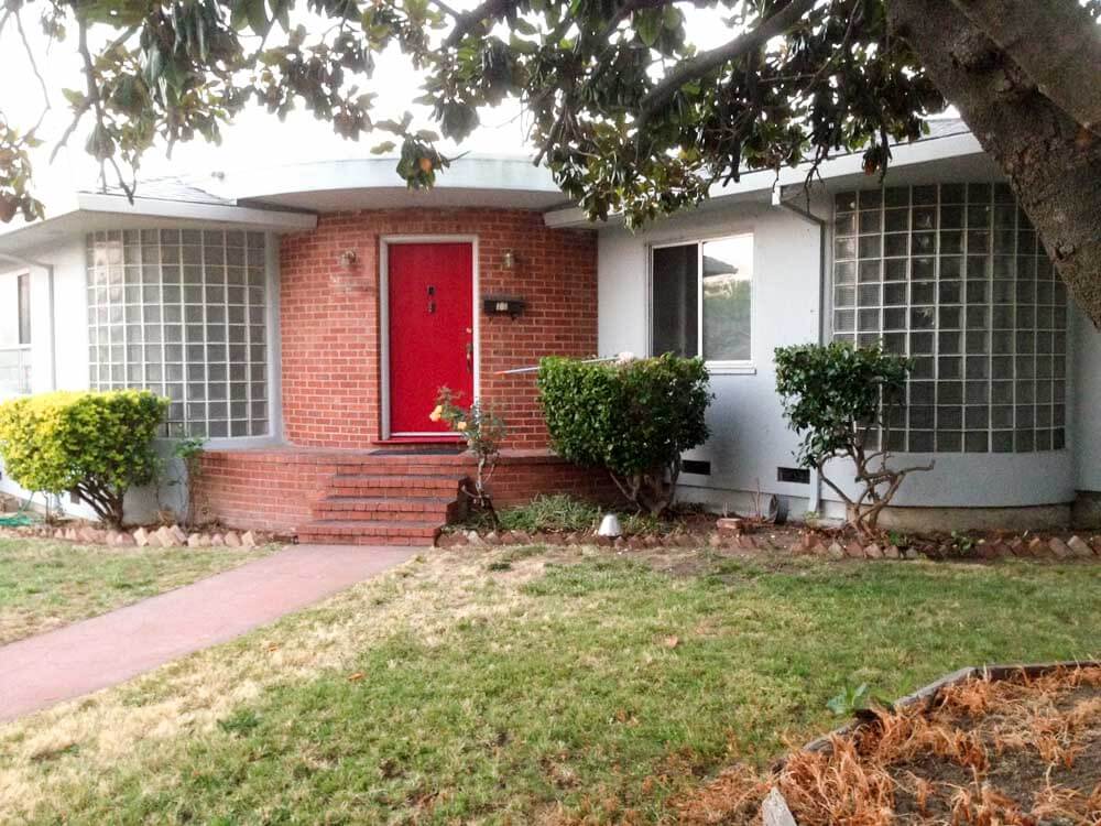
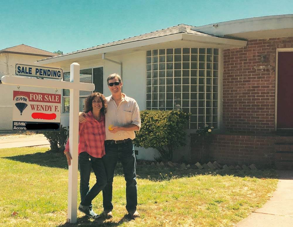
Hi, I have a problem I’m hoping you and your readers can help me with. I just purchased a house because it spoke to me, only I can’t quite figure out what it is saying yet. It’s giving me mixed messages. The house is a 1948 ranch with the typical long, low horizontal lines of a wide, single story house with a hip roof and big overhangs, combined with the strong vertical lines of a curved glass block and brick Art Deco “Waterfall”, or “Streamline Moderne” entry. So is it a mid-century modern ranch, or is it Art Deco or just plain eclectic?

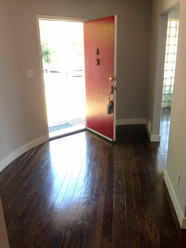
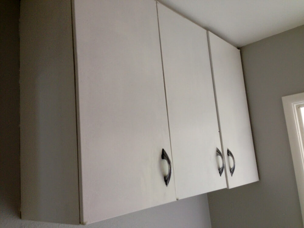
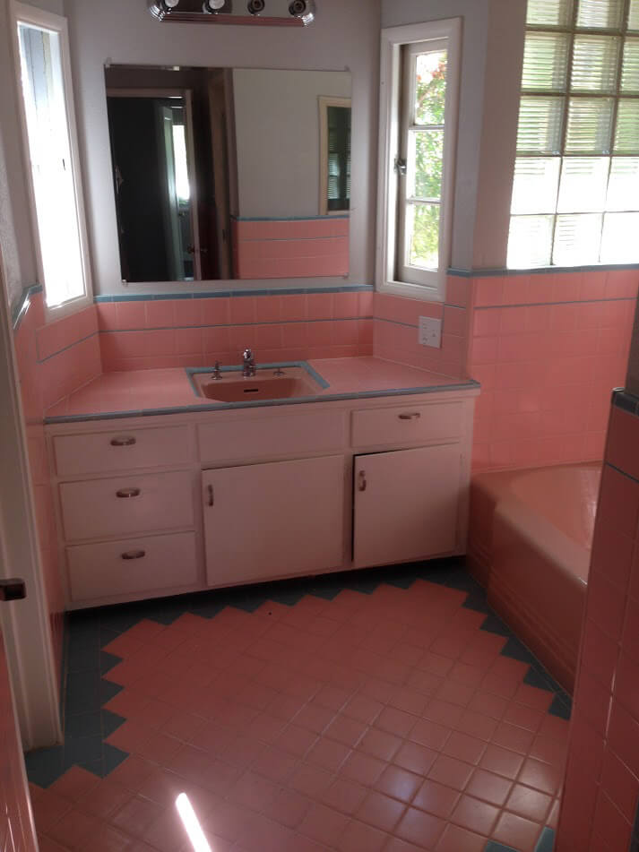
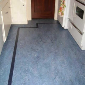
Some details have been lost over the years, but some remain like the original pink and blue bathroom, and there was a swinging kitchen door found up in the attic with a round port in it reminiscent of a ship (think Streamline). The bathroom addition to the right with its high, small windows is totally wrong, and the rest of the interior is just plain vanilla post war ranch with its plain, narrow trim and 8′ ceilings.
I have some ideas, many actually, but I’m struggling to come up with a cohesive direction to go with for this house as far as design inside and out. Do I use the remaining original bathroom with its worn tile as my inspiration, and match the new kitchen to it, or do I go with a more modern (1950’s/1960’s) feel throughout? Personally, I’m seeing red countertops and light birch cabinets for the kitchen on the inside, and sunny yellow with bright blue doors and grey trim for the exterior. I admit, I’m typically drawn to Arts & Crafts/Revival houses of the 1930’s with their warm, custom crafted details, so I’m a little out of my element.
I’d love to hear what ideas you and your readers have, including directing me to vendors that might fit the bill.
 Ted, whatever you call it, I love it — thank you for sharing; congratulations; and hooray that this house has made its way into thoughtful hands. And I love your sense of humor. Yes, readers say they listen to their houses, too, and sometimes it even gets… spooky! Okay, readers, here’s your chance:
- What to call the style of this house?
- How to remodel in a way that suits the original architecture — kitchen, bathrooms, colors for the exterior, and general ideas welcome!


Laurie says
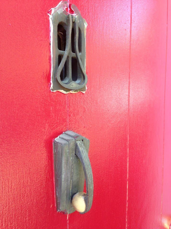
This house has the 40’s lingering design mixed in with the 1950s. I think you could mix a little of both and it would look lovely. I love the glass brick and round walls. Surprised the arches are not round. Maybe they were trying to modernize! Also the door knob screams art deco! Lots of fun to be had… enjoy.
Nina462 says
my suggestion is to look at magazines from that era for decorating ideas. If you look at Better Homes & Gardens or The American Home you can get great ideas. (but don’t buy the lead paint or asbestos tiles they advertise 🙂 Heywood Wakefield I think would be just grand in your house. Also, on the side porch, I’d put a couple of those chairs, the old metal ones with the shell back (galvanized metal).
Jo-Ann Mason says
Please, please rip out that bathroom and sell me those pink tiles! ???? I will pay all shipping costs to Canada.
It’s a wonderful house and your ideas for it sound great. Enjoy!
Ted Crocker says
I found the shower tiles saved in the crawl space. Nice to see someone cared.
Sandy McClay says
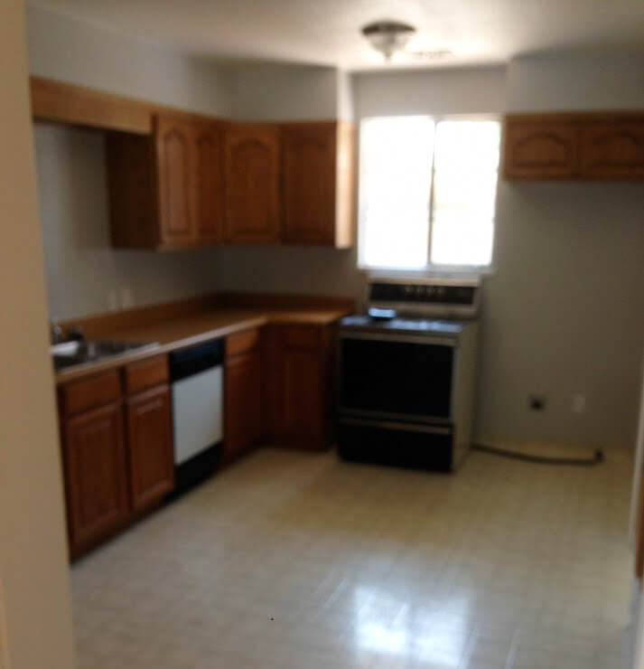
OH! This house is so cool…but gut the kitchen it definitely does not speak of this house’s character!
Jason Baker says
Beautiful home, and I would put it in the streamline or possibly art moderne category. If you took away the attached garage and went with a flat roof, you would clearly be in streamline moderne. But, first things first – looking the front elevation I would guess this has a cripple-wall foundation so the first thing I would do is make sure it has had a proper seismic retrofit. If some type of retrofit has already been done, I would have that checked to make sure it was done correctly as most cripple wall retrofits are not, and in fact some of the retrofits actually make things worse.
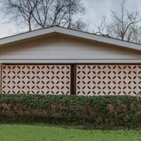
In 1948, garages were becoming much more common, but were not yet incorporated fully into the design of the house, as can be seen here. I’d plant things to obscure the garage, and remove some of the foliage to the right of the house to reveal more of the radiused architecture which has been obscured. As it stands, the garage grabs far more attention then it should. I might even be tempted to paint the garage portion a different shade of the house color.
It looks like many original light fixtures were removed, luckily it is quite easy to find good-condition originals through the usual sources in the streamline/moderne variety. Shop around, it’s actually fun finding them.
The bathroom is a gem (except the vanity light and mirror, which look like early 2000s big-box store replacements) and I would use the bathroom as an inspiration for the rest of the interior styling in places where original style has been scrubbed out, such as the kitchen.
As for the kitchen, I would envision soft, light colors, perhaps metal cabinets, and chrome tubular dinette furniture with period correct appliances. I’d avoid stainless steel and granite, this house does not want that stuff. Ditto for recessed lighting and skylights. Is there a door bell niche? Somehow I think the house screams for one, with long tubular bells.
Congrats on your find!
Sandi says
Here is my suggested todo list:
Pull the tooo tall shrubsand landscape low shrubs and keep them low.
Paint front door turquoise
Keep bathroom and paint the cabinet a very light shade of the tile going around the outer edge of the floor.
Gut the kitchen…….
The white cabinet is your inspiration piece …..look for those to redo the kitchen.
Llooove the glass block window!
I hope you have already trashed the vertical blinds.
Red concrete, repaint lighter gray.
Good Luck!
Emily Wilson says
This house wants to be a movie star! I’m getting a huge vibe from Old Hollywood Glamour, but it’s definitely right at the turn of the times and needs a modern edge. Aside from all else, please put a curve-backed piece of furniture near the curved window in the living space. Perhaps a curved sofa with art deco leanings?
Laura Ainsworth says
Oh, what a wonderful house! If you need a label, I’d call it “Moderne Ranch,” ha. But, really, just embrace the ’40s. The bathroom is to die for.
Yes, Heywood-Wakefield furniture would be perfect. For colors, patterns and furnishings, check out movies from that time. (If I think of some that reflect the style of people who would’ve lived in a house like that, I’ll write again.) Live in the movies for awhile and let your ideas percolate. It seems to me that since you were drawn to this house in the first place, you’ll probably be drawn to an appropriate look as well!
Diana says
Ted and Marzie…This beautiful home you have furnished just screams Art Deco with old Hollywood to me. I personally love Art Deco and like some of the glam of Old Hollywood. Embrace the glam in a more modern way…chrystal lights with modern barrel shades over them, etc. I know people tend to want to go 50s to 70s retro, but 30s to 40s can be a very interesting journey also. Look on Sherwin Williams they have charts that take you thru colors of all decades. Art Deco furniture shapes are very interesting and so is the artwork. This would be my idea to check out. Whatever you do, it is a beautiful home. Happy Decorating!
Ted Crocker says
I think the master bath I have in mind will say 1930/1940’s Hollywood. I want to build a custom curved vanity into the glass block wall at front. I chose my colors from S-W. Their yellow is perfect, but I am cutting the pigment to about 50%. I am also going to create a built in settee table and kitchen island that mimics the deco curves.
Sandra says
No headers show above the glass block wall (I doubt they’re recessed in the attic) If you touch the structure, you may have to lose the floor-to-ceiling blocks, so I’d recommend hands off the front.
I zeroed in on that because my 1956 house similarly mushes two styles together: ranch and modern. A ranch house would never have floor to ceiling windows in case it let the livestock in! The 1954 homes across the street were all-out-modern “Eichler” type style, with no attics, no insulation, hot in summer, cold in winter, and no garages, just carports. They had great modern style with indoor-outdoor connection, but were impractical.
By the time my house was built, they were obviously trying to meet practical demands. The result is “modest” and I’ve had a similar struggle to try and get my home to have style. When I replaced the main front window, I lost the floor to ceiling look because I had to add a header. However, because the house was built with a ranch-style porch over the window, it really didn’t make much difference as the overhang blocked the view from the top couple of feet of window, anyway.
That said, the deep overhangs are great! They keep the walls cooler in summer and dryer in winter.
It has been a struggle for me to figure out how to decorate with ranch-midmod bones, so I empathize.
Ted Crocker says
Yeah, I really like the overhangs for the reasons you mentioned and then some. Fortunately, this house was very well insulated and it stays about 10 degrees cooler on the inside. I’m trying to improve the indoor-outdoor connection that this house lacks – sort of playing to it’s ranch heritage.