

 Elizabeth wants our help: Which tile should she choose for the floor for her 1963 blue bathroom Retro Renovation? And fun: The renowned architects of the house built the Austin, Texas, airport, and Elizabeth is taking the color of the still-standing control tower for her color cues.

Elizabeth writes:
Hi Pam! I’ve been enjoying your stories, as usual. I mentioned to you recently that my husband has bought a 1963 house in Austin that has nine bathrooms. I’m ready to beg for your and your readers’ assistance on the first one.
Be forewarned, there is nothing original in this house. We did get the original floor plans from the Austin History Center, because the architects are locally reknown. (There were only two bathrooms originally!).
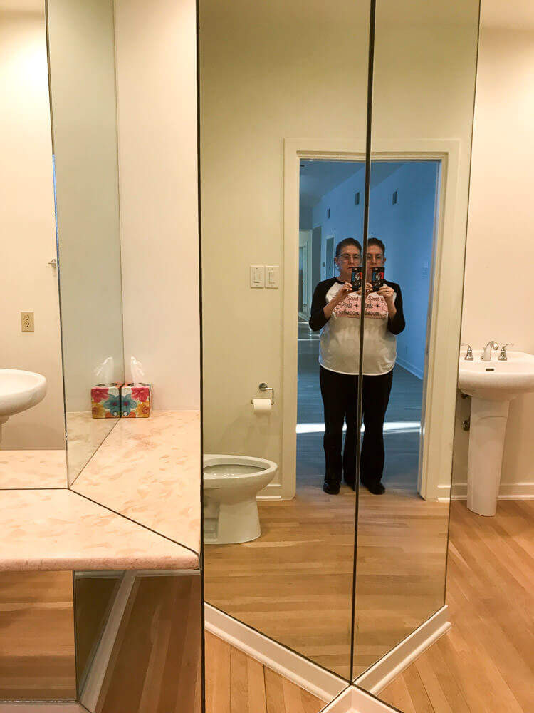
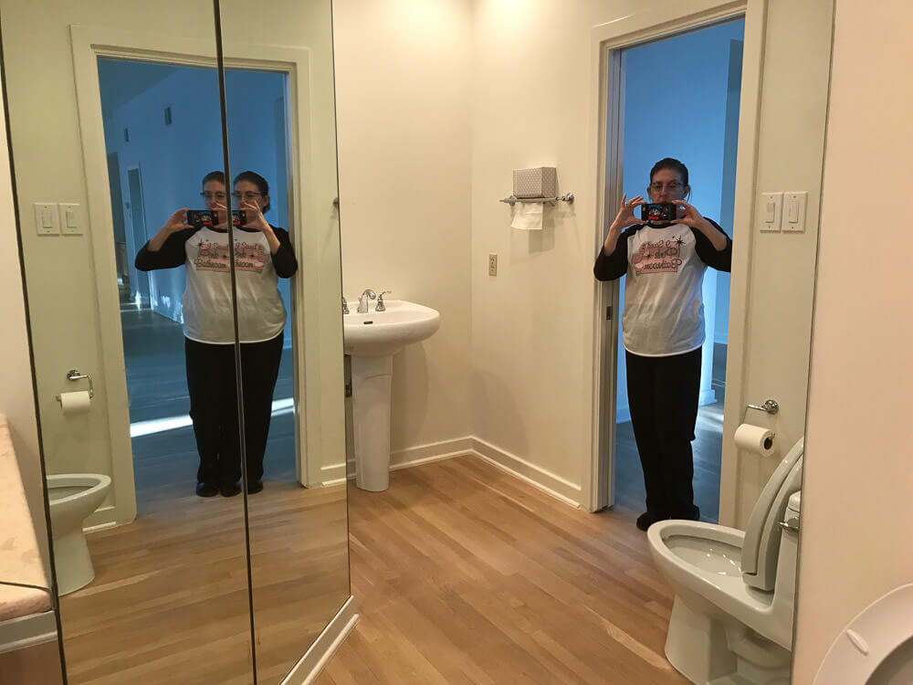
Here is the powder bathroom of the foyer. Many of the bathrooms will have to stay as is, because we do want to move in sometime this decade. But this, the only public restroom on the main floor, is going back in time to 1963.
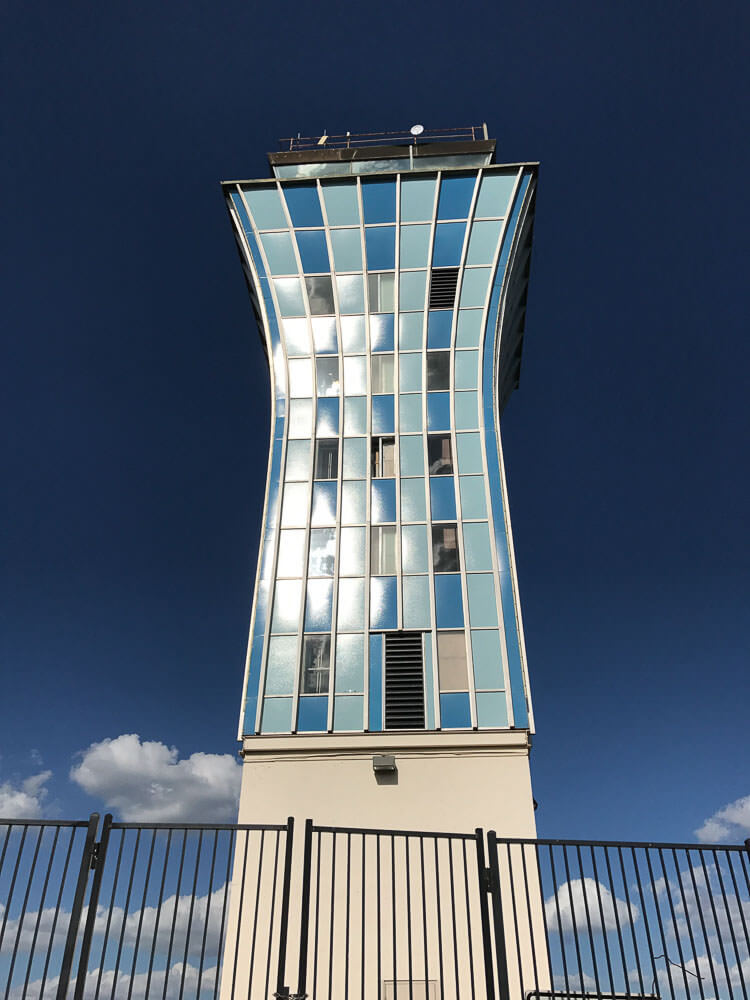
Our architects (Fehr & Granger) built our house in 1963. In 1961 they built the Austin airport, which is now gone except for the control tower. We are using the control tower colors as our theme for the house, which we named Sky Crest.
Here are the givens: new Dresden Blue toilet and sink from Peerless Pottery*; I think the sink that drops into a floating vanity. We definitely want the Blue field tile from Gardena, Calif., through Clay Squared. The sticky decision is the floors:
* Pam added link to Amazon, the blog earns a small commission for purchases completed.

#1 — shown above — Do we go with the Merola Crystalline Square Blue [See this tile in Pistachio on Kate’s floor] or …
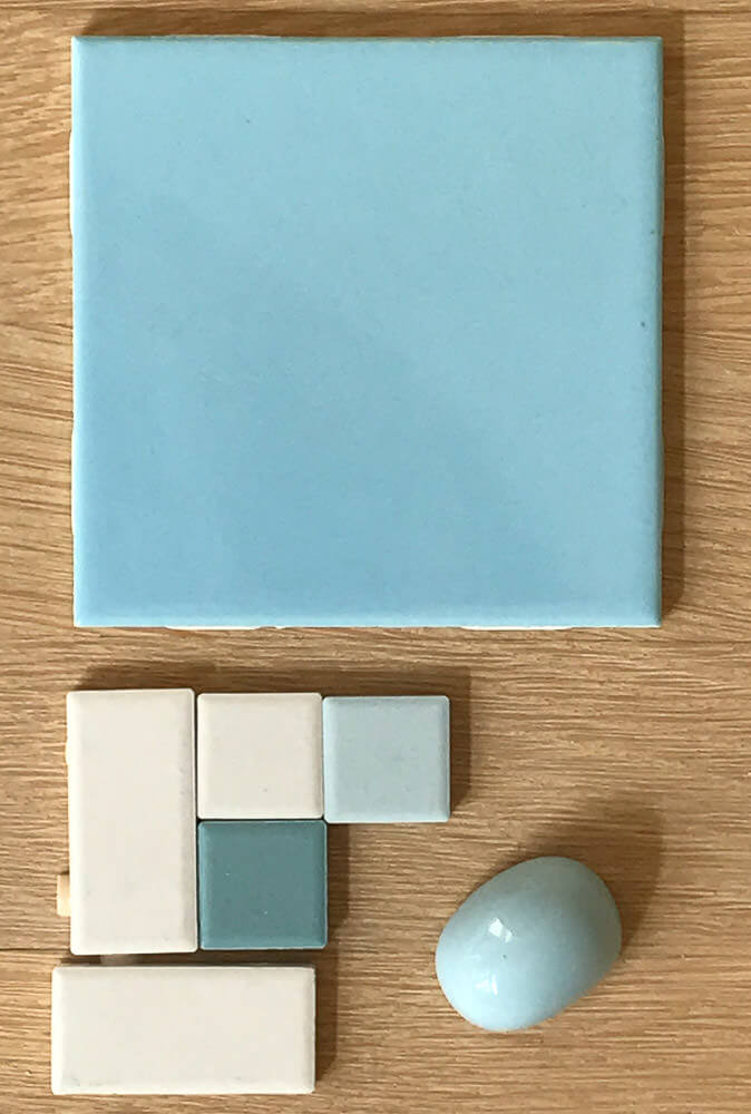
#2 — above — American Olean in a Pinwheel or Windmill pattern, using Glacier, Ice White, and Ocean Tide?
Thanks!!
Elizabeth
Thank you, Elizabeth, we love to decorate vicariously! And I LOVE that you are using the Austin airport control tower for color and pattern inspiration. Brilliant!
I have my own ideas, but I’ll let readers comment first.


TK says
Both good choices, but my preference leans towards #2, the pinwheel. More bright and cheerful, in my book, plus closer to the colors and shapes of the tower.
Dargis says
If #1 has a texture on it, out will be hell to keep clean on the floor.
Barb says
Our 1967 ranch has number 2 tile colors that we are keeping.
Christine W says
What a big project with alot of decisions to make. Even though you asked which of the two – I would use the Merola University Tile (which is neither) with a base cove, but this doesn’t really relate to the Tower.
The peaceful colours of the American Olean are really nice. I’d stick some Bimini Blue in there somewhere
Elizabeth from Texas says
Christine W, you really know your floor tile!! I had to google them both, but now I remember them from my research!
I was originally in love with Merola University Tile, but when I received a sample, I felt like the pieces were too big (from what I remember as a child) and that the large blue squares look as if they’d been piddled upon. Otherwise that would have been my favorite choice.
I see that some Bimini Blue stuck in the American Olean mix would give it some more contrast.
Thanks!
Carol says
I too loved the Merola University Blue. You never know, until you have it in front of you, if something is an option. #1 has darker colors and grey. This tends to make the blue darker. This is kind of a large floorspace compared to a period bathroom so it could darken the room. The #2 option is light and precise and clean looking. #2 would be like looking at Air Force One in the sun(with another blue added), while #1 would be like walking into a bathroom with 40 watt bulbs. They are both very, very appropriate and pretty, it’s just a personal preference. I like #2 with another blue added.
Christine W says
Now that I’ve seen your pink kitchen (wow!) what about using vinyl tiles in some sort of pattern and colour combo like the Tower?
Carolyn says
I’m all about prevention especially when it comes to cleaning. My choice, just based on upkeep, would be #1 because of the busy-ish splatter of the floor tiles. The powder room is a “public space” and will see a lot of use and abuse (people walking in off the street with gosh knows what on their shoes!) Even using gray grout, the plain tiles, while prettier colors, would highlight every bit of ick traipsed in.
How much do you enjoy cleaning? How many drop-in guests do you get? I’d save Choice #2 for the guest bdrm.
BkK says
Speckled #1 prob stays clean a bit longer….but #2 is the one I have in my 1956 bathroom….yellows, creme and brown tho
Grama Robin says
I’d go with the Merola splatter, but save the other pinwheel pattern for another bathroom because they’re both great!
Jean says
I vote for #1. The colors/spatter pattern are eerily similar to my teal 1964 bathroom.
Laurie A says
I think #1 is a better match, and I think it would look cleaner longer.
MARTHA says
Well, rest assured that either choice you make is going to be beautiful, as they are both lovely colors and excellent representations. I favor #2 the most. I love the clean white tiles in the combination and the shapes are very reminiscent of the tower style itself. Thanks for sharing, good luck.
Elizabeth from Texas says
Thank you, Martha! It is so kind of everyone to share their love of mid-mod with us to help us decide! I didn’t even think about the fact that the #2 tiles resemble the shape of the tower colors…