

 Elizabeth wants our help: Which tile should she choose for the floor for her 1963 blue bathroom Retro Renovation? And fun: The renowned architects of the house built the Austin, Texas, airport, and Elizabeth is taking the color of the still-standing control tower for her color cues.

Elizabeth writes:
Hi Pam! I’ve been enjoying your stories, as usual. I mentioned to you recently that my husband has bought a 1963 house in Austin that has nine bathrooms. I’m ready to beg for your and your readers’ assistance on the first one.
Be forewarned, there is nothing original in this house. We did get the original floor plans from the Austin History Center, because the architects are locally reknown. (There were only two bathrooms originally!).
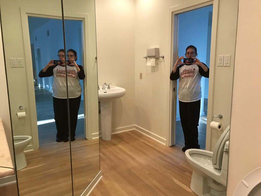
Here is the powder bathroom of the foyer. Many of the bathrooms will have to stay as is, because we do want to move in sometime this decade. But this, the only public restroom on the main floor, is going back in time to 1963.
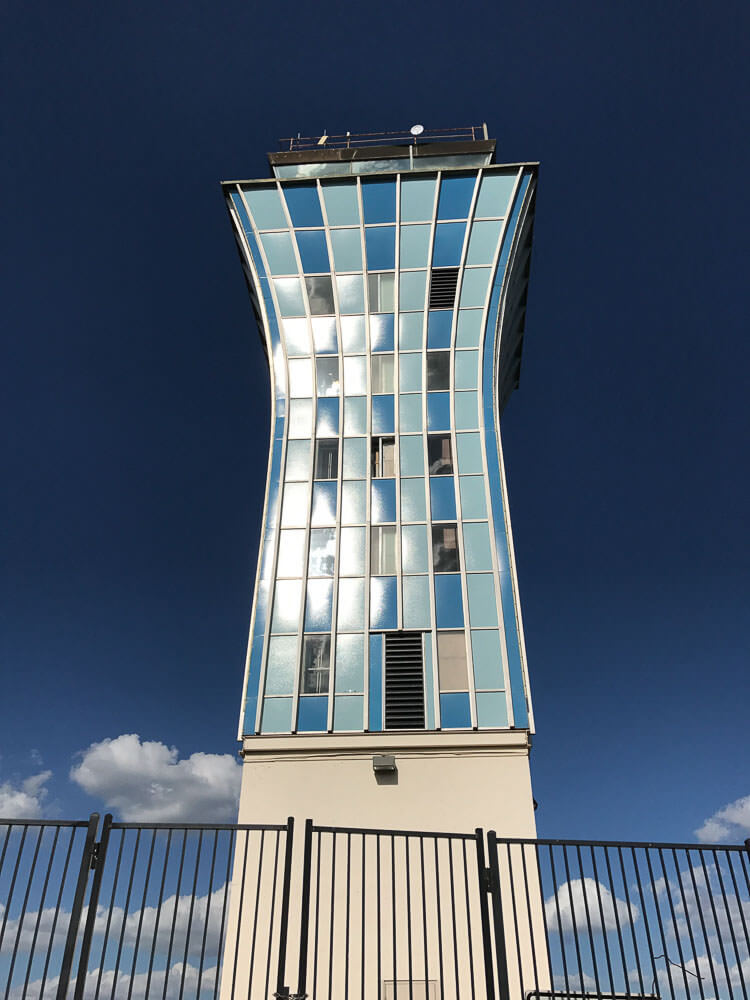
Our architects (Fehr & Granger) built our house in 1963. In 1961 they built the Austin airport, which is now gone except for the control tower. We are using the control tower colors as our theme for the house, which we named Sky Crest.
Here are the givens: new Dresden Blue toilet and sink from Peerless Pottery*; I think the sink that drops into a floating vanity. We definitely want the Blue field tile from Gardena, Calif., through Clay Squared. The sticky decision is the floors:
* Pam added link to Amazon, the blog earns a small commission for purchases completed.

#1 — shown above — Do we go with the Merola Crystalline Square Blue [See this tile in Pistachio on Kate’s floor] or …
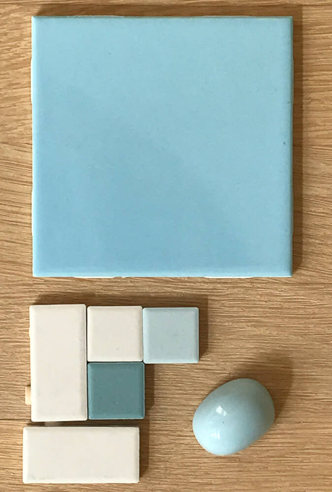
#2 — above — American Olean in a Pinwheel or Windmill pattern, using Glacier, Ice White, and Ocean Tide?
Thanks!!
Elizabeth
Thank you, Elizabeth, we love to decorate vicariously! And I LOVE that you are using the Austin airport control tower for color and pattern inspiration. Brilliant!
I have my own ideas, but I’ll let readers comment first.


Eartha Kitsch says
#1 for sure
Char says
#2!!!!
Char says
#2..The perfect combo!
Judy H. says
The Merola Splatter Mosaic…no question! One of the bathrooms in our mid-century home has wall tile identical to yours. We used the Merola Splatter Mosaic and love it! It adds the perfect contrast in color and texture to the tile walls. I think if you used the American Olean, your bathroom would look flat and uninteresting. Another bonus from using the Merola was that the bathroom didn’t require as much accessorizing since the floor added so much pizazz.
Jim says
Like number 1… it seems a little more sophisticated. Perfect for a guest powder room.
Nancy says
Number 1 will look great! (Plus I don’t love unglazed tiles.)
Kim says
#1 !!!!
Marie Gamalski says
I’m in camp Merola all the way… are those oval thingamagiggys from the toilet?? She actually found toilets in those cool colors?!?! LOVE the color of the one w/the Merola color group!!
Marie Gamalski says
Just editing my comment…. I thought the Merola w/the toilet thingamagiggy was more of a green/blue/tealy color until I clicked. I was SOOOO excited you could find a toilet in that color, but, sadly….no, just the pic I guess…..bummer….
Elizabeth from Texas says
The color change is the difference between one photo in bright sun and the other in a bit of a shadow. The color is a gorgeous Dresden Blue, but not the tealy shade you were looking for. But maybe if your bathroom is not in a bright room it would be okay? For example, this powder room has NO window.
Chris says
I like #1. All the colors and it looks like it would be easier to keep clean looking. But you live there 🙂
ineffablespace says
If you used Daltile instead of American Olean (same parent co.) , you would have more variety for blue shades and could achieve a subtler shift for your second option. I feel like the 60s mosaics had more subtle color shifts, or at least more similar saturation of colors than high contrast.