

 Elizabeth wants our help: Which tile should she choose for the floor for her 1963 blue bathroom Retro Renovation? And fun: The renowned architects of the house built the Austin, Texas, airport, and Elizabeth is taking the color of the still-standing control tower for her color cues.

Elizabeth writes:
Hi Pam! I’ve been enjoying your stories, as usual. I mentioned to you recently that my husband has bought a 1963 house in Austin that has nine bathrooms. I’m ready to beg for your and your readers’ assistance on the first one.
Be forewarned, there is nothing original in this house. We did get the original floor plans from the Austin History Center, because the architects are locally reknown. (There were only two bathrooms originally!).
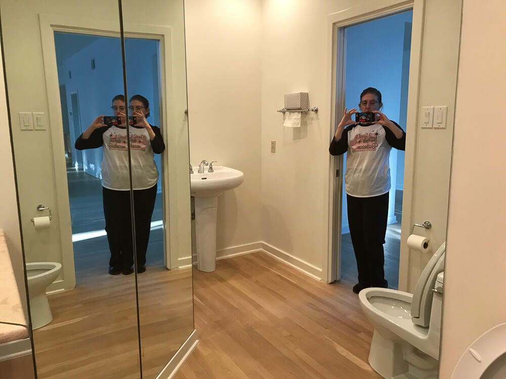
Here is the powder bathroom of the foyer. Many of the bathrooms will have to stay as is, because we do want to move in sometime this decade. But this, the only public restroom on the main floor, is going back in time to 1963.
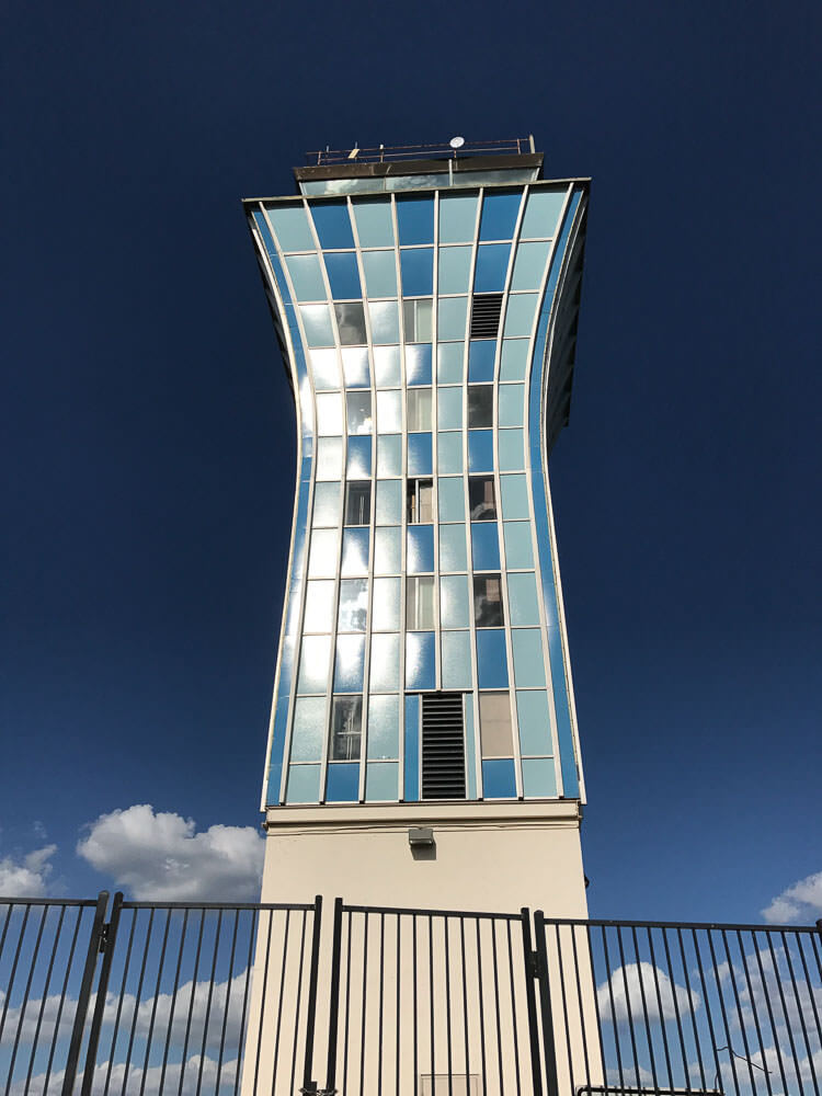
Our architects (Fehr & Granger) built our house in 1963. In 1961 they built the Austin airport, which is now gone except for the control tower. We are using the control tower colors as our theme for the house, which we named Sky Crest.
Here are the givens: new Dresden Blue toilet and sink from Peerless Pottery*; I think the sink that drops into a floating vanity. We definitely want the Blue field tile from Gardena, Calif., through Clay Squared. The sticky decision is the floors:
* Pam added link to Amazon, the blog earns a small commission for purchases completed.

#1 — shown above — Do we go with the Merola Crystalline Square Blue [See this tile in Pistachio on Kate’s floor] or …
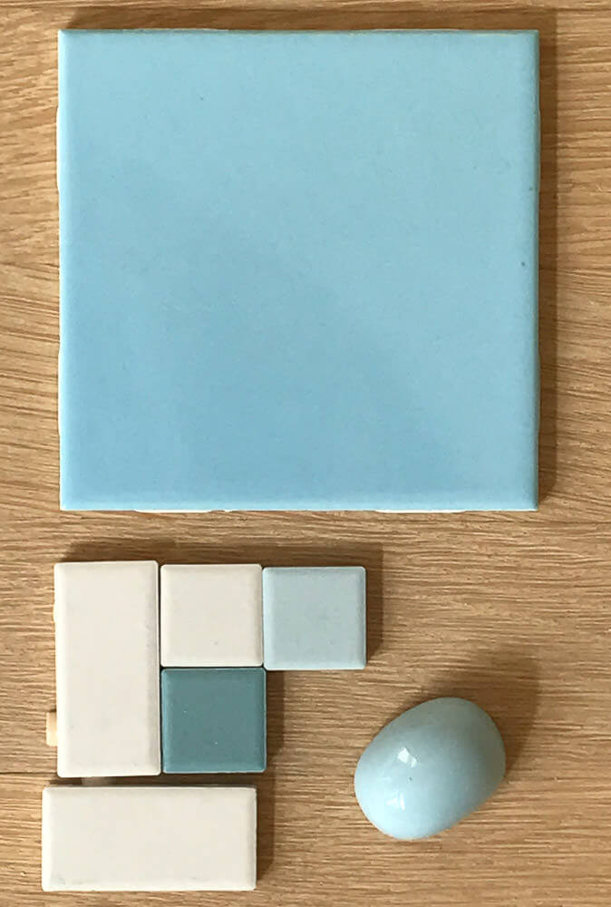
#2 — above — American Olean in a Pinwheel or Windmill pattern, using Glacier, Ice White, and Ocean Tide?
Thanks!!
Elizabeth
Thank you, Elizabeth, we love to decorate vicariously! And I LOVE that you are using the Austin airport control tower for color and pattern inspiration. Brilliant!
I have my own ideas, but I’ll let readers comment first.


Neil says
If you go the the website and look at the Merola tiles installed…they read more neutral/gray than blue.
So….the second choice, for sure; and heavy on the two blues.
Madeline says
#2 , cleaner , more modern and much more reminiscent of the tower.
Caitlyn says
I like both options but I feel like option 2 better reflects the tower’s design.
Nina says
Option #2
Catherine Hammersley says
the Merola
Pam Kueber says
Hey Elizabeth, doing some research on this question for a followup story on Monday, saw this, not sure it’s really period-authentic — not sure if they did penny rounds in the early 60s, but the colors might be right http://www.classictilenewyork.com/productcat/penny-round-mosaic-tile-blends-czg007a-light-blue-mix429
Helen Payne or says
This one would definitely be my choice of the three!
Susan Halla says
Oooh, not a comment on the color schemes, but Elizabeth, have you seen the Fehr and Granger exhibit at the Austin Center for Architecture? It’s only on display until November 15th! More info here: https://www.aiaaustin.org/event/fehr-granger-architects-austin-modernists-exhibit
There’s another great exhibit in Austin, Mid-Century Austin: Photographs by Dewey Mears on display until January 14th at the Austin History Center. Here’s info on that. https://library.austintexas.gov/ahc/mid-century-austin-photographs-dewey-mears-401505
Hey, if I can’t go, I want to make sure someone else can go and love it and tell me all about it!
Elizabeth from Texas says
Thanks, Susan! Yes, we went to the Fehr & Granger exhibit on opening day, which coincidentally was the exact day we closed on the house! And we went to the opening of the photography exhibit at the Austin History Center, where we had found the original blueprints of the house. But wait–there’s more–(like on the commercials) we also got to visit two Fehr & Granger Open Houses! One of them was the personal residence of Charles Granger. It was nice, but then they showed “before” pictures that demonstrated that they had demolished a BUTTER YELLOW BATHROOM!!! I was sad after that! I’m all about the colored bathroom fixtures and kitchen appliances!!! Appreciate your looking out for us!
Nina462 says
I’m going to have to say #1 with the little speckles. That is what is in my original 1965 blue/yellow bathroom & I love it.
Amy from Sacramento says
Love ’em both, but I prefer #1. The spatter is great and looks like it would hide dirt a bit better. (I gravitate towards pattern for that reason.)
ANDREA says
My goodness… both good choices… Mrs. Elizabeth I like #2 better.. It’s brighter… Less grey tones… But both beautiful.