

 Here’s a time capsule house of a different color: Not only is it designer-decorated, with every little detail carefully considered, color-coordinated, and matchy-matchy… but this house was barely lived in — for nearly 50 years! Yes, the owners had five other houses and only stayed here a few weekends each year. So pretty much every single element is: Original and pristine. Oh and: The house is for sale fully furnished! Let’s analyze the details — here’s how the late 60s / early 70s were done — in 17 photos >>
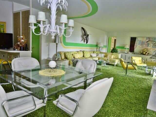
#1 (above): Oh my word, the lime green and yellow striping that leads you through the living room. What a snazzy way to connect the spaces in a large, long room.
Here’s the listing info:
- This single family home located at 446482 E Fishermans Road, Gore, OK 74435 is currently listed for sale by C21/Wright Real Estate, with an asking price of $359,000. This 2,832 sq. ft. property was built in 1960 and has 3 bedrooms and 3 full baths.
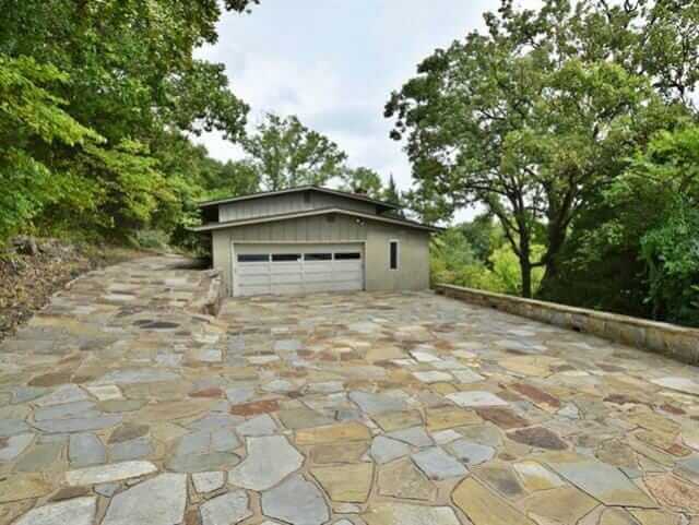
Yes, listing agent and Realtor Wes Nofire says that the decor we are looking at was conceived by a professional decorator hired by the second owners of the house, who bought it in 1970. The design of the original house also is a marvel, he said: The first owner was a World War II naval veteran, and designed the house so that all the plumbing, electric, etc. were accessible from one space — like inside a battleship. The home is three stories, with views to a nearby lake.
 #2 (above): The color palette in the living room is tightly controlled — lime green, sunshine yellow, and white. Note the yellow-back-painted shelves. The carpet has a hint of avocado to mellow out and ground the space.
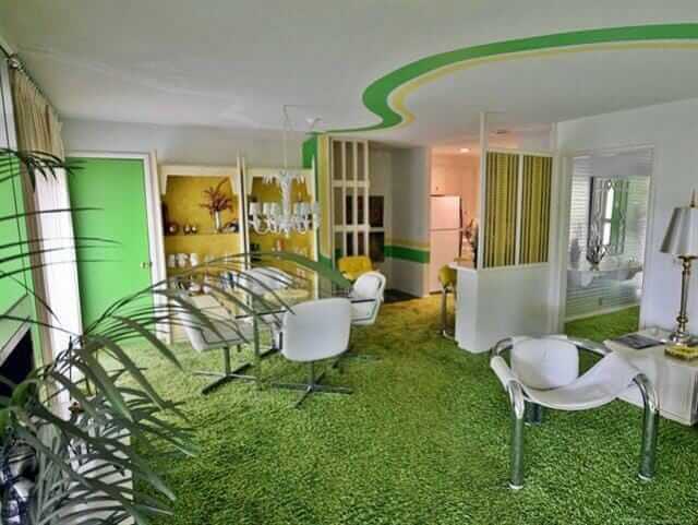
Peek: Into the dining room. Looks like very metallic silver foil wallpapear in there. I don’t have a photo, but Wes says he may be able to send me one.
Wes, who took these photos and generously gave me permission to feature them, says the only thing that has been changed in the house is that some of the white leather upholstery was reupholstered over time. All the appliances are original and they all work, he says.
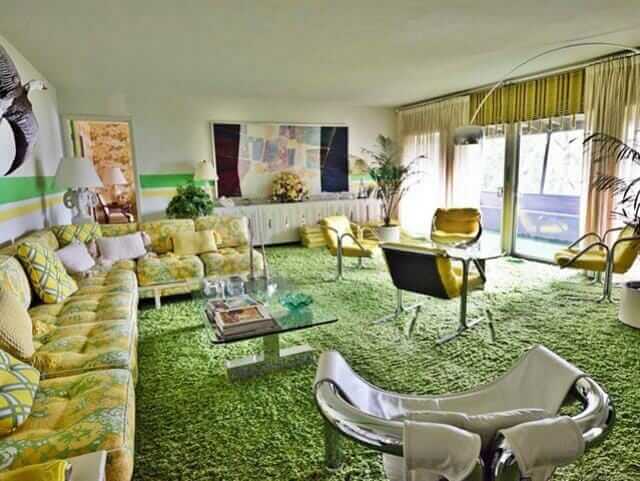 #3 — The sectional is wonderful. Notice the sheer pinch pleats are layered over what appear to be woven wood shades ala Beautie Vue.
 #4 — Tiny stools tucked under the mirrored sofa table. The fireplace (toward the back of this photo) also appears to be mirrored.
 #5 — Yes, carpet in the kitchen. No comments, please. It was the 1970s.
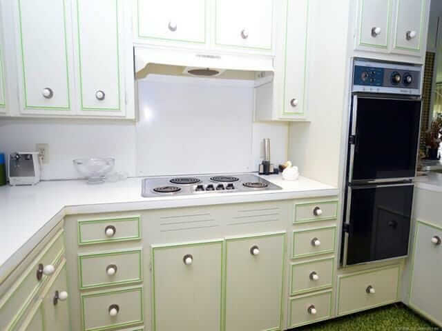 #6 — The cabinet door and drawer fronts have the look of some St. Charles’ I’ve seen, but I don’t think these are steel.
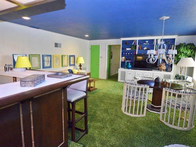 #7 — I’m thinking this is a family room. The color blue is now judiciously introduced — in the blue-painted ceiling, the back-painted cabinetry, the mats of the framed sketches above the sofa, and on the card-table chairs’ upholstery, methinks. Great card table chairs!
 #8 — I like how the doors are all painted. They are treated like geometric elements within each room, not whited out.
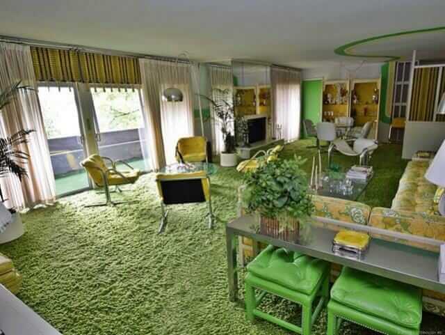
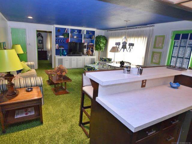
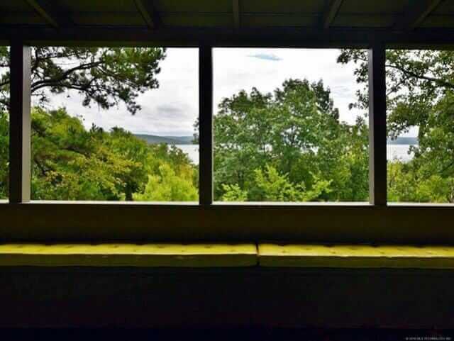 #9 & #10 — I’m thinking that all the living spaces are oriented toward the lake, with seating planned to enjoy the views.
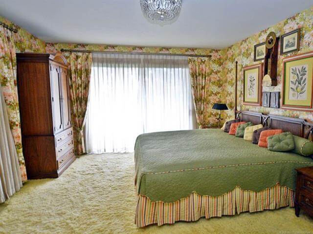 #11 — Fantastic master bedroom. Matching pinch pleat draperies and wallpaper… coordinated bedskirt and even piping. The little square pillows all in row == LUV.
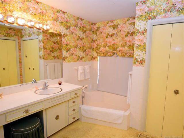 #12 — This bathroom goes with the master bedroom, same wallpaper. Again, I don’t wanna hear waah waahs, please, about the carpet in the bathrooms. It was the 70s.
 #13 — The yellow bedroom. The lime green dresser reminds me of Drexel Plus One sans the words. Flower-powered wing chairs are my new everything.
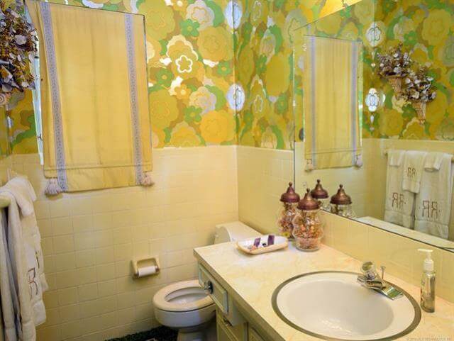 #14 — I *think* this is the bathroom that goes with the yellow bedroom. However, looking at photo #13, the wallpaper in the attached bathroom seems to match the wing chairs; I see blue. Me confused. P.S. Close yer toilet lids, people: Bad feng shui to leave them open, because your money energy is attracted to be flushed down that drain, and we don’t want that, do we?
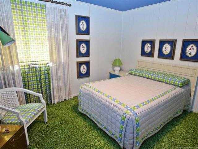 #15 — Every house needs a plaid bedroom. Notice: The window seems to be dressed with (1) sheer pinch pleats over (2) a plaid pull-down shade, which hangs over (3) cafe curtains that hang to ground, to line up with the pinch pleats. Now that’s attention to detail.
 #16 & #17 — You’d never know from outside, all the 1970s happy going on inside!
Link love:


Ray adamik says
Great c. 1970 decor. Love the style of that time and fashion too – like my dad’s belt with the bulls eye metal buckle. And in 1972 with my mom we bought a brass and white lacquer mod magazine rack at the Lord & Taylor store in Jenkintown Pa. No longer have it! By the way, in the same vein as this house, check out the split level at 200 Glenwood rd, Elkins Park, pa. – just went on the market yesterday.
Mary Elizabeth says
Have you ever seen “My Lottery Dream Home” on HGTV? Call David! This is mine if I ever win the lottery before it’s sold. 🙂
Joan says
This house is absolutely fabulous! I LOVE the green color scheme throughout..so many wonderful details thank you for posting!! I adore looking at these pictures..I’m an 80s baby and I was born in the wrong decade I would love to live in a house like this
Edward McNiel says
Man oh man, i wish i could win the Mega-Millions lottery. I would buy this in a heartbeat. It is perfect through and through. My absolute dream house and i would not change a thing.
MJ says
Big as a battleship, too! Love this place. But green is not my color so will have to step aside and let someone else buy and love it. Thanks for sharing this great house. I’m trying to get pinch pleated draperies made for my 70s house, but it’s slow going. Wide fabric rare and unaffordable for me since US gave up the textile industry.