

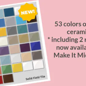
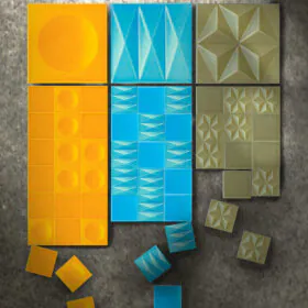
 It’s really quite amazing: What’s new is making what’s old possible again. That is: Modern technology continues to give entrepreneurs ways to revive vintage style products — in smaller runs, for niche markets or on-demand. Among the latest such retro-innovation: Make it Midcentury has introduced a new line of mid century modern inspired wall tiles — 19 decorative designs in all — made possible with special printing technology. Note, Make It Mid Century also now offers 53 colors of field tile — in colors selected especially for mid century bathrooms and kitchens.
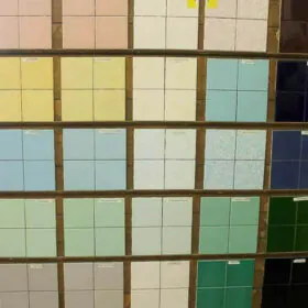
Our manufacturer uses the dye sublimation process for our tiles. That means we can get the brightest colors available and crisp, clear images. Dye sublimation is a printing process where the image is printed on special paper and then heated under pressure which melds the image to a coating on the tile blanks. Our tile blanks are Daltile brand blanks – a great blank from a reputable manufacturer means an outstanding final product.
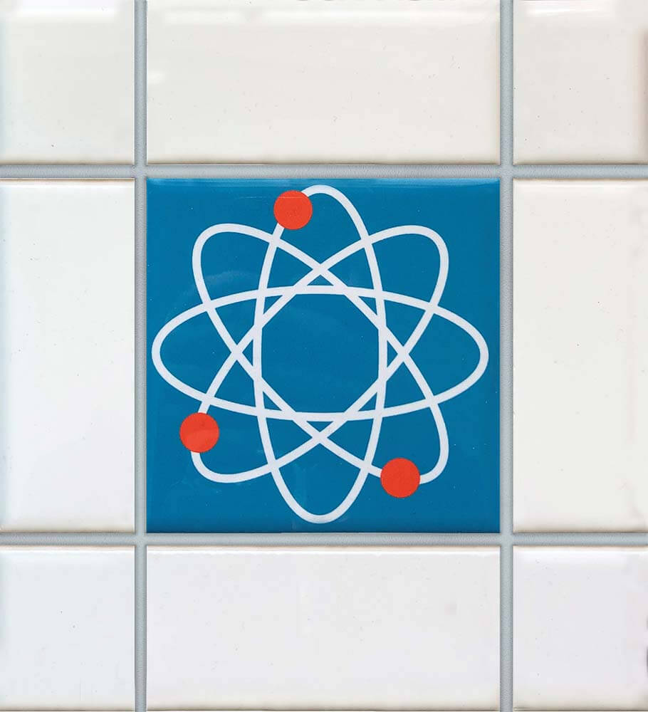
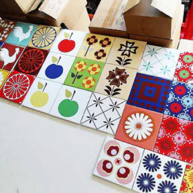
19 designs of mid century decorative accent tile
 Above: Susan show us how one of her new tile designs can be coordinated with a SparkleLam™ color + another manufacturer’s stock field tiles + a stock flooring.
As you will recall, Susan also is the innovator behind re-created glitter laminate, SparkleLam™. Remember that time she came to my house to see all my glitter laminate samples and talk glitter laminate so she could maybe tweak her designs a bit more? That was sure some fun! That said, I was just a wee detail in her big story: Susan sure seems to be working hard to create a nice line of custom products you can’t get anywhere else. (She now has SparkleLam™ in 16 colors.)
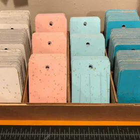
 Yikes, Make It Midcentury keeps 864 samples of field color tiles — both semi-gloss and matte finishes — on hand to help get matchy matchy, if that’s what you need.
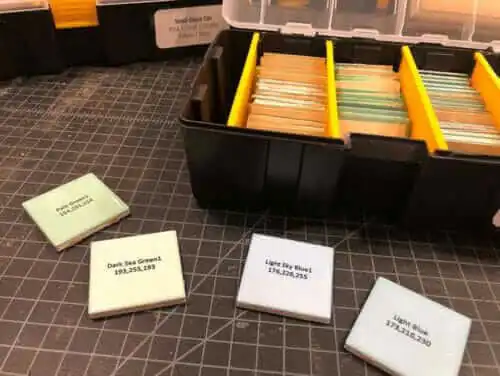
On her site, Susan has narrowed down her “order now” options the most popular colors. So don’t worry, you don’t really need to decide from 432 colors.

These decorative tiles are relatively spendy, given their bespoke nature, so it’s likely most buyers will use them as accent pieces.
For each of her stock colors, Susan shows major makers’ stock colors to coordinate. For example, scroll down the Starburst page to see her match picks.
On her website, Susan also mocks up ideas how to use her tiles as accent pieces — what a practical and customer-friendly feature. Above: Spirograph peppered in a pleasing, orderly fashion on a mock bathroom wall.

Nom nom, nicely done, Susan aka Ms. Make It Mid Century!
See all 10 designs:
- Mid century modern tile designs — 19 in all — from Make It Mid Century
- And: Make It Mid Century also now offers 53 colors of retro field tile — including terrific pastels like TWO pinks!


Linda Diane StClair says
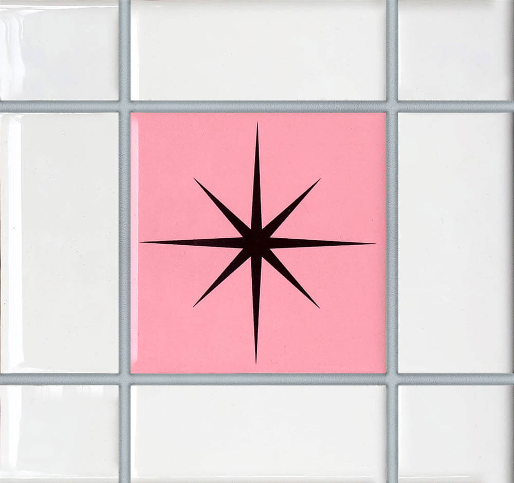
I would love to have about 20 of the pink and white tile with the black starburst in the middle. But I don’t see any way to order any.
pam kueber says
Hi Linda, Make It Midcentury’s website is hotlinked in the story — look for the blue underlined text.
Jodie Davis says
Love this Susan! I’m picturing a bathroom with this tile and then designing a shower curtain riffing off the design and having it printed at Spoonflower. What a time we live in!
Pam Kueber says
You should ask Susan to upload some designs to spoonflower so that you can buy matchy matchy – great idea!
Susan Halla says
That IS a great idea! I looked into Spoonflower a while back but it was early on and I wasn’t quite ready to embark on that avenue. Thanks for reminding me – I’m on it!
Amy says
I love the tiles and front doors (on the MIMC site)!! We bought a house built in 1949 that is a bit more MC traditional that I want to make more MCModern and these will be a great addition!!
Susan Halla says
Thank you, Amy!
libbyontheprairie says
I purchased a few dozen of the subway size aqua glow with the starburst pattern on them and they did not disappoint! I wanted a pop of fun for our new bathroom backsplash! They look amazing! My husband and I were the previous owners of Ethel (a 1953 mid century modest ranch) and we had the bathroom redone (You did a story last summer showing our bathroom in aqua glow and black)- Fast forward- My husband and I now own a new house Alice, a ranch from the 1970’s that I am taking back to the 1950’s. We had the bathroom redone at the new house to look just like the old house…PLUS the adorable backsplash. I love it all!
Susan Halla says
I love how you name your homes! We name our cars – we are currently driving Laverne and Shirley.
I hope you’ll share photos of your new bath with us!
Lesliel says
I have to remodel a 1870s school house so the bathroom To go to a stall shower to a. The bathroom is 7 1/2 x 8 with one wall double door, one a single door, and one wall a window.
Pure simplicity would do, adherence to Vintage is not an absolute.
Please advise where to turn for ideas.
Pam Kueber says
Hi Leslie,
My site is more about midcentury style and focuses on resources to restore those homes in authentic or authentic-ish midcentury style. Places like Old House Journal may be a good place for you to turn. For example: https://www.oldhouseonline.com/kitchens-and-baths-articles
In general, though, my sense is that that site, as mine, are in general about ‘adherence to vintage’ as you say. My personal opinion is that whatever design style you choose will be “dated” — so you might as well date it to the original era of your house… so there is consistency.
All that said, there are lots and lots of relatively low-cost options today to do a bathroom in an 1870s style with an emphasis on simplicity! Again, give the sites like OHJ a look and see if they can give you some ideas.
Good luck!
Pam Kueber says
okay, one more link, you might find ideas in stories about readers and their bathroom remodels: https://retrorenovation.com/category/bathroom-categories/bathrooms-hi-pam-reader-spotlight/
Ann Marie says
OMG! This is what I’ve been looking for since 2017. I especially love the Subway Stars ceramic wall tile! Those colors with the starburst pattern are going to make my heart sing in my new kitchen and bathroom remodel. Thank you, Susan at Make It Mid-Century and thank you to Pam for bringing this news to us.
Susan Halla says
You are so welcome, Ann Marie! I’m always thinking about cool new products for our store that meet the needs of the mid-century-loving peeps. Glad you like them!
And I thank Pam, too, for letting you all know!
Ronda Vallejo says
These are amazing!
Susan Halla says
Thank you, Ronda! We’re pretty partial to them, too!
carolyn says
Ha! I got only partways down the story when I thought , “Isn’t that the gal who…?” and sure enough, it is!
Since we see too many shows where they just take sledgehammers to everything leaving increasingly less original materials, this would be a great option to backdate re-muddling. And, like you mentioned, it makes more sense (cents) to use patterns sparingly in a solid field.
Susan Halla says
Hello, there!
Yes, it is me. THAT gal. 😉
I am as cost-conscious as the next person, so I deliberately made our tile to match other field tile on the market (and working on matching even more) so that you can use our tile in conjunction with others.
Watch for more patterns to be released as time allows!
Lori says
This is great! Love the light blue and light green!