


I continue to be on the hunt for readers who are looking for less expensive wallpaper for their mid century ranch, cape, colonial, bungalow and split level homes. This means: Wallpapers from the sweet cheerful 40s…to the atomic 50s…to the mod generation 60s…and all the stylistic tangents in between. For example, the more I’m into all of this the more I realize: We are a traditional nation. Small tone-on-tone prints are very suitable for your retro renovation, too!
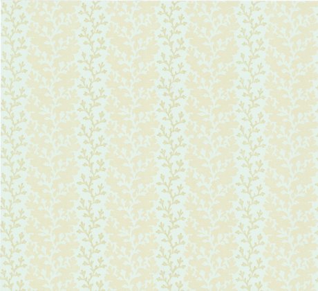
Today: 33 choices with a little of everything described above from Seabrook’s Carey Lind Mahogany Collection. These are “today” wallpapers but I like a number of them for several reasons. One of my most exciting finds is the paper above. See the ‘slubs’? And those dogwood blooms? A very typical barkcloth look! I can definitely see this paper in a pink bathroom — for those of you who want to ‘tone down’ the pink… it would also look great in a in a foyer, bedroom or office. Click through for additional selections and a complete gallery of other nice choices.
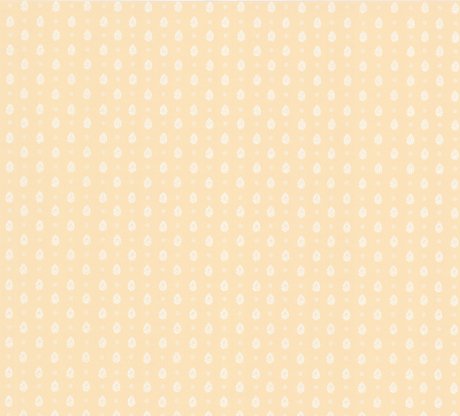
This tone-on-tone small print, available in several colorways, could look really great in a foyer, including one that has paneled wainscoting along the bottom (like my foyer.) This is very traditional – very Charlie Brown… Leave It To Beaver… Happy Days. I think it would look great!
This tone-on-tone stripe pattern featuring coral is available in a number of soft colorways and would be very suitable for a bathroom — ocean motifs are good in bathrooms, especially if you live along the cost. I normally don’t like stripes in a bathroom which includes 4×4 tiles up the walls – but this one could work because it is to soft. When I say “tone-on-tone” that’s what I mean – the design is so soft, so similar in color to the background color that the paper has an effect of texture rather than in-your-face design. Tone-on-tone papers are good in spots where you might want to add a design to the wall, but not have the paper ‘overtake’ the room. It’s easy, for example, to layer art work on tone-on-tone paper without the paper competing the art.
And click here for the entire Seabrook Carey Lind Collection with lots more colorways.


Hanna says
I don’t know where to post this, wondering if anyone, in their searches, has seen the retailer of the wallpaper in these images:
http://www.facebook.com/media/set/?set=a.10150183102422796.368441.357731292795&type=3
I don’t believe it’s real vintage, so if anyone knows who makes it I would appreciate the info. It’s my dream wallpaper and I have been looking for months!
Carole says
When I was a teenager we lived in an old farmhouse on 23 acres. My upstairs bedroom was papered in a wallpaper design with a mint green background and large pink roses (small dark green leaves were clustered around each rose). It was in muted tones like the dogwood paper pictured above, and really was pretty stuff. I’ve never seen anything like it since, but I still remember that paper so well.
fineartistmade says
A client wants to paper his whole 1940s cottage – thanks for the great resources!
pam kueber says
You’re welcome, fineartistmade. Be sure to see my entire wallpaper category: https://retrorenovation.com/category/period-accents/wallpaper/ Note, Bradbury & Bradbury has great document designs: https://retrorenovation.com/2007/11/07/1940s-wallpaper-from-bradbury-bradbury-if-cuteness-were-criminal-this-paper-would-be-public-enemy-1/
glenda says
I’m looking for vintage beauty salon wallpaper! Pink, white, and black are my colors … decorating similar to my grandma’s salon (back in the day!) … any suggestions would be greatly appreciated! Thanks!!
Troy says
wallpaperstogo has all of seabrooks papers for much less! I got ripped off ordering from Seabrook.
Jill says
Hey, have you taken a peek at Secondhand Rose wall paper?
http://www.secondhandrose.com/paper/wallpaper.htm
Especially the kitchen and bathroom stuff…pricey, but if you have the bucks, this might be the place to look.
I’m eyeing three bathroom papers for my tuquoise bathroon.
Elvis (aka) Jane says
That dogwood pattern is just lovely. And the slubbed paper would be my choice if we were to wallpaper in our house. It would be a challenge here, because all our door and window openings have a curved edge and no trim to butt the edge of the paper against. But Pam is opening my eyes to wallpaper: I used to be dead-set against it in any situation…now I’m coming around!
Sara in AZ says
Love the wallpaper! It does look like barkcloth. I will have to send a pic of some 50s pink kitchen wallpaper I picked up a while back. It is a light pink background with funky drawings of cheese and a grater, a salad bowl, a pineapple…. ect…ect… Very Retro!
RetroRuth says
Love the post, as always. Cute and sweet florals, but I love the coral stripe! It would be perfect for my peach bathroom. But we will have to see how the living room accent wall goes before we commit to more papering… 🙂