

 Mr. Modtomic left a nice comment yesterday, so I went to take a look at his blog, too. And what did I see but a Lane “Brutalist” bedroom set “in the style of Paul Evans” that Mr. Modtomic spotted at the Salvation Army for $249.99. I think… this brutalist stuff is a big deal. As I have said many times before but perhaps still not often enough, I am not a Ph.D. interior designer or historian and most certainly not a DIY-er … I am an obsessed writer-decorating-homebody-sweet-on-the-small-stuff woman in love with all things mid-mod especially all the back stories. The why-why-why-why-why. One of the main joys of the blog is the continuous journey of discovery. And now: I have discovered the world of brutalism, thanks to Mr. M.
Okay, so my main source of info about brutalism so far is Wikipedia, but that’s a start, right? The term “brutalism” was coined in 1953, (not the 70s or something!) when architects were working with concrete and I guess, because of the nature of the material and also for socio-political reasons (there is always a “utopian” vision, usually communist, behind this stuff), they created blocky designs that “showed” the wood forms and such. Big chunky structures that they did not try to make look all smooth and perfect. W-pedia says the word Brutalism actually comes from the “French béton brut, or ‘raw concrete, a phrase used by Le Corbusier to describe the poured board-marked concrete with which he constructed many of his post-World War II buildings.”
 Indeed, the most famous brutalist was Le Corbusier — hey, I heard of him before, for sure! Montreal Habitat’67 was brutalist — hey, I’ve even been there! A few years ago we drove to Montreal to visit friends, and I made DH drive by so I could take photos (above). It’s very cool … But … but … I am not sure I would want to live there. It looks cold. And like, I bet I would get lost finding my cube. Back in the day, the style did not catch on much either. Interestingly, Wikipedia mentions the failure coming in part due to “poor maintenance” and “urban decay.” Hey: Shouldn’t that be our counterpoint to the “the suburbs suck” pundit-crowd? I am heading into rant territory so I’d better stop. Suffice to say: Suburb-bashing annoys me.
Back to: Brutalism is kinda cool. And especially: That furniture. It surely screams “style!” The more I see of various design styles… understand their raison detre… and see how one design just kind of flows into the next (there usually are not hard “lines”… it’s a river that flows…), the more tolerant of all styles I become.
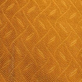
 Quickly surfing around, I see that Jere sculptures also are being called brutalist. Above: Chandelier in the brutalist style by Tom Greene for the Feldman Company, $425, from retrosymphony on etsy.com.
Mr. Modtomic … feel free to tell us more! Many thanks!


Gavin Hastings says
Not to assume the role of Mr Decorator PhD., but
Texture-Texture-Texture!
To my mind-A satin weave bedspread comes alive with a nubby weave carpet.
Grass cloth walls highlight the polish of smooth mahogany furniture…etc.
Shine-y and matte, nubby and smooth, metals and fabric all work together to to create a depth and texture to a room!
Re Don Draper’s credenza….I noticed that as well….and it is all the more powerful since the rest of the office is smooth and one dimensional.
I can see the bedroom set above; looking great in a spartan, flat painted room with a “no-texture” carpet and draperies.
pam kueber says
yes, dr. – playing with contrast is one of a decorator’s most powerful weapons if not THE most powerful.
Kyle says
My DVR didn’t record Mad Men this week ?? but this has me wondering about painting Brutalist furnitue shades of,,,,?gray. Just a thought. Still would be as much work to clean. Arts and Crafts is bad enough
Sheryl says
Sorry, meant on my first post “historcal architecture buff”
Sheryl says
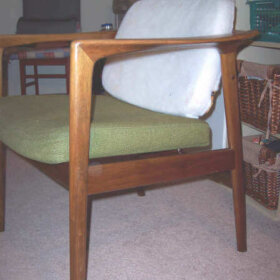
I call myself a historical architcture if you can understand. I love old buildings & old furniture & appliances. I think there’s nothing more beautiful than the older pieces. The bedroom set above has depth & can fit beautifully in a large room with the sun shining in. I’m not a fan of the building which I also saw years ago on a trip to Amsterdam. I do love the chandelier; the colors would fit perfectly in my dining room.
Now, I need to go snooping around in a Salvation Army. As they say “What’s someone’s garbage is someone else’s treasure”.
Rebecca Prichard says
Wow, great post! Very interesting. Yes, it is cold especially when it’s concrete. So, I agree, though I LOVE looking at it, I wouldn’t want to live there. But with the furniture, the warmth of the wood combats it.
shane walp says
Well here’s the disention: its ugly like lots of pop culture stuff from that period. The guy writing the article sounds like he’s forcing himself to try to appreciate it. It didn’t catch on, not because the “simple minded underlings didn’t understand” (as fringe artists are prone to think)but because the masses do have some level of taste. This stuff is where it belongs! Lol
Pam I far more enjoyed the week of the 60s you did! That’s stuff id definitely put in my house!
Joe says
Mad Men alert: Check out the sideboard in Don Drapers new (SCDP) office. totally in the brutalist style and very cool.
Jeanne says
I noticed Don’s new credenza Sunday, as welll! It really jumped out at me and probably for Gavin’s reasons of contrasting with the smooth surroundings.
**I’m going Salvation Army shopping for some accoutrements for my office** 🙂
Heather F says
Love it! Fantastic….love the backstory, too…thanks.
Bev Thompson says
There are many things that I might like to look at, but would never want to live with. The furniture pictured falls into that category – way too many nooks and crannies and surfaces where dust would reside. I like to live with things that are more user friendly and easy to keep clean.
Mary Tatum says
It almost seems like a 3D version of Cubism.
pam kueber says
i’m sure cubism was related! like i said, these styles are a river flowing together….
Jane says
I LOVE this stuff. The key is proportion- Brutalist furniture like the set above ($249 for the set???*dies*) would look amazing in a large, bright room with simple finishings. Uncluttered as the the style speaks for itself. Take it out of the orange/avocado shag carpet environment we remember them in and put them in a modern clean space where they can tower over everything as they should.
Funny, I have always admired Brutalist architecture and found myself alone in doing so. Some of the looming hulking office towers from that era give me the shivers.
pam kueber says
I agree – simplify the background and let the furniture do the talking. but hey, don’t dis on orange and avocado per se!