

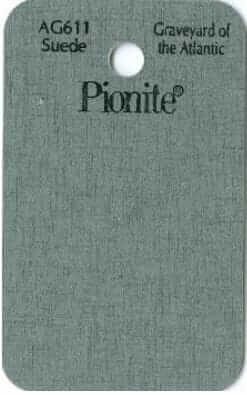
 I restrained myself for a whole month. But, after my recent outburst to Resist The Greige Nation, I have potent new ammo to go after this color trend a second time, namely: Pionite’s new kitchen countertop laminate, aptly named: Graveyard of the Atlantic. Do I really need to say more? Did that ever stop me?: Greige Nation = A freezing cold dark drowned death at the bottom of the sea, crabs and snails with no eyes and ghoulish sea monsters eating away at your flesh, your lifeless body sinking sinking sinking into the mushy nothingness of the earth, the weight of the salty water upon you, no proper burial possible… the light, the love, all human warmth… forever gone. *I slap myself and snap out of it.* Gray is fine, and even the color greige is fine, and I like some of the other colors in the new Pionite collection a lot. But, I just don’t think that a tsunami of greige Everywhere is what we need as a country right now, nor do I believe we are a Greige people. This is color marketing run amok amuk amuck. IMHO. Have A Nice Day. 🙂

Reader Interactions
33 comments

napgirl says
Color is SO personal and SO hard to pin down, I’ve been obsessing about the question for weeks now! I got about a million sample chips and sheets from Formica, Arborite, Chemetal, Nevamar, Pionite, Wilsonart, Arpa, Marmoleum, and probably a few other brands I’ve forgotten — in hopes of finding appropriate countertop and flooring choices to go with my new, still-uninstalled pale-yellow St. Charles cabinets. NONE of them really sang to me — nothing was working. I finally realized that it’s the CABINET color that’s not cutting it — a pretty serious drag, since I had the cabs shipped clear across the country, and they’re in spectacular shape. So — sigh — I’m now planning to have them electrostatically repainted in an in-your-face orangey red that I KNOW I’ll love. I’ve already started buying red Dansk enamelware on eBay to match them.
So, Pam, I’m totally with you on the greige thing, but for me it’s even more about the saturation than the actual tone. If my cabinets were only a stronger shade of yellow, I wouldn’t touch them, but I’ve come to understand that I’m all about those intense, bright reds, oranges, and marigolds….
Lynn-O-Matic says
I agree with Gavin–I would keep the sample chip handy. In fact, I would frame it and hang it on the wall. Just adds to the charm. I would keep a copy of your rant handy, too, Pam. I loved it. My fantasy job has always been to be the person who dreams up the paint color names. I once painted my bathroom in Flesh Charm.
I love all these Pionite suedes, and the colors look great together. This grey might be dreary all alone, but add some paint and accessories in a couple of the livelier colors and you’ve got yourself a room.
Sandie Sinatra says
Oh Pam, this one was great! I laughed out loud! “Graveyard of the Atlantic” – so NOT Don Draper!!!! And Gavin with the “Grey Fedora”-LOL-now that’s more in line with Draper! And when I think of when I had my little 1949 house and put “butcher block” on the kitchen counters……… What I would do differently today!!!! LOL 🙂
Annie B. says
This post has me rolling for numerous reasons! Graveyard of the Atlantic? Are they nuts? I’ll have to admit they’re spot on in getting the color right as I can see said Graveyard from where I sit.
Why couldn’t they’ve chosen a more “uplifting” descriptive name such as “Bruised Toe” or “Ad for Prozac”? Seriously, I admire gray and beige as much as anyone when used appealingly; mix ’em, and the color just looks dirty, in my opinion.
I really do like their orange-y sample, though.
Gavin Hastings says
They could have called it “Grey Fedora”….but how could you incorporate that into cocktail party banter when folks congregate in the kitchen?
Nope, the dramatic nonsense of “Graveyard of the Altlantic” works for me, and I would keep a titled sample chip handy to prove it.
Annie B. says
How could you incorporate “Grey Fedora” into cocktail party banter in the kitchen?? Gavin! Just wait until it’s five o’clock here in the Graveyard of the Atlantic and listen very carefully.
Actually, folks in this neck of nowhere would’ve called that color “Gray TROUT”.
I’m going to order a sample chip and hang it on my kitchen wall.
Thank you, Pam, et. al., for all this fun.
Amy from China Shepherdess says
I adore the grey. It’s the perfect backdrop for dramatic colors. With a grey counter you can easily switch out the orange or lime when you get tired of it. Hmm. Might have to consider this one.
Amy Hill says
If you ever want to clear a bunch of people out of your house, put that old classic “The Wreck of the Edmund Fitzgerald” on the stereo!
Thanks for “A Perfect Sorm” to start my week-end off, Ms Pam!
Getting close to Halloween.
pam kueber says
I absolutely positively also thought about The Wreck of the Edmund Fitzgerald when I read that name color and wrote the post. “Lake Michigan… never gives up her dead”…. Yes: The song conveys the horror of the watery grave….
Amy Hill says
Creepy for sure!
BungalowBILL says
That name made me LOL. Sounds like it could be a good state motto too.
Shane Walp says
For North Carolina!
napgirl says
But Pam, tell us how you REALLY feel! ;–)
Annie B. says
Don’t hold back; it’s not healthy!
Gavin Hastings says
Allow me please:
No one can be made to feel bad about their choices.
pam kueber says
i agree! i’m just having some fun… but only sort of. what gets me blasted about this greige thing is that i think it’s just color marketers and marketeers trying to get america to like something new that is so in stark contrast to what they have been selling the past 5-10 years — so that folks will be dissatisfied with what they already have and feel like they have to ditch the old trend and buy the new trend. it kind of gets to the heart of my blog which is Love The House You’re In… let it speak to you about what it wants… and ignore the mass marketers trying to sell you whatever is hot today
Annie B. says
Like tailfins.
dcgrl says
My countertops are original 1957 gray linen look. I love them with my white cabinets, but the formica is damaged (burns) in a couple of places and ready to be replaced. This might be a good choice. But I’m also tempted to go with yellow. Thoughts?
pam kueber says
dcgirl, I think the choice is really up to you, obviously you can do anything with white cabinets. I have a few more new pionites to put onto the blog that have a tight linen almost tencel look (i guess i’d say) – one gray, one greenish gray. i’ll post them tomorrow….
Gavin Hastings says
That gray would look great in my kitchen !!!!!
(but WHO let that name go to production?)