Help Christa choose an exterior paint color for her 1961 house
pam kueber - Updated: April 1, 2011
Retro Renovation stopped publishing in 2021; these stories remain for historical information, as potential continued resources, and for archival purposes.
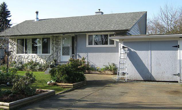
Since moving into her midcentury modest house a year ago, Christa has been having a ball updating the inside to reflect its 1961 architectural roots. Now, she’s ready to paint the outside — and has asked for ideas. Note in particular the rock wall — how to work it in? Read on for more background… then share your ideas about what paint colors she should use to freshen up the exterior of this adorable 1961 home.
Christa writes:
Hello Pam,
I’m a long time reader and admirer of Retro Renovation. When we moved in to our 1961 Vancouver Island house last April, your site provided oodles of inspiration for me!
Christa says: My husband Garrett and 5-year-old son, Emmit. Here's one from an evening last Summer, when Emmit set up his toys so that he could put on a show for them 🙂
Since moving in, I have painted almost all of the interior, save for the staircase, and completed many small projects to rejuvenate our home with a bit of colourful 1960s flair.
It’s been a ton of fun, and now that we’re cruising toward Summer, I’m anticipating painting the house’s exterior so that the outside will match the inside in pizazz. I have been browsing your paint inspiration collections, Flickr, and my own collections of vintage house magazines, and I’ve got nothing- I need your help!
I’m inclined to incorporate some aqua or seafoam, and/or mustard, burnt orange, pink, even black — really I’m all over the map and coming to a place of confusion in regards to what will actually suit the house. What will help it ‘pop’?
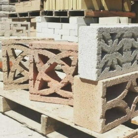
And what do I do with the rock wall? Does one paint any part of it, or just leave it? I feel lost. Any guidance you, or your readers could provide would be SO appreciated.
Yours in thrifty mid century modest-ness,
Christa
Christa, you have a lovely house, it just seems so idyllic. And, Vancouver Island: One of my favorite places in the world!
Readers, what do you think? What paint color(s) should Christa use to add curb appeal to her 1961 house? And, how should she deal with the rock wall facade?
Leaving the rocks alone is probably a good idea. As for the rest, just about any color will work as long as it’s bright or bold and creates a contrast to the pale grey roof and white rocks. I like the mustard idea, or electric blue or even red. I would try to stay away from anything that’s too pastel or powdery. And whereas the previous owner tried the light shade on the walls with the darker shade on the stairs, I would try the reverse, wtih the lighter shade on the stairs.
What a super cool home. Whatever you do, I would strongly urge you to keep the rock wall original. In mid century, rock, brick and concrete should be what they are. Painting them is practically non-alterable. Keep the MCM groove and go restrained and cool with the paint on the wood exterior or have some fun.
Can’t wait to see-
Kathryn
Elainesays
I love aqua for that house. I am doing a version of it on my new house, too, will have pix soon. With the rock wall, I would think ‘turquoise and silver’ and so leave the rock wall just as it is. Do you want to pick three colors? Aqua for the body of the house, another color, like a darker gray maybe, for the trim, and something brighter for the trim. I am going with turquoise/aqua, charcoal and coral, I think.
Stevesays
Make sure your outdoor lighting scheme includes a couple of dramatic up-lights on the rock wall. The texture and shadows will look amazing!
Just another Pamsays
Note to self, Steve is a genius, try this out if spring ever really gets here. Thanks, Steve!
Just another Pamsays
What about having some oversized….say 3 foot….metal sculpture, 60’s style, house numbers to go there as well? Too much? In what’s left of my brain it looks good but I hesitate…..
Juliesays
I vote aqua! Of course, that’s the color of my own house, so I might be a little biased:)
Bettysays
The Sherwin Williams Suburban Modern colors are a great place to start. Someone else posted the Suburban Modern.pdf – excellent!
Go crazy on the trim – that is where you can make it all pop! (Plus, trim can always be repainted in a day if you change your mind.)
I love the Burma Jade, or Plymouth Green, and Caribbean Coral.
Green for house, coral for trim? Or coral for house, green for trim?
Do not paint that wonderful stone, please.
Use the color of the stone and roof as your base upon which to build.
pam kuebersays
See all my Paint posts under Retro Accents category. The Sherwin Williams palette is there along with a variety of others.
Looking at your house, your two “pre-given” starting points, are colors from your roof (gray) and the stone and mortar on the front facade of the building.
Taking those two colors into account I picked s Sherwin Williams SW6193 Privilege Green for the body of the house (it is a GREEN-gray).
For the gable ends, I picked a Sherwin Williams SW 6195 Rock Garden (a darker color from the same strip as Privilege Green).
To bring GRAY down from the roof, to the front facade of your house, I picked Sherwin Williams SW 6234 Uncertain Gray. Use it for the inset area to the right of the front door, the vertical louvers, to the left of the garage entry door, and two garage doors.
For the front door and storm, and garage entry door I picked a Sherwin Williams SW 6557 Wood Violet. (a deep plum-gray)
All the trim around the windows, and soffit should be an (exact, or close as possible) color match to the stone on the front of your house.
I think a medium to dark color has a way of hiding blemishes, that a light color would bring out. I also think you can have a riot of color on the inside of your house, BUT when it comes to the outside, your selection should be “imaginative”, but toned down a bit. Happy Painting!
That’s a beautiful combination! I’m about to paint my 1954 dark brown shingle and am leaning green like what you mentioned or a bit lighter. love the suggestions – i should post a pic
Masonoidsays
I think something in a dark charcole would be amazing, definatly something to make the rock pop. Think about doing a trim in a turquise would be amazing
Amy Jeannettesays
The grey of the stone can definitely take the Seafoam; or perhaps pistachio! A light Flamingo, peach – OOH – tangerine! It would defintely benefit from a POP color! Especially with those jaunty, happy wide soffits! Beautiful little place!!
MaryEsays
Even if the stonework isn’t original, it’s still very good looking and you should keep it as is. The dark charcoal or similar dark colors are all wrong for the Pacific NW. We have enough gray in our lives with the weather, so go bright happy uplifting but in a subtle way. A muted aqua for the house, and some creamy almost yellow for the trim with a coral door. Subtle but eye-catching.
sheilasays
I think Benj Moore’s Dark Burgundy would set off the stonework nicely rather than blend with it. I would use Edgecomb Grey for the trim which will read white (really) but without the high contrast that is the downfall of many exterior color schemes. For extra punch, paint the front door either Crushed Velvet or Desert Sunset (two very different choices). These are all Ben Moore colors. Paint the garage door same as the body of the house so it won’t become the focal point. If you go with Desert Sunset for front door (and keep screen door same as main door to downplay it) you should use the Crushed Velvet around the roof trim. It would be a beautiful detail. I work in publishing/design so I am used to choosing color. Good luck.


 Since moving into her midcentury modest house a year ago, Christa has been having a ball updating the inside to reflect its 1961 architectural roots. Now, she’s ready to paint the outside — and has asked for ideas. Note in particular the rock wall — how to work it in? Read on for more background… then share your ideas about what paint colors she should use to freshen up the exterior of this adorable 1961 home.


Jim says
Leaving the rocks alone is probably a good idea. As for the rest, just about any color will work as long as it’s bright or bold and creates a contrast to the pale grey roof and white rocks. I like the mustard idea, or electric blue or even red. I would try to stay away from anything that’s too pastel or powdery. And whereas the previous owner tried the light shade on the walls with the darker shade on the stairs, I would try the reverse, wtih the lighter shade on the stairs.
Kathryn Madison says
Christa-
What a super cool home. Whatever you do, I would strongly urge you to keep the rock wall original. In mid century, rock, brick and concrete should be what they are. Painting them is practically non-alterable. Keep the MCM groove and go restrained and cool with the paint on the wood exterior or have some fun.
Can’t wait to see-
Kathryn
Elaine says
I love aqua for that house. I am doing a version of it on my new house, too, will have pix soon. With the rock wall, I would think ‘turquoise and silver’ and so leave the rock wall just as it is. Do you want to pick three colors? Aqua for the body of the house, another color, like a darker gray maybe, for the trim, and something brighter for the trim. I am going with turquoise/aqua, charcoal and coral, I think.
Steve says
Make sure your outdoor lighting scheme includes a couple of dramatic up-lights on the rock wall. The texture and shadows will look amazing!
Just another Pam says
Note to self, Steve is a genius, try this out if spring ever really gets here. Thanks, Steve!
Just another Pam says
What about having some oversized….say 3 foot….metal sculpture, 60’s style, house numbers to go there as well? Too much? In what’s left of my brain it looks good but I hesitate…..
Julie says
I vote aqua! Of course, that’s the color of my own house, so I might be a little biased:)
Betty says
The Sherwin Williams Suburban Modern colors are a great place to start. Someone else posted the Suburban Modern.pdf – excellent!
Go crazy on the trim – that is where you can make it all pop! (Plus, trim can always be repainted in a day if you change your mind.)
I love the Burma Jade, or Plymouth Green, and Caribbean Coral.
Green for house, coral for trim? Or coral for house, green for trim?
Do not paint that wonderful stone, please.
Use the color of the stone and roof as your base upon which to build.
pam kueber says
See all my Paint posts under Retro Accents category. The Sherwin Williams palette is there along with a variety of others.
Fred Gonsowski says
Looking at your house, your two “pre-given” starting points, are colors from your roof (gray) and the stone and mortar on the front facade of the building.
Taking those two colors into account I picked s Sherwin Williams SW6193 Privilege Green for the body of the house (it is a GREEN-gray).
For the gable ends, I picked a Sherwin Williams SW 6195 Rock Garden (a darker color from the same strip as Privilege Green).
To bring GRAY down from the roof, to the front facade of your house, I picked Sherwin Williams SW 6234 Uncertain Gray. Use it for the inset area to the right of the front door, the vertical louvers, to the left of the garage entry door, and two garage doors.
For the front door and storm, and garage entry door I picked a Sherwin Williams SW 6557 Wood Violet. (a deep plum-gray)
All the trim around the windows, and soffit should be an (exact, or close as possible) color match to the stone on the front of your house.
I think a medium to dark color has a way of hiding blemishes, that a light color would bring out. I also think you can have a riot of color on the inside of your house, BUT when it comes to the outside, your selection should be “imaginative”, but toned down a bit. Happy Painting!
Kathy Whitham says
That’s a beautiful combination! I’m about to paint my 1954 dark brown shingle and am leaning green like what you mentioned or a bit lighter. love the suggestions – i should post a pic
Masonoid says
I think something in a dark charcole would be amazing, definatly something to make the rock pop. Think about doing a trim in a turquise would be amazing
Amy Jeannette says
The grey of the stone can definitely take the Seafoam; or perhaps pistachio! A light Flamingo, peach – OOH – tangerine! It would defintely benefit from a POP color! Especially with those jaunty, happy wide soffits! Beautiful little place!!
MaryE says
Even if the stonework isn’t original, it’s still very good looking and you should keep it as is. The dark charcoal or similar dark colors are all wrong for the Pacific NW. We have enough gray in our lives with the weather, so go bright happy uplifting but in a subtle way. A muted aqua for the house, and some creamy almost yellow for the trim with a coral door. Subtle but eye-catching.
sheila says
I think Benj Moore’s Dark Burgundy would set off the stonework nicely rather than blend with it. I would use Edgecomb Grey for the trim which will read white (really) but without the high contrast that is the downfall of many exterior color schemes. For extra punch, paint the front door either Crushed Velvet or Desert Sunset (two very different choices). These are all Ben Moore colors. Paint the garage door same as the body of the house so it won’t become the focal point. If you go with Desert Sunset for front door (and keep screen door same as main door to downplay it) you should use the Crushed Velvet around the roof trim. It would be a beautiful detail. I work in publishing/design so I am used to choosing color. Good luck.