Help Christa choose an exterior paint color for her 1961 house
pam kueber - Updated: April 1, 2011
Retro Renovation stopped publishing in 2021; these stories remain for historical information, as potential continued resources, and for archival purposes.
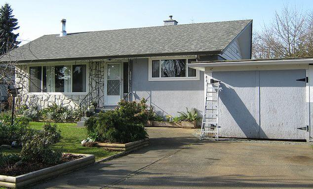
Since moving into her midcentury modest house a year ago, Christa has been having a ball updating the inside to reflect its 1961 architectural roots. Now, she’s ready to paint the outside — and has asked for ideas. Note in particular the rock wall — how to work it in? Read on for more background… then share your ideas about what paint colors she should use to freshen up the exterior of this adorable 1961 home.
Christa writes:
Hello Pam,
I’m a long time reader and admirer of Retro Renovation. When we moved in to our 1961 Vancouver Island house last April, your site provided oodles of inspiration for me!
Christa says: My husband Garrett and 5-year-old son, Emmit. Here's one from an evening last Summer, when Emmit set up his toys so that he could put on a show for them 🙂
Since moving in, I have painted almost all of the interior, save for the staircase, and completed many small projects to rejuvenate our home with a bit of colourful 1960s flair.
It’s been a ton of fun, and now that we’re cruising toward Summer, I’m anticipating painting the house’s exterior so that the outside will match the inside in pizazz. I have been browsing your paint inspiration collections, Flickr, and my own collections of vintage house magazines, and I’ve got nothing- I need your help!
I’m inclined to incorporate some aqua or seafoam, and/or mustard, burnt orange, pink, even black — really I’m all over the map and coming to a place of confusion in regards to what will actually suit the house. What will help it ‘pop’?
And what do I do with the rock wall? Does one paint any part of it, or just leave it? I feel lost. Any guidance you, or your readers could provide would be SO appreciated.
Yours in thrifty mid century modest-ness,
Christa
Christa, you have a lovely house, it just seems so idyllic. And, Vancouver Island: One of my favorite places in the world!
Readers, what do you think? What paint color(s) should Christa use to add curb appeal to her 1961 house? And, how should she deal with the rock wall facade?
I have EXACTLY the same problem…..I chose a color in the stone one oh the lighter shades…..mistake. I am now painting it the color of the grout YES…..frame it’s a grey beige. Make sure you match the grout perfectly. I then went to etsy and found some hanging house ornaments in burnt or ricotta orange and made an arrangement on then on stone side to brighten eye away from the stone. It looks good
natschultzsays
Ooh, I really like your sketch! I think the diamond trim is a great idea on a 1960’s house! And it’s really easy to accomplish too (as long as you have a mitre saw). I love the large vertical diamond on each garage door and the two smaller horizonal diamonds on a plaque below the kitchen window. However, I would not get a front door with square windows – three small vertical diamond windows would look great, but I don’t know if they still make those 🙁
I’d definitely go darker on the garage doors and the plaque / window boxes under the windows. Looking at the pics of your house again, I notice that the deep eaves cast a long shadow over your windows. I would take advantage of this and paint the window trim a really dark (almost black, but not quite) charcoal gray and the garage doors / window box / plaque a medium charcoal grey. Then the stucco siding the Wythe Blue and the shingled side eaves a medium charcoal gray. I’d paint the steps a really dark charcoal gray too, but I’d paint the tops and sides the same color – not the two-tone that currently exists. I’d also get some of those rubber stair rugs (they look like iron railings) and put them on each tread so that the paint won’t wear out too fast. I’d then find a funky colorful outdoor rug for the porch floor and pull a color from that and paint the front door to match. I’d also get a new screen / storm door – a full glass one that doesn’t block the view of the front door; it’s more modern, but totally worth it if you get a cool front door. Lowes sells a nice one for approx. $100 in lots of colors so you don’t have to paint it (it’s powder coated metal so it won’t chip). I’m sure they have a dark gray one; we got the “cranberry” color and had our burgundy trim paint perfectly matched to it.
I like the individual free-standing planters underneath the kitchen window too. We did the same thing under our front window – 2 (old) square concrete ones and then I found a nice long oval concrete planter at Lowes that was a nice brown / burgundy color for in between. I live in NY and concrete is the ONLY material that lasts (plastic and ceramic always cracks because it is very wet and it always freezes and thaws too much here).
You can probably paint the soffits under the eaves as well. The Wythe Blue would probably look good – it will appear darker, maybe like a blue sky. But, if there are vent holes in the soffit you have to be careful not to fill them in with paint because it will prevent air circulation through the attic / roof.
Good luck! I know the feeling of it taking FOREVER to finish a house! I started re-siding the front of my house in Board-and-Batt in Autumn 2008 (had to stop in December), finally finished in Spring 2009 and painted it that summer. Then we had an addition put on at the back and it was a DISASTER – I am still not finished re-framing everything on the inside (my advice to anyone considering an addition – just MOVE instead!). We added a portico on the front and I was hoping to finish trimming it out by this autumn, but I was busy working and installing the wood floors this summer, and when I finally started on the portico trim it ended up SNOWING in October! So, at best I’ll get the trim primed and installed by December and then will have to wait until spring to finally paint it. The front of my house has totally settled out of plumb / level, so every single board / batt and all the trim has had to be individually ripped / beveled / installed differently just so it “appears” level with the new level windows we had installed. Thank God I I know how to do woodwork – no sane carpenter would ever take the time to do it right (seriously, at least 4 different “professional” construction MEN have seen me working and told me point blank “You couldn’t pay me a million dollars to do this work!”). The funny thing is that since we first re-painted the house in 2008 the EPA has seriously cracked down and apparently it is now illegal to use oil paint on anything other than metal. When I bought more paint a few months ago for the trim the paint guy said it was illegal to use it on wood or Azek and that I could technically be arrested! But, I had no choice – the acrylic in the same color just doesn’t match. My siding is acrylic stain, and if I was to start ALL OVER I’d probably go with all acrylic just because finding the semi-gloss BM oil paint is very hard (only two stores near me carry it). If you insist on oil then I suggest Fine Paints of Europe, but that is VERY EXPENSIVE. So, in your case go with the exterior BM acrylic – at least the samples will match the actual color as well!
Interesting- I’m going to have to play around with the colour viewer some more, and try out some different trim colours! (Though the trim is the hardest to view at all realistically on there- it always looks kind of chunky and not quite right.)
I’ve already removed the plant box from under the kitchen window. It was made by the previous owners, from scraps of wood, and was a bit of an eyesore.
I was thinking that about the garage- going at least a couple of shades darker on the door to tone it down. Like you, I would love to replace the doors (or build a whole new garage/carport!) but yes, we are doing everything decidedly on the cheap! I did this sketch months ago with an idea for the garage door, though my thought was to tie it in with the window box, wonder if it would draw too much attention to the *ugly* garage, or look silly? http://www.flickr.com/photos/christaface/5617653052/lightbox/
Also- YES, I’m definitely buying some little $5 paint samples! I’ve already made the mistake- in our last house- of painting the living room before sampling or even putting swatches on the wall, and within the year I was moving furniture and repainting- what a hassle! In this house, I stared at paint samples in every room at every time of day to get an idea of how they would all read, and how they’d coordinate together, and so far *knock on wood* all of my picks have worked out really well!
Thank you for your feedback! I really appreciate it 🙂
natschultzsays
Hi Christa, I just checked your flickr pics. Wow, that was a great idea – the darker colors look awful with the stone – it actually ends up looking like two separate houses with one roof joining them together! The pale aqua blue is definitely the way to go – it balances the stone perfectly. Personally, I don’t like the white trim, sorry 🙁 I just see white trim, especially such thin, simple trim as yours, and it appears as if the house is unfinished or the trim overlooked. IMO, white trim only works on very substantial chunky or detailed trim where it accents the shadows. I’d definitely go with dark trim on your house. I’d actually try going dark on the shingled eaves as well – accentuate that detail. Charcoal would probably work.
BTW: Instead of a window box, I’d actually install a lattice on the wall under your kitchen window to balance out the stone wall. You already have planters on the ground there, so it would be easy. You can even a build mid-mod style one. I’d paint those existing planters dark so they stand out as a feature – it looks like you’re trying to hide them with the house color. Also, your house has the same problem as mine – a HUGE garage that takes away from the house. I’d try painting the garage doors dark so they recede because your garage actually protrudes and blocks the view of the house. I assume new garage doors are not in your budget (or mine), so that is the easiest solution. Personally, since they are swing-out doors, I’d add some mid-mod trim on them to make a feature of them, but paint it just one color so it is a subtle detail.
Good luck.
Oh yeah – buy sample paint colors! I have already gone through THREE different green trim colors at $50 / gallon! The chip that looked too dark (almost black) is the only one that looked the perfect shade of green on my house because it is in full sun. FYI – acrylic and oil show up totally different (I used oil).
Hey, thanks for checking in! I, unfortunately, have little to report. I appreciate SO MUCH all the comments and great takes on the house- wow. We have a lot to work with now. This Summer we got carried away with shifting around our landscaping and gardening, among other things, and never quite got around to buying paint.
I did play around with the Benjamin Moore colour viewer, though, to get a rough idea of what would work, and it was very helpful! Here’s my favourite combination that I’m leaning towards for next Spring: http://www.flickr.com/photos/christaface/5855898318/in/set-72157627008572916 The main colour is Wythe Blue, the door Corlsbud Canyon. Trim is Navajo White, side roof & steps are Mediterranean Teal. My flickr contacts had lots of feedback too!
I really love the idea of having a plant box made for under the kitchen window, to balance it out with the enormous living room window. I’ve been plucking inspiration photos from Flickr, and like this one: http://www.flickr.com/photos/jo_mclure/4735945968/lightbox/.
So anyway, at this point- much has been considered, but as yet I haven’t even bought a jar of sample paint- sorry to disappoint! But of course I will notify Pam the moment our exterior makeover is complete, next Spring. Thanks again for all the feedback, everyone!
kellysays
So…..what color did you finally decide to paint your home?
Would love to see pictures of teh new paint color!
…fingers crossed for that tangerine or flamingo colors which were suggested earlier!
🙂
Kelly
Just another Pamsays
I second everything Kelly wrote!
Hillerysays
Love your home. I’d keep the rock wall facade as it speaks to the charactor of the house. As some have said, always get samples and place them on all sides of the home. I love the idea of something bold and fun.
I know they are siding color, but I love the Sherman Williams Green Porcelian, Teal Taffeta and Grey Jacket. They would look lovely with the stone (natural but fun colors) and allow for a bright door and/or trim.
If you’d like to go bold, but not too bright, why not an eggplant or vintage wine color. That, with the grey stone and roof line would allow for a huge pop of color with some fun accents like chartreuse doors and trim.
I must admit that I am in love with the idea of a deep royal blue, brighter than the traditional. That, with the grey and crisp white trim would be amazing.
The 50s and 60s had color inside and out. Sherman Williams Statford Blue would be fantastic.
I cannot wait to see your choices.
Lindasays
I think the difficulty here are the gray roof shingles, which are probably not close to the color they were when the stone facade was installed. This type of stone was often applied sometimes after the homes were by the owners. Based on the mortar around the stone, the house color was probably a brown or tan, and the shingles some version of that. Trim would have been in the same family and darker to make the opening appear larger. This would be typical for the NW and that period. The idea was to have the house be the earth and rock background for the plantings and might have included some scrumptious scented orange Karume azaleas, ferns, like you have, or larger, like a camellia or two and a white dogwood.
Since you are probably not re-roofing anytime soon, you might achieve a close effect with walls the color of the mortar, and trim in some shade of color of the roof.
If those are vinyl windows I see, it will probably be hard to paint them, you will have to look for a compatible paint that doesn’t slide off in the next rain. However, if you can tone them down, try and and get them to tan.
You have a lovely home! A what a great place for a garden!
natschultzsays
Honestly, if your neighbor’s houses are boring neutrals and your house is close to the street / the houses are all in a line like many 1950’s developements, I would NOT choose a funky color like aqua and peach; it would just stand out too much and look awkward.
Do NOT paint the rocks – that is the #1 cardinal design SIN! Even if you hate the rocks, painting them will only make it worse. So, I would paint the body of the house a pale color – a dark color will make those rocks stand out so much and the house will look lopsided.
Personally, I like greens, especially on a low house like yours (and mine). My house is a cape, so the roof is just as much a feature as it is on yours. My house is Benjamin Moore’s Garden Path with Cambrige Green and a custom dark burgundy trim. My roof is the same as yours (architectural shingles) but in slate, so it is greys and reds. My fascia, soffit and window and door trim is all dark burgundy, and the vertical trim (corners, portico) and doors are dark green. Both my greens are grey-greens, so they would work on your house too.
Are your gutters grey or brown? If they are grey you can paint your window / door trim and the wide soffits a dark charcoal, but if your gutters are brown that would clash. I’d paint the main house light green and the gables (shakes / clapboards) dark green and the trim either dark grey or a dark, deep red.
I’d replace the storm door with a new full-glass one and get a new door – preferably a classic Mid-Century one with those staggered square windows. Match the frame of the storm door to the window trim and the door in either wood or painted to match the window trim or the secondary color to match your gables.
Whatever you decide, FIRST get some paint samples and test them on the house! Seriously, we originally found the “exact” colors in a BM book and the painter just bought them and put them on the house – the “Bordeaux” that appeared burgundy on the chip and in the picture looked bright clown purple on our house – it was a DISASTER! And the darker green trim was way too light as well (our house is in full sun, the house in the picture was in the shade). I went to the next darker shade, Cambridge Green, but I still think it’s too light. I might jump to the darkest shade (which is almost black on the chip, but in semi-gloss oil paint in the sun will probably be just right).


 Since moving into her midcentury modest house a year ago, Christa has been having a ball updating the inside to reflect its 1961 architectural roots. Now, she’s ready to paint the outside — and has asked for ideas. Note in particular the rock wall — how to work it in? Read on for more background… then share your ideas about what paint colors she should use to freshen up the exterior of this adorable 1961 home.


Fran says
Oops NON stone side has ornaments
Fran says
I have EXACTLY the same problem…..I chose a color in the stone one oh the lighter shades…..mistake. I am now painting it the color of the grout YES…..frame it’s a grey beige. Make sure you match the grout perfectly. I then went to etsy and found some hanging house ornaments in burnt or ricotta orange and made an arrangement on then on stone side to brighten eye away from the stone. It looks good
natschultz says
Ooh, I really like your sketch! I think the diamond trim is a great idea on a 1960’s house! And it’s really easy to accomplish too (as long as you have a mitre saw). I love the large vertical diamond on each garage door and the two smaller horizonal diamonds on a plaque below the kitchen window. However, I would not get a front door with square windows – three small vertical diamond windows would look great, but I don’t know if they still make those 🙁
I’d definitely go darker on the garage doors and the plaque / window boxes under the windows. Looking at the pics of your house again, I notice that the deep eaves cast a long shadow over your windows. I would take advantage of this and paint the window trim a really dark (almost black, but not quite) charcoal gray and the garage doors / window box / plaque a medium charcoal grey. Then the stucco siding the Wythe Blue and the shingled side eaves a medium charcoal gray. I’d paint the steps a really dark charcoal gray too, but I’d paint the tops and sides the same color – not the two-tone that currently exists. I’d also get some of those rubber stair rugs (they look like iron railings) and put them on each tread so that the paint won’t wear out too fast. I’d then find a funky colorful outdoor rug for the porch floor and pull a color from that and paint the front door to match. I’d also get a new screen / storm door – a full glass one that doesn’t block the view of the front door; it’s more modern, but totally worth it if you get a cool front door. Lowes sells a nice one for approx. $100 in lots of colors so you don’t have to paint it (it’s powder coated metal so it won’t chip). I’m sure they have a dark gray one; we got the “cranberry” color and had our burgundy trim paint perfectly matched to it.
I like the individual free-standing planters underneath the kitchen window too. We did the same thing under our front window – 2 (old) square concrete ones and then I found a nice long oval concrete planter at Lowes that was a nice brown / burgundy color for in between. I live in NY and concrete is the ONLY material that lasts (plastic and ceramic always cracks because it is very wet and it always freezes and thaws too much here).
You can probably paint the soffits under the eaves as well. The Wythe Blue would probably look good – it will appear darker, maybe like a blue sky. But, if there are vent holes in the soffit you have to be careful not to fill them in with paint because it will prevent air circulation through the attic / roof.
Good luck! I know the feeling of it taking FOREVER to finish a house! I started re-siding the front of my house in Board-and-Batt in Autumn 2008 (had to stop in December), finally finished in Spring 2009 and painted it that summer. Then we had an addition put on at the back and it was a DISASTER – I am still not finished re-framing everything on the inside (my advice to anyone considering an addition – just MOVE instead!). We added a portico on the front and I was hoping to finish trimming it out by this autumn, but I was busy working and installing the wood floors this summer, and when I finally started on the portico trim it ended up SNOWING in October! So, at best I’ll get the trim primed and installed by December and then will have to wait until spring to finally paint it. The front of my house has totally settled out of plumb / level, so every single board / batt and all the trim has had to be individually ripped / beveled / installed differently just so it “appears” level with the new level windows we had installed. Thank God I I know how to do woodwork – no sane carpenter would ever take the time to do it right (seriously, at least 4 different “professional” construction MEN have seen me working and told me point blank “You couldn’t pay me a million dollars to do this work!”). The funny thing is that since we first re-painted the house in 2008 the EPA has seriously cracked down and apparently it is now illegal to use oil paint on anything other than metal. When I bought more paint a few months ago for the trim the paint guy said it was illegal to use it on wood or Azek and that I could technically be arrested! But, I had no choice – the acrylic in the same color just doesn’t match. My siding is acrylic stain, and if I was to start ALL OVER I’d probably go with all acrylic just because finding the semi-gloss BM oil paint is very hard (only two stores near me carry it). If you insist on oil then I suggest Fine Paints of Europe, but that is VERY EXPENSIVE. So, in your case go with the exterior BM acrylic – at least the samples will match the actual color as well!
Christa says
Interesting- I’m going to have to play around with the colour viewer some more, and try out some different trim colours! (Though the trim is the hardest to view at all realistically on there- it always looks kind of chunky and not quite right.)
I’ve already removed the plant box from under the kitchen window. It was made by the previous owners, from scraps of wood, and was a bit of an eyesore.
I was thinking that about the garage- going at least a couple of shades darker on the door to tone it down. Like you, I would love to replace the doors (or build a whole new garage/carport!) but yes, we are doing everything decidedly on the cheap! I did this sketch months ago with an idea for the garage door, though my thought was to tie it in with the window box, wonder if it would draw too much attention to the *ugly* garage, or look silly? http://www.flickr.com/photos/christaface/5617653052/lightbox/
Also- YES, I’m definitely buying some little $5 paint samples! I’ve already made the mistake- in our last house- of painting the living room before sampling or even putting swatches on the wall, and within the year I was moving furniture and repainting- what a hassle! In this house, I stared at paint samples in every room at every time of day to get an idea of how they would all read, and how they’d coordinate together, and so far *knock on wood* all of my picks have worked out really well!
Thank you for your feedback! I really appreciate it 🙂
natschultz says
Hi Christa, I just checked your flickr pics. Wow, that was a great idea – the darker colors look awful with the stone – it actually ends up looking like two separate houses with one roof joining them together! The pale aqua blue is definitely the way to go – it balances the stone perfectly. Personally, I don’t like the white trim, sorry 🙁 I just see white trim, especially such thin, simple trim as yours, and it appears as if the house is unfinished or the trim overlooked. IMO, white trim only works on very substantial chunky or detailed trim where it accents the shadows. I’d definitely go with dark trim on your house. I’d actually try going dark on the shingled eaves as well – accentuate that detail. Charcoal would probably work.
BTW: Instead of a window box, I’d actually install a lattice on the wall under your kitchen window to balance out the stone wall. You already have planters on the ground there, so it would be easy. You can even a build mid-mod style one. I’d paint those existing planters dark so they stand out as a feature – it looks like you’re trying to hide them with the house color. Also, your house has the same problem as mine – a HUGE garage that takes away from the house. I’d try painting the garage doors dark so they recede because your garage actually protrudes and blocks the view of the house. I assume new garage doors are not in your budget (or mine), so that is the easiest solution. Personally, since they are swing-out doors, I’d add some mid-mod trim on them to make a feature of them, but paint it just one color so it is a subtle detail.
Good luck.
Oh yeah – buy sample paint colors! I have already gone through THREE different green trim colors at $50 / gallon! The chip that looked too dark (almost black) is the only one that looked the perfect shade of green on my house because it is in full sun. FYI – acrylic and oil show up totally different (I used oil).
Christa says
Hey, thanks for checking in! I, unfortunately, have little to report. I appreciate SO MUCH all the comments and great takes on the house- wow. We have a lot to work with now. This Summer we got carried away with shifting around our landscaping and gardening, among other things, and never quite got around to buying paint.
I did play around with the Benjamin Moore colour viewer, though, to get a rough idea of what would work, and it was very helpful! Here’s my favourite combination that I’m leaning towards for next Spring: http://www.flickr.com/photos/christaface/5855898318/in/set-72157627008572916 The main colour is Wythe Blue, the door Corlsbud Canyon. Trim is Navajo White, side roof & steps are Mediterranean Teal. My flickr contacts had lots of feedback too!
I really love the idea of having a plant box made for under the kitchen window, to balance it out with the enormous living room window. I’ve been plucking inspiration photos from Flickr, and like this one: http://www.flickr.com/photos/jo_mclure/4735945968/lightbox/.
So anyway, at this point- much has been considered, but as yet I haven’t even bought a jar of sample paint- sorry to disappoint! But of course I will notify Pam the moment our exterior makeover is complete, next Spring. Thanks again for all the feedback, everyone!
kelly says
So…..what color did you finally decide to paint your home?
Would love to see pictures of teh new paint color!
…fingers crossed for that tangerine or flamingo colors which were suggested earlier!
🙂
Kelly
Just another Pam says
I second everything Kelly wrote!
Hillery says
Love your home. I’d keep the rock wall facade as it speaks to the charactor of the house. As some have said, always get samples and place them on all sides of the home. I love the idea of something bold and fun.
I know they are siding color, but I love the Sherman Williams Green Porcelian, Teal Taffeta and Grey Jacket. They would look lovely with the stone (natural but fun colors) and allow for a bright door and/or trim.
If you’d like to go bold, but not too bright, why not an eggplant or vintage wine color. That, with the grey stone and roof line would allow for a huge pop of color with some fun accents like chartreuse doors and trim.
I must admit that I am in love with the idea of a deep royal blue, brighter than the traditional. That, with the grey and crisp white trim would be amazing.
The 50s and 60s had color inside and out. Sherman Williams Statford Blue would be fantastic.
I cannot wait to see your choices.
Linda says
I think the difficulty here are the gray roof shingles, which are probably not close to the color they were when the stone facade was installed. This type of stone was often applied sometimes after the homes were by the owners. Based on the mortar around the stone, the house color was probably a brown or tan, and the shingles some version of that. Trim would have been in the same family and darker to make the opening appear larger. This would be typical for the NW and that period. The idea was to have the house be the earth and rock background for the plantings and might have included some scrumptious scented orange Karume azaleas, ferns, like you have, or larger, like a camellia or two and a white dogwood.
Since you are probably not re-roofing anytime soon, you might achieve a close effect with walls the color of the mortar, and trim in some shade of color of the roof.
If those are vinyl windows I see, it will probably be hard to paint them, you will have to look for a compatible paint that doesn’t slide off in the next rain. However, if you can tone them down, try and and get them to tan.
You have a lovely home! A what a great place for a garden!
natschultz says
Honestly, if your neighbor’s houses are boring neutrals and your house is close to the street / the houses are all in a line like many 1950’s developements, I would NOT choose a funky color like aqua and peach; it would just stand out too much and look awkward.
Do NOT paint the rocks – that is the #1 cardinal design SIN! Even if you hate the rocks, painting them will only make it worse. So, I would paint the body of the house a pale color – a dark color will make those rocks stand out so much and the house will look lopsided.
Personally, I like greens, especially on a low house like yours (and mine). My house is a cape, so the roof is just as much a feature as it is on yours. My house is Benjamin Moore’s Garden Path with Cambrige Green and a custom dark burgundy trim. My roof is the same as yours (architectural shingles) but in slate, so it is greys and reds. My fascia, soffit and window and door trim is all dark burgundy, and the vertical trim (corners, portico) and doors are dark green. Both my greens are grey-greens, so they would work on your house too.
Are your gutters grey or brown? If they are grey you can paint your window / door trim and the wide soffits a dark charcoal, but if your gutters are brown that would clash. I’d paint the main house light green and the gables (shakes / clapboards) dark green and the trim either dark grey or a dark, deep red.
I’d replace the storm door with a new full-glass one and get a new door – preferably a classic Mid-Century one with those staggered square windows. Match the frame of the storm door to the window trim and the door in either wood or painted to match the window trim or the secondary color to match your gables.
Whatever you decide, FIRST get some paint samples and test them on the house! Seriously, we originally found the “exact” colors in a BM book and the painter just bought them and put them on the house – the “Bordeaux” that appeared burgundy on the chip and in the picture looked bright clown purple on our house – it was a DISASTER! And the darker green trim was way too light as well (our house is in full sun, the house in the picture was in the shade). I went to the next darker shade, Cambridge Green, but I still think it’s too light. I might jump to the darkest shade (which is almost black on the chip, but in semi-gloss oil paint in the sun will probably be just right).