

 Reader Kami loves the built in 1970’s hutch in her dining room because of its charming details and storage capacity — however, the hutch isn’t jiving with the rest of the room and is in need of refinishing. Kami likes the eclectic mix of 1930s -1970s furniture that came with their house, but isn’t sure how to make all of it work together in this room while also trying to achieve a “cottage feel.”

Kami writes:
Hello Pam!
I came across your site by randomly clicking through blogs that discuss renovating and styling post-WWII houses. When I arrived at your site, I found a wonderful source for information and inspiration!
Here is my story:
My husband and I are teachers and we just purchased our first home. It’s a post WWII cottage that was maintained by the original owners until they passed away. When we bought the house from the owner’s children, we were sure that we wanted to keep the integrity, charm and style of the house. As an added perk, the children threw in nearly all of the 1940s – 1970s furniture. That brings us to the design dilemma.
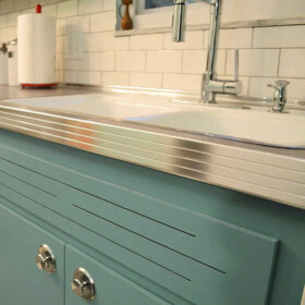
Included in these bonus pieces is a really cool built-in hutch/buffet. It’s at least nine feet long and has these really cool yellow/green plastic panels. I really like it’s functionality and form. The top of it is brown woodgrain laminate, which is super helpful when you are using the buffet to serve food because once the guests have left, it’s a simple spray and wipe cleanup with no lasting damage to the piece. The only problem is that it is painted with a faux wood grained pattern that is peeling, and has blotches of different paints all over it. The laminate is starting to peel off as well. I don’t mind that it’s brown but that particular shade looks kind of wacky with the super cool table that we received with the house. The table and chairs are in the Hepplewhite style and they are a rich mahogany brown. The walls in the room are a blue grey color, which accents the paintings and the peacock blue curtains.
I’m leaning on painting the hutch, but I have no idea what color I should choose. The panels are yellow green, the table is mahogany, the paintings are blue, the walls are grey and the wood floors are red oak. I really want to try to keep the room in the 1940s-1950s design aesthetic, but leaning towards a cottage style. If you all have any tips, I’d be really grateful.
Sincerely,
KamiP.S. We haven’t added the molding to the room yet, because it is being repaired. It will be painted white when it’s done, though.

Repeat the colors and shapes already in the room
Kami — that’s a tall order. Blending so many styles can be tricky. One trick to use when making an eclectic grouping of decor look less chaotic and more intentional is repetition of colors and shapes.

I know the obvious thought for the built-in might be to paint it white, but before you decide to pull the trigger on the white paint, consider trying to repeat the color of your wood dining table — the deep mahogany — on the built-in.
Rustoleum makes a product called cabinet transformations that Pam has mentioned several times here on the blog before. They have an extensive range of colors available — surely one would match your table — and the cabinet transformations system can be used over laminate. I think making the built-in cabinet match the dining set would help unify the room and balance the darkness of the wood around the room.
Adding a large rug under the table — like this one from Albert & Dash — would help make the space look more finished and add a medium color tone to the room — bridging the gap between light walls and dark wood. We chose this hooked rug style because you said you wanted to evoke a cottage design; you could also use a braided rug.If you are being very budget conscious — shop vintage and at estate sales… Pam says she sees rugs in both these styles — large vintage ones — very inexpensively priced where she lives at estate sales and thrift stores. In reality, the colors in your rug help set the colors for the entire room. Just make sure whatever colors you choose don’t clash with the mahogany — I would probably stick with blues, greens, yellows — which allow the reddish mahogany to stand out — instead of rugs that are predominately red or orange. The mahogany already has a warm red tone — adding too much more red to the room could make it feel too intense.
The pattern in the rug also evokes of the shapes in the yellow plastic panes of the hutch in addition to the decorative grooves on the lower doors and even the shapes of the chairs in the dining set. The cottage blue color we chose of the rug complements the artwork. Painting the small piece of wall between the upper and lower parts of the cabinet the same cottage blue color as the rug would help carry the color around the room as well as provide a high contrast backdrop for the lovely white dishes that Kami has displayed on the hutch — really allowing them to pop.
Instead of keeping the walls light grey, I suggest painting them a pale lemony yellow to echo the yellow plastic door inserts in the hutch and the gold accents around the room. The yellow also brightens up the room, helping to achieve a lighter and more airy cottage feel. Once the white moulding is installed, it will feel much more crisp. To finish off the room — especially if you want to reinforce the cottage feel — you could swap out the peacock blue curtains for fresh and airy looking white curtains. However, the peacock blue curtains would still work with this color scheme if you end up liking the more formal look.
It is possible to successfully blend varying styles and decades together in one room — through the repetition of color and shape — like I’ve done above. Repeating the same colors (mahogany wood tone, white, yellow and cottage blue) evenly throughout the room helps make the room feel cohesive, while the repetition of similar geometric shapes (rug pattern, chair back, hutch doors — even the mirror) adds interest and further unity to the room’s design.
What do you think readers?
What would you suggest to help Kami unify her dining room?


Genevieve says
New idea- glass panels with diamond panes. Instant Old English.
lynda says
Do a “Google Image” search for– built in country blue hutch– Plenty of pictures will come up to help you “see” your hutch in a new way. The more I look at the hutch the more I like it, even if you don’t paint it. In the image searches, really liked the picture of the blue hutch with a dark wood top and I liked the fabric on the wall of one hutch. It looked like they made it a bulletin board. Maybe they put up cork before they put up the fabric.
Annie B. says
Kami,
Remove, or push in, leaves of the table so that you can use two chairs at either side and one chair at each end. Might look less formal and a little cozier.
Don’t throw me out of the family for suggesting this, but paint the walls in an old fashioned “harvest” or “Williamsburg” gold color with white ceiling and trim. Harvest gold is both ’70’s and 18th. century at once. Gold goes with the glass in the hutch, too.
Cover the chair seats in a print with a touch of gold and match your window treatments to it.
Move the books to another location and keep your milk glass collection – add more, if you have it.
lynda says
And….I think Annie B’s suggestion is good too. I also agree with Bungalow Bill about the Irish or French Country look. I think German when I look at it too. You will have so many choices!
Diana D. says
I think Annie B.’s suggestion of a gold-ish color to coordinate the color of the table with the green color of the plastic panel is a good one. I have used this palette myself, the gold/tan color I used on the wall is Benjamin Moore 247 Consentino Chardonnay.
Since the hutch has already been faux finished and it is chipping, I would refinish it per Bungalow Bill’s suggestion with distressing, probably an antique white base. So there is now a cabinet that can look more dutch colonial and blend with the table. Next, I would place the laminate counter with butcher block that has been stained to match the hue of the table.
Back to Annie’s suggestions for the white ceiling and trim….
I would tackle the light fixture at the end when you see what you like about the changes you have made and decide what should be done to further enhance the look you are going for.
Lisa says
I like these suggestions to look at gold colors — the “historic home” palette at Benjamin Moore has some nice gold shades that read pretty neutral and won’t scream “70s throwback” unless you want them to (and add lots more 70s accessories).
If gold is not your thing, how about olive?
pam kueber says
I have BM’s Putnam Ivory in my bedroom. It is a lovely soft gold. I agree, gold works very well with green. Cuz gold includes green.
Lynn says
After reading and thinking through ALL the comments, I still vote for Pam’s solution here of staining the hutch to match the table and repeating colors & shapes elsewhere, because it meets Kami’s needs the best.
It keeps the green glass panels, which Kami loves because of their color, and the hutch, which she loves for its look and function, in the dining room, which is where she wants it. And it looks good to me! It’s possible to do a fine job with the rustoleum kits. I’ve painted laminate cupboards before, took my time, and they came out looking great. And the other color elements and adding a rug will also make a huge difference. I think everybody else is going for a “designer” look that’s not necessarily suited to Kami’s needs, budget, and the room.
Pam, I enjoyed reading your analysis and following your thought process. I’m gonna try to apply the same process myself in my new home.
pam kueber says
Just to be clear: This story was written by Kate. She’s the one who came up with the idea to paint the hutch to match the table. As with virtually all decorating questions — there is not one “right” answer. I might not have recommended what Kate did — but I thought it was a totally valid idea — I liked it! It’s great to hear others’ ideas, too!
Alan says
To further beat a dead horse:
“I adore the idea that people are trying to work with existing furnishings that have some longtime connection to their house. I am totally of the cheap and cheerful (and save yer money for real emergencies like your retirement) school and love a challenge to make lovely interior spaces out of hand-me-downs. It’s totally do-able.”
Until it’s not.
Not everything is doable and while the solutions being offered for the hutch are creative, none of them are going to give Kami something that feels like it belongs with that table and all of them are going to take a lot of time and effort … If cost is your primary criteria, then Kami should sell the hutch on eBay to someone who really wants a 70s hutch (bet there are plenty on this board) and use the proceeds to buy herself a hutch that’s in proportion to the room, matches the table and feels cottage-y.
That’s what editing is all about – sometimes there’s something that’s really well done – a chapter of a book, a riff in a composition, a scene in a movie, a 1970s hutch. But it doesn’t really fit in with the rest of the piece and removing it, while painful to the creator, makes the entire piece a lot stronger.
So while there’s some antiques you look at and immediately see how, with a little TLC and a few tweaks, they can work in a new design, there are others that are always going to stick out and cause disharmony. No matter how many Rustoleum products you throw at them. That’s when you either stick a tablecloth or slipcover on it and figure it might work in some future house, or go hit eBay.
Short answer to Kami’s question of whether there’s anything she can do to that hutch to get it in line with a “cottage-y” room?
There is, but it’s complicated, and time consuming and hence not worth the time you’ll need to spend to get to an end result that’s never going to read as anything better than “mediocre”
BungalowBILL says
Funny thing though, Kami likes the hutch. I like the hutch. It provides a great function. Quite honestly, there is nothing other than the plastic panels that make it read Mediterranean. The lines are much more Colonial or Irish or French country and those aspects can come to the forefront with a few inexpensive tweaks.
ChrisH says
But if it’s tweaked it’s no longer a ’70s hutch. Personally I have no problem putting most ’70s stuff in the dumpster. But I understand there are people who really groove on the ’70s aesthetic. If Kami just wants a white buffet/hutch then she could probably sell the one she has, buy a replacement and have money left over.
The hutch isn’t what I’d want, but I recognize it’s essential ’70s-ness. Someone out there wants it, just the way it is, and is willing to pay well for it.
Kami says
This particular hutch is built into the wall/plaster with huge six penny nails. Taking it out of the wall would not only destroy the hutch, but it would surely ruin the wall. I would have to replaster the wall, paint it, etc.
I’d like to keep it because I do recognize that it is fairly unique, but it’s been painted already. That’s why it has so many paint splotches. The original family must have been experimenting with faux wood graining because it’s in abudance throughout the house in unexpected places.
ChrisH says
I see. That’s puts things in a different light. If they’ve already experimented with wood graining then maybe continue along that line matching the table.
jay says
Well if you removed it you could always cover the wall in Pam’s knotty pine – stained or painted. Would look nice with the dining set.
lynda says
What about a semi-flush ceiling light in the middle of the room and just use candle light on the table if you need more light. You might even be able to add lighting to the hutch in the cabinets or as a lamp on the counter. Lots of choices and this one at Lowes is not too much money.
http://www.lowes.com/pd_339980-82850-38150_4294857054__?productId=3388944&Ns=p_product_qty_sales_dollar|1&pl=1¤tURL=%3FNs%3Dp_product_qty_sales_dollar%7C1&facetInfo=
ChrisH says
Kami, bet you’re sorry you asked 🙂
I’m going to start by saying that if you ask for advice you get a wide range of opinions. That’s a good thing. I’m also going to say we aren’t obligated to stay within the styles/themes you’ve said you want. Of course you are not obligated to follow any of our advice either.
Now then, Alan is correct about a couple things. One, the hutch is really quite special. You shouldn’t paint it, and you shouldn’t touch those panels. I’m not particularly fond of the ’70s, but if I had that hutch I’d keep it the way it is. Try to get the laminate top repaired. Tile the counter top if you must, but don’t touch the panels and don’t paint it.
If I lived near you I’d come over and show you how to mix stain and varnish to get the color about the same as your table, but I don’t know as I’d advise that as a DIY project. That’s the only “refinishing” I’d even consider on it. Better still, leave it alone.
Alan is also correct that you are swimming upstream going for the cottage look. Is it possible to reconsider that? Sometimes working with what you have requires going with your 2nd or 3rd choice for decorating styles.
Finally Alan is right that the painting beside the doorway should go. You need to emphasize the horizontal on that wall. Or just leave the wall blank.
I disagree with Alan about getting rid of the table. I like Pam’s idea – save your money for something you really need. It’s a nice table and appears to have been well cared for. Keep the perfectly good table that you seem to like. (I like it too).
I’m wondering if a runner in front of the hutch wouldn’t be just as good as a big area rug? Not sure, just a thought.
I’d loose the candelabra light and replace it with a more ’70s style swag lamp. Something with a ceramic body that could be painted. Might be an opportunity for a pop of color.
Do the walls have to be white? I’d think some shade of green might look nice with the mahogany table.
I’d play around with one of the “color viewers” such as Benjamin Moore’s, or SW, or any of the major paint manufacturers. See if an accent color on the window wall would help. I’m thinking something a couple shades lighter than the other 3 walls might make that window wall look farther away, creating some visual space.
Well, that’s not what you asked for, but maybe it will give you some thoughts. You can of course ignore it as irrelevant.
Kami says
I’m not dismayed at all. I’m actually surprised at the strong differences of opinion. I do understand that all of you are genuinely trying to help me and I’m really grateful for everyone taking the time to do so. What’s great about these suggestions is that it inspires me to come up with a plan that works best for the space based on what’s important to me, and what I feel I can part with. At the end of the day, I have to be pleased with the solution, and I’m glad to have so many voices to give counsel.
ChrisH says
Absolutely. You have to like the solution. All we can do is make suggestions.
Louisa says
The hutch and dining table/chairs are both wonderful, but I do agree with others that maybe they should not be in the same room. Rather than altering either piece, why not move the hutch to another location and then center the dining furniture for a more balanced look?
Andrea says
I am with Alan, here. Just because the hutch and the dining room table and chairs came with the house, does not mean that they need to stay together. They are obviously not a set (classic dining room table/70’s mediterranean hutch). They aren’t the same finish, the same scale or the same aesthetic. If the hutch was removed from the dining room, and the table and chairs were centered, then things like reupholstering the seats, and a more cottagey-homey tablecloth (vintage crochet ? embroidered ? Vintage print ?) could set the tone for a more relaxed look. An area rug that coordinates with the upholstery colors, and curtains or a blind that are also more casual could set the tone. I think the hutch OR the dining room table and chair set should go, and be matched with something more sympathetic. Ditto for the light fixture. It is a super pet peeve of mine when I see hanging light fixtures that are not meant to be swag lights hung as such. Either permanently shorten the chain or replace the entire fixture with something that is a more comfortable fit with the hutch OR the table. Same with the angled mirror on the wall, which isn’t really a friend with either of the major pieces. If you are keeping the table and chairs, then I suggest a wall color that suggests that time period, like a slightly grey-ed down chalky pastel. If you are keeping the hutch then choose more vibrant olives, oranges, mustards, and look for a chunkier, more casual dining room set from the same period. Rearranging or changing the furniture/wall color is in no way compromising the original integrity of the house.
Marta says
Casita = Mediterranean cottage. You don’t have to go all damask and cottage rose and chippy distressed paint.
pam kueber says
you are right.
BungalowBILL says
I’d paint the hutch and distress it, remove the plastic panels ( put them over a window with a bad view) and replace with shirred fabric. I’d tile the backsplash and maybe the serving top with blue and white delft, or blue and white French or Portuguese tiles. Change out the knobs. I’d take the lacquer off the chandelier and let it tarnish.
The table and chairs are too nice to permanently muddle and you may change your taste toward more traditional in the future. Why not just put a tablecloth on the table and slipcover the chairs?
lynda says
Good, practical advice. I had forgotten how sheers were often put in cupboards and in shutters. Blue and white would compliment the color of the dining set. And yes, tastes do change, so the comment about the table is right.
Kami says
This is a really good idea. I had thought about putting tile over that countertop because it keeps the funtionality, but I’m not sure that it would stick to the peeling laminate. What if I painted the hutch a country cottage blue, and distressed that? I also really liked the idea of using the panels to cover a window with a bad view. Never thought of that.
So many good ideas to choose from!
pam kueber says
Hi Kami, I think distressed cottage blue would be lovely. Really — all these ideas and input are just meant to get YOUR head turning as color is so personal. Hey, I was on Rust-Oleum’s Furniture Transformations page yesterday — they have a cottage blue. Not sure if it’s exactly what you want but here you go — http://rustoleumtransformations.com/furniture/colors.php . I also like the idea of Milk Paint colors – at minimum as a guide, cuz they are authentic country cottage! http://www.milkpaint.com/color.html and http://www.milkpaint.com/prod_mp.html
Note: I have a blue distressed TV cabinet … in my basement storage now. Bought it around 1993 when Shabby Chic was all the rage. It’s a classic idea.
If you tile the top, you are going to have to edge the tile. Shouldn’t be too hard — but plan ahead.
Let us know what you decide!
lynda says
I think if you google laying tile over laminate you will find some answers. You might want to make sure the tile you choose has some sort of finished bullnose tile to put along the front edge. Or, you can have a piece of wood painted to match the cabinet on the edge of the counter. Have fun!
BungalowBILL says
I was just going to write that. The top of the wood edge would be at the height of the finished tile + adhesive, then just “drop” the tiles in the “frame”. I’d be tempted to take all the laminate off the top, but sometimes it can be reattached as easily as using an iron with a towel between that and the surface for protection. The heat reactivates the glue.
Genevieve says
A cottage blue/ milkpaint blue/ colonial blue/ country blue would bridge the decades, being popular through all the decades you are covering. You can use eye hooks and dowel rods on the top and bottom to run a fabric panel in a nice small pattern to match. A color will actually make the hutch seem smaller. If you paint it white or match it to the wall, it will be visually unbalanced unless you also have a lot of heavy white mouldings and trims and other white furniture to counterweight it. As it is, you have a mahogany table that is a strong brown piece of one era and a the strong brown piece of another era, and they compete with each other. It’s like they are trying to match, but they don’t. A color will let the two pieces balance/offset each other. It’s like old movies, you don’t have two red heads or two blonds or two brunette actresses in the same scene, and often not in the same movie. Then it only takes smaller bits of color here and there to balance one side of the room with the others. It takes a lot of white to do the same thing, which is hard if you don’t have the space. Also, 70’s Mediterranean isn’t necessarily that far removed from Old English/Medieval styles, popular in waves from 1880’s? up until the very early 50’s. It could work if you are very eclectic about other accessories in the room. I would be very deliberate about mixing it up, so that it isn’t all one era and then the hutch, or a butch of unrelated things whitewashed into one style. Whitewashing can work for the right collection of things, but personally, give me color any day of the week.