

 Reader Kami loves the built in 1970’s hutch in her dining room because of its charming details and storage capacity — however, the hutch isn’t jiving with the rest of the room and is in need of refinishing. Kami likes the eclectic mix of 1930s -1970s furniture that came with their house, but isn’t sure how to make all of it work together in this room while also trying to achieve a “cottage feel.”

Kami writes:
Hello Pam!
I came across your site by randomly clicking through blogs that discuss renovating and styling post-WWII houses. When I arrived at your site, I found a wonderful source for information and inspiration!
Here is my story:
My husband and I are teachers and we just purchased our first home. It’s a post WWII cottage that was maintained by the original owners until they passed away. When we bought the house from the owner’s children, we were sure that we wanted to keep the integrity, charm and style of the house. As an added perk, the children threw in nearly all of the 1940s – 1970s furniture. That brings us to the design dilemma.
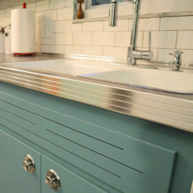
Included in these bonus pieces is a really cool built-in hutch/buffet. It’s at least nine feet long and has these really cool yellow/green plastic panels. I really like it’s functionality and form. The top of it is brown woodgrain laminate, which is super helpful when you are using the buffet to serve food because once the guests have left, it’s a simple spray and wipe cleanup with no lasting damage to the piece. The only problem is that it is painted with a faux wood grained pattern that is peeling, and has blotches of different paints all over it. The laminate is starting to peel off as well. I don’t mind that it’s brown but that particular shade looks kind of wacky with the super cool table that we received with the house. The table and chairs are in the Hepplewhite style and they are a rich mahogany brown. The walls in the room are a blue grey color, which accents the paintings and the peacock blue curtains.
I’m leaning on painting the hutch, but I have no idea what color I should choose. The panels are yellow green, the table is mahogany, the paintings are blue, the walls are grey and the wood floors are red oak. I really want to try to keep the room in the 1940s-1950s design aesthetic, but leaning towards a cottage style. If you all have any tips, I’d be really grateful.
Sincerely,
KamiP.S. We haven’t added the molding to the room yet, because it is being repaired. It will be painted white when it’s done, though.

Repeat the colors and shapes already in the room
Kami — that’s a tall order. Blending so many styles can be tricky. One trick to use when making an eclectic grouping of decor look less chaotic and more intentional is repetition of colors and shapes.

I know the obvious thought for the built-in might be to paint it white, but before you decide to pull the trigger on the white paint, consider trying to repeat the color of your wood dining table — the deep mahogany — on the built-in.
Rustoleum makes a product called cabinet transformations that Pam has mentioned several times here on the blog before. They have an extensive range of colors available — surely one would match your table — and the cabinet transformations system can be used over laminate. I think making the built-in cabinet match the dining set would help unify the room and balance the darkness of the wood around the room.
Adding a large rug under the table — like this one from Albert & Dash — would help make the space look more finished and add a medium color tone to the room — bridging the gap between light walls and dark wood. We chose this hooked rug style because you said you wanted to evoke a cottage design; you could also use a braided rug.If you are being very budget conscious — shop vintage and at estate sales… Pam says she sees rugs in both these styles — large vintage ones — very inexpensively priced where she lives at estate sales and thrift stores. In reality, the colors in your rug help set the colors for the entire room. Just make sure whatever colors you choose don’t clash with the mahogany — I would probably stick with blues, greens, yellows — which allow the reddish mahogany to stand out — instead of rugs that are predominately red or orange. The mahogany already has a warm red tone — adding too much more red to the room could make it feel too intense.
The pattern in the rug also evokes of the shapes in the yellow plastic panes of the hutch in addition to the decorative grooves on the lower doors and even the shapes of the chairs in the dining set. The cottage blue color we chose of the rug complements the artwork. Painting the small piece of wall between the upper and lower parts of the cabinet the same cottage blue color as the rug would help carry the color around the room as well as provide a high contrast backdrop for the lovely white dishes that Kami has displayed on the hutch — really allowing them to pop.
Instead of keeping the walls light grey, I suggest painting them a pale lemony yellow to echo the yellow plastic door inserts in the hutch and the gold accents around the room. The yellow also brightens up the room, helping to achieve a lighter and more airy cottage feel. Once the white moulding is installed, it will feel much more crisp. To finish off the room — especially if you want to reinforce the cottage feel — you could swap out the peacock blue curtains for fresh and airy looking white curtains. However, the peacock blue curtains would still work with this color scheme if you end up liking the more formal look.
It is possible to successfully blend varying styles and decades together in one room — through the repetition of color and shape — like I’ve done above. Repeating the same colors (mahogany wood tone, white, yellow and cottage blue) evenly throughout the room helps make the room feel cohesive, while the repetition of similar geometric shapes (rug pattern, chair back, hutch doors — even the mirror) adds interest and further unity to the room’s design.
What do you think readers?
What would you suggest to help Kami unify her dining room?


lynda says
Maybe I read it wrong, but I thought just the countertop was laminate. The right dishes would help the look. I like the green inserts. Maybe just play up the 70’s colors. How about Madeira dishes http://www.hillhousewares.com/category0maker0pattern38.html dishes by Franciscan or Floral http://www.hillhousewares.com/category0maker0pattern24.html –both very popular in the mid 60’s to 70’s. Colony thumbprint glassware in gold or green was popular too. http://www.hillhousewares.com/category6maker46pattern398.html
the glassware that went with the Franciscan dishes was popular too.
http://retroartglass.com/store/item/2z75t/View_All_Glass/Medieval_Decor_Franciscan_Madeira_Ice_Bucket_and_Goblet_Set.html
I think a mix and match look can be great, don’t let all these opinions scare you off from using what your have and making it all look fabulous!
Downsizing baby boomers are cleaning out the china cabinets filled with 70’s stuff now and maybe you can find just the right lovelies for your cabinet.
allegory says
Whoops I just reread the piece is laminate and peeling. Major major project IMO. Especially with all the cutouts on the door. If it can be sanded down without damage you can apply that antiquing painting technique that comes out looking like distressed whitewashed or even in avocado …I remember they used to sell the kits and you applied the green and “antiqued” it with black that you wiped off. And you have a Mediterranean antiqued painted china cabinet. I would use a color if you’re going to keep the table as it is unless you want cottage-y it would be cream with a tan/brown “antique” finish and replace the inserts. I would prime.
Susan says
I’m a little taken aback by how many people on RETRO RENOVATION are encouraging Kami to REPLACE the fabulous green inserts. Those are what make the hutch. I would be more inclined to “gently” replace the dining room table, which is less unique, but, as Pam said, I applaud Kami for trying to keep the furniture that has history with the house (whether the elderly couple were designers or not), not to mention the financial savings. One of the best ideas here, in my opinion, is painting the hutch to make it appear as a built-in that’s been there all along…if you’re really determined to add “cottage” in there. Or, alternatively, I, too, agree with darkening the wood of the hutch to match your table. I also stuck to ’50s-’60s in decor, but I recently fell in love with Z Gallerie “apple green” curtain panels. When looking for a paint color to complement them, a designer friend recommended I go and get the paint matched to the curtains — turns out my “apple green” panels EXACTLY match Benjamin Moore’s “Avocado”! You can’t get more ’70s than that. So now I’ve embraced the ’70s…and loving it! I love that you’re embracing it, too. Good luck!
allegory says
Exactly. My mother’s [very expensive custom cherry] 70’s kitchen cabinets had those inserts. The “realtor” encouraged me to paint the cabinets and replace the panels when selling the $600K house (in 1998). ! Um, NO WAY. As it turns out, the very first buyer who I had (after firing the realtor) bought the house and loved the kitchen.
I say either boldly embrace the Mediterranean era and leave the china cabinet alone or if it’s is smudgy and “used” looking,(which it doesn’t seem to be)… go with painting it a period color like avocado. But it will NEVER look “right”. OR just sell the whole thing because you can get “cottage” very inexpensively but it won’t be that massive heavy build you own now unless it’s original not a reproduction.
No offense but all of the book and colonial style glass knickknacks should be put away and replaced by Mediterranean period LARGE pieces like a giant orange glass bowl, maybe a turquoise decanter and multicolor glasses etc. Maybe a period rug like plushy red or orange. Replace the chandelier with something period. I would seal the deal with a huge almost campy Mediterranean piece of art or even a “velvet Elvis” type of piece with a Flamenco dancer or something.
When I gave a perfectly good plaid sofa to a college kid once, she complained “I hate plaid and I hate green”. My answer was “Nobody knows you hate it so do it WELL and make it work.” I’d say the same thing applies here.
You have a charming gift from a the former owner to tell a story about how you came to own a 1970’s Mediterranean dining room LOL..
I can’t tell about the table but it looks like cherry to me and the china cabinet? Is that a fruitwood or what? The mismatch of table/chairs (Queen Anne?) and china cabinet is more disruptive to me than the 70’s Mediterranean so I don’t know about that. Maybe cover the seats in a 70’s crushed velvet retro fabric. No offense but I don’t like the pattern rug AT ALL.
hannah says
I LOVE the green inserts on the hutch! I’d work in some avocado green in the rug and lose the blue. I also agree with a table runner, or some placemats on the table to break up all the wood. The wall above the surface of the hutch – FLAIR SQUARES!! *lol* Sorry – couldn’t resist. I’d tile that area I think.
I also agree with darkening the wood of the hutch to match your table.
pam kueber says
🙂
tammyCA says
Also, if you choose to paint & get that cottage-y look…you might want to try chalk paint where you don’t have to prime first…you can search on the net how to make your own (mixing paint with plaster of paris) instead of buying the very expensive stuff that come in limited colors.
tammyCA says
I love cottage decor and the hutch has a cool design for that, but if it were me I would have to paint the hutch (I wouldn’t paint quality wood furniture). I’d change the hardware and take out the green plastic inserts (somebody else might be able to use them), maybe putting in chicken wire (I’ve done this, very easy), or fabric on thin expanding rods & putting in cheerful colored dishes. The hutch overpowers the room now, so painting it white or a light yellow like the walls makes it not stand out so much & since it is built in it will flow more. The laminate part…hmm, tile maybe, if it is going to have food on it.
A small room needs lighter, airy colors & fabrics…and pretty vintage tableclothes to protect the nice table.
Show us what you finally decide on…it’s fun to see before/after pics.
Jim says
The hutch dominates the room, is not that great of quality, and forces the table against the wall. The table is much better quality furniture. Consider selling the hutch on ebay. Someone who is trying to achieve a funky 70’s decor will love it. Then you can buy a corner hutch that matches the table and center the table in the room. The room will achieve the 40’s/50’s cottage feel that you are striving for and also be more comfortable.
Annie B. says
Kami,
Check out the image on Benjamin Moore’s website under a color called “Marblehead Gold” used in a “Spicy and Modern Yellow Kitchen”. The wall cabinet used in the photo reminds me of your hutch in its styling. They’ve used gold and white in this interior the way I had in mind when I posted my idea. See what you think.
TappanTrailerTami says
Wow……….I am very late to this party, but maybe Kami will see my comments.
Yes, keep your hutch. Yes, keep your lovely Duncan Phyfe style 40’s mahogany table and chairs. While you probably can’t *quite* get cottage, there are ways to tie these two items together more cohesively.
# 1 – do not paint the hutch. I’d lay you odds, that the hutch top and the bottom are not original to each other – they are entirely different styles. It is time to make the hutch top and bottom love each other a bit more…..I would remove the green plastic panels (sorry!). While they are in keeping with the style of the bottom, they are not really in keeping with the style of the top. I would do one of three things then: replace them with clear glass, replace them with a non-colored patterned glass, or leave them open. If they are left open, I *might* paint just the inside of the hutch.
# 2 – I would lose the lower doors, and have new ones made that match the top. The bottom doors just do not go with the top, and I think it would be easier to get your whole room to a more cohesive place if you start with the cohesiveness of the hutch.
Once that is done, I would strip and stain to match your table – yes, lots of work, but you’ll be happier in the end I think. Once that is done, then I would put new laminate on the top that matches the new stain color.
I would look for a new (old) dining room fixture also. While the table is fairly formal, getting the hutch top/bottom tied together will help a lot I think.
Last would be a 40’s or 50’s semi formal/cottage-y style table cloth.
Have fun!
Kami says
I have been faithfully reading every comment. I think you hit the nail on the head with the mismatched top and bottom of the hutch. I think the lower section was once just plain cabinets, and the top portion was added directly onto the bottom sometime after. I’m pretty sure this is the case because the brown laminate runs underneath the section where the upper cabinets and lower cabinets meet.
I’ve thought about getting new bottom doors. But the pattern on them is so interesting.
Truthfully, though, I should probably figure out whether the form or function is most important.
STL Mom says
Kami,
I think your hutch is cool, but it looks like three styles to me: base, top, and plastic panels. In my opinion, one should change. Can you use the plastic panels somewhere else in the house, maybe as a screen or in front of a window?
If you paint or refinish the hutch a dark mahogany color, the details will stand out less and the mix of styles will be less obvious. Also, a counter-top that is a contrasting color will visually separate the pieces, which may or may not be good. Try taping big sheets of paper over the counter top and squint to get an idea of how it would look. There are a lot of really great looking laminates that are not too expensive and are functional.
If you keep the hutch dark, I think painting the walls a very rich color will make the room look more balanced than the pale color that is there now. If you keep the plastic panels, I would pick a gold or green shade.
On the other hand, it might be interesting to paint the hutch dark red, with a mahogany counter-top. So many choices! Good luck.
p.s. Is there room to put the cookbooks inside the bottom cabinet? It’s great to keep them handy, but your white dishes would look so pretty on that shelf.
Kelley says
Hi Kami,
I really admire your enthusiasm for working with what was already in the house!
The hutch does look wonderfully functional. However, I think it looks very out of scale in the space. I actually had to scroll back up to see exactly what your dining room table and chairs looked like when you mentioned that you loved them, because the hutch really dominates the room visually. I think that its height is a bit awkward, too – it gets so close to the ceiling, but doesn’t quite reach it.
To remedy this I would add trim to the top of the hutch to bring it all the way up to the ceiling and paint the whole piece out the same color as the walls. I’d take out the plastic panels, too, and replace them with a clear material – again, I think they are putting attention where you don’t necessarily want it. These changes would really reduce the visual weight of the hutch and enhance its built-in look. This also would put the focus on the table you love and make the room seem much larger.
I was unclear whether you chose the wall color. You do mention that you like it and I agree that the blueish gray seems to go well with the painting, the curtains, and the dark wood tone of the table and chairs. If you needed to repaint to keep a similar color, the way it is showing on my screen I think Gray Owl by Benjamin Moore might be a good choice – it’s a sophisticated, light gray with blue undertones.
I also agree with Kate’s idea to bring in a rug that repeats and reinforces the other colors present in the artwork and curtains.
Best of luck with your new home!