

 In this week’s Retro Design Dilemma, reader Melissa wants our help with ideas to lightly update her 1954 kitchen. She and her husband have just purchased a 1954 mid century modest ranch — which they love. However — the kitchen is in need of some TLC. Although Melissa and her husband don’t mind the current flooring, she says that it is in poor shape and must be replaced. Struggling to decide on a floor replacement — as well as what to do with the walls and counter tops — Melissa contacted us for ideas.
Continue for Melissa’s story –>
Melissa writes:
Hi Pam & Kate,
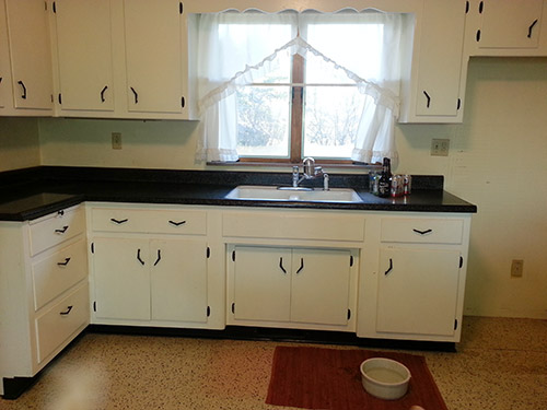
We just purchased a MCModest home. A ranch built in 1954. We fell in love with the house immediately, mostly for the flat roof, the large kitchen,and the huge basement (with a built-in “love couch nook”!) I’m looking for some help with the kitchen! (I don’t have to stay in the ’50s era, I just want it to be kind of retro.)
We will be keeping the cabinets white with the black hinges and pulls. Our appliances are black (I’m saving for the black Big Chill fridge). We have a stainless steel topped kitchen table (wooden legs) with white chairs.
1. The floor is in horrible shape and must be replaced. My husband likes the black and white checkered look, but for me its a bit too harsh. Even if we did that we would be better off without a solid color tile because we have 3 big dogs (2 black and 1 white that shed like crazy.) We also would like ceramic tile so the floor won’t be ruined by their combined 275lbs running through the house. Ideas on floor?
2. The countertops are black with gold flecks. Since we have the stainless steel Nutone range hood, and a stainless steel table — I don’t think the gold flecks really go all that well. I was thinking of replacing with stainless steel counter tops. Good idea? or keep the black and gold?
3. What the heck do I do with the walls? My husband says a bright dark blue. I have no idea.
4. Do you have any idea what those things are above the kitchen window? Built in speakers? They have been painted over, so we can’t tell until we get in there to paint and unscrew them from the wall.
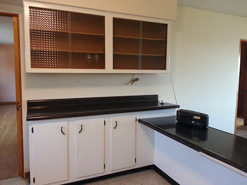
If you and your readers have any ideas: I’m all ears. Also I know I sent more pics than suggested, the kitchen is so large and interesting with its different level counter tops, I wanted to show you the whole thing.
I also couldn’t pass up showing you the built in love couch nook!
Thanks sooo much!
-Melissa
After Melissa’s initial email, further research of her own — and moving into the house to live alongside the laminate — Melissa began to rethink replacing the counter tops.
In a subsequent email, Melissa wrote:
Hi Pam and Kate,
I wanted to update you on the fact that now that we have moved in, I have fallen in love with the black laminate with gold flecks and don’t want to change to stainless steel counter tops (#2 on my list). I wish they still made the flecked laminate — as the section next to the sink is very faded (probably from the previous owners leaving a wet towel there when drying dishes). I have searched a bit on the laminate and all everyone talks about is white with gold flecks — is my black with gold flecks rare? Or maybe not from the original owner and put in in the 70’s or 80’s?
Pam confirmed that she believes Melissa’s black laminate with gold flecks is indeed rare — even more so than the coveted white laminate with gold flecks. We also applaud Melissa’s choice to live with the laminate for a while before just ripping it out to avoid any remodeling regrets.
This leaves us to solve the following dilemmas in Melissa’s vintage black and white kitchen.
Let’s help Melissa… Readers, what are your ideas for:
- What material/color to use on the floor which will stand up to large dogs and hide footprints and fur?
- What should be done with the walls?
- What are the things in the soffit above the sink?
Pam’s design and decorating ideas for Melissa’s 1950s kitchen:
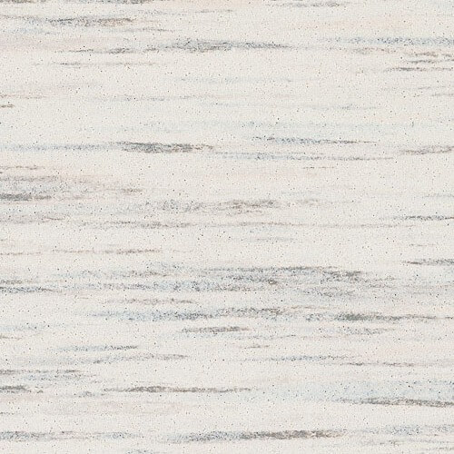
Melissa, I love the Azrock Cortina Autumn Haze VCT floor in my kitchen. Several other readers have used it as well – see their kitchens here. Good news, in 2012 Azrock introduced an additional 15 colors. This expanded line is called TexTile — and from looking at the website, I though the “Raw Silk” color would work well in your kitchen. It looks like it has dark charcoal streakies — good to coordinate with your counter tops. Of course, you’ll want to get a sample first. I find this streaky floor great at hiding dirt. But, it does require maintenance — regular stripping and re-polishing, which I pay to have someone else do. My little dog — Astro, 20 pounds — slips and slides a bit, on occasion. I’m guessing bigger dogs wouldn’t slip and slide as much due to their weight — but I am NO expert on this question. Isn’t ANY kind of floor — except carpet — going to be slip and slide, to some degree, for a dog?
I am also a wallpaper lover. In my three mood boards (fun!) I found both reproduction and vintage wallpapers that had enough “value” — strength of color — to hold their own in our kitchen, considering the graphic boldness of your striking black counter tops — which I LOVE.
Finally, I went to the uploader full of readers’ dinettes to find dinettes that pull the entire look together.
Mixing and matching these ideas — one versatile flooring with an infinite possibility of wallpaper and dinettes — you can achieve quite a wide variety of retro looks.
 Above: Mood Board #1 Atomic Doodle:
- Wallpaper — turquoise Atomic Doodle from Bradbury & Bradbury
- Flooring — Azrock TexTile in Raw Silk
- Vintage dinette — readers Tim and Stephanie’s dinette from uploader — 217 vintage dinette sets in reader kitchens

Above: Mood Board #2, Oh So Charming Red:
- Wallpaper — 1940’s vintage wallpaper from Hannah’s Treasures
- Flooring — Azrock TexTile in Raw Silk
- Vintage dinette — reader dinette from uploader — 217 vintage dinette sets in reader kitchens
Above: Mood Board #3, Inviting Blue and Brown:
- Wallpaper — vintage wallpaper from Hannah’s Treasures
- Flooring — Azrock TexTile in Raw Silk
- Vintage dinette — reader dinette from uploader — 217 vintage dinette sets in reader kitchens
Kate’s design and decorating ideas for Melissa’s 1950s kitchen:
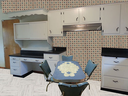
The vintage Sears kitchen catalog that we featured had one illustration that instantly reminded me of Melissa’s great vintage kitchen — which is what inspired me to create my mood board.
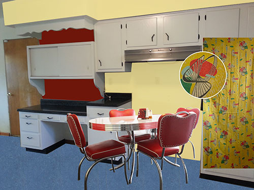 Above: Mood Board #4, Cheery Cherry Red, Brilliant Blue and Sunny Yellow:
Melissa’s husband had suggested using bright blue on the walls — which Melissa wasn’t sure about. Instead of putting the blue on the walls — this blue Armstrong linoleum flooring (Update: Armstrong no longer carries —see this list for other possible suppliers) would be durable for the dogs as well as hide fur and footprints. Instead of painting the kitchen deep red like the inspiration kitchen — a light buttery yellow lightens the space — while working nicely with the blue floors. To add more color to the room — Melissa could paint some small areas of deep red as shown. Since Melissa’s kitchen has a large window and eat in area similar to the inspiration — these vintage yellow 1950s curtains from ebay seller 954kathys (link now gone) or something similar would work well in that area — as well as pick up some of the other colors in the room. To finish it off a retro dinette set — like reader Jamie_abe’s new, vintage looking red dinette which was featured in our story 23 red dinette sets — vintage kitchen treasures would look retro-tastic and would be easy to track down if Melissa can’t locate a vintage dinette set.


Jennifer says
Hi Melissa,
I don’t know much about flooring, but in terms of colors: I am so glad you decided to keep the black counters. More than anything, I am glad you decided against stainless steel. I think stainless steel adds a very cold and gray look to a kitchen. Black and white is a fantastic color combination, and still retro; my first choice for the accent walls and appliances is Red. Or, as others have said, wallpaper. I bet you can find a wallpaper with red, white, and black to pull all the colors in. Then for appliances, red is totally in right now, and they make everything in it: toasters, microwaves, coffee machines. The floor I am less sure about, don’t know what will hold up to the dogs. Good luck!
Jennifer
Tricia says
I honestly love all the mood boards. What a sweet kitchen!
Sooz says
I love blank walls. I like to pick up the colour in the flooring and accessories and let the cupboards and benchtops speak for themselves. Because you do have a blank slate, go out and find some great vintage fabric (reproduction is fine) that you really love. Then use it for the colour choices. Pick 2 or 3 colours from the fabric and echo these in the furnishings and floor. Or if you like to switch up things, leave the floor more neutral as Pam suggested and bring all the colours in with soft furnishings. That way you can change them, and the colour, any time in the future.
Barb says
You mentioned a worn spot in the laminate …. maybe a good place for a built-in glass cutting board from Vance? Pam wrote about them a while back: http://www.vanceind.com/built-insurfacesavers.aspx
Melissa says
If I can’t find a sink with a drainboard that fits- that’s a great route to go!!
Gerry says
We used Mannington Magna commercial sheet vinyl in a bathroom.
I think the color was Cream Beige. Great for hiding dirt.
Wears well and I will consider it when we redo our kitchen floor.
Looks similar to terrazzo.
Robin, NV says
As always, love the mood boards guys! I like #4 followed by #3. I don’t know that I’m all that fond of wallpapering the whole kitchen but I love the colors and pattern of the #3 mood board.
Erich says
Melissa, that’s a great kitchen already. Our approach at MCM, is to try to keep as much originality as possible. That keeps values up and you don’t end up with a mix of eras. You kitchen looks pretty original. The flooring is the big question. It is sheet vinyl, and looks tan in some photos and gray in others. It does have a bit of a busy pattern, which we think clashes with the specks on the counter top. A gray with a more muted pattern would be good.
The pattern on the counter top looks vintage, but the bull nose on it does not. The thin laminates that make this bull nose possible, have not been around all that long. Still I do like the pattern. The counter top may have originally been tile, given all the other things I see. As well many laminate jobs of the mid fifties, would have finished the edge with an aluminum strip.
I believe those things above the sink are speakers, given the pattern of the grilles. I would rethink your choice of a black refer. It will be a large black object in the corner and will pull you eye away from everything else. White would be good, or a pale green might be a good choice. Make a cardboard mock up and you’ll have a better idea.
Barbara is correct in that many cabinets from that era were shallow. In practice, you’ll find that humans are quite adaptable, and that’s cheaper than redoing the entire kitchen. You’ll never match the cabinets, either the wood, the hardware or the craftsmanship.
Blue walls? Well, I see what you see, which is a lot of black and white. White walls and white cabinets lend elegance. Remember, if you go to contrasting colors, your demarcation lines between the colors will have to be perfect, otherwise it’ll look like some college dorm rooms.
White walls can be your canvas for other things that have color. A couple of bright spots. Do you really want to spend your time in a pale blue or green kitchen, with the light that will always be there?
The pulls are nice, and I like the way they were installed. I’ve seen something similar, usually in copper over pot metal.
The curtain and curtain rod over the kitchen wind have to go. Here is another place where you can put a splash of color. Kirsch ripple fold track can be attached to the ceiling. It is very minimal. Then you can get some nice retro bark cloth with fun patterns.
The couch nook is interesting, but obviously a home built, not too well executed element. Notice the 2 X 4 support legs. There shouldn’t be any legs at all. It should float free on the edge. Is the mahogany paneling really blue?
Have fun with your new house.
MCM Revival
Jay says
The worn out yellow linen countertops in my kitchen were original 57 and looked just as big and beefy with integral rolled backsplash and bullnose edge. The heavy wood construction underneith was unbelievable. No particle board.
Melissa says
I like the idea of a ripple fold track for the curtains, thanks!
I was told that most of the house was built by the original owner, so I’m sure he built that little couch himself. The paneling in the basement is a greyish blue.
Hunter Hampton says
You are smart not to want a black and white checkerboard floor. I did that once, biggest mistake ever. Not only are they visually too harsh, but you won’t believe how they show everything. You mentioned doing ceramic tiles, if you want to go that route do porcelain, not ceramic. The reason is, ceramic doesn’t have the color all the way through so every chip will look like a roach
That said, I think you should stick with vinyl or Marmoleum. You want a floor to compliment your kitchen, not slap you in your face when you walk in…like a black and white checkerboard. Go for softer colors…
Alaska Nita says
For Pam and keeping the peace in her kitchen:
http://www.sears.com/frigidaire-40inch-freestanding-electric-range/p-02262592000P?prdNo=25&blockNo=100&blockType=G100
It’s not the exact same model, but it does come in white.
pam kueber says
Yes – but he wants gas. I am not sure I ever really made that clear. So cool you were watching, Nita!
Alaska Nita says
Verona Appliances makes a similar gas range in antique white, white, black, burgundy, and stainless. Frigidaire makes the gas range in stainless and the electric in white. Five Star Appliance makes a really big commercial-grade model in stainless (with or without gold accents). American Range has their Heritage Series of ranges with are gas-fueled and come in stainles, black, white, crimson, yellow, sapphire blue, dark blue, forest green, chocolate, sandstone, gray, and even custom colors to match whatever you might already have in mind. Finally, Bertazzoni has a variety of options, but in limited colors (although they do offer red).
…I’ve been looking into replacing my old Jen-Air with something a little different. Mostly because it’s outdated and I can’t get replacement parts for it if anything breaks…
Nita says
I have always loved the look of red with gold, they compliment each other well. Have you maybe thought about using a bold red on the walls with maybe some gold accents to bring out the gold in the counters? If you’re sure about going with a blue, maybe find inspiration in nature and art. Think maybe Van Gogh’s Starry Night? It combines blues, golds, and blacks in shades that really compliment each other. This could provide you with a fantastic palette for your kitchen, and the white cabinets would keep it from looking too dark.