

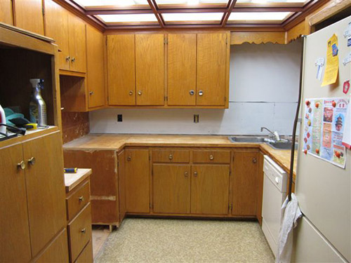
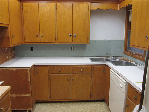
 Reader Rebecca’s 1963 kitchen is in need of some TLC. She already has come up with a great solution to swap a wall oven with a full size stove — which she documented on her blog, The Vintage Life. But now she’s stuck. Rebecca will use Formica aqua boomerang laminate on the counter tops… she has picked out a mosaic tile back splash… and she’s decided on a wall color. Her final dilemma: What color to paint or refinish the faded chippy wood kitchen cabinets?
 Rebecca writes:
We are redoing our 1963 kitchen and have decided on an aqua, orange and white palate. We are keeping the current cabinets and my dilemma is what color should the cabinets be. We are considering using the Rust-Oleum Cabinet Transformation product but I am stuck as to what color. Our thinking was that the cabinets needed a “refresh”. They are leaning a little yellow and yes there is some damage in a few places. I have attached a couple pics I put together from the Sherman Williams Color Visualizer. [Editor’s note – we did not show these photos – but we made our own, below.] They are crude but give a little bit of a vision of what it could be. One picture is with the cabinets in a darker color and one picture is with the cabinets staying as they are. We thought the painting of the cabinets at least in a darker color really made the other colors pop a little more. So that is what we were thinking. It would be easier to leave them alone but I really think we need to do something with them. We are open to your suggestions.
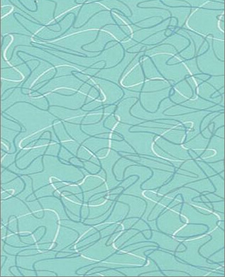
The counter tops are going to be the Formica aqua boomerang that we bought before they discontinued it.
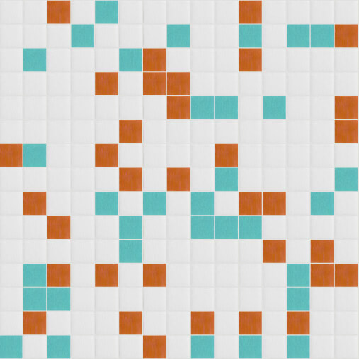
The back splash is going to be glass mosaic tile from Mosaic Tile Supplies. I used their tile maximizer to create my own blend of white at 70% then aqua and orange at 15% each. Here is a link to their site. Colors we chose are Snow white – KA077, Pumpkin – KD101 and Rochester – KB009. If you haven’t played with it before it is really fun.
We have an aqua oven and I was thinking of putting some of the Formica in the front of the dishwasher like the gal did with her Betty Crocker cookbook cover. We are looking at doing a cork floor in perhaps a lighter cork color. Any painted wall space will be in the Holiday Turquoise from Sherman Williams.
With all this in mind, what is your suggestion on the color of the cabinets?
Thank you for helping me get unstuck!!
5 ideas to repaint or refinish these old wood kitchen cabinets
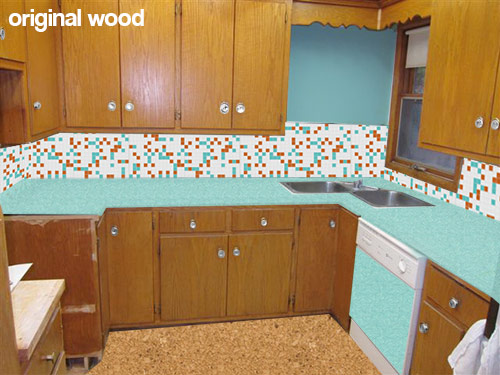 This first mock up (above) shows what Rebecca’s kitchen would look like with her new counter top, backsplash, flooring and paint choices while keeping the wood cabinets the same color they are now. While I personally like the current look of the natural wood cabinets — I understand her need to paint them — since my kitchen cabinets — which were a similar color and construction — were also heavily chipped and damaged. Using about a gallon of wood putty, several coats of primer and a fresh coating of paint really helped my kitchen feel cleaner and removed the “rough around the edges” feeling. If you want to replicate the look of the natural wood, yes, Rust-Oleum Cabinet Transformations might be great — you can add just enough glaze (maybe further diluted) at the end to bring out the natural grain after the painting.
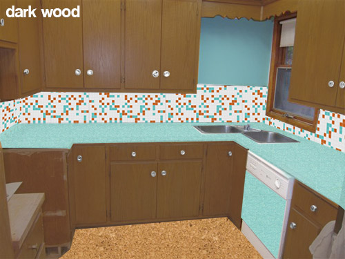 Rebecca also is considering painting her cabinets a darker wood toned color like the mock up above. While I like the idea of keeping a wood like finish on the cabinets — this darker color in combination with the other choices — makes me think of the 1970s more than the 1960s. This is fine if that is the look that Rebecca is going for, or if she likes this look — but I was under the impression that she is wanting a more late 50s early 60s look.
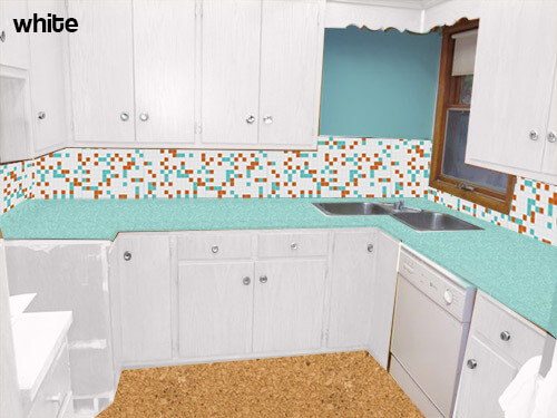 My initial thought — if the original wood tone cannot be preserved — was to paint all of the cabinets white. This will help the dishwasher be less obvious — though I would not use the laminate panel in this case. The all-over white will also substantially lighten and brighten the space and really let the fabulous aqua boomerang countertops, aqua appliances and mosaic tile backsplash take center stage. Because of the warm cork flooring it and other color on the walls — the space will not feel too sterile.
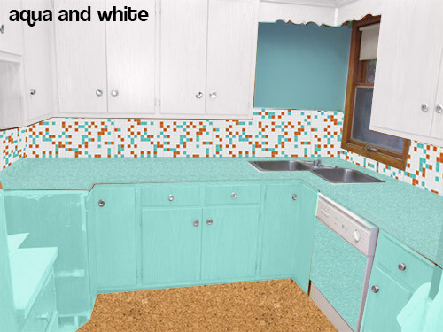 Pam suggested trying the mock up above — instead of painting all the cabinets white — paint the bottom cabinets aqua.
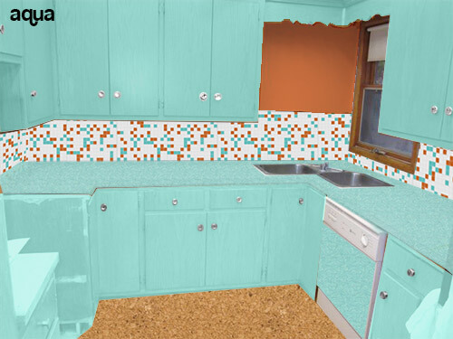 Or even going as far as to paint all the cabinets aqua (like the above mock up) and making the wall orange to match the tile?
Readers — what do you think that Rebecca should do with her cabinets?


Jamie D. says
I like the clean crispness of the white. I think I’d like turquoise if the floor were different, like off white VCT with the occasional turquoise/orange tile thrown in.
I’d be curious to see how a pale yellow would look. My first thought with the turquoise boomerang laminate was to paint the cabinets pale yellow, but I’m not sure how that would go with your mosaic tile.
Sarah g (roundhouse) says
I agree that the tile needs to go all the way up above the sink area. That will make such a statement, and not seem ‘unfinished’. My vote as far as the cabinet color is white I think it lets the tile, countertop and floor really stand out. Also paint the window trim white (it’s left natural in the mock up) if you do go that route.
Mostly though, i’m not sold on that floor… Needs to be more orange… Either a different shade of cork or vct that matches that burnt orange color from the tile.
midmichigan says
I think off-white, beige or cream color. I wouldn’t go with the crispness of stark white. IMO, you need a “heavier” color to go with the aqua that’s quite powerful itself.
There was someone in a post recently on this blog that painted their cabinets with a paint that made them look like they were constructed of metal. That finish might work.
Stacia says
I vote for turquoise. But instead of matching the color of the counters, make it much darker. Much like the color used in the retrorenovation home page, in fact! It needs a darker or duller tone somewhere and that will really make the tile and counters, as well as that stove, stand out.
Annie B. says
Paint all cabinets white. I love the brightness.
BungalowBILL says
How about painting the frames of the cabinets one color, say white and the doors and drawer fronts another, say aqua?
That bare spot above the sink kinda bugs me. Makes me feel like something was taken out and feels unfinished. I would tile the entire space, maybe adding a large decorative tile as a piece of art.
Janet in CT says
WOW, BungalowBILL, you and I think alike! I sent a post early this morning but it never showed up. My first apartment was white with pale yellow doors and drawer fronts and everyone loved it. It was a more cottagey look though and may not be what Rebecca is looking for. I also thought adding aqua or multi-colored hardware would really make it pop. The aqua stove and formica and the tile choice so far are great and I think you are right on with the tile over the sink!
Janet in CT says
Just see my first post is awaiting moderation because I had the H word in there that the combination of paint colors on the cabinet is a love it or not look. Anyhow, you could always try it and then repaint if it isn’t quite right. I had birch cabinets in my house and painted them almond and loved them but I have to add that you have to clean and maintain them. It is important that you apply a clear coat over them or the constant rubs from your hands will eventually start to damage the paint. I found that out the hard way.
BungalowBILL says
Janet, together we can conquer the world! I suggested the color combo as it would play off the mosaic pattern.
Tom says
Ditto on the blank space, that corner begs for a window to the left of the sink. I assume that’s an inside wall though or else one would already be there. Here’s a few suggestions for that space.
Open up the wall (without tearing out the other wall surface, that is!) and frame out a space the same height as the window and as wide as the space. Frame the opening in matching trim. Add shelves (which would be about 4″ deep), lining up the middle one with the horizontal member in the window. Use this area to display a few selected kitchen-related things. For a better match, you could add a few shelves across the actual window as well.
Or you could do the same inset box, but instead of shelves put some lighting in the box, then build a frame (removable, so you can change bulbs) to simulate window sash and use some kind of frosted glass so the bulbs don’t show. Lights on during the day and lights off at night.
If those sounds like too much work, you might contemplate painting a faux window in the space if you are, or know, a pretty good artist.
Or you could just hang one of those starburst clocks there, but that’s the easy way out! I’d think “inside” the box. 🙂
Rebecca - Madison, WI says
Tom, you are correct, that space is an interior wall that backs up to a bedroom. The intercom system for the bedroom is right behind it. I love your idea about creating some sort of insert there. Countertop space is so limited and this would give me a space to put some of my collectibles. Also, love the clock idea. Thank you so much for taking the time to give your idea, very creative!
Mary Elizabeth says
Rebecca, I just love your choices of colors and materials for laminate counters and tile backsplash, and I agree with the cabinets being a combination of two colors. I think what might have happened in the building is that the kitchen was designed either (1) to “bump out” beyond the house with the back of the kitchen protruding out beyond the bedroom, or (2) the kitchen was designed to go in the opposite corner in the house, and was meant to have two corner windows. Then the plans changed due to budget constrictions or other considerations, and no one bothered to change the cabinet design. The wooden valance is definitely designed to go over windows in the 1950s-60s cabinets.
Since the current window goes withing inches to almost to the wall, it looks like, I like Tom’s suggestion of opening the wall and putting shelving in there. This kind of built-in shelving is very much to the period. What you could do also is put a mirror back to the shelves to give the sense that they are deeper. Then fill it up with spices or your kitchen collectables, like orange and aqua Fiestaware. If you don’t want to break into the wall, you could use some “floating” glass shelving in there, too, with the support brackets painted to match the wall. Finally, you can install a series of three or four wedge-shaped curved shelves (each a quarter of a circle) with the straight edges against the cabinet to the left of the sink and the wall. These are also true to the period and would be big enough to hold small collectibles like salt and pepper shakers or cream and sugar sets.
No matter what you do, it is going to look fabuous and you will have a bright and cheery kitchen to dance around in your shirtwaist dress, frilly apron and Papagallo flats. 🙂
Jocelyn W. says
I would throw some open shelving into that blank space for sure. It’d be a nice place to display some collectibles of coordinating colors.
Lauryn says
The contrasting colors can look cute in a bigger kitchen, but the previous owners of our home did that to our kitchen cabinets and the kitchen was way too small for it to work. It seems to me that this kitchen is also too small for that idea. (When we painted our cabinets all one color it was amazing to me how much more open the space felt.)
lady of the house says
I have the same feeling about the blank space. Suggestion 1: bump the mosaic tile up a few inches to the same level as the window sash. Suggestion 2: put a mirror there to reflect light from the window.
Chicago Mel says
I’m loving this post because I am having many of the same design dilemmas with my own kitchen. I think I am in love with the aqua/white cabinet combo. In the aqua/white cabinet scenario, what color do you paint the tall cabinet that is facing the refrigerator? Is it all aqua?
I love the idea of paneling over the dishwasher with laminate. Does anyone have any suggestions on what adhesives to use to acheive that look?
I loved the tiled cork floor in this 1956 kitchen makeover. https://retrorenovation.com/2009/03/06/janes-1956-retro-renovation-kitchen/ I am considering achieving a similar look with marmoleum click tile using a warm and cool neutral.
I can’t wait to see the finished kitchen, especially with some cafe curtains in the window!
Joe Felice says
In the case of this dishwasher, no adhesive is necessary. The metal surrounding trim on the door comes off. Take one side off & slide the laminate in, then replace the trim. I did this to my folks dishwasher a few years back. It couldn’t have been easier. I’m jealous, because my tall-door dishwasher has a solid, wrap-around front–no way to put anything on it that would look like it “belongs.”
Janet in CT says
I would go with painting them white. I think the aqua is too much with the countertops. My first apartment had white cabinets with yellow doors and I still think it was one of the cutest kitchens I have ever seen. Maybe a combination of white with aqua doors and drawer fronts would work but you would have to try a few to see if you like it or hate it. In any case, I would put colored hardware on to match the backsplash tile and to bring in some contrast. Love the countertops and aqua stove and tile colors.
Anonypilgrims says
I wanted to support the theory of cabinets one color and doors another. However, I would go with aqua cabinets and white doors.
Mary says
I like either the original wood, or the all white. Although the white and aqua are nice, overall it takes away the impact of the aqua countertops. If you go with white, I think the aqua stove and aqua dishwasher panel would help “ground” the room and avoid a white-out effect.
Maybe it looks better in person, but in the pictures the natural cork looks a lot like oriented strand board. I believe colored cork tiles are available–maybe an aqua and white checkerboard would work? If you stay with the original wood, I would try to match the floor tone to the cabinets, or go a little darker.
Diane says
Just looking at these photos my eyes keep getting drawn to the floor. They do make a darker cork floor and even many designs with light n dark tones mixed together although that raises your costs. It appears that that color does nothing for the room.
Beth says
I agree, Diane. Not loving the floor. My favorite is the aqua and white.