

 Reader Rebecca’s 1963 kitchen is in need of some TLC. She already has come up with a great solution to swap a wall oven with a full size stove — which she documented on her blog, The Vintage Life. But now she’s stuck. Rebecca will use Formica aqua boomerang laminate on the counter tops… she has picked out a mosaic tile back splash… and she’s decided on a wall color. Her final dilemma: What color to paint or refinish the faded chippy wood kitchen cabinets?
 Rebecca writes:
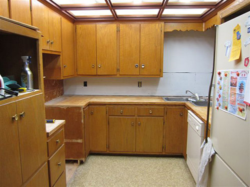
We are redoing our 1963 kitchen and have decided on an aqua, orange and white palate. We are keeping the current cabinets and my dilemma is what color should the cabinets be. We are considering using the Rust-Oleum Cabinet Transformation product but I am stuck as to what color. Our thinking was that the cabinets needed a “refresh”. They are leaning a little yellow and yes there is some damage in a few places. I have attached a couple pics I put together from the Sherman Williams Color Visualizer. [Editor’s note – we did not show these photos – but we made our own, below.] They are crude but give a little bit of a vision of what it could be. One picture is with the cabinets in a darker color and one picture is with the cabinets staying as they are. We thought the painting of the cabinets at least in a darker color really made the other colors pop a little more. So that is what we were thinking. It would be easier to leave them alone but I really think we need to do something with them. We are open to your suggestions.
The counter tops are going to be the Formica aqua boomerang that we bought before they discontinued it.
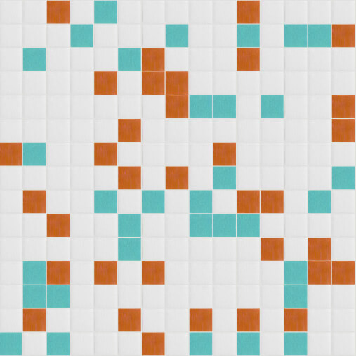
The back splash is going to be glass mosaic tile from Mosaic Tile Supplies. I used their tile maximizer to create my own blend of white at 70% then aqua and orange at 15% each. Here is a link to their site. Colors we chose are Snow white – KA077, Pumpkin – KD101 and Rochester – KB009. If you haven’t played with it before it is really fun.
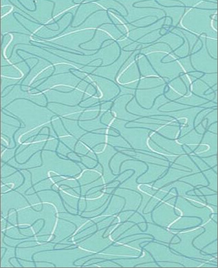
We have an aqua oven and I was thinking of putting some of the Formica in the front of the dishwasher like the gal did with her Betty Crocker cookbook cover. We are looking at doing a cork floor in perhaps a lighter cork color. Any painted wall space will be in the Holiday Turquoise from Sherman Williams.
With all this in mind, what is your suggestion on the color of the cabinets?
Thank you for helping me get unstuck!!
5 ideas to repaint or refinish these old wood kitchen cabinets
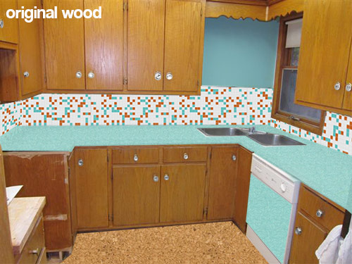 This first mock up (above) shows what Rebecca’s kitchen would look like with her new counter top, backsplash, flooring and paint choices while keeping the wood cabinets the same color they are now. While I personally like the current look of the natural wood cabinets — I understand her need to paint them — since my kitchen cabinets — which were a similar color and construction — were also heavily chipped and damaged. Using about a gallon of wood putty, several coats of primer and a fresh coating of paint really helped my kitchen feel cleaner and removed the “rough around the edges” feeling. If you want to replicate the look of the natural wood, yes, Rust-Oleum Cabinet Transformations might be great — you can add just enough glaze (maybe further diluted) at the end to bring out the natural grain after the painting.
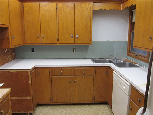
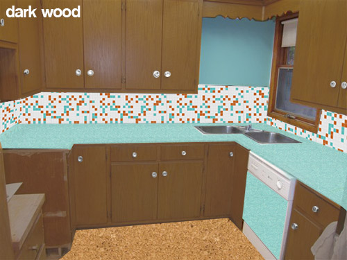 Rebecca also is considering painting her cabinets a darker wood toned color like the mock up above. While I like the idea of keeping a wood like finish on the cabinets — this darker color in combination with the other choices — makes me think of the 1970s more than the 1960s. This is fine if that is the look that Rebecca is going for, or if she likes this look — but I was under the impression that she is wanting a more late 50s early 60s look.
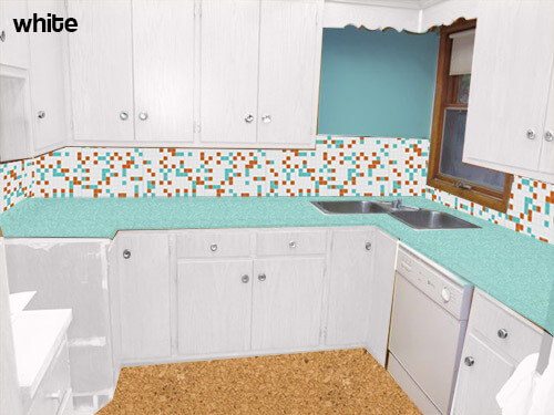 My initial thought — if the original wood tone cannot be preserved — was to paint all of the cabinets white. This will help the dishwasher be less obvious — though I would not use the laminate panel in this case. The all-over white will also substantially lighten and brighten the space and really let the fabulous aqua boomerang countertops, aqua appliances and mosaic tile backsplash take center stage. Because of the warm cork flooring it and other color on the walls — the space will not feel too sterile.
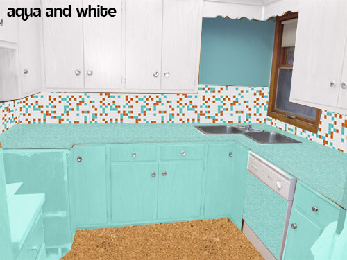 Pam suggested trying the mock up above — instead of painting all the cabinets white — paint the bottom cabinets aqua.
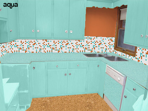 Or even going as far as to paint all the cabinets aqua (like the above mock up) and making the wall orange to match the tile?
Readers — what do you think that Rebecca should do with her cabinets?


Dawn says
OY VEY! I hope I am not too late! Rebecca, I used Rustoleum Cabinet Transformation last year on my own VERY similar wood cabinets. I had lived with them for a year. And now I have lived with them painted for a full year. So I can now reflect.
I did a full review of the product on my on blog. The product while over all GOOD, was a lot of work. And the top coat, especially on dark stain, is a pain in the rear, so just know that. However long you think its going to take, TRIPLE IT.
I went dark. I used the Chocolate. And a year later, I do not like it. Its too dark for my house. I have a big kitchen with one big window so I get good light, but the dark is just too much. I am now considering stripping my cabinets and leaving them natural. I really wish I had not done the transformation.
I still overall love the product, but even taking my time, I have a lot of imperfections. It has, however, held up really well in the last year and we LIVE in our kitchen.
Of the pictures above I LOVE LOVE LOVE the white. It really pops with your color choices. I LOVE your tile choice…Gorgeous!
Good luck!!!!
Jay says
I remember this project. Nice to have your feedback a year later. I thought it turned out well.
Dawn says
Thanks Jay. It has held up really well so overall I am pleased with the product. I just wish I had waited a little longer to decide to do something. And I wish I had gone lighter. Ahhh regrets!!!
Everyone else loves it though and I get a lot of compliments, but I think I want a bit more “Original”. Heck, I dont know. I seem to change my mind weekly. And the price couldnt be beat really for a quick fix.
Long term though I do think I might have to strip and refinish them eventually. I really wish I had the guts to go all Aqua! Thats the retro color I love best, even though it exists no where in my house.
Nico says
Hi, what about white on the bottom cabinets and then on the top a much lighter almost white shade of the Holiday Turquoise? Gives the top a little color without taking away from the amazing counter tops and stove. 🙂
D'Lynne Garner says
I like the white option. White is consistent with all decades, but especially the 1950s and 1960s, and white will make the aqua really stand out. I’d love to see a tile floor that mimics the backsplash, with 12×12 tiles (vinyl or linoleum maybe) in white, with a very few aqua, and orange added in a random placement. http://www.walmart.com/ip/Congoleum-Alternatives-12-x-12-Vinyl-Tile-in-Aqua-Spring/21873686?srccode=cii_13736960&cpncode=30-153996482-2&adid=1500000000000036337720&veh=cse
orangey says
I just love the natural color of the wood cabinets. It’s the most authentic and becoming hard to find. It seems that everybody paints them. As mentioned earlier, painting cabinets is not easy and it can be time consuming when done properly. It may be easier just to restore the wood. I can’t really see any damage so it’s hard to say exactly what to do to them but perhaps sanding and applying tung oil may perk them up. Plus, I think the natural wood makes the aqua really pop. I’d try keeping the wood but if it’s impossible, go with the all white. I like the idea of a vintage clock or some other period accessory going in the spot above the sink. Sometimes I think we go too far with the tile and once it’s there, it’s there. You can always swap an accessory when you like. Please keep us posted. It look like it’s going to turn out great no matter what you decide.
Leslie says
I like the original cabinet color, maybe just clean them up with something like Howards.
Otherwise, I would do turquoise frames and white doors. Not wild about the cork floor, might look at a sheet vinyl in a more retro color.
I’d think about going all the way up with the tile in that area behind the sink, or maybe some shelves there or something.
Love the stove.
Diane in CO says
I think Sarah g is the only one who mentions the window — and that bothers me the most in the mock-ups. Paint the window white or the same as the wall.
Also, cork flooring comes in so many colors and designs. Is the mock-up floor, which is very “corky,” the choice of the owner? I tend to agree with several other commenters that the floor could be different.
Love the glass mosaic tile!
Brian T says
I grew up in a 1960 house that my parents bought in 1969. Its kitchen had an aqua refrigerator, aqua double wall ovens, and lots of unpatterned aqua formica — countertops and semi-attached round breakfast table.
The original 1960 finish for our cabinets was called a “pecan” stain — basically, taupe. This slightly pink cast of this brownish neutral looks great with aqua but wouldn’t look great with orange.
Around 1980, my mom made one of the boldest decisions and had all the cabinetry painted a color she called “shrimp” — peachy pink, not pastel but not saturated brightness either — while retaining all the aqua formica. There was also some wallpaper in the breakfast area, featuring dinner-plate-size poppies in shades of aqua and blue. The whole effect wasn’t as bad as it sounds, but it was “a lot of look.”
Around 1992, she had all the cabinetry painted aqua to match the formica. This was the best look, and it’s what I’d recommend for here. If you’re worried it will be too much aqua, use a paler aqua on the upper cabinets. Someone mentioned that aqua paint wouldn’t let the formica stand out — but (a) it will still gain distinction from its pattern and (b) having the countertops NOT stand out is still a nice look — the whole room would “stand out” as a unit.
I love the aqua and I see that orange is a nice complement (I always thrilled at the sight of Howard Johnson’s). But the orange is too strong to be used much more than in the tiny amount of backsplash — certainly not on the cabinets. If you’re not married to the orange, may I suggest this: How about the aqua formica you have, aqua cabinets below, pale yellow cabinets above, and the backsplash you have but with brightest yellow instead of orange. That two-tone look would be period-appropriate but not garish.
Stephanie MCM Lush says
We had a similar choice to make in our “new” 1958 ranch this winter. Before living in the house we were set on painting the original birch cabinets. But I took some advice I have seen Pam give on the blog, and decided to live with it a while. After replacing the 90’s brass hardware with chrome hardware from rejuvenation, adding some paint on the walls, and new boomerang countertops I could never paint these cabinets! They’re not perfect by any means, but they’re beautiful to me 🙂
I’m not sure if Rebecca has lived in her home for a while or not..just thought I would share.
So my vote is to keep the original cabinet color. I think both the tile and the countertops really pop against that patina 🙂
Retrofit Culture says
Renovating my kitchen a few years back was so fun (in hindsight, at the time it was stressful making all the decisions), I’m so happy to weigh in on someone else’s decision making process! I don’t know if I have anything that hasn’t been said already but here’s my opinion…
I like the all white cabinets a lot, but I also like the white/aqua combo if the “aqua” was more of a peacock or darker aqua like the darkest boomerang in the laminate. I like the idea of keeping the niche painted and not tiled, because you can find fabulous vintage art or kitchen kitsch to hang there (it’s to hard to hang anything with tile there). And I love cork floors!! Love, love, love. In fact when we renovated our kitchen that’s what we choose, and they were beautiful–all light and dark and swirly–BUT, if you wear heels, have dog(s), or have a busy household in general, I unfortunately do not recommend them. Sad, but true. Their soft finish just does not hold up, even with tons of coats of poly.
Rebecca - Madison, WI says
Thank you for the info on the cork. We have two dogs and I did not think about that. That is why it is so great to have all this feedback.
Retrofit Culture says
Its such a shame too, because cork flooring is so beautiful, warm & inviting, and green. My new dream is to have a cork flooring accent wall in another area of the house…now just were to put it! I can’t wait to see the kitchen once it’s all done!!
pam kueber says
I think you should really look into the specifications of the materials you are interested in using. Some floor finishes may have special coatings that are harder….
MsKittyMuses says
I absolutely love your color palatte! If Formica was still making the turquoise boomerang laminate, that’s exactly what my husband and I would have done in our ranch.
I personally really love the white cabinets. You have such a great stove, and the counters and back splash and so fun and unique, I feel the other choices minimize the impact of them, and makes your eyes fight for what to look at. And since it is a smaller space, it definitely makes it feel much bigger and more open.
What ever you do, and have wonderful taste, and I’m sure it will look fabulous!