Wallpaper the backsplash? Deb wants our help with her Retro Design Dilemma
Kate - Updated: September 20, 2020
Retro Renovation stopped publishing in 2021; these stories remain for historical information, as potential continued resources, and for archival purposes.
Reader Deb and her husband are in the final stages of their DIY vintage style kitchen remodel. It’s coming together just beautifully — but now, they are stuck on a final design decision: Shoudld they add adorable 1940s style Bradbury & Bradbury wallpaper to the backsplash? Or will it be too much? They want to hear from the ever-helpful tribe of Retro Renovation readers. To wallpaper or not to wallpaper, that is the question. Read on to hear Deb’s story and to weigh in. Pam and I will hold back and post our photoshopped ideas at noon.
Deb writes:
Hi Pam,
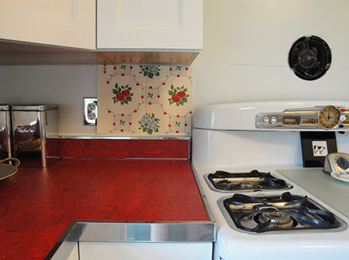
We’re in the final stages of our kitchen redo (having done all the work ourselves except for the sheetrocking) and we can’t agree on whether to use this wallpaper from Bradburyas our backsplash or not.
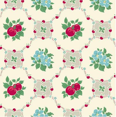
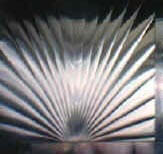
“Apple Betty” by Bradbury & Bradbury
I love it but my husband thinks it is too busy and takes away from the nickel outlet covers (which he has some strange attachment to lol). Behind the stove will be new/old fan with a sunburst stainless steel panel. Is this all too much? The wallpaper would be vinyl coated for protection and used only under the cabinets.
Also, I want to let you know that your explanation and pics of doing the metal edging on your counter tops helped immensely when it came time to do ours.
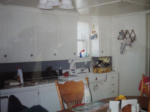
Kitchen before with original Youngstown “Diana” sink unit.
The original kitchen had the washer and dryer under the counter and a “Diana” Youngstown sink unit. It was too far gone to save but I did manage to pry off the the Diana emblem and will be putting it on my new sink cabinet. I know I said that we did it all by ourselves but that isn’t entirely true. We had the floor installed and we bought the RTA cabinetsfrom Barker Cabinets in Oregon. Barker also has slab front cabinets and they are a joy to do business with. Shipping took seven days from Oregon to upstate New York.
The walls are a very light blue. We have a Big Chill fridge in Buttercup yellow (ebay) that hasn’t been put in yet. The woman I bought it from in New Jersey, had won it in a raffle and could not fit it in her kitchen.
If anyone wants to know the particulars of putting in linoleum counter tops and stainless steel edging, my husband is willing to share what he did. It’s taken 1 year and 3 months of no vacations, working every single weekend and a lot of evenings to get to this point. And best of all my DH and I are still talking to each other.
So readers — now we need your thoughtful opinions — what should Deb do with her kitchen back splash?
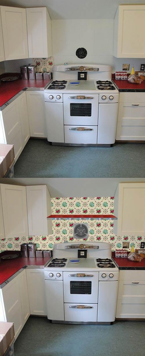
Through the magic of Photoshop, Kate made some mock-ups of Deb’s kitchen to help her visualize how it would look with the three variations wallpaper and the sunburst stainless steel backsplash:
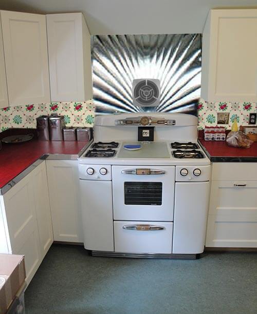
1. Sunny Day Combo:
For the first mock-up, we put the stainless steel sunburst backsplash over the stove and Bradbury & Bradbury Apple Betty wallpaper between the cabinets and counter top. This looks pretty nice… but we feel like the drama of the stainless steel backsplash might be overwhelming the rest of the kitchen design, which is so lovely. Hmmmm….
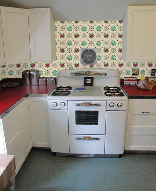
2. All wallpaper:
For the second mock-up, we extended the wallpaper all the way behind the stove and up to the ceiling. Deb wasn’t planning on having the wallpaper extend this far up, but if the stainless steel backsplash is not used, it would be a more finished look to have the wallpaper extend all the way to the ceiling, instead of being cut off at under cabinet height. We’re kind of digging the vintage charm starting to come together once this wallpaper is added…
3. Add a shelf to the combo:
Deb could also add a shelf for knick knacks — made using the same red linoleum and metal edging from the countertops — an idea that is similar to the shelf in Pam’s kitchen:
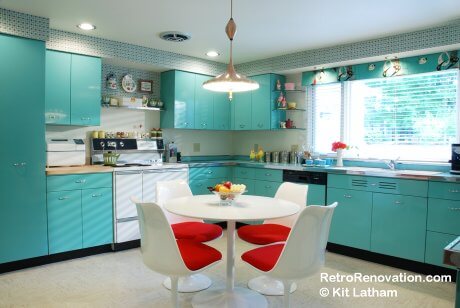
Note the shelf in Pam’s kitchen, above the stove. It is about 6″ deep, edged with stainless steel like the countertops (but a different size of SS.) I never did anything but paint my backsplash. Some day soon I think I will tile it; I have been mulling the issue… for years. As you can see, I adore wallpaper in a vintage style kitchen. ADORE. – Pam
4. Shelf plus stainless steel backsplash
If Deb’s husband still isn’t sold on the wallpaper, this option is for him. Combining the sunburst stainless steel backsplash with the shelf provides a more toned down look, while still allowing space for Deb to display vintage knick-knacks. Maybe paint the backsplash the same yellow as the refrigerator coming in… or tone the yellow paint down a bit… or, a shade similar to that of the floor might work, too.
Pam and I both agree on this one — the Bradbury & Bradbury wallpaper that Deb chose is just perfect for the space. The pattern picks up the red from the counter tops, the blue from the floor and the buttery yellow from her Big Chill refrigerator. The space above the stove and fan is just calling out for a shelf to fill it — one that Deb could use to display some cute vintage knick-knacks. If it were our kitchen, Kate and I both are loving mood board number three.
I’d go with light yellow 4×4 tiles instead and do the wallpaper on a non-cabinet wall. The light yellow would pick up on the color in the wallpaper, would let the nickel outlets pop, and you could still incorporate the wallpaper elsewhere.
mmhsays
What about this vintage wallpaper off ebay? The background is a subtle blue and there are red and yellow flowers in it. The pattern is a little less tile-looking and will play off those counters beautifully. The satin nickel plates will look great on it!
As I guessed, all you Retro folks have beaten me to my comment, so I have but to agree with the many who like the look, but are concerned about cleaning and longevity of the wallpaper. I’d go with tile. I will add that I’m not a fan of wallpaper in general, plus although adorable this pattern is ver busy for the space. If you could find small mosaic with stainless, red and white that would be amazing (I just did a quick search of “mosaic tile stainless red” and found several really fabulous possibilities.)
Melissa L.says
I actually think this is a tough question: I couldn’t really decide between the two options so I looked through a bunch of photos of kitchens from the 40s-60s. And they mostly don’t have wallpaper backsplashes. Looks like the soffits were the place to put the wallpaper/design which makes sense and would keep it from looking too busy. So–my vote is no wallpaper. Too bad you don’t have soffits as I think the wallpaper would look really spectacular on them. Lovely kitchen–the countertop and floor colors are wonderful!
Lynnesays
Deb, I have to ask…what sort of vinyl coating are you talking about for the wallpaper? Some sort of coating applied after its installed?
When I see the wallpaper photoshopped in, I’m inclined to take back my practical advice about splashproofing the stove and sink areas. It looks perfect. Hopefully your husband will come around when he sees the photoshopping, but if not, start nagging!
JKayesays
I love your kitchen and the wallpaper. But, I am thinking that putting the wallpaper in the narrow strip between the counter and cabinets will make it seem crowded and too busy. You can’t really see and appreciate the overall wallpaper pattern, because it doesn’t get to repeat itself enough in that narrow space. What you’ll see of the pattern will just seem like some busy work, particularly when appliances or other items are sitting in front of it.
But, if you have a big wall to put that wallpaper on, such as next to the dining table, then you could see the pattern repeat itself over and over to the point that it actually looks less busy and becomes a pleasing expanse of pattern that makes sense.
If you have enough of the wallpaper, I would consider using it on one big expanse of wall, and then painting the wall between the counter and cabinets and behind the stove in a color taken from the wallpaper, such as the yellow from the dot in the flowers, or the gray, which might look nice with the red counters and metal trim.
Actually this is remarkably similar to what one of my grandmothers did in her kitchen. She actually had two wallpapers. One had a kitcheny pattern (plates and stuff) with red in it similar to her red linen countertops. But the background was a subtle sort of geometric pattern in like gold and cream. There was a companion paper that was just the background pattern, and she had the subtler wallpaper on the backsplashes and under the chair rail in the breakfast area, and the busier pattern on the other walls. I forget which she used on the soffits.
I’m digging the wallpaper, but def hold off. People bring up an interesting point that the stainless panel could drag your kitchen in more of a dinery direction, and the importance of making sure the yellow makes sense in the room. That said, I would do something to break up the white-on-white look eventually.
Some people think that the pattern is overwhelming, I think the opposite. It lets you repeat the bright colors the room already has in small enough doses to NOT be overwhelming. And it may limit the number of accessories that you’ll want there, but that could be a good thing. My grandmother likes a lot more clutter than my mom and I do. But a month or so after she redid her kitchen I came up with a really nice and kind of busy treatment for the backsplash (that also spared me from stripping wallpaper), and then she said we needed to put things away to show more of it. Huge win!
If you do use wallpaper, do something to not have it under the window where splashing from the sink will age it prematurely. Either remove the wood trim under the windowsill and put in new trim that comes all the way down to the existing 4-inch backsplash, or add stainless steel similar to what you’re putting over the stove – with or without the existing wood trim, depending on your aesthetic preferences. I would also add thin trim, either wood or metal, to finish the edges of the stainless steel panel(s).
I love the wallpaper and how it picks up the red countertop (which is awesome). But, the background appears to be a cream and you have off white cabinets and bright white stove. I think the wallpaper might look dingy in comparison. With the cool chrome panel I’m not sure that you need that much pattern in the backsplash. To me, the chrome panel, edging & nickel plates say slick; almost restaurant/diner style. The B&B wallpaper says charming & cute. Conflicting styles. Perhaps do the rest of the backsplash in stainless steel quilted panels to keep with the diner look and add the pattern and color in art & window treatments.
What a lovely choice of wallpaper. Your husband is lucky you only want to do the backsplash because I would want to do all the wall! It is an absolutely cheery print and really adds character as well as tying the elements that you have done. It makes good design sense from my pov.
MsKittyMusessays
I absolutely LOVE that wallpaper, especially in your kitchen and with those gorgeous counter tops! What a wonderful job you two have done so far! I say go for it!
If you’re having a stainless steel panel behind your stove, and there is minimal wall exposure behind the sink, keeping it clean probably won’t be a major issue. You can always do plexiglass only where the sink is, or do a panel there too, depending on the lines with the window sill.
I also don’t think it’s that busy at all, since it’s such a small space of wall, and everything else is solid colored. If you had a checkerboard floor, or patterned counter tops, it may be too much, but here I think it would be the perfect accent. And I think the outlet covers will still show up well!
This is my absolutely favorite time period for a kitchen, so I’m very partial already. We have very well maintained birch cabinets stained in the typical oragney tone, and they’re beautiful, but I secretly wish someone had painted them white over the years so I’d have a reason to do what you’re doing with yours! It looks so happy and cheerful, especially with the wallpaper. Good luck finishing it up, what ever you choose!


If anyone wants to know the particulars of putting in linoleum counter tops and stainless steel edging, my husband is willing to share what he did. It’s taken 1 year and 3 months of no vacations, working every single weekend and a lot of evenings to get to this point. And best of all my DH and I are still talking to each other.
 For the second mock-up, we extended the wallpaper all the way behind the stove and up to the ceiling. Deb wasn’t planning on having the wallpaper extend this far up, but if the stainless steel backsplash is not used, it would be a more finished look to have the wallpaper extend all the way to the ceiling, instead of being cut off at under cabinet height. We’re kind of digging the vintage charm starting to come together once this wallpaper is added…
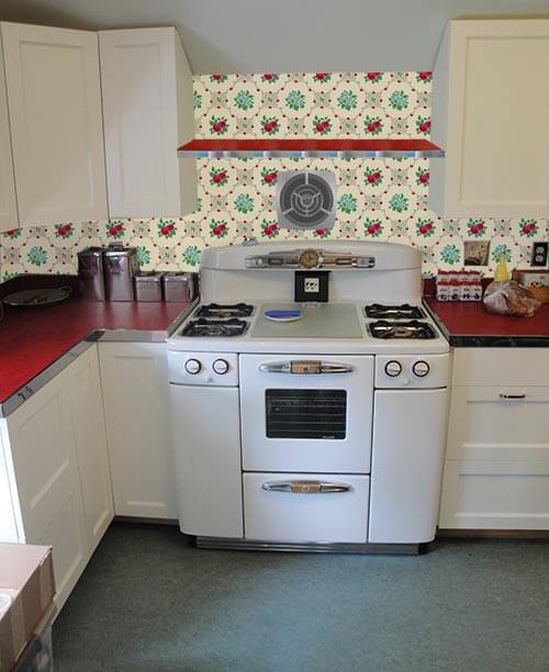 Deb could also add a shelf for knick knacks — made using the same red linoleum and metal edging from the countertops — an idea that is similar to the shelf in Pam’s kitchen:
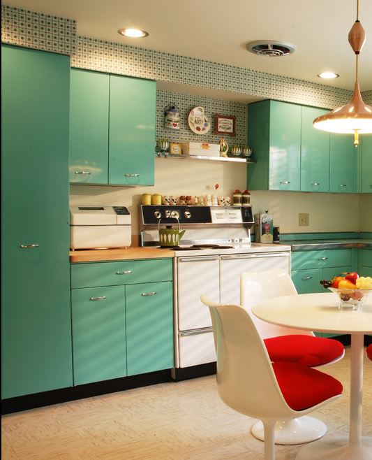
 If Deb’s husband still isn’t sold on the wallpaper, this option is for him. Combining the sunburst stainless steel backsplash with the shelf provides a more toned down look, while still allowing space for Deb to display vintage knick-knacks. Maybe paint the backsplash the same yellow as the refrigerator coming in… or tone the yellow paint down a bit… or, a shade similar to that of the floor might work, too.


BlueJay says
I’d go with light yellow 4×4 tiles instead and do the wallpaper on a non-cabinet wall. The light yellow would pick up on the color in the wallpaper, would let the nickel outlets pop, and you could still incorporate the wallpaper elsewhere.
mmh says
What about this vintage wallpaper off ebay? The background is a subtle blue and there are red and yellow flowers in it. The pattern is a little less tile-looking and will play off those counters beautifully. The satin nickel plates will look great on it!
http://www.ebay.com/itm/Vintage-Kitchen-Wallpaper-1930s-pale-blue-with-red-and-yellow-flowers/390582204953?rt=nc&_trksid=p2047675.m1851&_trkparms=aid%3D222002%26algo%3DSIC.FIT%26ao%3D1%26asc%3D261%26meid%3D9000062668771727821%26pid%3D100005%26prg%3D1088%26rk%3D2%26sd%3D360599522260%26
Deb Cerrone says
mmh, I like that wallpaper
Laura says
Your first wallpaper choice is more of a kitchen design than this one.
Roberta Lee says
As I guessed, all you Retro folks have beaten me to my comment, so I have but to agree with the many who like the look, but are concerned about cleaning and longevity of the wallpaper. I’d go with tile. I will add that I’m not a fan of wallpaper in general, plus although adorable this pattern is ver busy for the space. If you could find small mosaic with stainless, red and white that would be amazing (I just did a quick search of “mosaic tile stainless red” and found several really fabulous possibilities.)
Melissa L. says
I actually think this is a tough question: I couldn’t really decide between the two options so I looked through a bunch of photos of kitchens from the 40s-60s. And they mostly don’t have wallpaper backsplashes. Looks like the soffits were the place to put the wallpaper/design which makes sense and would keep it from looking too busy. So–my vote is no wallpaper. Too bad you don’t have soffits as I think the wallpaper would look really spectacular on them. Lovely kitchen–the countertop and floor colors are wonderful!
Lynne says
Deb, I have to ask…what sort of vinyl coating are you talking about for the wallpaper? Some sort of coating applied after its installed?
Chad says
When I see the wallpaper photoshopped in, I’m inclined to take back my practical advice about splashproofing the stove and sink areas. It looks perfect. Hopefully your husband will come around when he sees the photoshopping, but if not, start nagging!
JKaye says
I love your kitchen and the wallpaper. But, I am thinking that putting the wallpaper in the narrow strip between the counter and cabinets will make it seem crowded and too busy. You can’t really see and appreciate the overall wallpaper pattern, because it doesn’t get to repeat itself enough in that narrow space. What you’ll see of the pattern will just seem like some busy work, particularly when appliances or other items are sitting in front of it.
But, if you have a big wall to put that wallpaper on, such as next to the dining table, then you could see the pattern repeat itself over and over to the point that it actually looks less busy and becomes a pleasing expanse of pattern that makes sense.
If you have enough of the wallpaper, I would consider using it on one big expanse of wall, and then painting the wall between the counter and cabinets and behind the stove in a color taken from the wallpaper, such as the yellow from the dot in the flowers, or the gray, which might look nice with the red counters and metal trim.
Chad says
Actually this is remarkably similar to what one of my grandmothers did in her kitchen. She actually had two wallpapers. One had a kitcheny pattern (plates and stuff) with red in it similar to her red linen countertops. But the background was a subtle sort of geometric pattern in like gold and cream. There was a companion paper that was just the background pattern, and she had the subtler wallpaper on the backsplashes and under the chair rail in the breakfast area, and the busier pattern on the other walls. I forget which she used on the soffits.
That said, my other grandmother’s new kitchen now (described in my comment above) has tin ceiling backsplashes with a painted effect that makes a pattern in red. This not retro, but does show what a patterned backsplash can look like: https://www.facebook.com/photo.php?fbid=10100657018172204&set=a.10100657006365864.3474398.9345609&type=3&theater
Everyone thinks that the patterned backsplash made the room, which was otherwise pretty standard today style. There’s no universal solution.
Chad says
I’m digging the wallpaper, but def hold off. People bring up an interesting point that the stainless panel could drag your kitchen in more of a dinery direction, and the importance of making sure the yellow makes sense in the room. That said, I would do something to break up the white-on-white look eventually.
Some people think that the pattern is overwhelming, I think the opposite. It lets you repeat the bright colors the room already has in small enough doses to NOT be overwhelming. And it may limit the number of accessories that you’ll want there, but that could be a good thing. My grandmother likes a lot more clutter than my mom and I do. But a month or so after she redid her kitchen I came up with a really nice and kind of busy treatment for the backsplash (that also spared me from stripping wallpaper), and then she said we needed to put things away to show more of it. Huge win!
If you do use wallpaper, do something to not have it under the window where splashing from the sink will age it prematurely. Either remove the wood trim under the windowsill and put in new trim that comes all the way down to the existing 4-inch backsplash, or add stainless steel similar to what you’re putting over the stove – with or without the existing wood trim, depending on your aesthetic preferences. I would also add thin trim, either wood or metal, to finish the edges of the stainless steel panel(s).
Lori D. says
I love the wallpaper and how it picks up the red countertop (which is awesome). But, the background appears to be a cream and you have off white cabinets and bright white stove. I think the wallpaper might look dingy in comparison. With the cool chrome panel I’m not sure that you need that much pattern in the backsplash. To me, the chrome panel, edging & nickel plates say slick; almost restaurant/diner style. The B&B wallpaper says charming & cute. Conflicting styles. Perhaps do the rest of the backsplash in stainless steel quilted panels to keep with the diner look and add the pattern and color in art & window treatments.
Jillian says
What a lovely choice of wallpaper. Your husband is lucky you only want to do the backsplash because I would want to do all the wall! It is an absolutely cheery print and really adds character as well as tying the elements that you have done. It makes good design sense from my pov.
MsKittyMuses says
I absolutely LOVE that wallpaper, especially in your kitchen and with those gorgeous counter tops! What a wonderful job you two have done so far! I say go for it!
If you’re having a stainless steel panel behind your stove, and there is minimal wall exposure behind the sink, keeping it clean probably won’t be a major issue. You can always do plexiglass only where the sink is, or do a panel there too, depending on the lines with the window sill.
I also don’t think it’s that busy at all, since it’s such a small space of wall, and everything else is solid colored. If you had a checkerboard floor, or patterned counter tops, it may be too much, but here I think it would be the perfect accent. And I think the outlet covers will still show up well!
This is my absolutely favorite time period for a kitchen, so I’m very partial already. We have very well maintained birch cabinets stained in the typical oragney tone, and they’re beautiful, but I secretly wish someone had painted them white over the years so I’d have a reason to do what you’re doing with yours! It looks so happy and cheerful, especially with the wallpaper. Good luck finishing it up, what ever you choose!