

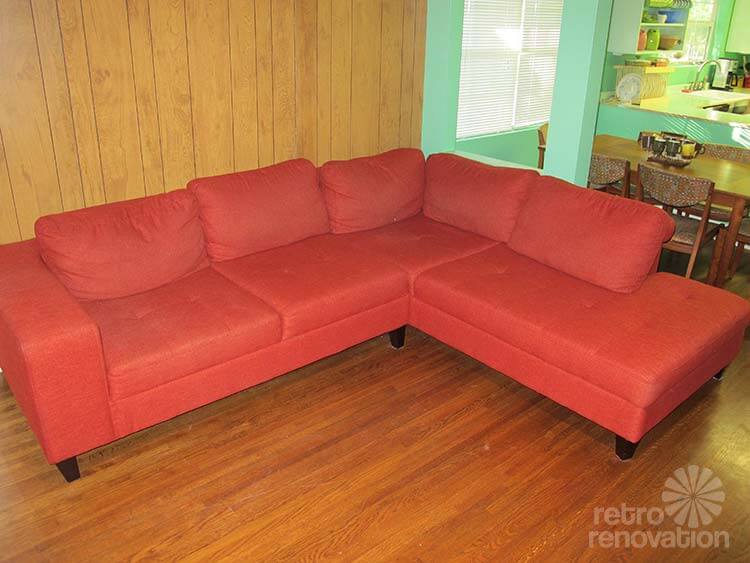
 Reader Ashley loves bright colors and retro style. Though her house was built in the 1930s and originally a country style, she wants her great room to have a more 50s/60s vibe — at least in her kitchen/dining/living room area. She’s painted the built-in shelves a burnt orange to match her vintage modern sectional couch and even put up — yes, I said put up — wood paneling along the front wall. With a new Big Chill fridge and some Youngstown vintage steel cabinets waiting to be painted, Ashley needs our help to pull it all together and create her retro modern dream room.
 Ashley writes:
Hey Pam,
First off I just want to say that your site is amazing and I cant even tell you how much this has helped me in the past few years. THANK YOU!(I apologize in advance because this will be long) I don’t know where to start so I will just tell you everything….
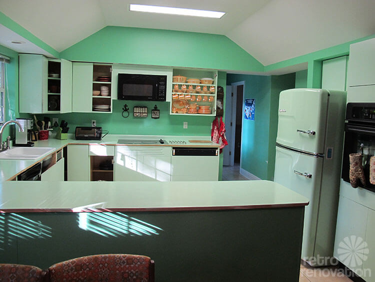
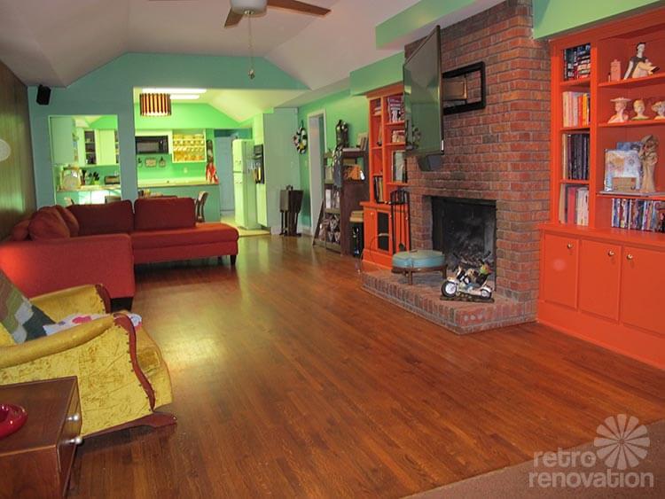
I live in Alabama and we bought our house a little over a year ago. We wanted a more midcentury modern style house but we needed acreage for my husband’s business and shop so unfortunately we were not able to get that. Our home was built in the early 30s and is more of a country style home (I am not complaining anything old is better than new in my book) and has been updated and added on to several times. It has a very open floor plan and the den, dinning room and kitchen are all connected and technically one room.
I bought my second set of Youngstown cabinets yesterday after almost a year of searching and need to decide how to do the kitchen to where it will still go with the rest of the connecting rooms and have the mcm look I am going for.
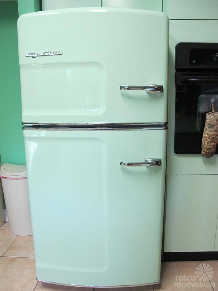
We painted the den and built ins, put up wood paneling, bought furniture all when we moved in and recently bought a BIG CHILL fridge in jadeite green. With all that being said…Now I am looking at these rooms as a whole and I am not sure what I have done. Are the colors all from the same decade, does my fridge go with my couch and have I wasted all his money and ended up with a disaster. EKKKKK!!!!
I am so overwhelmed! I hope that made sense.
I obviously need to repaint the mustard room past the den…so should I paint it the same color (vegan sherwin williams) as the den and kitchen or change the color all together.
Geeze Louise this is long and I hope it makes sense. Cant wait to hear back!
Thanks so much in advance.
Ashley
Ok readers — let’s give Ashley some ideas. How can she tweak her large space to all coordinate and look more cohesive?
Kate’s advice:
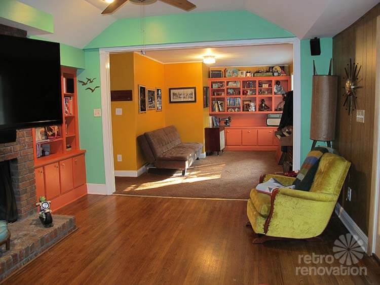
Ashley’s large great room area — including kitchen, dining room, living room and den — has a lot going on and is a big space to plan. I can see why Ashley is stuck — she has several angled walls where they meet the ceiling, long walls that connect rooms, pieces of wall that jut out and have cut outs and lots of corners. My advice for you Ashley — simplify.
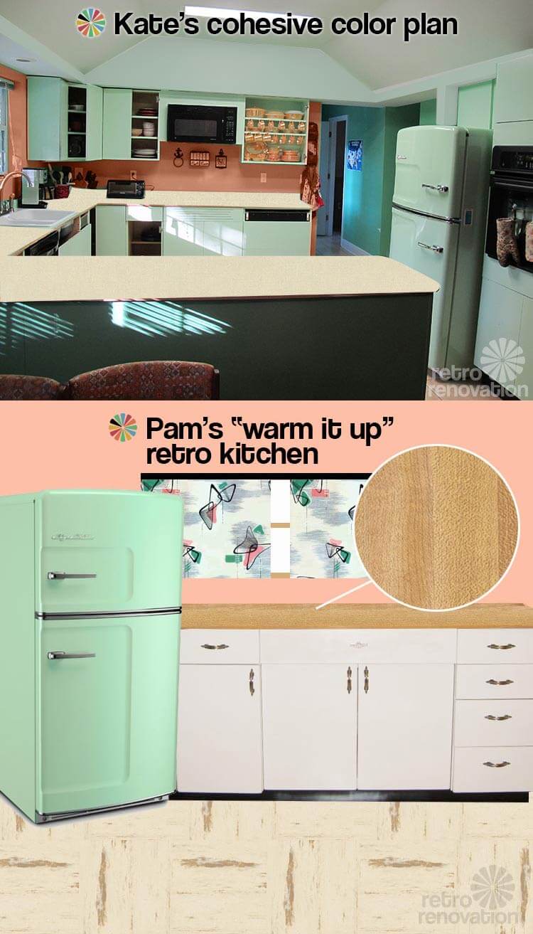
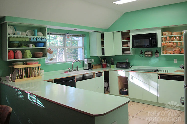
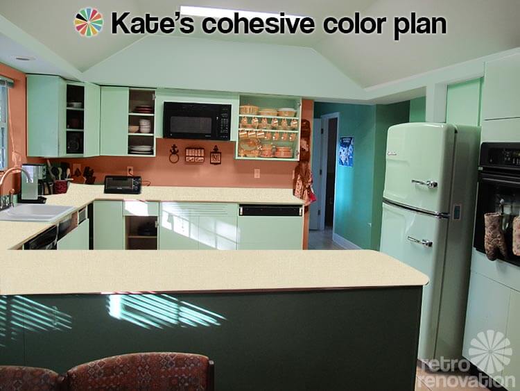 Let’s start with the kitchen. I think having your Youngstown steel cabinets painted to match that stunner of a Big Chill refrigerator that you have is a great idea. In fact, the color you are thinking about painting your Youngstown cabinets is close to the Sherwin Williams “mint condition” color that I painted my kitchen cabinets. What I think needs to happen on the walls though, is to first — paint the angled bits of wall that meet the ceiling the same color white as the ceiling. Before, when they were bright green, it was drawing too much attention to this portion of the wall — taking away from your cool fridge and cabinets. By painting it white, it will blend in and allow the true focus to be where it should be — on your soon-to-be awesome kitchen.
Next, I would pick a color that relates to your dark orange couch and painted built-ins (hard for me to recommend one since the oranges look so different in every photo) but is several shades lighter. Maybe a coral or peach depending on the specific orange on your couch. Get a bunch of coral and peach swatches and hold them up next to your couch and built-ins to see which one looks best. Then, I would use that color to paint the wall between the bottom of the cabinets and counter top. This will bring some warmth into your kitchen to help it coordinate with the rest of the rooms. Before, with the green on green color scheme, it felt too monochromatic and too “cold” next to the warm burnt orange of your sofa and built-ins.
For counter tops, I would choose a warm neutral laminate with a linen look — like Arborite Weathered Hemp or Earthen Hemp. Get samples of both and see which one coordinates best with your neutral tile floor and wood floor. This will add further warmth to the space, as well as some subtle texture to add interest. Since you have some chrome on your refrigerator and possibly cabinet handles — you could use metal edging like Pam used in her kitchen to complete the look.
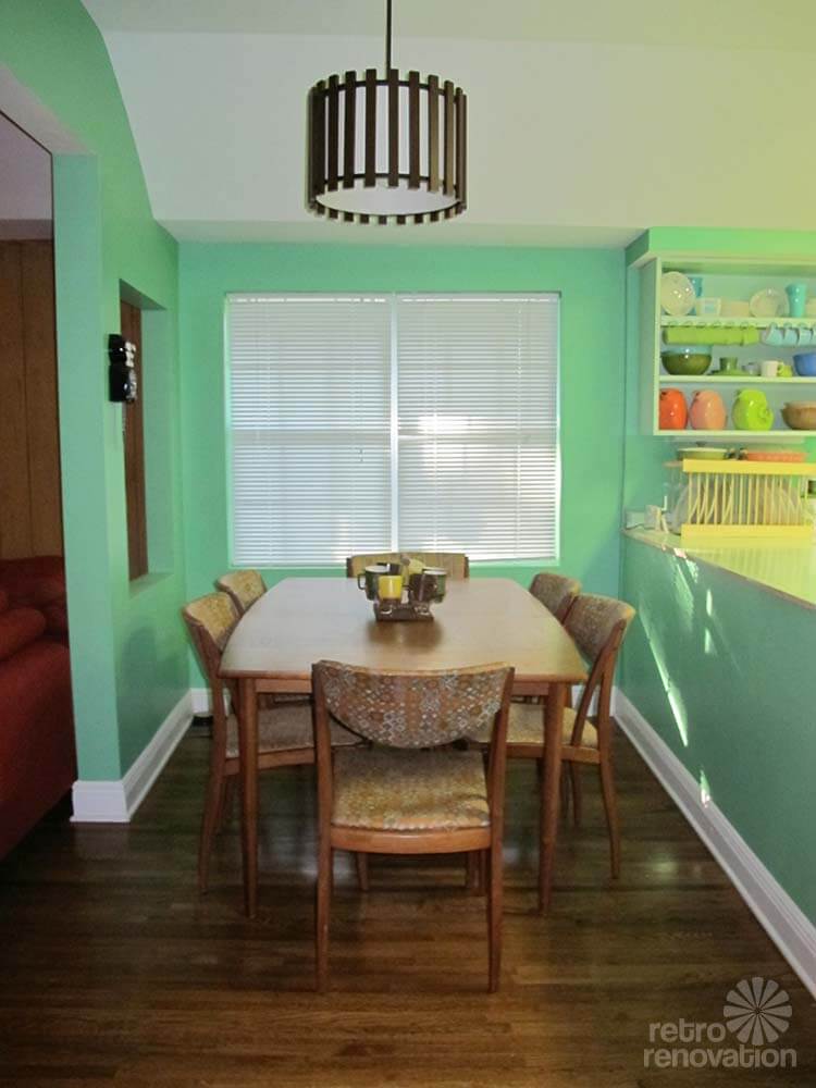
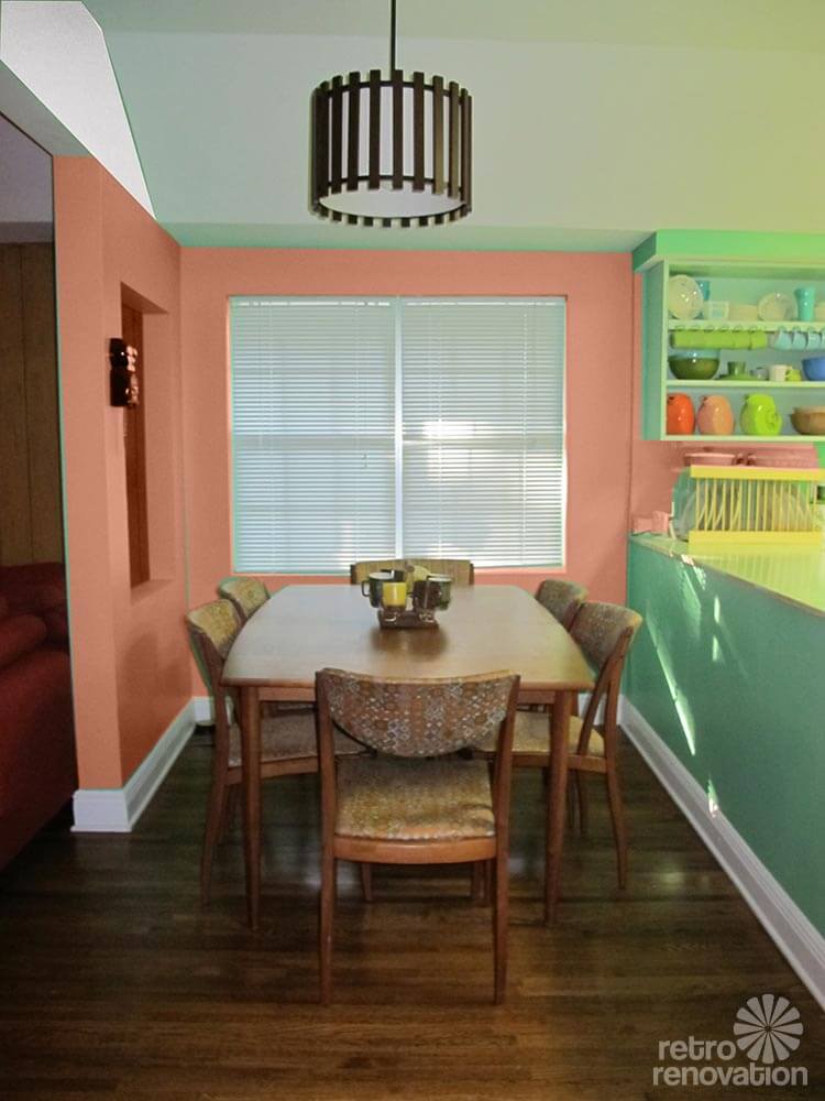 I would continue the peachy-coral paint into the dining room. The warm color will look great with your warm wood Drexel dining set and wood floors.
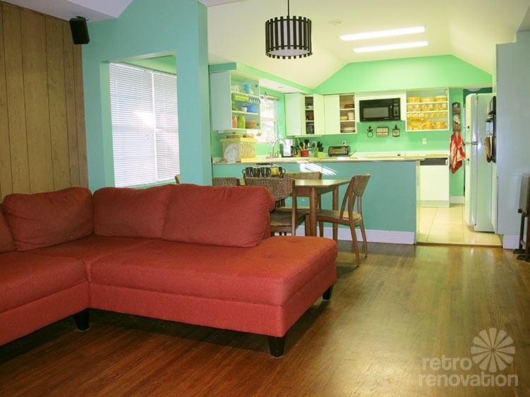
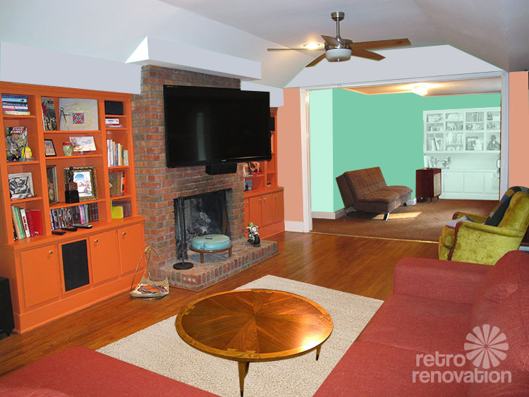 For the living room, continue the same peachy-coral color on the walls. The warm color will look great with the wood paneling, fireplace and other burnt orange pieces in the room. I’d add a neutral area rug — like this one from IKEA — in front of the sofa to visually anchor it and break up the large expanse of wood flooring. Then find a vintage coffee table, like this round Lane model, so you have somewhere to set your drinks. You could also add a few light neutral and light green throw pillows to your couch to bring the kitchen color out into your room. All of these touches will also make your room feel cozier.
Continuing through the room, I would paint all the bump outs near the ceiling the same white like in the kitchen, to draw attention away from them and towards the other elements in the room.
In your den room (previously yellow), you could paint The walls the Sherwin Williams Vegan green that you used before, then paint the built-in the same color as your kitchen cabinets. Put some orange pillows on your futon and a few orange/peachy things on your shelf and you’ll have a space that uses all of your favorite colors in a pleasing and cohesive arrangement.
Pam’s advice:
Ashley, your Design Dilemma inspires me to offer some theoritical design advice: There is, I believe, a “logical” order to making design decisions about a room. Fundamentally, the most expensive decisions are the most important ones. You nail these down before progressing to less expensive decisions. More expensive = hard to change, you want to be very careful, very thoughtful, because unless you are made of money, you want to be able to live with these decisions a long time. Less expensive = easy to change. Repita: The order in which you make design changes: Expensive first, Inexpensive after.
In regards to your design dilemma, I would advise: Do NOT get hung up on the color of your walls — until you have the more expensive designs made first. Wall color is relatively cheap and easy to change — while kitchen cabinets, countertops, refrigerators etc. ARE NOT.
Here is a stab at identifying which expenses fall into which bucket:
Expensive — focus on these first:
- Architectural changes to the house — moving walls, moving windows, moving doors, etc.
- Kitchen cabinets
- Kitchen countertops and tile backsplashes
- Kitchen floors
- Kitchen appliances
- Large pieces of new furniture
- Custom window treatments
Inexpensive — focus on these after:
- Paint color
- Used furniture
- Accessories
- Rugs
In the case of your specific questions and dilemmas, Ashley, here is what I think I might do:
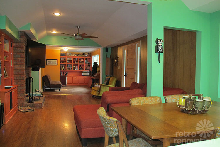
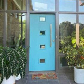
- You did not ask about this — so I realize this is unsolicited advice — my apologies! — but I question the fact that your front door seems to be opening into the smack dab middle of your living room. To me, this placement looks like it is disturbing furniture flow and use of the room. And, it means there is no real foyer area to welcome guests, to put down their bags, etc. You said that the house has been added on to over time, and I am guessing that the den is an add on. My suggestion, if it is possible, is to consider moving the front door either closer to the den, or closer to the kitchen; then add a half-wall to compartmentalize it, and then move forward with the design of the living room. Admittedly, though, I can’t really see the entire situation. This is just a thought. But I think you get my idea — this is an issue of “fixing the architecture” that I might deal with first, before moving forward on aesthetic issues.

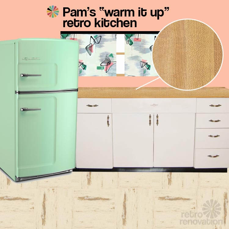
- For the kitchen, you have already locked into one expensive piece — the jadeite Big Chill refrigerator. So, this is now a starting point for the next steps in your kitchen. I do not think I would go with cabinets painted to match the fridge. I think it would be better to go with another color — one that would make the Big Chill fridge pop like the beautiful hunka hunka that it is.

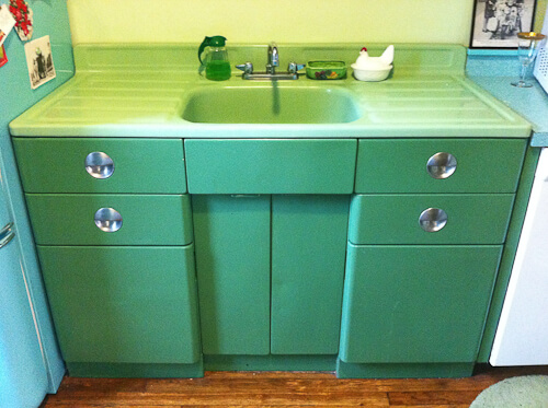
Erica’s jadeite kitchen cabinets — believed to be original finish I have seen ONE example of jadeite greenish steel cabinets here. I like how they appear darker than the jadeite of the sink — and presumably, darker than your fridge. You could also go with white cabinets. Maybe you don’t even need to repaint them if you stick with white? If you do repaint, be sure to test for lead paint first and if it’s there, take precautions accordingly; consult your own properly licensed professional.
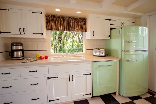
How the jadeite Big Chill looks with white cabinets — click the photo to see the story on this kitchen - For countertops, I would consider something wood-look to bring warmth to all the metal in your kitchen. Wood-look countertops also would relate to the wood tones through the rest of the open concept area adjacent. How about Formica’s Butcher Block laminate. I would not edge them in metal, I would choose a simple postformed edge. And here’s another idea I have been toying with lately — real maple was used on countertops in the 1940s. How about maple laminate? Or, if you want to keep the wood tones darker to coordinate with your Drexel and your wall paneling, how about a wood toned laminate in the Drexel shades? I also like the idea of a woodtone countertop because you are mid century in the country.
- For flooring, how about my kitchen floor, Azrock Cortina Autumn Haze. I think that would look quite nice. Alternatively, look at the sheet linoleum from Forbo and go with a light marbleized linoleum. I just read Jane Powell’s book on linoleum (affiliate link) this weekend. A must-have for any Retro Renovator’s collection! She makes a very compelling case for the environmental benefits of true linoleum vs. flooring that contains vinyl/PVC.
- For paint color for the wall, I went with Kate’s suggestion. And, I tied all the colors together with barkcloth from Melinamade (update: company now gone).
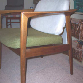
- In the living room, I would nix the burnt orange paint on the bookshelves. They are just too much. I love the Jerry Seinfeld gag where he says that when he has a killer headache, he wants to take just enough aspirin to kill him — then back it off. Same deal with the old saw: When you are getting all dolled up for a night on the town, the minute before you are walking out the door, check yourself in the mirror and take one piece of jewelry off. These cabinets are your aspirin, your one-bling-too-many. Either strip them and stain them to match your paneling or Drexel, or use a product like Rustoleum Cabinet Transformation to mimic that wood look. I would likely finish the bookshelf in the den the same way, for visual continuity since you have one large open space.
- I agree with Kate about repainting the mansard parts of the ceiling white rather than a color.
- You have a big investment in the sectional. So that stays.
- Paint color for the walls, room to room to room? Once you have all the expensive decisions outlined above completed, the paint colors should come relatively easy. I like Kate’s ideas a lot — as they keep the paint colors in the families of the larger decisions. One final note, the rug to go under the sectional could/should tie all the principal colors of the entire connected space together. It will need to contain shades of jadeite green, burnt orange, light and dark woodtones… I would not make it too light and bright. It should read dark to settle the space. Maybe a large oval chenille braided rug in a principally brown colorway, with these other colors speckled in. This would also be cozy to lay on, and it has a little bit of country in it, too.
Good luck, Ashley. We congratulate you for being bold with color — you are close! Let us know what you decide!


Mariele says
As always… Kate’s advice hits the nail on the head. I think I’d do a different paint color on the built-ins, but otherwise, Kate’s idea looks A++!!
Mary J says
It has taken me days to digest all the ideas in this thread, but I still did not see some of the things I would do. I liked Kate’s choice of a peachy/coral paint color to coordinate the kitchen with the living room. I would also apply this color to the wall behind the cabinets in the dining nook. I also think Pam had a point about the front door and TV. Moving a door could be a major undertaking since this also affects the exterior. Paint the cabinets minty green or white with minty green backs in the open cabinets, whichever you like better. I’m not usually a fan of white kitchens (tearing one out now), but you have so much other color it wouldn’t be boring. If you go with white cabinets add in mint accents with window fabric, accessories, and jadite dishes.
As for the entrance, have you considered making the living room area more living-roomish and moving the TV to the den/alcove? You could place it in the built-in and you would still be able to see it from the kitchen and the living room but it wouldn’t be the focus of the room. I would stay with the built-in paint color you have – you must have liked it – and keeping the built-ins all one color to unify the living room and den while keeping the kitchen a separate defined space.
Introduce some pattern by recovering the sofa in the den/alcove. If it’s a futon cover, these are easily replaced. If you don’t want to go to that expense, then consider replacing the mustard paint with a floral wallpaper that picks of the colors of all three spaces. I would also add a game table with high-back armless upholstered chairs in place of the upholstered chair. A flame stitch in in oranges and aguas would look great and coordinate with a floral in the den/alcove. Move the upholstered chair in front of the built in to make a reading nook if there’s room, or put it in the den and put a new (to you) chair in front of the built-in. Add in a coffee table, and you’ve really upped the entertaining and relaxation opportunities of the space. Now that’s room for living!
Suz says
I feel your joy and pain. I am also in the throws of a major kitchen remodel and totally confused about color. Seems like all the colors I like are “accent colors” and I thought getting my St. Charles cabinets powder coated cobalt or royal glitter blue might be a bit much (not positive – from someone who used to have a revolving disco ball- with lights in the living room) Anyway, I was stuck. A friend suggested hiring a colorist and I was a bit taken aback at $200 per hour! But I bit the bullet and can only say I wish I had done it sooner. The team I found Angelisse Karol made so much sense. I will have plenty of color in my kitchen with light sky blue cabinets.
Joe Felice says
Here’s another thought. Is Formica’s coral Boomerang still available. If you paint the dining area coral, that laminate would look super on the counters and would ties the rooms together.
pam kueber says
nope, coral discontinued
Joe Felice says
Is the refrigerator supposed to be aqua? On my screen, it looks more like jadite. I think painting the cabinets the same color is a bit much of that color, but, if the refer is aqua, turquoise goes well with that. Buttercup would also go well. Otherwise, the coordinating, darker green looks fine. Love the salmon in the dining area! One nice thing about MCM colors is that they all go well together.
pam kueber says
it’s jadeite
Evie says
You have a great space and there is lots of great advice and ideas! Ultimately whatever you choose has to feel good to you! I have tweaked my mid century kitchen for 15 years! I lived with white walls for the first 9 years and finally found the color that works well in my space. I live in a area with gray skies for many many months, so choosing a color that illuminated my kitchen was crucial for surviving the rainy season. I started with white as it worked with the design and gave myself time to make those decisions after living in the space.
I went more along Pam’s lines–neutral colors for the cabinets, counters and floors. I know how I am and I can get tired of my surroundings and like to change things up. My high ticket item(s) in the kitchen was the glitter booths and stools. I made them the star of the show. I would do the same if I had that beautiful Big Chill (I’m jealous). And would get some really cool mid century drapery as Pam suggests. Same with your beautiful sectional–I wouldn’t create competition with any large swatches of similar colors. Introducing drapery/pillow cases with a cool atomic pattern to complement your sofa would be awesome. I’m a fan of Flor carpet tiles, lots of colors and patterns to choose from. You can cut them to fit your application and (I) would cover some of the hardwood to soften the space. I did this in my den and it made it brighter and made coordinating accessories easier as they stood out and didn’t seem to get swallowed up by the heaviness of the dark floor or in some cases, make them contrast too greatly against the floor.
You might find that keeping the walls lighter and more neutral feels better and perhaps an accent wall in a desired colored that works with the fabric/drapery you have chosen feels right.
For me, who LOVES color (and my kitchen screams color), the colors you currently have would feel too heavy for me. Also, I agree with keeping those angled parts painted white–the eye does a lot of traveling otherwise.
Also, the space where the table is seems awfully small/narrow. I can’t tell what’s going on in the ‘mustard’ wall area–but I couldn’t help wonder if you dining set could go there. It feels like it is crammed into the current space, I know we would have chairs hitting those walls.. Would be nice if you had a space where you could have a china cabinet or sideboard along with it. Granted it’s away from the kitchen, but good excuse to get a mid century serving cart! You can make a breakfast nook or breakfast bar out of the little space!
Lastly, a starburst clock on your fireplace instead of the flat screen.
Good luck! I hope your place will be featured here again with some after photos–would love to see what you settle on!
Cynthia says
Thank you, everyone — Ashley for bringing this up, Kate and Pam for their great ideas and rationale, and everyone else who chimed in. This whole topic is very timely for me, as we have a bit of an open floor plan, too, and are remodeling the entire first floor (including putting a new-old kitchen in a space that was previously a playroom for our kids). I have been struggling with colors and patterns, and have had many of the same dilemmas as Ashley. I got a lot of good ideas from reading this post and everyone’s responses.
Pam, I especially love the advice of figuring out what stays and cannot be easily changed, and working from there. Great advice, and it really clarifies a lot for me.
Ashley, I can’t wait to see updates! Love your house and your style!
Sheila says
No advice from me, but I have to say how much I enjoyed reading Pam and Kate’s advice – what a way to team up and cover so much: providing both concrete recommendations and articulating the rationale behind those choices. Bravo (Brava?)!
pam kueber says
Thank you, Sheila!
Mary Elizabeth says
I would go with Pam’s idea about the butcher block laminate or real solid maple. I had the Formica butcher block kitchen counters in my 1978 condo. But when a 1987 coffee pot fire burnt a hole in the counter and smoke damaged the cabinets and wallpaper, I was told by every supplier that Formica no longer made this laminate. They are telling you that they have made it continuously since the 1970s, so once again the suppliers don’t always know what the heck they are talking about.
You should price the maple vs. the Formica. The advantage of the Formica is–usually–a lower cost, water and stain resistance, easy clean up, long wear, and mid-century authenticity. Also, you can order them custom made and install them yourself, bringing the price down. Some close friends of mine have maple countertops, installed by their cabinet maker at a pretty hefty expense. At first they were paranoid about letting any water sit on the countertop for 30 seconds, but with multiple layers of polyeurethane as a finish, their little spills have proved inconsequential. If the wood countertop is stained, you can often remove stains with white vinegar. If it is damaged (burn or scuff marks, for example) or worn, it can be sanded down and refinished without removing it from the cabinets.
Either way, the wood or wood-look will go very nicely with the metal cabinets, whichever color you choose, and it will provide an element that will carry through to the wood in the dining area and the rest of the open space.
pam kueber says
Or, use maple laminate.
lynda says
Just use the real maple and use Waterlox (must be careful with bleach or oxi clean type products, otherwise, nothing hurts it) Or use Watco Danish oil and refresh now and then with mineral oil. We have had them for 37 years and only refinished them 3 times. They still look great. You can’t renew a laminate, and there is just something nice about the real wood look in a house! You could use Ikea butcher block to keep costs down. Maple is far less than the quartz, granite, marble, or soap stone.
pam kueber says
I agree. Real deal butcher block might be great, too. See this story and comments on it: https://retrorenovation.com/2012/05/14/butcher-block-countertops/
Rinke says
I love teal and turquoise, but the shade used does not do the house justice. I must admit I like the kitchen as is, why the need to make it look like the rest of the house? In my opinion it’s the turquoise in the living area that looks off. A pale grey (with a hint of blue or green in it) instead would make other colors stand out nicely. It would not interfere with the brick either.
I love what Kate did to the kitchen picture; classical (between salmon and old rose) pink might be the way to go if you do want to ground the kitchen.
If you don’t want to repaint all the turquoise, you could look for a pale pistachio or olive for the living room ‘head end’ walls (as in: a calmer green). The yellow in the back room is amazing! Good luck!