

 Reader Laurie has been hard at work fixing up her 1966 ranch house. She’s been working to get the interior painted and clean up the yard and even found new mid-century style doors at Lowe’s and had them installed. Now Laurie is ready to pick paint colors for her front door and trim. She has a few ideas, but wants our input and help to decide on a color scheme so that when painting weather rolls around this spring she can get right to it. What colors do you recommend?
Laurie writes:
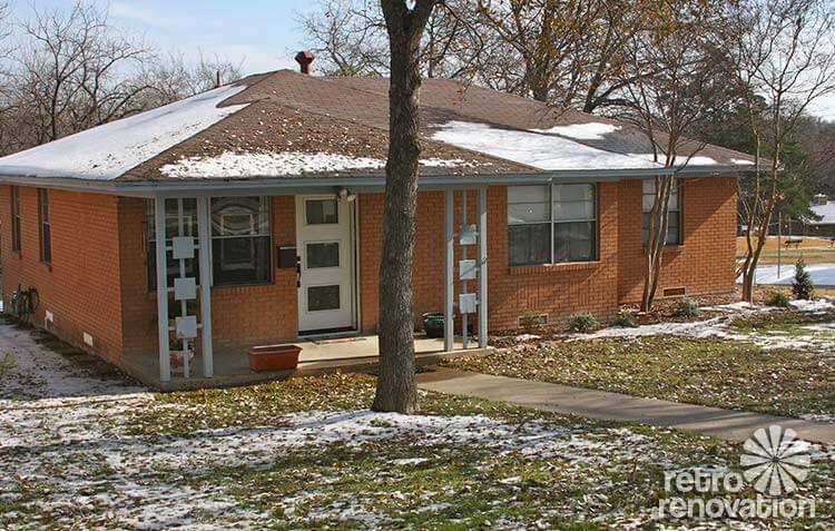
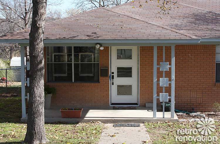
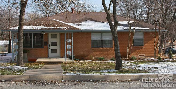
My house was built in 1966. I bought it last year and spent time painting the interior and fixing up the yard so the house didn’t look abandoned. I need some help choosing proper paint colors for the exterior. I bought new doors at Lowe’s that were just installed a couple weeks ago and the weather is such I can paint the doors soon. The trim will have to wait until spring, though, I think.
I was leaning towards white for the trim and blue/green (not turquoise) for the door.
The shrubs in the front will grow to be three feet tall and stay green all year.
I just painted the inside this fall. Tackling the outside next. This house has been a lot of work for me the past year. It’s coming together though. Thank you for your help.
Laurie
Readers — what colors would you choose for Laurie’s mid century brick ranch exterior?
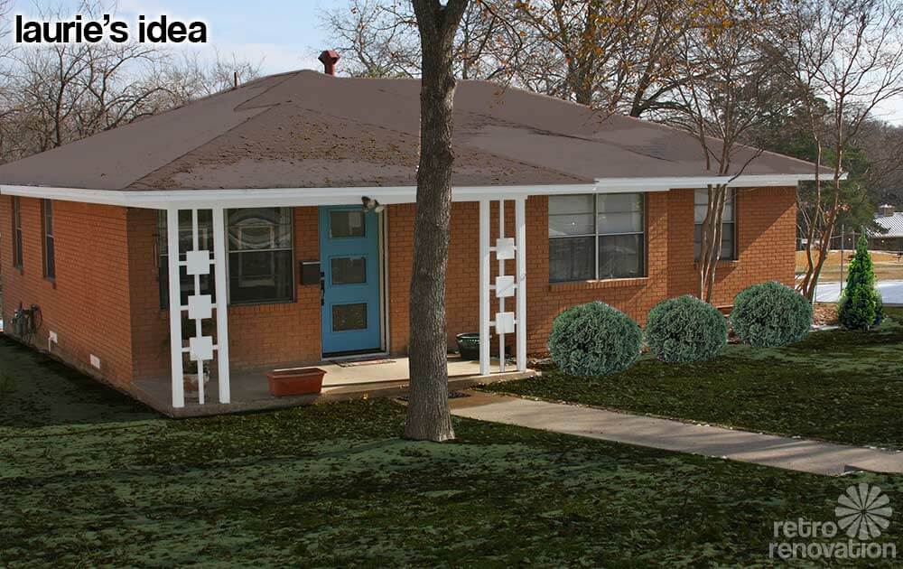 Laurie already had some ideas on how she wants to paint the trim on her house. The mock up above is my guess at how Laurie is envisioning her house will look after she paints all of the trim white and the door a “blue/green (not turquoise).” Did I get the door color right Laurie? To get a better idea of how the new paint will look in summer, the snow on the roof and yard was minimized using Photoshop and larger shrubs were added where Laurie already planted some that she says will get to be three feet tall.
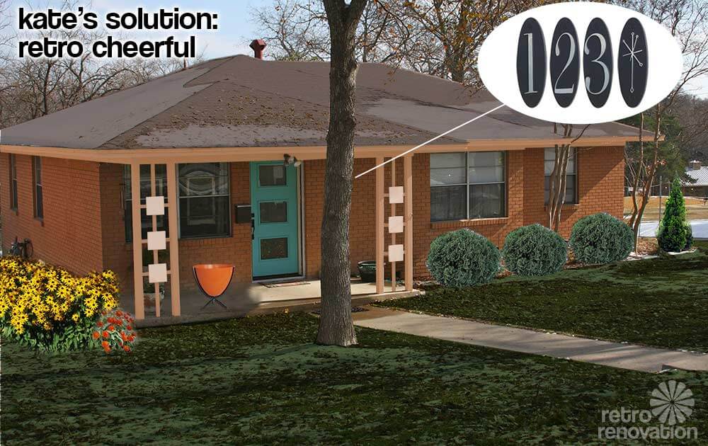
Kate’s solution: Retro cheerful
My look for Laurie’s exterior is retro, playful and full of cheer. For the trim on the soffits and most of the porch columns, an earthy peach blends nicely with the orangey brick without being too stark of a contrast.
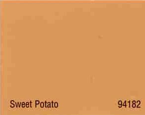
My color suggestion reminded Pam of a house color scheme she profiled back in 2009, painted with a combination of Copper Haze and Sweet Potato. The same colors would work well on Laurie’s exterior — using Sweet Potato for the trim and soffits and Copper Haze on the six squares on the porch columns. This would make the decorative squares stand out a little without screaming too loudly. For the door, a medium aqua tone really pops off the color of the brick and makes Laurie’s new door the focal point of the front of the house. Adding some fun accessories like a hot orange bullet planter from Hip Haven that could be filled with anything from flowers to decorative grasses and the retro oval metropolitan collection house numbers from Home Depot really makes it feel like 1966 again. To add even more happy to the front of the house, brightly colored flowers like Black Eyed Susans or Zinnias make the entry feel even more inviting. Once the front porch is fixed up, Laurie is going to want to sit out there more often, so finding a comfortable patio chair or two like these vintage Homecrest rocker chairs from Etsy seller Moderninspiration should also be high on her list.

Pam’s solution: Front porch focus
What a lovely house you have, Laurie — and it is lucky to have found you as an owner! Looking at your house, my key idea is to really play up the front porch and particularly the front porch columns, which are keepers. Their geometry actually reminds me of breeze blocks.
#1 — Add square-diamond trim to the front porch columns: As you can see, I suggest you add a second layer of square trim to the front of each of the three decorative squares on each column. You know those square toppers they put on wood fence posts? You might just be able to buy those and screw them on — that would sure be relatively easy and inexpensive. Something like this (I found this at Lowe’s) — but not too dinky — you may need to look at the larger ones, okay? You want to pretty much fill that square with a diamond, I think:
 #2 — Slate blue for the front door and diamond trim — As for paint colors for your new diamond trim pieces and for your new front door, Kate and I played with her Photoshop until I found a shade of slate blue that I thought I looked good with your brick. Not too neon… toned down, greyed out a bit. As you can see, I selected this color for the door and the decorative fence cap.
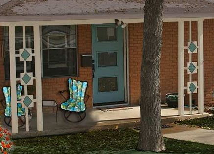 #3 — Outline the diamonds in the roof color — See how the diamond trim has a bead on the outside edge? Kate and I even put a DIFFERENT color on that bead — to “outline” the diamonds and make them pop. Try the roof color grey-brown from the fascia trim for this color — you may need to darken it up a bit to “see” it on the diamonds from the street — you’ll need to eyeball this.
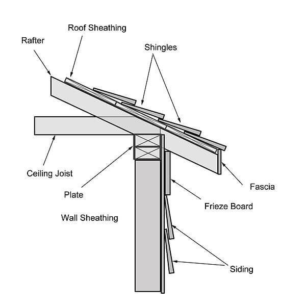
#4 — Color for the fascia trim — Use the roof color: For the house trim, I wanted to see what it would look like with the roof color painted onto the fascia — that’s what the trim right under roof edge is called. I think my idea here was to keep the line of your house overall long and lean and to not call excessive attention to the trim along the roof line.
#5 — Color for the frieze board and porch trim — Use the color of your concrete porch with the sunlight hitting it: Okay, so now I know that I am sounding like Mrs. Blanding choosing paint colors, but that’s how it works. For some reason, on this house, I think I would not use Super White for the trim. Because the house is relatively small and not tall, I am thinking an off white with a hint of gray-brown ala the roof color. So, I had Kate copy the color of your porch at a spot where the sunlight hit it.
#6 — Decorate the porch — I found two vintage Homecrest patio chairs on ebay that might look good on the front porch. I liked the upholstery because it played up your colors… and because it added some 1960s flair to the area. Be careful not to overdue the decorating, though, or the small front porch will start to look cluttered.
Thanks for sending us your Dilemma, Laurie! Be sure to send us “after” photos!


Mary Elizabeth says
Laurie, what a cool house! I love the different rooflines and the simple porch with the way cool architectural roof supports. Whatever color you pick is going to be fabulous.
My ranch is a 1950s “colonial ranch” with white siding, so I chose a traditional dark red door in a color called New London Burgundy and shutters and garage doors in Jamestown Gray, which is actually a grayish blue. Your house definitely calls for something more sixties.
I think aqua would be perfect for the door, but since you don’t like it, I have some specific color suggestions that are other blue-greens. They are all Benjamin Moore, which we have used almost exclusively for our house, but you can look at their chart to see what I mean and buy any brand paint you want. The blues, ranging from more green to more blue in the mix are BM 725 Seaside Resort, 733 Palm Coast Teal, 741 San Jose Blue, 740 Harbor Side Blue, 748 Blue Toile, and 754 Wilmington Spruce. Each of these color chips is is on a strip of similar colors ranging from darker to lighter, so once you decide the proportion of blue to green you want, take home the strips and pick two or three you like in that spectrum. You can get small samples of interior paint and paint a wide swath of two or three on the door to see how they look. Then when you have chosen your color, sand off the sample paint and paint with exterior paint in a low gloss. (I’ve noticed that MCM houses have less glossy paint than colonial style houses.) I assume the door from Lowe’s came primed. It’s great you found that door there!
Once visitors enter that door, what color palette are they seeing in the entry and living area? You might want to carry that palette outside as well, in the tradition of blending indoors and outdoors. Would your interior mix with a nice avocado green (not the muddy version with too much brown) or harvest gold door? Either of those would look fabulous with the brick and be also MCM appropriate. Benjamin Moore’s golds 250, 257, and 278 would be nice. The avocados I’m thinking of are 475, 483 and 496. (You know, you want the color that is more guacamole and less cut avocados turning brown in the air.) 🙂
As for the decorative supports, I love your idea of painting them white. The house is small, and personally I wouldn’t want too many colors going on. But the suggestion that you might paint the squares something else has my imagination going. What about basic off-white with the squares in the door color or a slightly darker or lighter version of that color? Can’t wait to see that when the painting is done. Yes, isn’t it great thinking about spring right now?
Janet in CT says
First of all, I love you house and especially the decorative posts! I am not good at color choices but have to agree with the turquoise door! I do think white trim is the way to go. One color on a local brick house here has a terracotta door which looks really great but they also have a big accent board on the side also painted that color. I think a darker shade of bittersweet orange or the terracotta with big plant pots in the same could look nice. Good luck in your new home!
Barb says
Dark brown trim with a pale tangerine door.
Sara says
Love your house! Wish we could see pics of the inside too! 🙂 A lot of mid-century brick houses here in my town have green or teal trim. I think it really accents the brick. Actually many of the brick houses here have bright limey green or bright mint green trim, and although it definitely accentuates the brick and I kind of like it, it’s a bit on the shocking side and I wouldn’t be brave enough to pull it off. But a nice teal green-blue shade would look lovely on your house.
Marcia says
I’d go for a deep green on the trim and paint the concrete slab the same color. You could go for almost any color on the door – a muted turquoise or teal should be fine. Maybe get two more of those white pots and spray paint to match the door, then set the 3 pots under the windows and add some bright flowers to them. That would add some balance to the door.
stacia says
You are spot-on with the blue-green: teal, not turquoise, in my opinion. For the porch supports, maybe paint all the posts teal as well, but paint the squares differently, a lighter teal or even an orange that reflects the brick.
Roundhouse Sarah says
My “MIL” has the exact same brick color. For her house we did a light buttery yellow trim and an aqua door. I know you are hesitant about aqua or turquoise for the door but that color is really amazing with that brick color. The aqua can also be grayed out so that it’s not Pow! Caribbean blue in your face!
Now if you aren’t a fan because everyone with that brick color does aqua for the door my second suggestion is a bit unconventional. How about a very light ice-y blue for the trim and a yellow door.
midmichigan says
The front door, roofline and decorative front porch roof supports have classic MCM design so I’d contrast those with the same color against anything else. You might also consider installing some random, gauged slate on the concrete porch.
https://retrorenovation.com/2010/01/20/multi-color-slate-flooring-an-authentic-mid-century-choice/
Aletha VanderMaas says
Hi Laurie,
Your new front door is perfect – I’m shocked you found that at a big box store! With your orange-ish brick, I’d certainly go for a blue front door. Anything from navy blue to wedgewood blue would be lovely. Not sure white as trim would be my first choice, though…maybe a dark navy trim with a lighter blue door? I’m sure whatever you decide will look lovely – your home is adorable!
Lynn says
Laurie, my recommendation is to paint the front door panels a color that compliments your living room when the door is open. I know that you said “not turquoise”, but I wouldn’t discount it. Just me, I love turquoise! Green may look nice and blend with the green shrubery outside, but again I would think about the interior colors.
LauraL says
I agree with Lynn. I recently painted our front door a sunflower gold that is a few shades darker than our living room walls. The door is a big part of our entry way as it only opens 90 degrees to accommodate a nifty built in room divider in our 1962 raised ranch. Going from a black door to a bright door took some adjusting, but adding a gold flowerpot and the right doormat has brought in the compliments. I noticed a number of my neighbors in my mid-century subdivision have also repainted their doors in bright colors, including turquoise, bright yellow, pink, and bright red. One of the former colors of our front door, found while sanding, was a cool toned blue-green. 🙂
Laurie, I hope the blue-green works for you and your living room. The bushes you planted are perfect for the space and the ranch! I like both ideas put forth by Pam and Kate.