

 It’s simple but true: Combining white with off-white — be it a soft beige, a yellowy linen, 1960s “bone” or a creamy vanilla — makes for a classic decorating palette that is almost infinitely versatile as well as pleasing to the eye. In today’s story, reader Jessica show us how she took advantage of this restful palette — which came with her rental unit – to create a cheery vintage style kitchen. Okay, she did have a bit more to work with — the red-trimmed tile around the sink. But you get the idea: Add an edited palette of strong contrasts to white-and-off-white foundation — Jessica chose red and black — and you have instant decorating success. Let’s see more of Jessica’s adorable space –>
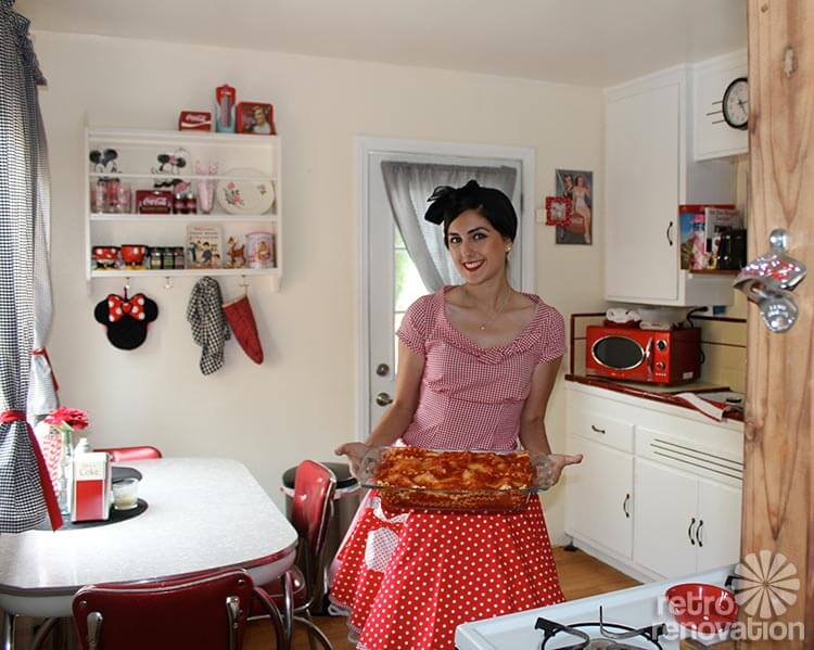
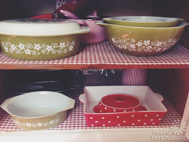
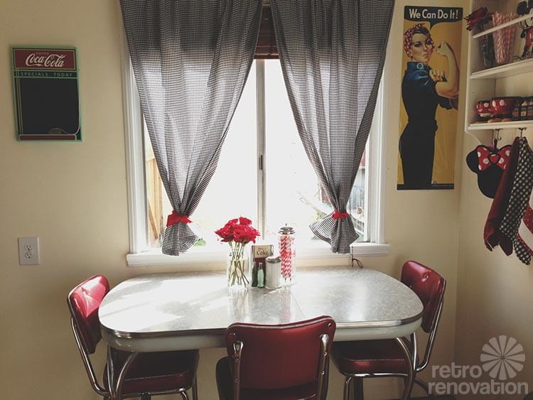
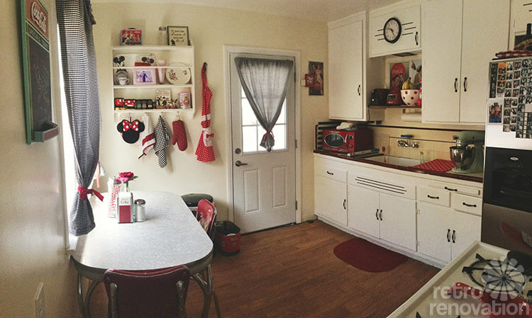 Jessica transformed here rental kitchen into a charming space by sprinkling bits of color — and pattern — throughout the room. Yes: Checks and polka dots can mix beautifully, when the backdrop palette is restrained.
Jessica tells us more about her love of the retro about her quest to make this rental space her own:
I guess I’ve always have been into the retro/vintage look. When I was a kid I fell in love with watching I Love Lucy. I could watch it all day and just grew a huge love for the 50s. I’m 24 but feel like an old lady (haha), because I love things that most people my age don’t. From the music, the cars and overall feel of that time is where I belong. I was definitely born in the wrong era!
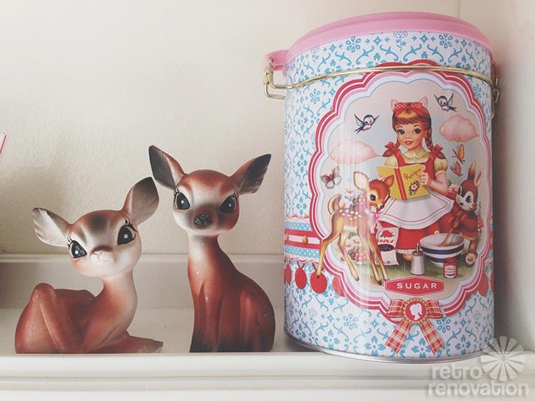
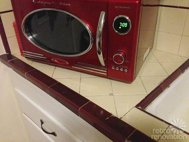
The house was built in the 40s. Not much has been updated other than the floors. I have a whole collection of vintage kitchen goodies: two cookbooks that are vintage, some vintage deer that are salt and pepper shakers.
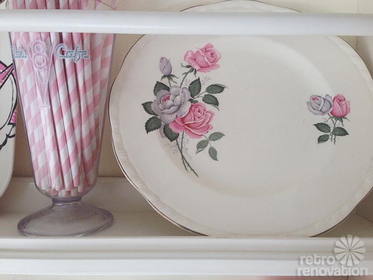
My pink floral dish is from a set that belonged to my great-grandmother, those are from the 1950s.
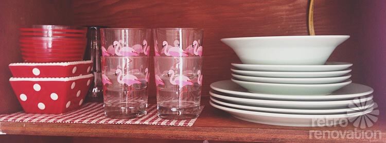
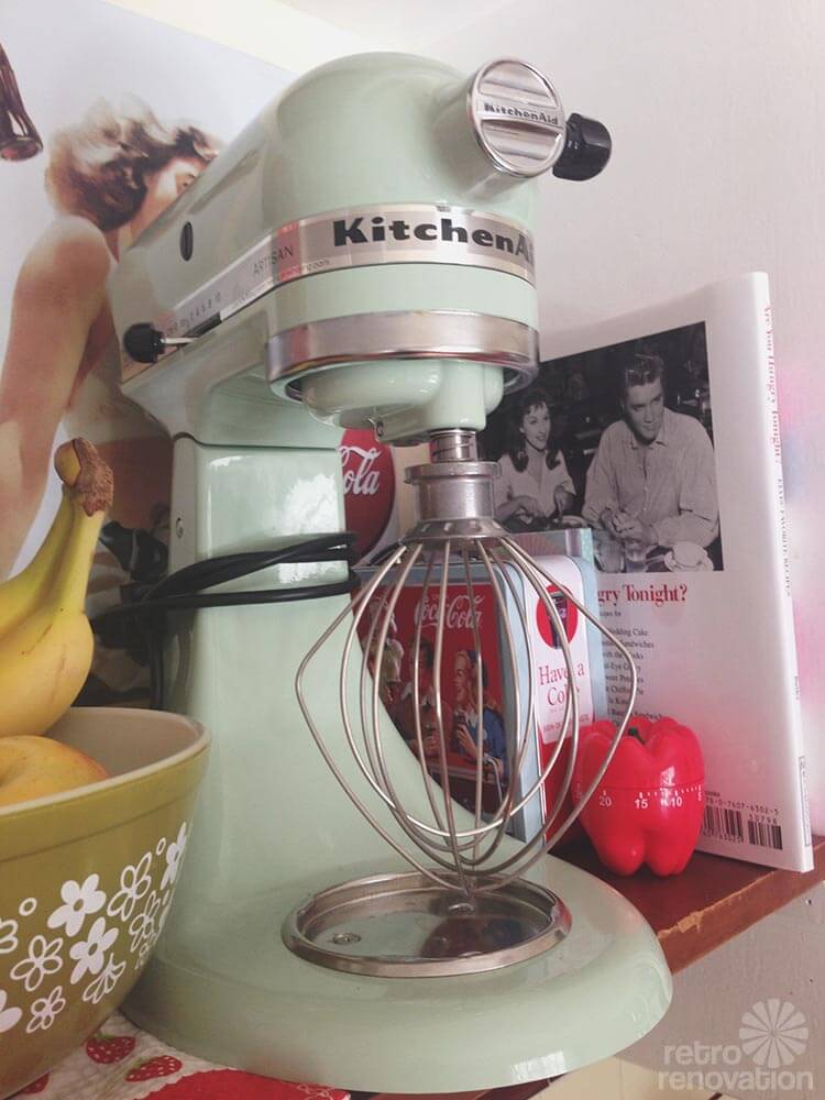
My dishes are a mint green (IKEA) that match my KitchenAid perfectly. My glasses with the flamingos are from IKEA too.
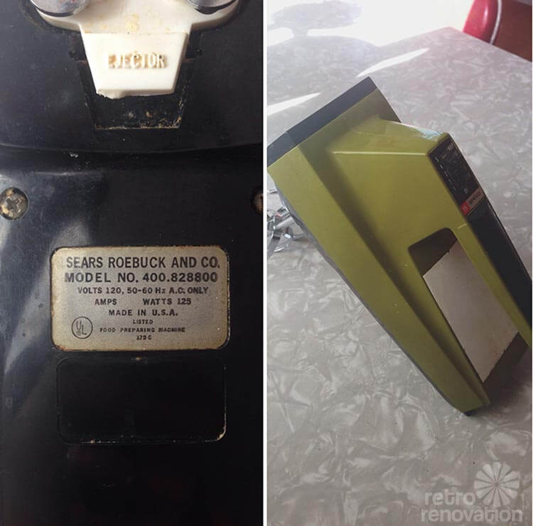
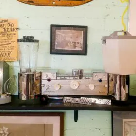
My little hand mixer was bought from an estate sale, I believe that is from the 50s.
The walls are a very light yellow. In the photo you can compare it to the white cabinets.
I also attached a picture of myself dressed up as a “retro housewife” 🙂


We love the contrast of white with an off-white. So if you are in a rental that’s all bright-white on bright-white — and the landlord wants to keep things neutral — and this story convinces you — maybe you can convince her or him to repaint the walls an off-white to provide some additional depth to work with?
Jessica, your kitchen is adorable — and you get major props for sending a photo in which you dress the part. We love it! Thank you so much for sharing your sweet space with all of us and being an inspiration to “Love the house you’re in!”


Cristy says
https://www.englishtapware.com.au/products/WM-RW-CCTOILET-BL/
If money is no object here’s a lovely powder blue toilet for $3,200.00 ?
pam kueber says
@ Cristy:
Indeed!